The 15 Best Movie Posters Of All Time, Ranked
The emergence of the art of moviemaking affected many other art forms, too. Cinema required a different acting style than actors had developed onstage, for example, and it also led to people specializing in the arts of cinematography, sound design, editing, and all those related fields that make moviemaking such a collaborative art. Cinema is fun in that it's also commerce in addition to being art, and so it also required new developments in marketing, such as the movie poster.
When you're marketing movies — in many cases, experiences that run for 90 minutes or more — it's difficult to choose one single image that sums up a succession of them. That's an art in and of itself. How much do you give away? How much do you rely on your famous stars? Do you try to represent the movie's plot? Its tone? Or do you simply try to construct an enticing image that'll get people in the door so they can find out what it means? We've already rounded up the best movie posters of the 2010s, but the posters in this article are the best movie posters of all time, and they each approach that challenge in slightly different ways.
Fargo (1996)
In 1996, the Coen Brothers directed "Fargo;" see where it lands on our ranking of all twenty Coen Brothers movies. They'd been making a name for themselves with films like "Blood Simple" and "Raising Arizona," and "Fargo" probably could've been marketed as more of the same. After all, it too is a crime story about good people trying to do good things, but getting weighed down by the coincidence and randomness of a violent, inexplicable world. Instead, the film's poster tried to show that this was a movie all about tone.
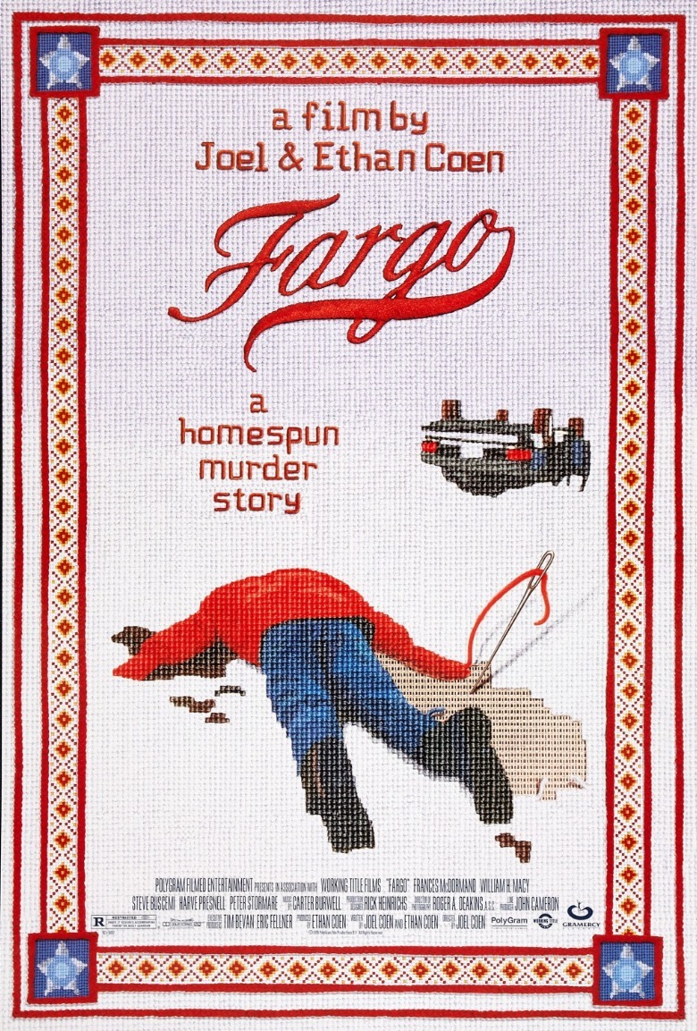
"Fargo" is a deeply-Midwest movie, full of kooky accents and frequent exclamations of "Don'tcha know?" The movie's delightful poster takes the form of a cross-stitched image of a man lying dead in the snow — the kind of thing Frances McDormand's character Marge Gunderson might have hung on her wall. Its bright red and white contrast an excellent way to catch the eye, and in seeming so cheery, the poster tells you all you need to know about the film's tone — it's all about the incongruence of violence seen through an overly-polite, kitschy, cutesy lens.
The inclusion of the needle stuck in the unfinished cross-stitch is a brilliant touch. After all, "Fargo" is very much about the fact that we're joining a story still in progress.
Airplane! (1980)
The 1970s were full of disaster films with star-studded casts, full of people who had been extremely famous a decade or two earlier. The poster for 1970's "Airport," for example, isn't just full of headshots of stars like Burt Lancaster and Dean Martin. Every space that's not headshots is taken up by a big list of the names of the actors whose headshots ring the image. When "Airport" and its many sequels were spoofed a decade later in "Airplane!," however, the stars are not the draw. The point is that we're more than ready to laugh at people on an airplane in increasingly-convoluted peril, and the poster reflects that goal brilliantly.
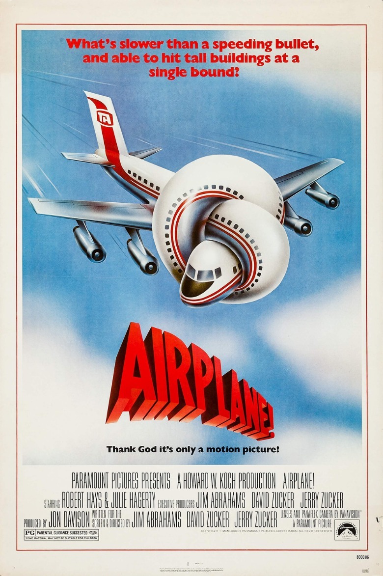
This is a great example of movie-poster art being an art in and of itself. The goofy, illustrated image of an airplane that's been tied in a knot would become iconic on its own, emblematic of an entire decade that would be filled with spoof movies indebted to this one. It's even got two taglines, indicating just how over-the-top this movie's going to be. One spoofs a "Superman" tagline, and the other pokes fun at itself, and that's exactly the movie's approach to comedy.
Halloween (1978)
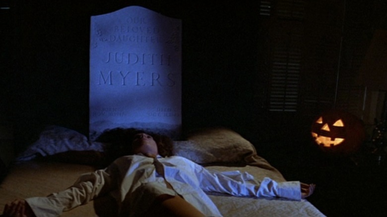
By the time John Carpenter released "Halloween" in 1978, we'd had other holiday-based horror movies. After all, "Black Christmas" changed slasher movies forever, and that was released in 1974. "Halloween," though, would cement the holiday slasher as a tried-and-true staple of the horror genre, and the film's phenomenal poster is surely not an insignificant part of its eventual iconic status.
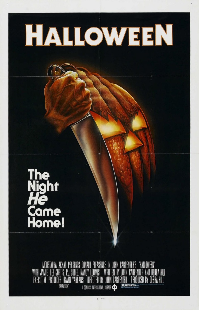
Like the poster for "Airplane!," this is an excellent example of creating your own imagery for the poster that isn't necessarily taken from the film itself. That Jack-o-Lantern isn't in the movie, but it doesn't matter, because the way its jagged bottom matches that jagged, curved knife is masterful.
Plus, "Halloween" boasts one of the best taglines ever: Halloween, we learn, is "The Night HE Came Home!" Nowadays, that statement carries with it all of our knowledge of Michael Myers. Audiences seeing this poster in 1978 wouldn't have met him yet, however, which is what makes it such a great tagline; it first makes you want to know who "he" is, and it feels even more ominous once you know.
Vertigo (1958)
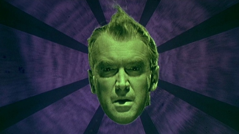
A discussion of the best movie posters of all time wouldn't be complete without an Alfred Hitchcock appearance. The best of a very good bunch — which also includes the posters for "The Birds" and "Psycho," among many more — is undoubtedly "Vertigo." Many critics would tell you that "Vertigo" is Hitchcock's best movie, and it's certainly his weirdest, playing with color and special effects like the veteran director hadn't yet had a chance to.
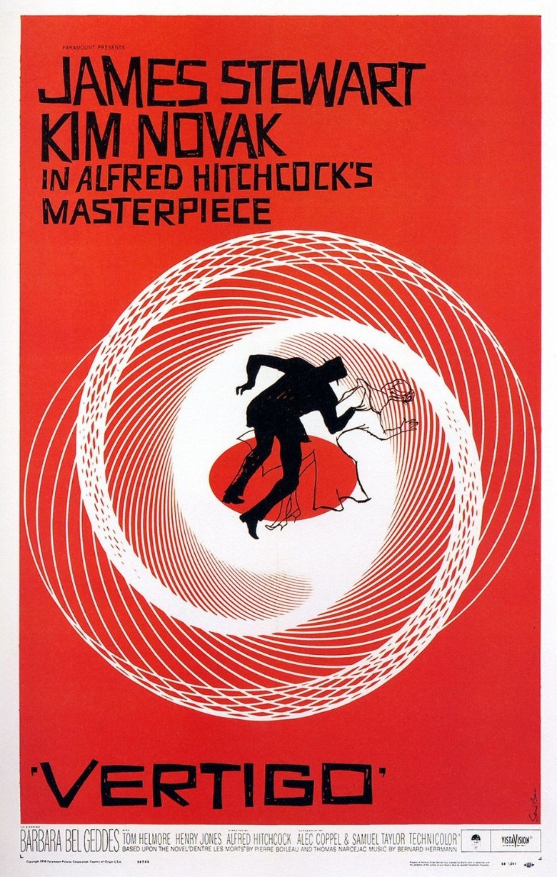
The poster was designed by the iconic Saul Bass, who spent a lifetime in film and design. He's also the man responsible for many of Hitchcock's best credits sequences, including the angular scroll that opens "North by Northwest." For "Vertigo," Bass developed a vertigo-inducing illustration that shows a man and woman's silhouettes falling down a spiral. Most of the poster is a vibrant red, a color that turns out to be very important in the film. Before you've seen this movie, you have no idea what that illustration indicates, but it certainly captures the movie's eerie, off-the-wall tone. Plus, James Stewart, Kim Novak, and Alfred Hitchcock's names are huge! Would you have really needed to know anything else in 1958?
Star Wars (1977)
The "Star Wars" franchise has produced some incredible poster art over the years. Any kid who was alive in the 1990s can tell you that seeing the poster for "Star Wars: Episode I — The Phantom Menace" in theaters was exhilarating. A young Jake Lloyd walking through the desert, casting a shadow that's unmistakably Darth Vader? Is there anything better?
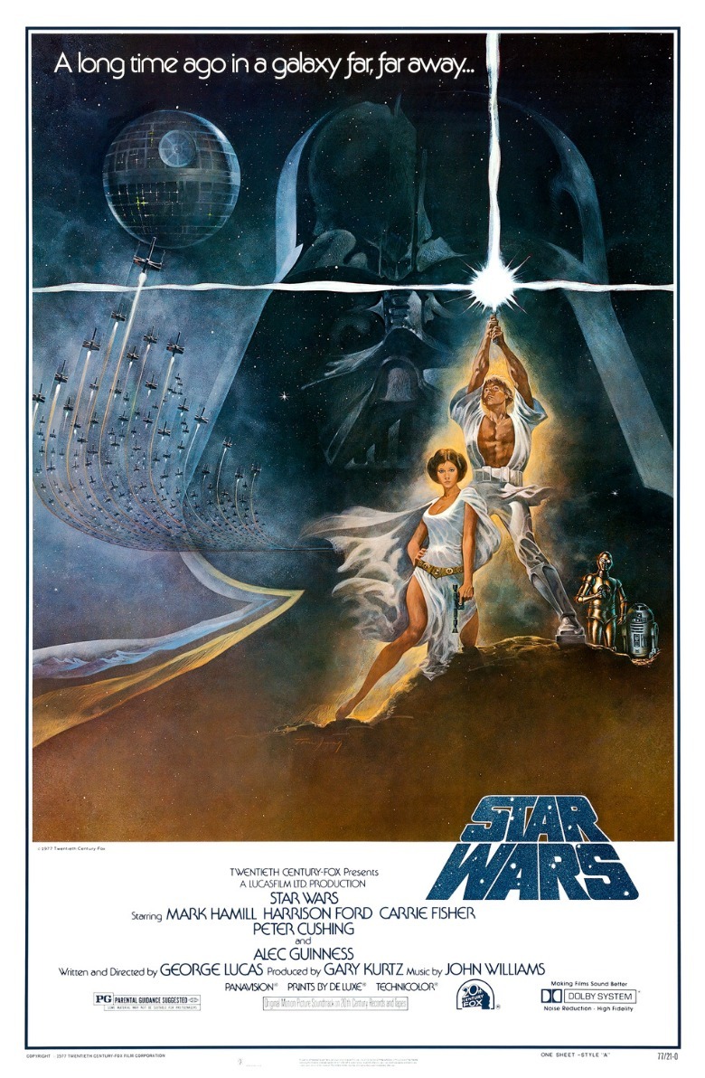
The first-ever "Star Wars" poster was even better, actually. Back before the original installment picked up its "A New Hope" subtitle, audiences were first introduced to a galaxy far, far away through this image of a totally ripped Luke Skywalker raising an inexplicably three-pronged lightsaber up into the sky triumphantly. By aping the style of prolific illustrator Frank Frazetta, artist Tom Jung's poster nods to the pulp sci-fi novel covers that inspired the film's aesthetic. Plus, if viewers don't yet know that your movie is about to spawn a culture-shifting franchise, you could do a lot worse than promising them gorgeous women, hunky men, battles in space, and the looming presence of a certain guy in a dark helmet...
The Social Network (2010)
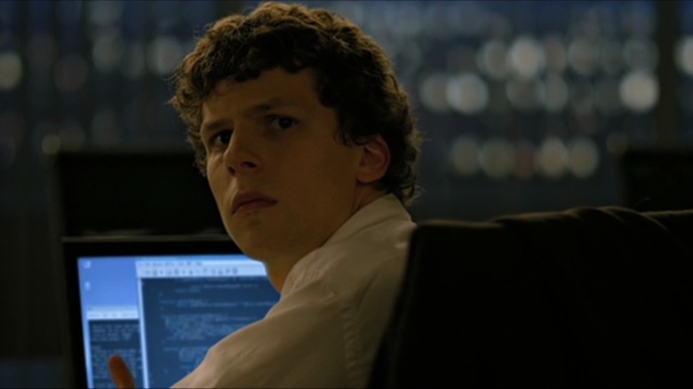
The poster for "The Social Network," David Fincher's 2010 film about the early years of Facebook, didn't invent the trend of putting giant text over a movie star's face. The poster for 2007's "Michael Clayton" featured the tagline "The Truth Can Be Adjusted" overtop of George Clooney. Still, "The Social Network" perhaps did it best.
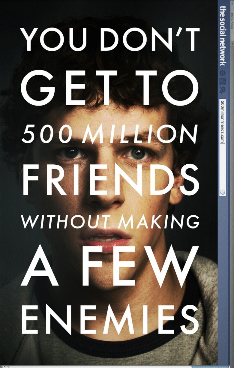
It features an extreme closeup of star Jesse Eisenberg's face, looking somehow both defiant and uneasy, just as he is throughout the film. Overtop of his face, gigantic text reads, "You Don't Get To 500 Million Friends Without Making A Few Enemies." The film's title is only visible along the side of the poster, looking an awful lot like the header of Facebook at the time.
There's one simple reason why this poster works better than any of the other "text on face" ones: In the early days of social media, we loved putting text on images. At first glance, this poster could be a Tumblr meme, and it's only once you look closer that you realize you're being sold something far more elevated. A "Social Network" sequel is happening now too, so we'll have to see how the poster matches up!
Jurassic Park (1993)
Like the posters for "Airplane!" and "Halloween," the original teaser poster for "Jurassic Park" distilled the movie down to one simple image meant to grab attention. It's just the logo for the titular theme park, featuring the silhouette of a dinosaur skeleton over the movie's title. There are a few things about this poster that make it the best example of other posters like it.
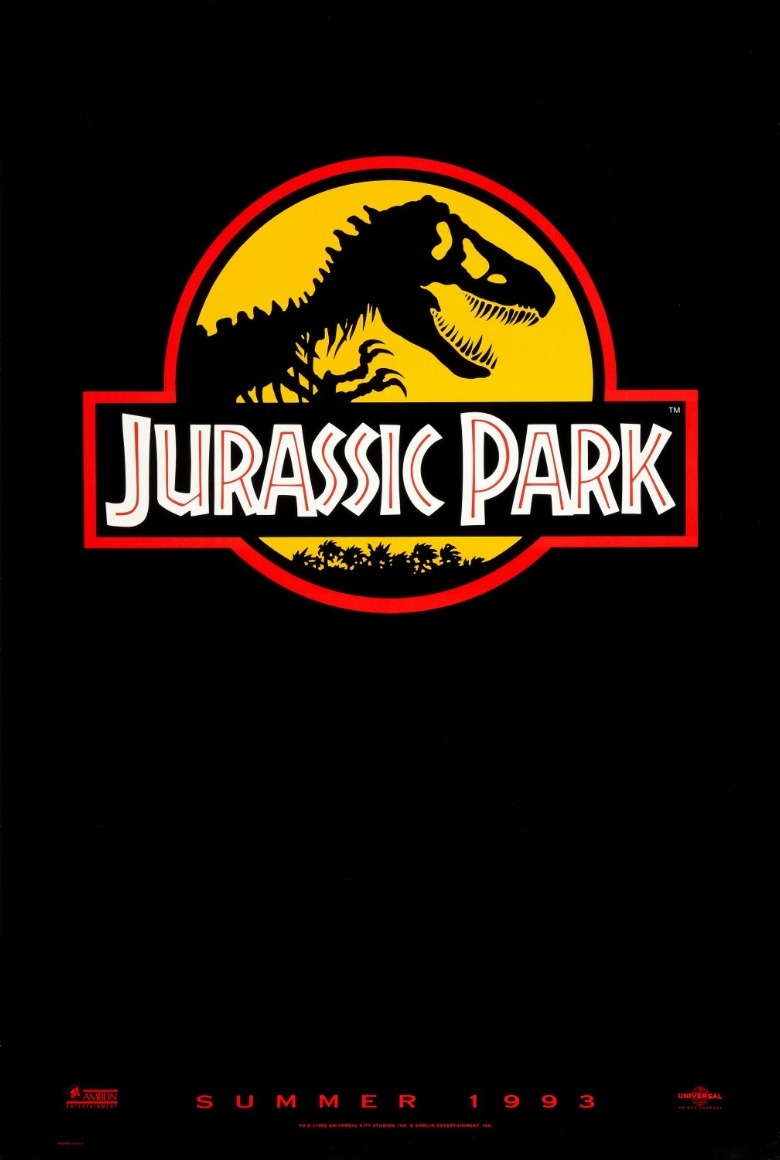
First, there's the minimalism of it all. This poster doesn't even tell us that it's a Steven Spielberg film, let alone trumpeting the fact that it had stars like Laura Dern, Jeff Goldblum, and Sam Neill in its cast.
Second, there's the fact that the design of the park logo actually incorporates the skeleton on the cover of Michael Crichton's source novel. Fans of the book will know exactly what they're looking at, while people who don't yet know that they're fans won't be able to get it out of their minds. Imagine being a dinosaur-obsessed child and seeing this poster. "Summer" would've seemed further away than ever.
E.T. The Extra-Terrestrial (1982)
You may notice that we've reached the part of this list where Steven Spielberg is going to show up several more times. Perhaps no other director better understands filmmaking as an intersection between art and commerce. His movies have been culture-shaking events ever since Spielberg reshaped the box office forever, and a lot of that comes from the marketing.
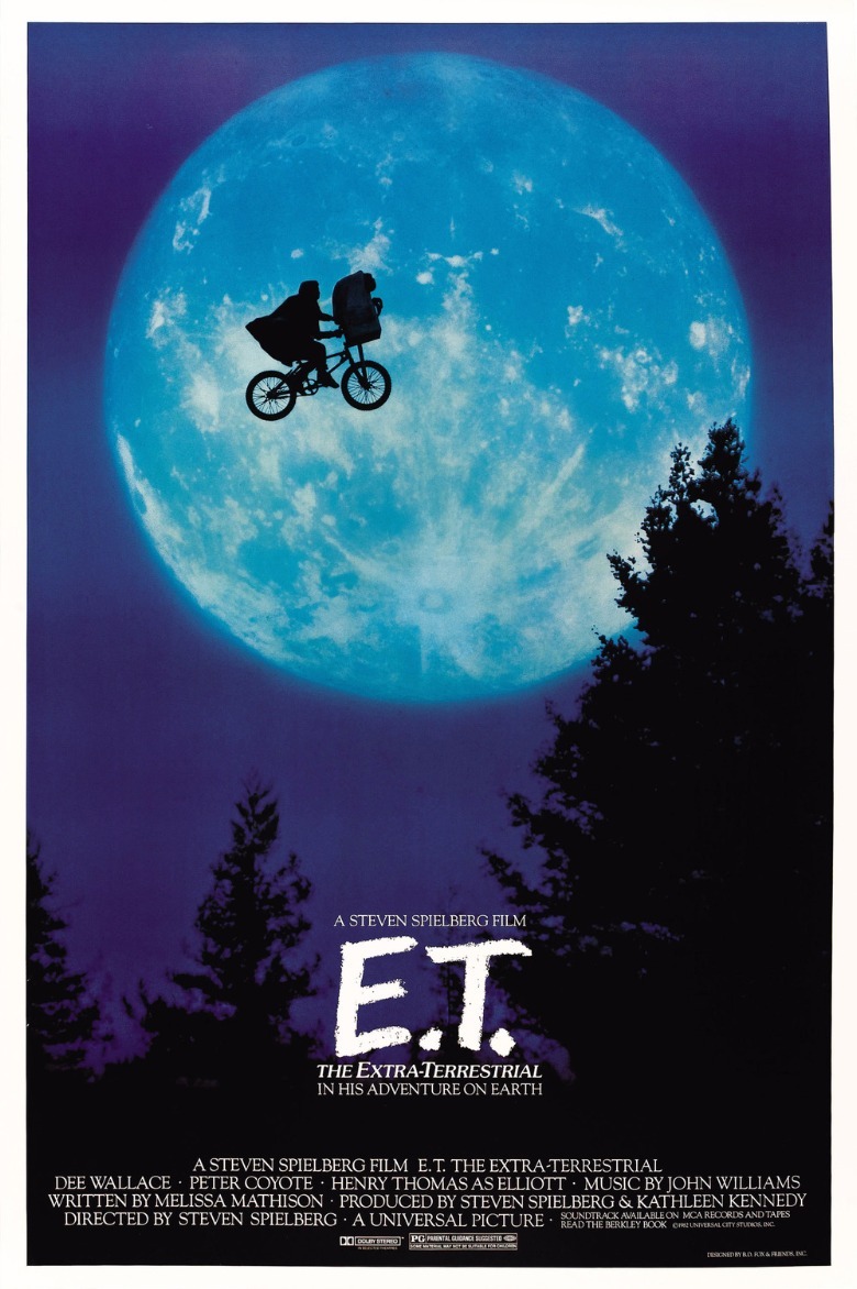
That all being said, putting "E.T. The Extra-Terrestrial" on this list feels a bit like cheating. The poster is all about the silhouette of a cloaked Elliott (Henry Thomas) riding his bike through the air, the lovable alien perched in the basket on his handlebars. That's one of the most indelible images in cinema history, for my money, so it makes sense that that's how they advertised the movie. Still, there's no denying its power even when stripped of the euphoric, swelling score that accompanies that moment in motion. Even if you haven't yet seen the film, this poster clearly shows you that you're in for something special.
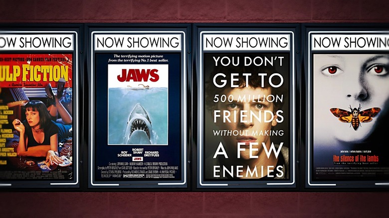
Pulp Fiction (1994)
Like the original poster for "Star Wars," the poster for "Pulp Fiction" also nods to an art style that used to be commonplace. Quentin Tarantino was inspired by the seedy, seductive, ultra-violent vibe of the cheap paperback crime novels from which the movie takes its name, and the poster reflects that, taking the form of one of said book covers. (In case you didn't get it, Uma Thurman's character Mia is reading just such a book in the image, also titled "Pulp Fiction.")
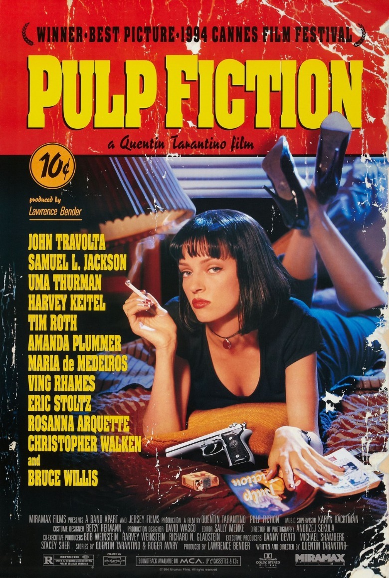
This is, perhaps, a brilliant exercise in marketing misdirection. Much of the movie involves macho stars like Bruce Willis, John Travolta, and Samuel L. Jackson committing some truly heinous acts of violence, but it's Thurman's short black bob that they imagined would get people in seats. They weren't wrong.
Intriguingly, the "Pulp Fiction" poster led to a copyright-infringement legal battle between Miramax and the photographer who took that image. Miramax prevailed in 2021, because the statute of limitations had run out. By then, this "Pulp Fiction" poster had already been a dorm-room staple for decades.
Raiders of the Lost Ark (1981)
Steven Spielberg again. By the time "Raiders of the Lost Ark" was released in 1981, Spielberg's name was synonymous with quality, and fans were also well aware of his friendship and occasional partnership with "Star Wars" creator George Lucas. That's why, when they geared up to launch a new franchise together, their joint involvement was the focus of everything. "Indiana Jones – the new hero from the creators of JAWS and STAR WARS," trumpeted the first poster's tagline.
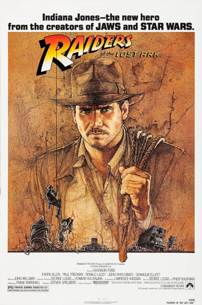
Long before "cinematic universes" were a thing, the first "Raiders of the Lost Ark" poster marketed the movie as not only the first installment in a new fictional world, but an installment in the continuing, real-life crossover careers of Lucas and Spielberg. The guys behind "Jaws" and "Star Wars" made this? That's all I need to know. The illustration of a dashing, whip-sporting adventure hero — one of Spielberg's best protagonists – is just a bonus.
The Exorcist (1973)
There are a number of shocking images in "The Exorcist," many of which have been used in artwork for subsequent re-releases of the film. Back in 1973, however, Warner Bros. opted to hold its cards close to its chest. You're not going to see Linda Blair's head spinning around, or watch her vomit pea soup. Instead, the first poster for "The Exorcist" was all about signaling the movie's incredibly eerie atmosphere.
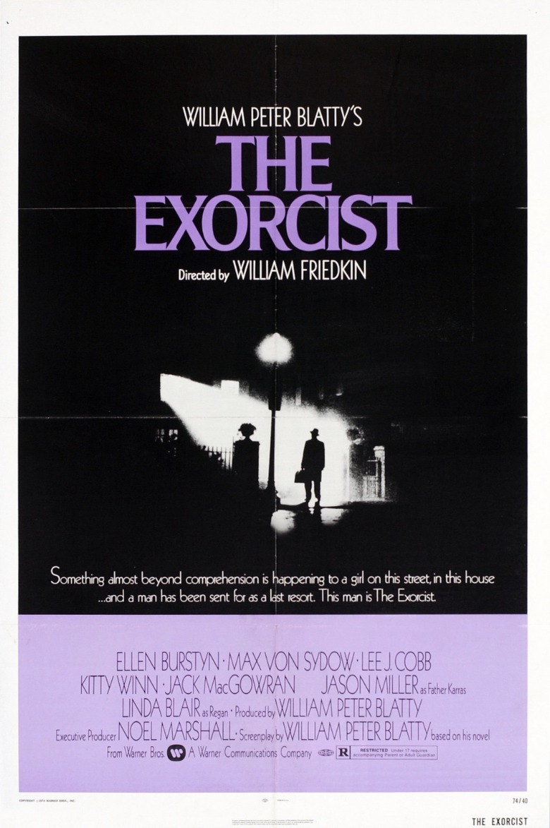
"The Exorcist" has a reputation as a gross-out scare-fest, but a lot of its staying power comes from its elegance and restraint. There's a reason it's one of very few horror movies that won Oscars.
The poster leans into that elegance and restraint, boiling the movie's shocking storyline down to the simple, indelible image of a man standing under a foggy streetlight, staring up into a house. "Something almost beyond comprehension is happening to a girl on this street, in this house," says the tagline. The implication is that it's too scary to show you on a poster; you'll just have to see the movie to find out what they mean. It's marketing-by-omission at its best.
The Silence of the Lambs (1991)
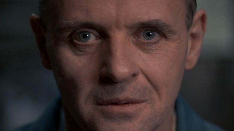
"The Silence of the Lambs" is another horror movie did very well at the Academy Awards. In fact, The film's Oscar sweep stunned even its creators. Like "The Exorcist," they could've advertised this movie with any one of many shocking images to be found once you press play; like "The Exorcist," they decided instead to dial it back. This poster combines several trends mentioned above, and it knocks them all out of the park. There's a star with a beguiling expression on their face; is Jodie Foster here terrified? Thoughtful? This also isn't something that actually happens in the film, and is instead a new and striking image that sums up the movie's tone.
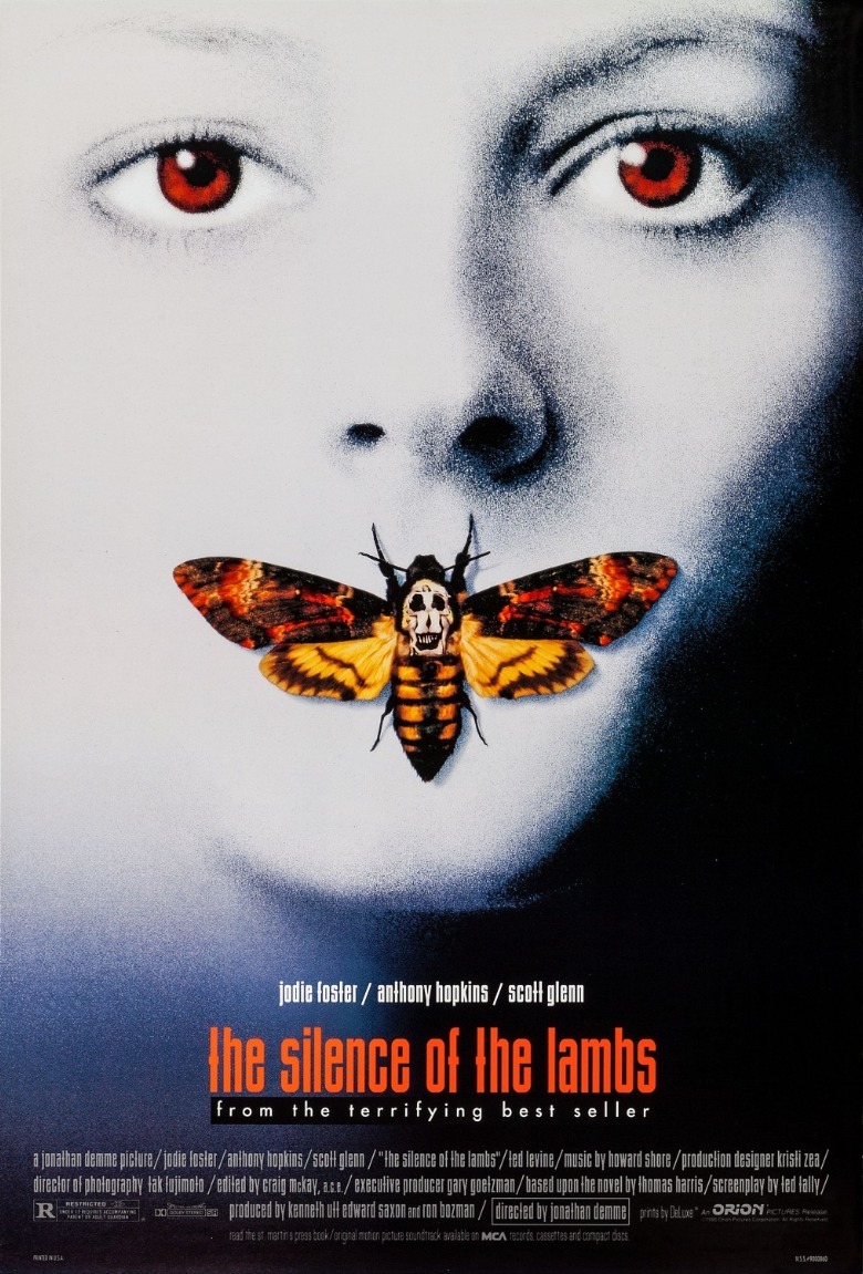
The iconic Deaths-head hawkmoth that covers Foster's mouth serves two purposes. First and perhaps most obviously, it signals "silence," of course. That skull where her mouth should be also suggests death passing someone's lips, and anyone who's read "the terrifying best seller" that the poster mentions knows exactly why that's important. Then you look closer, and you realize that's not actually a skull at all; it's Salvador Dali's "In Voluptas Mors," a scandalous photograph of naked human bodies. To paraphrase a certain cannibalistic doctor: The world is more interesting with this poster in it.
Beauty and the Beast (1991)
While several of the posters on this list have been illustrated, I haven't yet included any for an animated film. That changes with "Beauty and the Beast," which changed Disney Animation forever. The poster is a marvel of design that expertly communicates the lush romance of the film itself. In fact, the tagline at the top — elegantly centered and italicized, one word per line — makes the claim outright that this will be a beautiful love story.
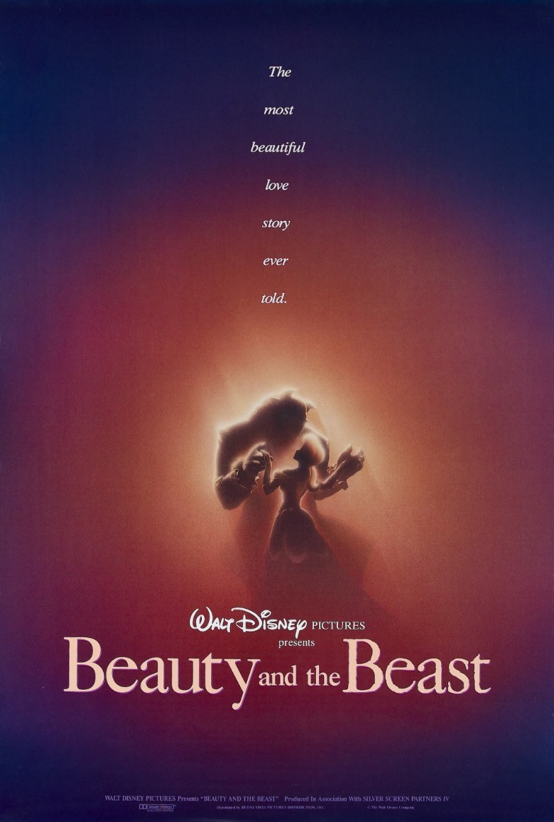
If you've been following along, you'll note that this poster, like many other greats, is an original piece of art rather than something taken directly from its film. Instead, rather than the precise linework of the Disney Renaissance films, this poster features a much softer image, a simple, yet stunning portrait of two figures who appear to be dancing.
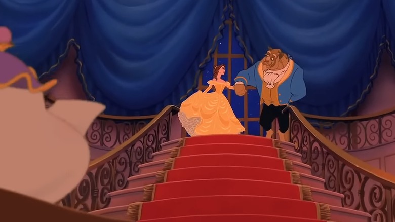
Furthermore, the colors here are incredible; the blues, browns, and yellows subtly recall the tuxedo the Beast wears in the scene that's referenced, but everything is, again, softer. Incredibly, they seem to be burning with such passionate love for one another that they're glowing.
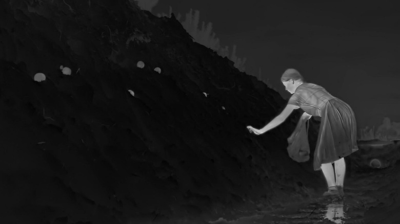
The Zone of Interest (2023)
Jonathan Glazer's film "The Zone of Interest" is a vital meditation on the nature of malevolence, a deeply-upsetting film that places us right alongside a concentration camp as those terrible chimneys belch flame and ash into the air. For the most part, though, the movie is about the Nazi family who live nearby, blissfully going about their domesticated lives, happily ignoring the inhuman devastation happening just over the wall.
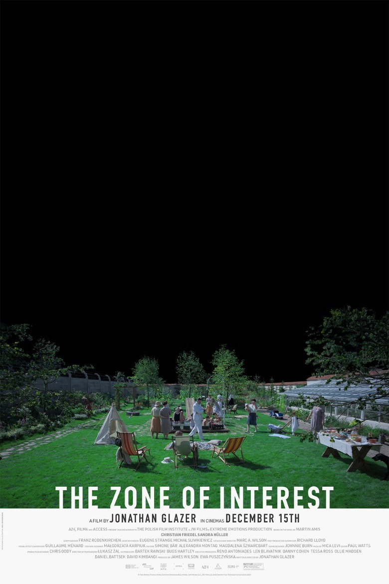
In other words, this is a movie about what it's not about. The design of the poster flips only the sky into the negative, depicting a light-hearted garden party under a blackened expanse that takes up most of the poster, as if pressing down on these characters ... but do they care? Even the title is made up of negative space, the bottoms of the letters left open. This is a movie all about what we ignore, defining our lives (and morality) in relation to what we overlook. There's no overlooking this poster.
Jaws (1975)
I told a few friends I was working on a piece about the best movie posters of all time, and every single one of them said some variation of, "Okay, so, 'Jaws' and what else?"
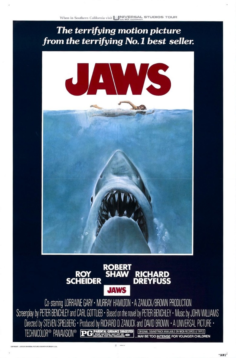
As Steven Spielberg's semi-autobiographical masterwork "The Fabelmans" taught us, the man was born for this. Spielberg is synonymous with "Jaws," and "Jaws" is synonymous with "blockbuster," and "Jaws" didn't just scare audiences; it taught them how to watch movies. In addition to the film's record-shattering release — which was almost certainly helped along by such a striking poster — teaching audiences to view films as events, people still talk all the time about how restrained the movie is, how you don't actually see much of the shark until quite late in its runtime.
That's true in one sense, but also, you've seen the shark before the movie starts, hanging in the theater lobby. They've already given you everything you could want, and you're still happily asking for more. That's marketing at its best.