Severance Cinematographer On Using Light And Darkness To Create That Eerie Innie Aesthetic [Interview]
The first season of Apple TV+'s "Severance" rightly received rave reviews and, to the relief of many a fan, is in production on a second season. And while we're eagerly waiting for season 2 to premiere, we can revisit the first season and reflect on what made it such a compelling watch.
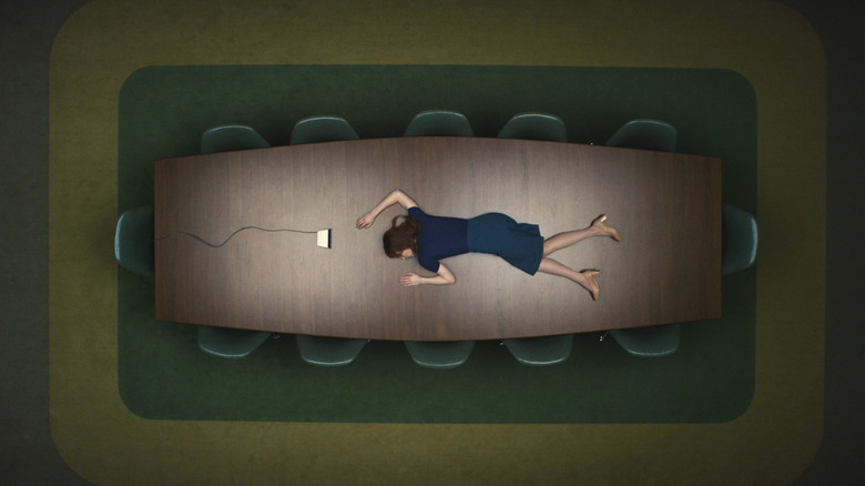
One of the most striking things about "Severance" is the aesthetic of the severed floors. That office space makes up the Innies' entire world, and its vibe is very different than places on the outside. The look comes together through many facets, from the production design to the score, to, of course, the lighting and cinematography.
"For me, it was really about pushing aesthetic as much as possible," cinematographer Jessica Lee Gagné told /Film about her work on all nine episodes of the show's first season. Read about how she helped creating the eeriness of Lumon, including how she approached creating the light show in the memorable "Defiant Jazz" scene.
Warning: Mild spoilers for the first season of "Severance" follow.
The conversation below has been edited and condensed for clarity.
'I was so afraid of it just being an office show, and it being just beige'
I know you've worked with Ben Stiller before, but I'm curious how he pitched "Severance" to you in the very early days when he first was bringing you onto the project. How did he describe the show to you, and what made you interested in it?
Ben and I have worked together on "Dannemora" and other small things, and "Dannemora" was a pretty big, long project for both of us — it was the first limited series I did, first television series I did, and the first [dramatic] television series he did. Through that, we really developed a lot of creative trust, so he had been sending me projects here and there, testing the waters on what he wanted to do next. And then he sent me this, saying that it was something he really liked and that he thought it could move forward. He just sent me the script, he didn't really say anything. Usually, he doesn't really say anything when he sends me stuff, and then I just respond.
I responded saying, "Interesting script, but I don't know if it's something I feel like shooting." I looked at it maybe more from a selfish point of view a little bit there, just because of the environments that were on paper — offices, windows, underground — they're sets with nothing. I was more afraid of it, I think, than willing to do it.
It is obviously office space underground, but it has a very specific look, a very retro look, a very open-space-but-claustrophobic type of feel. How did you contribute to that aesthetic? What was your inspiration in bringing that to the screen?
Well firstly, it was just written as an office. It wasn't written, "mid-century office with all these visual things." So, it took us finding a couple visual references that were out of the box, and I think for me, it was really about pushing aesthetic as much as possible. I was so afraid of it just being an office show, and it being just beige, that I really was pushing to find visual references that were really striking. I fell on this book called "Office" by Lars Tunbjork, and that book, for me, really defined a lot of the aesthetic and where we could go visually. It showed me that there can be so much beauty and simplicity in the absurdity of an office, and you can really make everything visually iconic in a way, like even a pen can be really beautiful.
'It's hypnotic at one point, and then it's just pure anger and emotion'
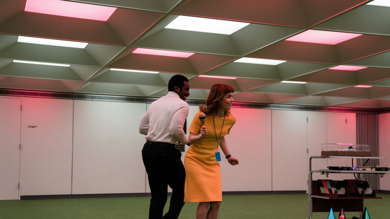
There are certain scenes that come to mind in the series that, for even a casual viewer, the lighting really jumps out. The first that comes to mind is the defiant jazz scene — the dance scene on the unsevered floor, with the lights flashing in the ceiling above. How did you approach setting up the lighting for that?
It actually took quite a bit of time to discover the exact lighting aesthetic for it — it was the first time we were really using the panels and the ceiling with color. We had done the emergency lighting look that had been established, we had done turning on the lights, turning off the lights in the room, we knew what we were working with as a tool.
But it took Ben giving us the song, because I was like, "I don't know where to start." We have all these sky panels lighting this set, every single tile is like a specific light, and they all have to be programmed. It's not like you can put some — I mean, maybe you can, but we weren't aware that we could do this — like just plug in some software that will dial in some lighting for your music. So with the music, we listened to it, the gaffer and I, because that's what we used to really riff off of, and then we were like, "Okay, this [is] what is inspiring us in terms of color and tone."
And then with Ben, one thing that was important to do was to determine how many phases of color he wanted, because it would've been weird if it started super abruptly. We decided that there needed to be a crescendo. And that was also something Ben wanted, in the style of that scene, there's a big crescendo happening.
So, we split it up into four parts, designed the four parts individually, but with a running theme in the lighting. It was about adding color, so it started off with certain colors, and then it got more and more colorful, more and more saturated. And then at one point we just went for this orange and red, which it seems a little cliche, but it really suited that sequence for the anger that Dylan [Zach Cherry] was going through.
There was a little bit of refining when we got in there with the actors. We were shooting it as one Steadicam sequence, and then just riffing and doing little different parts. But every time it was a full run-through with the camera, and we were practicing the timing where the color would change, whether it was starting too early or too late. So, that second part of it got figured out while we were shooting.
I don't think you'd notice, but there definitely was an intention behind it, an intention with the progression of it to make sure that these characters were really getting lost in this color and world. And it's hypnotic at one point, and then it's just pure anger and emotion that bubbles up at the end.
'I thought defining them through black was really interesting'
There's another scene in the show where I think darkness is used very well, is when Milchick is with Ms. Casey and she makes that long walk to the elevator going to who knows where. Milchick's face is covered in darkness in that moment. How did you approach that scene and choose to take that approach, using literal darkness to really emphasize how dark this situation was?
There are certain areas of Lumon that we don't know about, that our characters don't know about, and I thought defining them through black was really interesting, like having things be really obscure, taking away information.
And when you don't see Milchick, because it's a very intentional — it's interesting that you caught that, but it was intentional to not see his face at all, which is so hard with digital cameras now, you see everything. We even had to take out information in post, because I was struggling to get it and to be dark enough there.
But it was just that shadow that you don't know about, the part that's behind the unknown, and you can also see that in the sequences when Adam [Scott, who plays Mark] and Britt [Lower, who plays Helly] are walking in the hallways: They're walking and the lights are turning on. That's also part of that expansive unknown.
'She doesn't want to be seen because she's obviously spying'
I've focused a lot on the Innie world, just because it's so different from anyone's everyday life, but obviously you had to do the lighting for the Outie world as well. How did you approach the lighting of the outer world spaces, especially places like Mark's house? Is there any specific thread you wanted to have there that was different from the Innie world?
There's not really a thread aesthetically, but there was a thought or a process behind them, like how to decide which way to go with the lighting, and it needed to make sense for the characters, so it's very character-driven. If you look at Cobel's or Mrs. Selvig's house [Patricia Arquette's character], she's always lit from outside, very rarely are there lights on inside. She doesn't want to be seen because she's obviously spying. So she's always in the dark.
And then Mark also is in the dark, but for him it's very different. He's only turning on lights when he needs them for practical purposes. He's a very depressed person, so he's not taking the time to set up a lighting environment in his space, he's just using light to live, basically. "Well, I'm going to go in the kitchen. I need light to see, so I'm going to turn on the light in the kitchen." That's him. And then at Devon and Ricken's [Mark's sister and husband, played by Jen Tullock and Michael Chernus], there's warmth. You could consider it coming from Devon, but a lot of it's Ricken and more his desire. He wants to be seen and wants to have like this perfect environment around him of warmth, and it's more about appearances than it is about anything else.
The first season of "Severance" is now streaming on Apple TV+. Season 2 does not have a premiere date yet.