How Severance Created A Warped Workplace For a Founder God [Interview]
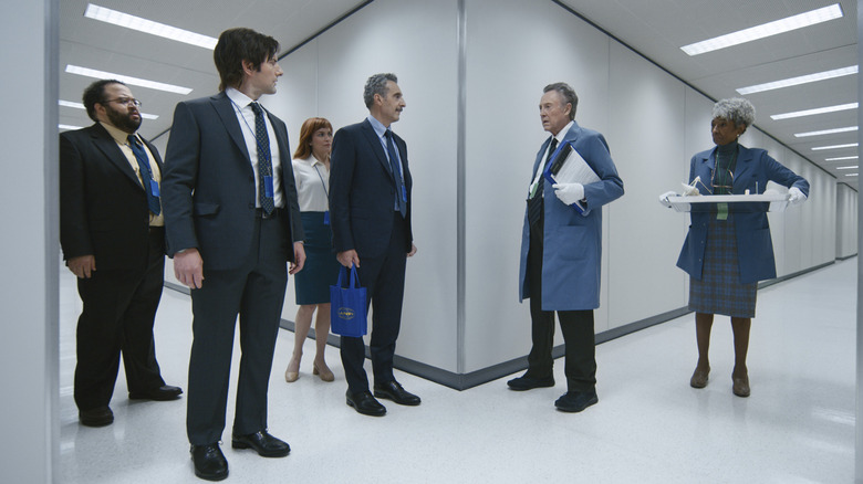
"Severance" is an amazing show in almost every respect, and one of those ways is the jarring look and feel of the severed floor where Mark S. (Adam Scott) and his fellow MDR employees spend their entire existence.
For the show's production designer Jeremy Hindle, that claustrophobic-yet-expansive aesthetic was intentional, a way to show that the severed employees were being observed without having surveillance cameras front and center. "They're lab rats," he told /Film, about Mark S. and the show's other severed characters. "They're these little children being birthed into the office, and they're being experimented on."
In an interview with /Film, Hindle shared the inspiration behind creating the twisted work areas where the founder is literally God and those who work for him are nothing more than mere minions tasked with indecipherable objectives. Read on to find out how Kier's house ended up on the severed floor, how the MDR office was meant to be a fun albeit claustrophobic playground, and where the real-life Lumon building resides.
This interview was edited and condensed for clarity.
'If you had described what you were working at, it would make no sense to anyone.'
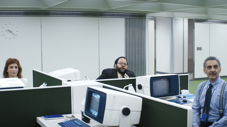
One of the reasons I thought "Severance" was so amazing was the look and the aesthetic of the severed floor. It has a sense of being very open, but it's also very claustrophobic.
Isn't that crazy?
Yeah! How did you approach creating that and getting that feeling across the screen?
[Writer Dan Erickson] had written "large room, four desks." And the large room was... Okay, large. I made it really large. I think it's 40' x 80'. The key was that the ceiling was only seven feet, two inches, I think. It's really low. I had it at seven feet and [executive producer and director Ben Stiller] was like, "Ooh, it's too low," and I was like, "Okay, I'll give you two inches."
You know what's amazing? Because for that set, we knew that the whole part of the show underground is like they're lab rats. They're these little children being birthed into the office, and they're being experimented on.
When you have them at a desk that has these dividers, that makes it feel really claustrophobic already. But I wanted to have the dividers be able to go up and down so they could be able to manipulate them and talk to each other. And it's also more fun to shoot — it was like a playground. But I think it's really the main answer that question, is it's definitely the low ceiling makes it really feel dominantly claustrophobic in such a big space.
It also feels very retro down there, like a '70s office vibe. How did that choice come about?
When I first read the scripts and I met Ben, I showed him some Ken Roche and Eero Saarinen stuff from the John Deere building in Chicago. If this show is about workplace, we should go back to when offices were really about just work. If you look at those buildings, they're pristine, they're powerful, they're dominant, and they're really well designed. They're stunning. And it made it feel like the office was a very serious place, which this was going to be a serious place because they're coming down and they're mining numbers or whatever they're doing.
It just felt like a natural thing — we needed to go back to this time period because that's when work was just work. And then when they leave, it was different. And then the computers and stuff were designed to be retro, and they're a little bit playful.
But also, if you left your "innie" life like Petey does and went up top, if you had described what you were working at, it would make no sense to anyone. None of it makes any sense to the real world. Ben and I had this same reference at the beginning, which was the movie "Playtime." It's a '60s French film by Jacques Tati, and the design is really fun. And this show to me was like my "Twin Peaks," where you get to have fun with these characters. I get to have fun with the story, and I get to have fun with the audience. And it was like, "Let's just play with them. All the time."
Dan wrote something that, "You have the license to do anything. There are no rules down there. The rules are that they won't remember. That's it."
'She's the one person that's not severed, so she does need a bit of sky in her.'
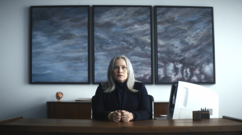
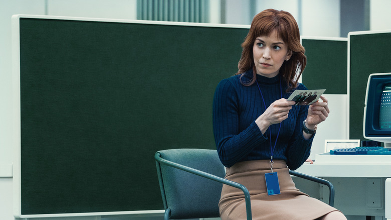
I noticed MDR has a green overtone, Ms. Cobel's office is blue, and O&A has grays and blacks. What was the thought behind the color coding?
The green is really grass. It's like the play area. They have a play apparatus. They have grass. Green is also a very calming color.
And blue was Cobel's, which was more like the reverse of the sky. She's the one person that's not severed, so she does need a bit of sky in her. She has the lightwell that gets natural light into her. And you start to feel that those colors are natural to her.
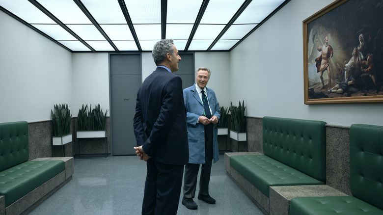
And then gray was definitely for O&D because everything is about those paintings. The paintings are the story in those rooms. You have so little time to see each painting, and the paintings have to stand out and be really dominant because there's so much there. I hope Dan does a book on them because the paintings are amazing. He wrote each detail in each painting, and it was really funny.
Did you have a favorite painting? Is there any one you were like, "Oh, I want to take this and put this in my living room?"
I love the one where [Lumon founder Kier Egan] is looking down on the Great Lakes. I don't know if it's the painting I love — I love Dan's writing because the characters are like, "Yeah, I don't like this one." "Why?" "Well, he could fall." And it's so funny. Dan is an amazing writer. He's invented this whole mind-blowing world while he was working underground, by the way, at an office in Orange County at a company that made garage doors.
'Everybody in the town works in this bloody place. It's amazing.'
The unsevered part of Lumon was interesting too — the arial shots of the big building. I don't know how much of that is real.
That's a real place called Bell Labs. When I showed Ben the Ken Roche and Eero Saarinen, the John Deere building, we started designing the interiors. I was like, "This is the look." But then when I came out to New York, Bell Labs was mentioned. And I'm like, "Bell Labs. That's Eero Saaranin and Ken Roche." It's the same designers. And it's the most amazing building.
But as far as I knew, it was still defunct. It had been empty since the '90s. But this lovely man had bought it and completely restored it and turned it into this sort of utopia again. There's a dental office. There's a public library. Everybody in the town works in this bloody place. It's amazing.
We had a ton of visual effects — we removed most of the trees and houses around it. We took everything away and just put it back to what it would've been at the beginning. I feel really lucky that the show got to have that space because it is so believable that this company is this big. They have to be.
And even the interior shots? I'm thinking of the first episode where Mark walks in there's the aerial shot of him checking in?
That's a hundred percent that place.
Wow. That fits perfectly. It just almost felt like a brain itself.
It's all the walkways. And the only thing we did was change the color of the carpet in visual effects, and then we put Kier's face up on the wall. It's a stunning place. It really is. It's the same language as the show.
'He's their God. Of course they'd build his house underground!'
Another set I thought was really interesting and, frankly, creepy was Kier's house on the severed floor. Did the script say have a Victorian house enclosed inside or did that come about later?
No. Dan had written it, I think, that you just walked into the room. You went through each part of it, but it was just in the office environment underground. It didn't really have a lot of description of his aesthetic.
But I remember the location guy showed me this picture of a museum in the Bronx. And it was amazing. It had this Brutalist building, this beautiful grass area, and a Victorian house. And we were like, "Wait, this is the place underground." It's very Michel Gondry or very Charlie Kaufman. Let's just take the whole thing and put it underground, the whole thing. And that's what we did. So it was fun to see them walk through the art exhibit and come across the lawn into his house.
I remember being blown away when we did the first renderings for it to see what it would look like. it was so fun to think, "Wow. These people are so extravagant." Basically, he is God to them. He's their God. Of course they'd build his house underground!
There's a clear contrast between all the severed areas versus our world. And particularly for Mark, because we see his house, and it's just very sad, frankly. It's a very sad house. When you were creating the place where the outie Mark lived, what was the thought process in bringing that to life?
I think I looked at about 60 locations. We looked everywhere. And it was trying. A lot of it is trusting your instincts when you're looking and going, "No." But we got there and what I loved about it was the it's up in the hill, it's idyllic, it's beautiful. There's trees around it. But the buildings were really fractured, kind of like Mark. All the windows were vertical. There was no horizontals. Even though they have the most amazing views, the design of it was completely wrong. And it just was like, "Wow. That's Mark." Mark is this fractured beast.
The season finale of "Severance" airs on Apple TV+ on April 8, 2022.