Wicked: For Good Doesn't Resolve The First Movie's Biggest Weakness
This article contains spoilers for "Wicked: For Good."
You'd be surprised by how much a film's most glaring flaws can be tolerated if its stronger elements manage to break through. I was ultimately won over by "Wicked," Jon M. Chu's adaptation of the first half of the 2003 Broadway musical hit, in large part because Cynthia Erivo and Ariana Grande-Butera are emotional supernovas. Not to mention that the film's energy soared with just about every one of their songs, in which their vocals shot up to the stratosphere.
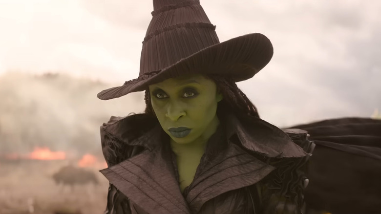
The duo's performances managed to elevate a film that, sadly, looks like washed-out muck. The dichotomy between performance and image really set in during the "Wizard and I" number where Erivo is singing her heart out, and she hardly makes an impression against the gray-looking wheat field she's running through. There's no sense of contrast between Elphaba, Oz, the field, and the sky, which all seem to blend together. The same issue occurs during those masterful final notes of "Defying Gravity," where Elphaba in her massive black cloak hardly stands out amid the muted sepia sky.
It's that constant back and forth between form and performance that truly keeps me from loving "Wicked." With "For Good" coming out a year later, I was hoping the response to the first film's murky cinematography would give Chu and cinematographer Alice Brooks enough time to create a much more stimulating image. Unfortunately, the second half of "Wicked" is a significantly lesser movie whose messy plotting, weaker performances, and lack of memorable songs mean there's no mask for its visual inadequacies.
Wicked: For Good looks as phony and washed out as the first film
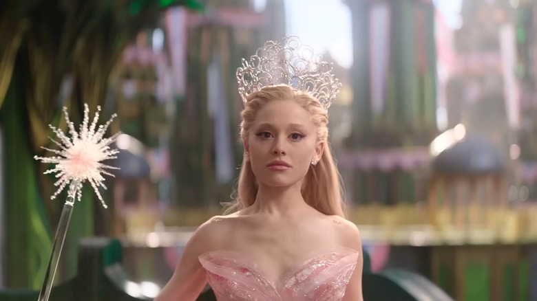
In "For Good," the fantastical world of Oz, with its emerald-encrusted metropolis, fields of flower patches and yellow brick roads, is at the behest of atrocious lighting that ensures none of it ever pops. There's a multitude of factors to both "Wicked" movies looking like this, with one of the main contributors being the lack of contrast between the actors and their surroundings. Elphaba and Glinda blend into these incredibly phony-looking backgrounds, and it's such an eyesore to look at. It's particularly noticeable during the "No Good Deed" sequence where Erivo is once again belting those notes, only to get lost in the visual sludge of her brown-interior castle, billowing smoke, and a flurry of poorly CG-rendered flying monkeys. All of the work of Academy Award-winning production designer Nathan Crowley is for naught, as the huge practical sets and props end up looking fake.
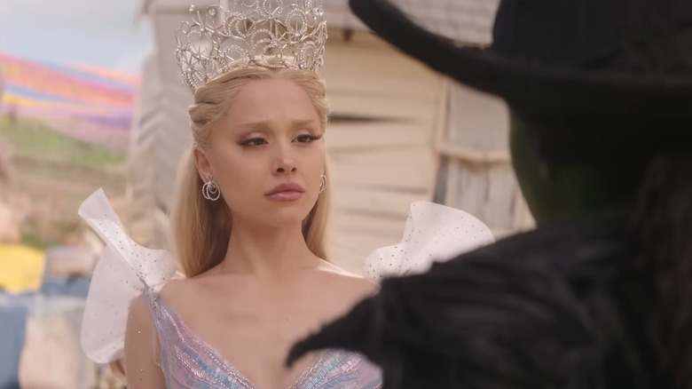
A lot of the backlighting also creates this hazy overcast look that obscures what's on the actors' faces. It feels like these movies should come with sun visors because you usually pull those down when you can hardly make out what's right in front of you. Color temperature is another big issue with "Wicked" considering colour is technically present with Elphaba's skin, Glinda's wardrobe and the overall image, albeit in a muted presentation. I keep thinking back to the sequence in "For Good" where Elphaba and Glinda have their tussle in the town square of Munchkinland. One of cinema's most recognizable locations, the place where audiences learned the full breatdh of Technicolor in 1939's "The Wizard of Oz," has the visual appeal of an overlit graveyard.
Wicked: For Good's ugly visual palette is part of an industry-wide problem
The drabness of "Wicked" comes down to imbuing a sense of "naturalistic" realism that shows a misunderstanding of what the real world looks like. Something that's not just an issue with the "Wicked" movies, but the industry as a whole, is an absence of texture. There's this seemingly allergic reaction to imperfection in the realm of CG-laden blockbusters as of the past five years. Scenes often have to light everything the exact same way in case some tweaks need to be made in post-production. Think of the emotional impact Erivo and Grande-Butera's performances would have if they actually stood out among the students at Shiz University or among the Munchkins. "For Good" further illustrates a regression from how movies used to look over 86 years ago.
This isn't even to say that the film's visual palette doesn't resemble the Victor Fleming classic, so much as it's the flattest looking cinematic interpretation of Oz. Sidney Lumet's "The Wiz" makes considerable use of costumes and production design that turns Frank L. Baum's world into a fantastical reinterpretation of New York City. Sam Raimi's "Oz the Great and Powerful" is arguably a worse film than either "Wicked" movie, but not when it comes to its striking and color-filled aesthetic. Even Walter Murch's "Return to Oz," one of the greatest examples of '80s kindertrauma, is able to make sharp contrasts between Oz as both a place of wonder and a ravaged nightmare landscape.
For all of its bells and whistles, the "Wicked" duology has no sense of visual identity worth remembering.
"Wicked: For Good" is now playing in theaters worldwide.