Why Blockbusters Look So Gloomy These Days, According To The Shang-Chi VFX Team [Exclusive]
Every time a new trailer for a major movie drops, the first wave of excitement is inevitably followed by a second wave of scrutiny. Sometimes, feedback is title-specific, but often the same comments appear like clockwork on social media for each new movie. Why does everything look so dark? How are these visuals so colorless and washed out? Was this entire movie filmed on a rainy day?! It's a reasonable question. Not every blockbuster falls into the trap of dull-looking cinematography, but plenty certainly do.
In an interview with our own Jeremy Mathai, the visual effects teams besides some of our favorite modern movies opened up about the secrets of their trade. The team behind "Shang-Chi and the Legend of the Ten Rings" addressed the much-discussed desaturation problem, revealing one of the reasons why our heroes have started to look less colorful. It turns out, it may not be an aesthetic choice, but a practical one.
Fewer Colors Equals Simpler VFX Work
Mathai asked "Shang-Chi" VFX Supervisor Christopher Townsend and Additional VFX Supervisor Joe Farrell if they buy into the explanation that less vibrant color palettes make visual effects integration easier. "A more muted subdued color palette is absolutely helpful to make things feel more real," Townsend explained, but says sometimes it's taken even further, and movies end up looking nearly black and white. He gets into the technical details, saying a black and white visual effect "is generally easier because you're taking out the whole component of color and vibrancy."
Townsend explains that "those films with more subdued or a more sort of homogenous color palette are generally easier to pull off," because the visual effects process is always simplest when done with fewer colors. Though the VFX supervisor is diplomatic about the topic, he does note that the team behind "Shang-Chi" knew color was essential to making the story come to life:
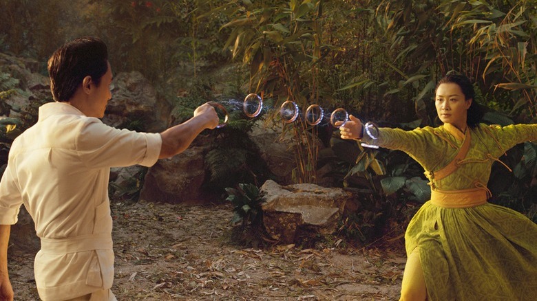
"I do think a lot of the MCU stuff and particularly 'Shang-Chi,' it had some vibrancy and we wanted to keep that. We wanted to keep that world of Ta Lo vibrant and lush. It makes it much harder to pull that stuff off, but that was part of the narrative and part of the storytelling, that it's supposed to feel that way. So that was an important aspect that we wanted to maintain."
Shang-Chi Is A Vibrant Exception
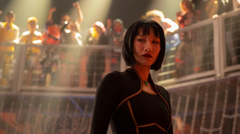
Farrell adds that the film's Macau-set sequences, in which Shang-Chi (Simu Liu) reunites with his sister Xialing (Meng'er Zhang) at an underground cage fighting club, definitely benefited from brightly-colored visual effects. Farrell points out the colorful billboards and bright lights that punctuate the scene set in the city's nightlife. He also pinpoints one sequence in particular — the fight with Death Dealer (Andy Le) in front of a neon pink, flashing billboard–as an area of focus for the visual artists. He says that the team "distinctly went out of our way to really hold onto that color and that incredible vibrancy that we could get from both the main photography and, of course, what we were adding to it."
Townsend and Farrell's comments shed some light on the dreary cinematography that's rampant in recent blockbusters. It's simply easier for VFX artists to maintain realism while working with fewer colors. Unfortunately, the results of the trade-off are often movies that look less real, thanks to their flat gray appearance. Hopefully, the vibrancy of "Shang-Chi" and a few other big-budget exceptions will inspire other filmmakers to inject a little more color back into their cinematic worlds.