Clint Eastwood Wanted The Look Of Letters From Iwo Jima To Make Audiences Uncomfortable
In 2006, Clint Eastwood directed a pair of war dramas that stood as companion pieces. The first, "Flags of Our Fathers," based on the 2000 book by James Bradley and Ron Powers, was a contemplative and violent dramatization of the Battle of Iwo Jima, told from the perspective of the seven American soldiers who famously raised an American flag to signify their battlefield victory. The raising of the flag was captured on film by the Pulitzer-winning photographer Joe Rosenthal, and his picture served as the inspiration for the Marine Corps War Memorial in Washington DC. Eastwood's film climaxed with Rosenthal's taking of the picture.
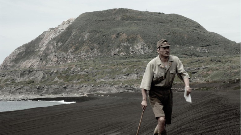
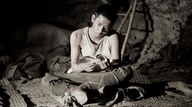
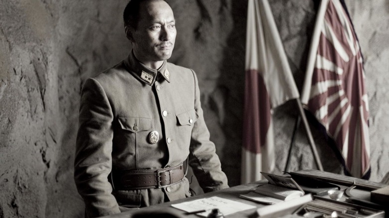
"Flags of Our Fathers" was released on October 20, and its companion, "Letters from Iwo Jima" was released on December 20. "Letters" also detailed the events of the Battle of Iwo Jima, but from the perspective of the Japanese soldiers. Ken Watanabe gave an excellent performance as real-life General Tadamichi Kuribayashi, the military commander who was able to fend off invading American forces for an impressive 36 days. "Letters" was based on his letters, published as "Picture Letters from Commander in Chief."
Both films were shot by Tom Stern, who has been Eastwood's regular cinematographer since his 2002 film "Blood Work." Stern, when working for Eastwood, tends to favor muted color palates and washed-out earth tones. There are no warm, sunlight shades in his movies. No reds, blues, or yellows. It's mostly fog greys and metallic silvers, with maybe a hint of mossy green.
In a 2006 interview with Terry Gross on the NPR radio show "Fresh Air," Eastwood explained that he wanted the look of "Iwo Jima" to be as uncomfortable as possible for viewers.
The discomfort of war
While Eastwood rose to prominence playing no-nonsense and violent characters like Dirty Harry or The Man With No Name in the 1960s and '70s, his views of movie violence seem to have matured and softened as he developed as a director. In his post-"Unforgiven" films, one can see a definite shift away from the glorification of violent characters, often depicting murder and combat as a tragic, moral failing. This was certainly the theme of his 2003 Oscar-winning film "Mystic River."
While both "Flags of Our Fathers" and "Letters from Iwo Jima" possess a certain degree of distant patriotism — they are not explicit antiwar essays — one can see that Eastwood's view of combat was not romantic or glorified. Since the films were set in 1945, one can see Eastwood presenting battlefield violence as a relic from a former era. He is not openly critical of war, but he is not making propaganda, either.
A great deal of Eastwood's non-romantic view of combat came from Stern's lack of colors. Indeed, Eastwood admitted that he took out most of the color in post-production, making "Iwo Jima" look as terse as possible. In his words:
"[T]he film was shot in color, but I sort of de-saturated. We de-saturated it down to the point where it didn't look comfortable color. We didn't — we certainly didn't want the picture to have a technicolor in the old-fashioned sense, Dorothy and Toto in 'The Wizard of Oz' or something. But [...] we wanted to de-saturate it down to where it looked almost close to black-and-white.
It's worth noting that it was not a shimmering, classic '40s black-and-white, but a drab, "colorless world" black-and-white. Visual shades of grey to remark on the filmmaker's moral imperative.
The non-glory of war
Eastwood doesn't comment on it with Terry Gross, but there is a film theory at play when it comes to filming combat. François Truffaut famously said that there can never truly be an antiwar film, as battlefield combat, with its explosions and violence and inherent life-or-death drama, is imminently cinematic. Even if a filmmaker hopes to depict combat as a negative experience, in filming it at all, they are showing how exciting it can be. That excitement can often be read as tacit approval.
Eastwood and Stern hoped that, by taking out their film's color, they would show that war was not colorful, glorious, or attractive. Eastwood said:
"The colors were very subdued and, of course, explosions are a little brighter because they're explosions. So it was just a question of choices that we all made to have it have that look, which gave it the non-comfortable feeling of war."
While the washed-out aesthetic served a dramatic function in Eastwood's war diptych, it must be something he became fond of universally. All of his films since have featured a similar foggy visual motif that doesn't always serve as a comment on the action. What, for instance, was the function of setting the musical "Jersey Boys" in a colorless, muted universe? Or the documentary-like "The 15:17 to Paris?" It seems that Eastwood became so fond of Stern's unique skill that he just sort of stuck with it, whether or not it was appropriate for his material.
Stern, meanwhile, recently made his first feature film as a director. "The Almond and the Seahorse" has already debuted at film festivals. There is, as of this writing, no set public release date.