The Russo Brothers Explain Why Captain America: Civil War Looks So Gray
Comic books — and particularly Marvel comics — have historically made great use of talented and wonderfully imaginative artists who never let silly things like self-seriousness, embarrassment, or, occasionally, good taste stop them from drawing some of the most vibrant and eye-popping splash pages in the entire medium. Take a brief stroll through Comic Twitter or the convention center at San Diego Comic-Con and you simply can't miss admirers heaping all sorts of love upon the unforgettable work of countless artists over the decades.
So when Marvel Studios first put the then-nascent Marvel Cinematic Universe into gear back in 2008, those knowledgeable fans were perhaps the only ones with some idea of how wild and unconventional the visuals in these movies could really be. After all, coming off a decade defined by the black pleather of the "X-Men" franchise meant there was nowhere to go but up in terms of color ... right?
Well, that hasn't quite turned out as anticipated. Although the MCU has its notable exceptions (thank goodness for "Thor: Ragnarok," "Black Panther," and the "Guardians of the Galaxy" movies!), we still seem stuck in this pervasive mindset that insists on draining the color right out of these movies. Other than "Man of Steel," perhaps the nadir of this trend came with the frankly ugly-looking "Captain America: Civil War," which inspired a Patrick Willems video essay that's well worth your time. Now, several years later, the Russo brothers are addressing this criticism. If you ask me, their, ah, interesting response kind of needs to be seen to be believed.
The gray men
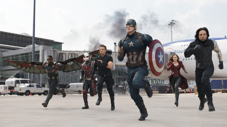
When "Captain America: Civil War" first released, the overwhelmingly positive reactions were drawn almost exclusively to that spectacular action set piece that pitted one half of our beloved Avengers team against the other, duking it out over the question of superhero registration as well as Tony Stark's jealousy over Cap paying more attention to his beloved BFF Bucky Barnes than himself. It's admittedly been a while since I last saw the movie, but I'm pretty sure that last part was the biggest reason for the actual civil war.
In any case, once the dust settled, a creeping concern began to invade discussions about the movie: Why exactly is it all so monotone and gray? For those who have been dying to know the filmmakers' thoughts on this for the better part of a decade, boy, do I have good news for you! In an appearance on Vanity Fair's "Notes on a Scene" series, directors Joe and Anthony Russo finally shed some light on their chosen color palette in "Civil War." Their answer, apparently, is that it's supposed to look as ugly as it does? According to Joe:
"This movie is brutalist in tone. It's meant to be devoid of color. The whole idea behind it was all these characters were slipping into this morally gray area. They didn't understand their identities. They were in conflict with one another."
Mmmm'kay? I feel like this reasoning applies much more to the similarly toned-down (and far less-criticized!) "The Winter Soldier," as opposed to the spectacle-filled events of "Civil War" that arguably called for a more "Avengers"-like visual approach. I mean, the airport sequence is literally meant to be a live-action splash page! Still, the movie remains among the highest-rated MCU offerings on Rotten Tomatoes, so maybe they were onto something.