How Akira's Record-Breaking Use Of Color Resulted In 50 New Shades
There are movies that people consider to be groundbreaking and influential, but aren't really. Then there are the handful of movies that can truly, quantifiably be considered groundbreaking and influential, whose imprint in the industry can still be felt today. One of those films is the legendary anime film "Akira."
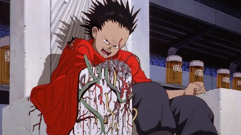
Directed by Katsuhiro Otomo in his feature directorial debut and based on Otomo's own manga epic of the same name, there never was a film like "Akira" either before or since. Even as an adaptation it is a daunting and impressive achievement, as the manga contains 120 chapters and over 2,000 pages that were condensed into a two-hour film (which is a reason why the film's ending is a bit confusing). For comparison's sake, the "Attack on Titan" manga lasted for 139 chapters and we're 84 episodes into the manga with still plenty of story left to adapt.
Then there's the huge production involved with the anime adaptation. Virtually every great animation director, background artist, and key animator of the time worked on "Akira," with "The Akira Committee" being the name given to a huge partnership of several Japanese studios and companies, including Toho, Bandai, Kodansha, LaserDisc Corporation and more. For the animation itself, every studio from Gainax ("Neon Genesis Evangelion") and Kyoto Animation ("K-On!"), to Pierrot ("Naruto") worked on delivering one of the most impressive feats of animation ever put on the screen. Where many studios at the time were taking shortcuts in order to cut on time and cuts, like repeating frames (a very big culprit of this is Hanna-Barbera's use of limited animation, well, "Akira" went the opposite way.
A true marvel of color and light
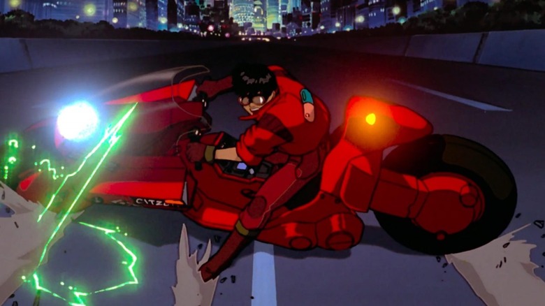
Even when removing the incredible worldbuilding and storytelling (as well as some scary foresight), which helped popularize the cyberpunk genre, "Akira" is a visual masterpiece. Almost every frame is created by hand with an incredible amount of detail, not in small part due to the film's high budget. Take any frame and you'll see it shines with bright colors and an attention to camera angles to rival any live-action film. The film places a special attention to lighting in order to heighten the sense of a effect of the colors and to give the impression of a city that never sleeps — Nerdwriter has a fantastic video on this subject.
Then there's the use of color in the film. "Akira" uses an incredible range of color to evoke its feeling of a futuristic world, with bright oranges shining against dark blacks and blues, where greens and reds show the fight between human progress and nature. There are a whopping 327 shades of color in "Akira," 50 of which were allegedly specifically created for the film, according to a behind the scenes video on the production of "Akira" (via Kambole Campbell's writing on the legacy of the film for its 4K release). The reason was that, since most of the film takes place at night, a wide range of colors was needed to make the scenes pop, and it's clear they succeeded.
The use of color, along with a meticulous attention to facial expressions, was not commonly seen in anime. Each character's animation was tailored to pre-recorded dialogue, meaning the animators had to make the character movement feel realistic and sync the lip movement, where many animated shows and movies use a predetermined set of lip movement that is rotated to fit any word intonation.
It's no surprise to see "Akira" still dazzle audiences 34 years after its release. Its iconic bike slide shot has been referenced to death the past three decades, and Hollywood has never truly given up trying to make a live-action adaptation. Just like the powerful teenager with telekinetic powers that gives the film its name, there has never been anything like "Akira" before or since its release.