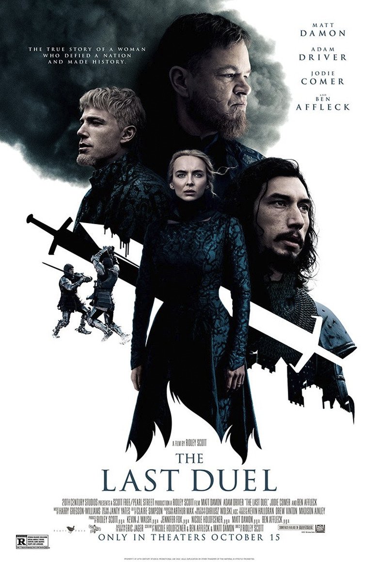
This New The Last Duel One-Sheet is a Blatant Rip-Off of a Classic Mondo Poster
Over the past 15 years, posters devoted to pop culture have exploded in popularity thanks to companies like Mondo, Gallery1988, Bottleneck Gallery, and Hero Complex Gallery commissioning talented artists to capture the essence of a film or TV show in a single, memorable image. At the same time, official posters commissioned by studios have gone from the era of incredible artists like Drew Struzan to ... whatever the hell this is.
So it's not surprising that a major film studio would look to that smaller, hipper community of pop culture posters for inspiration. What is surprising, though, is the extent to which the poster for "The Last Duel" completely ripped off a beloved Mondo poster for "Game of Thrones." This is downright egregious.
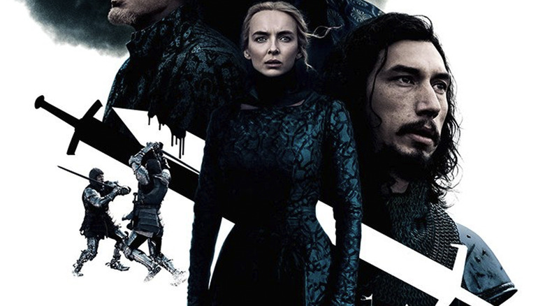
The Last Duel Poster
 20th Century Studios
Take a look at this new international poster for Ridley Scott's "The Last Duel." Pretty cool, right? There's the prominent white background with a dash of dark coloration in one corner to help with the aesthetic flow. The floating heads of the story's major players loom large, and there's a really neat design trick in which the background white cuts into a supporting player's image to form the outline of a castle. There's Jodie Comer's Marguerite de Carrouges, front and center, brow furrowed and looking intensely off to the right of the frame. Characters battle to her left, symbolizing the key conflict of the narrative. And of course, there are those distinctive black and white sword designs which cut through the whole image at an angle, helping to underscore the fight that slices through the heart of this story.
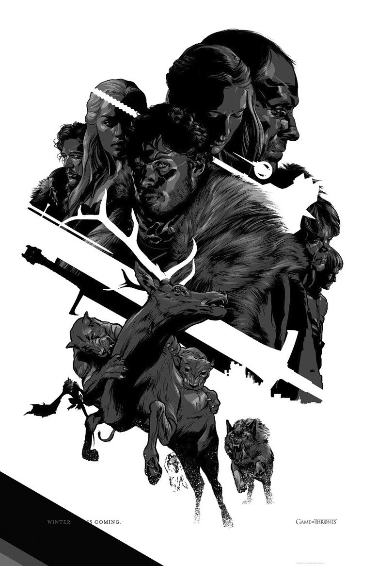
Martin Ansin's Game of Thrones Poster
 Mondo
Mondo
Now take a look at artist Martin Ansin's "Game of Thrones" poster from 2012, which was created on behalf of Mondo. Pretty cool, right? There's the prominent white background with a dash of dark coloration in one corner to help with the aesthetic flow. The floating heads of the story's major players loom large, and there's a really neat design trick in which the background white cuts into a supporting player's image to form the outline of a castle. There's Richard Madden's Robb Stark, front and center, brow furrowed and looking intensely off to the right of the frame. Characters battle to his left, symbolizing the key conflict of the narrative. And of course, there are those distinctive black and white sword designs which cut through the whole image at an angle, helping to underscore the fight that slices through the heart of this story.
I think we can all understand how it must be difficult to come up with a fresh design when you've got a deadline breathing down your neck. And seeing artists steal or tweak each other's designs is a natural part of being in a creative field. But what 20th Century Studios did here? This is blatant, outright theft, and deserves to be dragged. I hope the studio takes a page from the Lannister playbook and pays its debts, because they should be cutting Martin Ansin a fat check for swiping his design here – or, at the very least, sending him a giant gift basket.