How 'Mary Poppins Returns' Recreates And Reinvents Familiar Costumes And Sets [Set Visit Report]
When we visited the London set of Mary Poppins Returns last year, one thing was said time and time again: this is a sequel, not a remake. This meant that director Rob Marshall and his team had to capture everything that made the 1964 original so charming while also aging it to reflect the passage of time (and more refined audience tastes). Naturally, this meant costumes and sets that captured that familiar magic while also reinventing that magic for a new generation. Here's how they made it happen.
Mary Poppins Keeps Up With the Fashion Trends
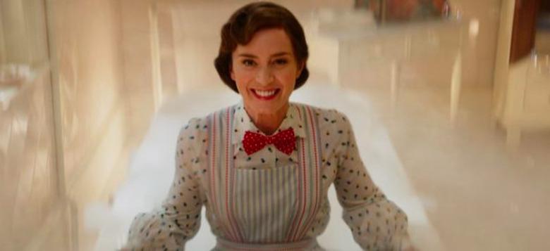
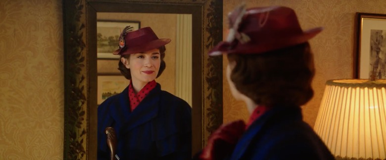
Mary Poppins is practically perfect in every way, which means she can never be stuck in the past. Sure, she may be a supernatural, ageless nanny with unspecified magical abilities, but she knows how to dress well and she certainly keeps up with the trends. For costume designer Sandy Powell, this meant recreating Mary Poppins' wardrobe so she still looked like Mary Poppins while also taking into account the fact that this movie is set decades after the first one. Powell explained the basic fashion choices:
"[The original movie] was set in sort of an Edwardian period, or meant to be an Edwardian period with some 1960s thrown in, but the coat was just above the ankle, sort of nipped-in at the waist with a hat and an umbrella. So I wanted to do something similar and actually 1934 is a period for women which is not a million miles away in shape because it's a longer longer hemline, much longer than a few years later in the 1930s toward the war when hemlines rose up toward the knee."
As for colors, it was a matter of sticking with what already works and seeing what looked good on the new Mary Poppins herself, Emily Blunt:
"The color – blue – is stronger than it probably would have been for a real governess and brighter than the original, which is navy. I didn't want to do navy because it's too hard and actually reads on camera as black. I wanted to do a blue that from a distance was a dark blue and then as you got closer to it or it got brighter, you actually see there's a stronger blue in there. And with the black mixed in, it sort of stops it being overly vibrant or too sort of royal blue. The hat is a typical 1930s shape with a brim and it's not a million miles away from the original which she wears on the top of her head in an Edwardian style and this is sort of at a jaunty angle on the side. I arrived at red for the hat simply because I tried many different hat shapes on Emily to see what would work, what didn't work and likewise with clothes. The first thing I did when I met her was try on a bunch of different 1930s skirts, dresses, blouses, coats, hats, just as a starting point just to see what would work on Emily, on Emily's shape and sort of quite often you hit on something in that first fitting that sort of dictates what the style is going to be, what the look's going to be."
Updating Cherry Street Lane For Modern Audiences
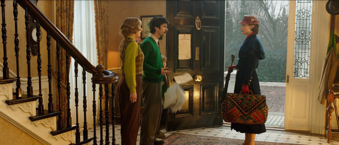
Meanwhile, production designer John Myre found himself with a similar predicament. How do you update a location as iconic as Cherry Tree Lane while maintaining its essence? As he explained, they had to account for both the passage of time and changing audience tastes:
"We're coming in in the winter. It's in the mid-30s. It's in Depression era. This is the world that Mary Poppins comes into. We felt that in the first movie, we didn't really like the idea that it looked like they were all living in white mansions. We thought it might be more accessible for today's audience if they lived a little more humbly. So we took the size of their houses down. We added brick into them and made them feel a little more real."
In his search to find the perfect look for the revised Cherry Tree Lane, Myre took a field trip to London and the city itself ended up creating a brand new adjective for the production:
"The original movie was all shot on the Disney sound stages. [Director Rob Marshall] said, 'Again, I want to make this more accessible for today's audience.' So he threw me on a plane to come to London and scout locations and one of the first places that we found was an area of Queen Anne's Gate and there was this quintessential British pub and it was on this curvy street and this was the picture that Rob saw and he said, 'Yes, we can make the movie in London and shoot some exterior locations.' He said, 'I want to make it kind of a love letter to London.' So I went around with our location scout and thought what could we use of London? And I kept saying it needs to be London, it needs to be London. And she came up with a word that doesn't exist called – Londony. And she took me to a place and said, 'Well, this looks rather Londony.' So, I immediately told everyone on my team – all my set designers, and illustrators, and painters – that everything we do from now on needs to be Londony."
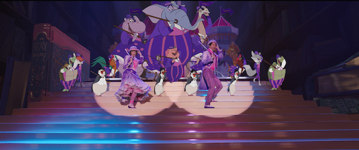
Leery Costumes...Built for Dancing
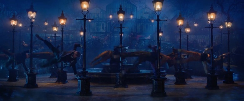
While Mary Poppins' costumes had to be designed with the character's iconography in mind, Powell faced a different challenge for the supporting cast. Lin-Manuel Miranda's Jack is a leery, a lamplighter, and he has to dance...as do many of his fellow leeries in a major musical number. This meant a lot of costumes...costumes that had to look appropriate for the time and place while allowing for dancing:
"Jack, a leery – the leeries are the first thing I had to start designing simply because there are so many of them. I think there are over 70 altogether. There are about 30 or 40 dancers, cyclists, specialist cyclists, and stuntmen. So all in all, we must have made about 80 or 90 costumes for all the leeries... We had to know very early on what clothes were going to work that these guys could actually dance in. So they had to be completely believable as characters – as working men – but then also have to work as dance costumes without being made out of Lycra or look like dance costumes. So that's quite a challenge."
If this sounds a lot like the famous chimney sweep musical number in the original movie...well, yeah. But Powell wanted to make sure every single dancer in the number stood out from the pack:
"The idea was to give them all the same feel, the same look but create individuals within them, amongst them. Rob didn't want a chorus line. Like in the first one, the chimney sweeps were great but the dance piece in that, they did all look the same in the original. And he did want individual characters. And they are all injected with little bits of color. En masse and at night they do look quite dark and the silhouettes are gray but when you see them closer or in daylight you see little bits of color."
Even Cartoon Characters Need a Costume Designer
Like in the original movie, Mary Poppins Returns features a sequence where a few characters enter an animated world and meet and sing with – and dance alongside – animated characters. But even animated characters need someone to design their costumes, which presented Powell with a series of unique challenges:
"Yes, the animators designed the characters, the animals. Initially they asked me – so we could do this – to give them lots of reference for the period. So I gave them lots of images of different shapes and sizes of people in a different range of clothes – we're not doing this at an exact date in the 19th century, we're sort of doing it quite broadly 19th century – so I gave them lots of images. Then when they design a character or a set of characters, they then send them to me with their ideas of the drawings and quite often I corrected them – it's really an interesting way of working and I think initially I was sending things that had far too much detail for them and they'd really can't do much detail. It's very spare but it's really genius that they can sum up a character in a few lines. And the same with the clothing. You had to sort of extract the essence of whatever it is they're wearing. I couldn't do stripes like this, they could do two or three stripes because it's just too much work because it's all hand-drawn every time."
***
Mary Poppins Returns hits theaters on December 19, 2018.