The 25 Best Manipulated Versions Of Studio Logos
Studio logos serve a general purpose for any movie. They can suggest a type of film – people have a basic idea of what a Disney movie entails – or simply a sense of pomp and circumstance. While there's no shortage of studio or production company logos, there aren't as many cases of filmmakers playing around with those logos in front of their movies. This list highlights 25 such unique cases over 80 years, from the goofy to the ominous.
A Night at the Opera (1935)
Leo the Lion of the MGM logo has been a genuine piece of cinematic iconography for decades. He was iconic enough back in 1935 for the Marx Brothers to mock him during the studio logo for A Night at the Opera, their first Metro-Goldwyn Mayer film. Groucho, Chico, and Harpo get in on the fun, the latter "speaking" even though he's traditionally silent. Though A Night at the Opera isn't the brothers' best, the opening's appropriately subversive.
2001: A Space Odyssey (1968)
2001: A Space Odyssey doesn't play with the studio logo (MGM again) as much as adopt a rare revision. In fact, 2001 is just one of three movies (the others are The Subject Was Roses and Grand Prix) to feature this stylized logo, an attempt on the studio's part to update its image. Though 2001 remains a widely beloved film (and the stylized version is present on home-media editions), this logo didn't survive past 1968. It's almost fitting– the image can remain unique to this incredible opus.
Silent Movie (1976)
Compared to Blazing Saddles or Young Frankenstein, Silent Movie is one of Mel Brooks' more underrated films. As the title suggests, there's no dialogue in the film, save one word spoken by famed mime Marcel Marceau. The 20th Century Fox logo doesn't appear in its usual form or fanfare, but on a billboard the leads of the film drive by to incite the opening credits. It's not the gaudiest use of the Fox logo, but the Silent Movie take is fittingly old-school.
Raiders of the Lost Ark (1981)
Something ineffable was lost when The Force Awakens opened without the 20th Century Fox theme. Similarly, it'll be odd for Disney to release an Indiana Jones movie, from the outset. Starting with Raiders of the Lost Ark, each Indiana Jones movie has incorporated the Paramount mountain into its first image (Kingdom of the Crystal Skull is cheekier, dissolving from a mountain to a molehill). Raiders remains the hallmark with its Paramount logo transitioning to the opening, suggesting a sense of adventure the film easily achieves.
Back to the Future Part III (1990)
It's rare for a studio logo to not transform and change over time. Even those that remain the same, like the MGM logo, are renovated with time. Few commemorate their past the way Universal Pictures did with a handful of films in 1990, including Back to the Future, Part III. As that was Universal's 75th anniversary, it makes sense to honor their past by showing audiences how far the studio had come. It's only a shame that they didn't do something similar in 2015 to commemorate a century of cinema.
Gremlins 2: The New Batch (1990)
Gremlins is a wonderful film; however, Gremlins 2: The New Batch not only has Daffy Duck and Bugs Bunny, but it starts with them. This opening, plus a brief gag at the end, was written and animated by the legendary Chuck Jones, and is as delightfully meta as the ensuing live-action film. Gremlins 2, in general, is excellent, and the opening twist on the Warner Bros. logo delivers on the madcap promise. No wonder Joe Dante got to direct the Looney Tunes characters in Back in Action.
The Rocketeer (1991)
In the 1980s, Walt Disney Pictures released darker live-action films, eventually creating Touchstone Pictures to make harder PG/PG-13 rated films. But some of their films in the 1980s and early 1990s, including the delightful The Rocketeer, utilized a spartan, text-on-black-background logo that could suggest something exciting, ominous, or both. The theme playing under the version in The Rocketeer is its main titles; some films had no music over the logo. Few films now need this austere logo, but we can always dream for its return.
Toy Story (1995)
It was logical that the Walt Disney Pictures logo was overhauled in their first computer-animated feature, Pixar's Toy Story. The bouncy theme is part of Randy Newman's score, but was utilized in other Pixar films for the next decade. Sadly, the Pixar-ized logo has gone away: when Disney changed its castle-set opening logo in 2007, the change stuck for Pixar films. Even worse: the new logo is on home-media versions of Toy Story, thus screwing with Newman's soundtrack.
Waterworld (1995)
You won't find much praise for Waterworld, but the way director Kevin Reynolds employs the Universal Pictures logo to start his story of a future where water has flooded Earth is pretty cool. It's one time in the film where the effects look genuinely convincing. Also, having trailer-voiceover artist Don LaFontaine use his booming tones to set the stage was a novel twist. Too bad the film didn't measure up.
Moulin Rouge! (2001)
Baz Luhrmann is wildly ambitious, recently transitioning to Netflix for his disco-themed TV show The Get Down. Though it wasn't his first film with 20th Century Fox, Moulin Rouge! features a distinctively revised studio logo. (His The Great Gatsby adaptation plays with the Warner Bros. logo.) We get to see a conductor gesticulating as wildly as someone can to get his orchestra to perform the fanfare, then switch into a mini-overture of music that will be played and sung throughout. It's a fittingly bombastic beginning.
Down with Love (2003)
With Peyton Reed in the stable of Marvel directors, hopefully people have rediscovered his 2003 romantic comedy, Down with Love. In the same vein as films like Pillow Talk, Down with Love is a witty romp starring Ewan McGregor and Renee Zellweger with tons of innuendo in place of direct sexual content. Reed tips his hand with the 20th Century Fox logo appearing as it did in the 1950s, preceding a title card that the film is presented in Cinemascope, the widescreen format that enabled split-screen gags in the Doris Day-Rock Hudson films inspiring this one. There's really no better way to start such an homage.
The Aviator (2004)
If time is kind, people will eventually realize how much they've underrated Martin Scorsese's The Aviator. The sprawling biopic features one of Leonardo DiCaprio's most complex performances as Howard Hughes, as well as other memorable performances from a vast ensemble including Cate Blanchett, Alan Alda, and John C. Reilly. Scorsese, well versed in cinema history, utilizes the three-strip Technicolor style throughout each era the film depicts, matching the color palette of old. He extends that to the Warner Bros. logo, the skies surrounding the logo awash in greens and blues, a hint of the striking visual feast to come.
Harry Potter and the Prisoner of Azkaban (2004)
The third Harry Potter film was the first with a new director; in many ways, Azkaban breaks with tradition, starting before we see or hear the title character. Alfonso Cuaron doesn't waste time in bringing something more lively to the franchise, as his constantly roving camera zooms through the Warner Bros. logo into the second-floor bedroom of our heroic young wizard as he uses his wand as a flashlight to study in the middle of the night. Azkaban is generally one of the stronger Potter films, and the way Cuaron utilizes the studio logo foreshadowed the rest of the film's energy.
Ocean’s Thirteen (2007)
Steven Soderbergh, another great filmmaker/careful student of cinema history, is no stranger to playing with studio logos to honor the era inspiring his work. (Magic Mike uses a 70s-era version of the WB logo.) Arguably his most popular films, the Ocean's trilogy offer striking takes on the Warner Bros. logo. The 2007 closer, Ocean's Thirteen, goes all in (sorry) with bright greens, blues, and reds soaring over the WB logo over a big band fanfare; unlike the Euro-themed score of the second film or the cool jazz of the original, this one teases a Vegas-style blowout.
Zodiac (2007)
David Fincher's films are fine examples of playing around with studio logos: Alien3 extends a note of the 20th Century Fox fanfare and cuts it off before its conclusion; The Curious Case of Benjamin Button depicts its logos as a collage of buttons. His best film, Zodiac, plays with studio logos in the most direct way: both the Paramount and Warner. Bros logos appear as they did in the 1960s and 1970s, in glorious widescreen, to pay homage to the period crime drama about to unfold. As the best examples do, this sets the stage perfectly before the story begins.
Superbad (2007)
In some respects, Superbad is a throwback to teen comedies of the 1980s, but its neon-hued opening logo, during which we see silhouetted images of the leads played by Jonah Hill and Michael Cera dancing, seems just as indebted to the 1970s. The Columbia Pictures logo has come so far from the two-dimensional illustration from that era, but the way it's used in this film suggests nothing more than a laid-back story, which is exactly what comes right after all that silhouetted dancing.
Presto (2008)
While Pixar had its own version of the Disney logo, it doesn't play with the Disney logo (or its own logo) in features. But the 2008 short Presto, still their best, quickly showcases cheerfully manipulated versions of both logos before starting its most manic story. The logos, in keeping with the ensuing raucous magician's performance, are presented with a circus-like fanfare before we see Presto introduced as a "Pixar cartoon," something in line with Looney Tunes shorts of old. It's a perfect start to a perfect short.
Watchmen (2009)
In what may be a scorching hot-take, Zack Snyder's Watchmen isn't very good. At least the opening credits, depicting an alternate history of America once superheroes appear, are the film's standout sequence. The opening logos, set against a yellow background with great significance to the comic book, are deliberately spartan: in another movie, the four studio logos would take up a minute of screen time. Here, it's about 10 seconds, as Snyder leaps into the storytelling. Watchmen is exceedingly slick, but its logos are bracing in their simplicity.
The Wolfman (2010)
One of the Universal Pictures logos utilized in the brief montage in Back to the Future, Part III is brought back in full in the 2010 version of The Wolfman. As a way of tipping a hat to Universal's horror-centric past, director Joe Johnston (showing up again after The Rocketeer) employs the 1940s-era version of the Universal logo. The film that comes after that logo may not be like the Lon Chaney, Jr. original, but the logo is a perfectly apt nod to the past.
Argo (2012)
Argo not only takes place in the 1970s, but it hinges on the film industry of the period. As such, it only makes sense for director/star Ben Affleck to pay homage to Warner Bros. in the 1970s with a revival of its Saul Bass-designed logo. Things have changed radically since then for how the studio's logo looks – it would only be a few years before the Bass design was old hat – but bringing it back is a welcome reminder of how the studio used to open its pictures.
Django Unchained (2012)
It's unsurprising that Quentin Tarantino is on this list – he's as much a die-hard cinephile as a director, so playing around with a studio logo or reviving an old version is almost predictable. Django Unchained is in a similar vein as Inglorious Basterds, depicting a revenge-fantasy version of history in which the oppressed take out their oppressors. But Django is also indebted to Westerns of the past, so the Columbia Pictures logo appears in its stripped-down 60s-era form. It's the right way to set the stage for an exploitation throwback.
Cloudy with a Chance of Meatballs 2 (2013)
The Columbia Pictures logo is so stately, it borders on pompous. So it makes sense that a film as silly as Cloudy with a Chance of Meatballs 2 would play with that logo. The 2009 original has some fun, as a banana flies into frame to knock the statuesque icon off her platform; the 2013 sequel goes further by having that banana stand on its...hind legs, with a cheerful strawberry riding it like a horse. This hints at the sequel's revelation that mutated food has become anthropomorphized, but maintains the anarchic spirit of the first entry.
Saving Mr. Banks (2013)
There's not much to praise about Disney's self-serving biopic about Mary Poppins, but the beginning of the film offers something a little different than usual. While director John Lee Hancock doesn't bring back the Buena Vista Distribution logo that was standard in the early 1960s, we see a 60s-style "Walt Disney Presents" title along with old-school legalese that would often show up in fine print at the bottom of such logos. In this respect, there's a nice homage to the past at the beginning of a film all about nostalgia.
The Interview (2014)
The Interview had an infamously tortured road to release, released digitally before getting a small theatrical release on Christmas Day 2014. So some people may not remember the hot-button comedy's stylized take on the Columbia Pictures logo. The movie, set in the present, doesn't play around quite as much, but Rogen has a history with tweaking the Columbia logo, including The Night Before. So for The Interview, an off-kilter film, it makes sense to see the logo in a similarly unexpected fashion.
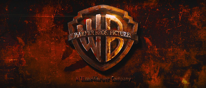
Mad Max: Fury Road (2015)
George Miller's post-apocalyptic car-chase fantasia would, naturally, start with a revised version of the Warner Bros. and Village Roadshow Pictures logos. Here, in keeping with the film's reliance on dirt and blood, we see both logos grimy as all get-out, while we hear a car engine revving up shakily. The image goes dark a couple times, matching the sound of the engine turning over as it starts up; add to that the radio broadcasts on the soundtrack, and you get an intense opening to an equally tense action epic.