VOTD: This Year's Best Picture Snafu Could Have Been Avoided With Better Typography
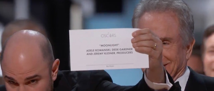
After this year's 89th Academy Awards aired last month, all anyone could talk about was the unprecedented mistake that happened when the wrong Best Picture winner was announced live on the air. After presenter Warren Beatty was confused by the award envelope he was given to read, La La Land was mistakenly announced as the winner when Moonlight was supposed to be rewarded with the honor. Thankfully, the mistake was fixed on the air and Moonlight received their prize.
Following this huge gaffe, everyone was wondering what led to such a mishap. The official answer was that the wrong envelope was handed out to the presenters, and while that's where the mistake originated, there's a way this could potentially be avoided if superior typography work on the Oscar winner envelopes was used instead.
Find out how Oscar winner envelopes typography can be improved after the jump.
The first minute and a half of the video focuses specifically on the Oscars, but the rest of the video makes a strong case for better typography design across the board in order to avoid other famous mix-ups, from flubbed Miss Universe pageants to election ballots. Poor typography designs can confuse people very easily and as we've seen, can result in some unfortunate mistakes.
A mistaken Best Picture announcement isn't anywhere near as important as a confused election ballot for the United States government, but the point remains the same. We need to take more time to perfect our typography in order to avoid larger mistakes.