The Making Of Ian Glaubinger's 'Voltron' Poster
We're going to do something a little different with this poster post. There's an awesome poster available right now called The Defender, by artist Ian Glaubinger. It's a Voltron poster. But instead of just telling you about it, we talked to Glaubinger about the making of the poster, and the vision behind it. He also provided us with multiple different process shots. Hopefully, you'll get an idea how one of these limited edition screenprints gets made.
Below, find out all about the making of Ian Glaubinger's Voltron print, The Defender.
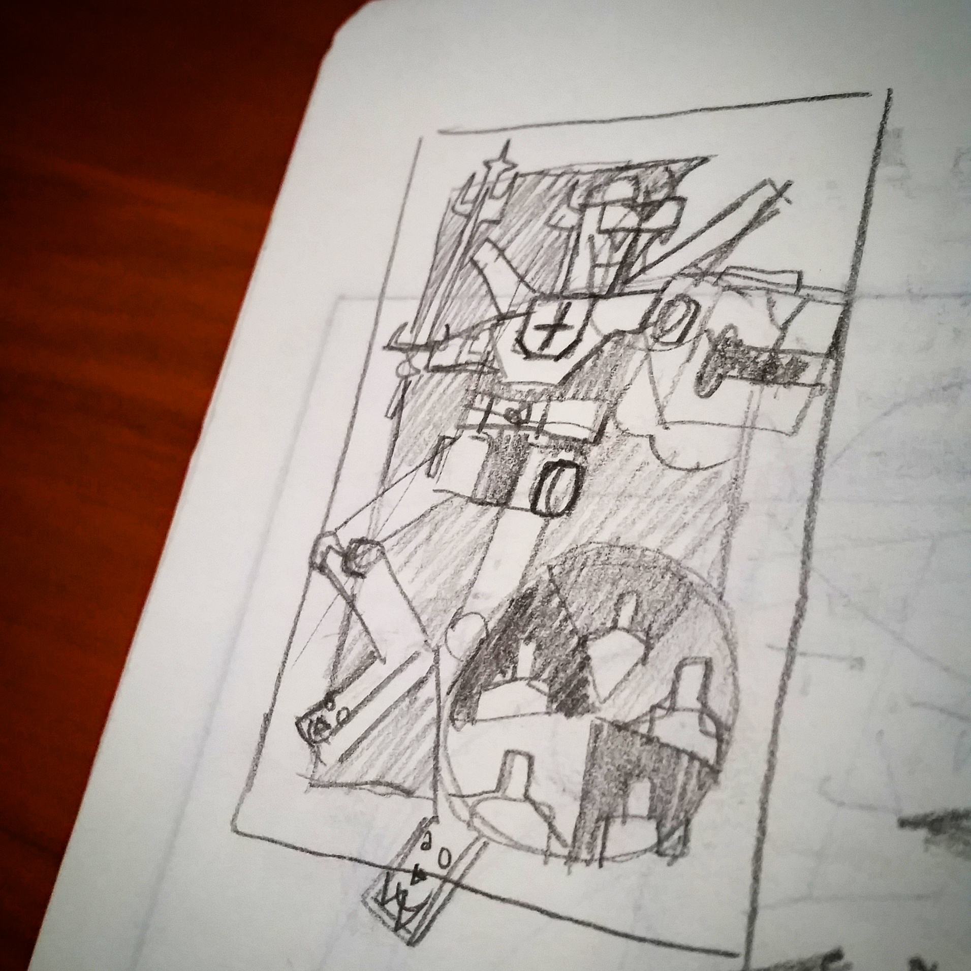
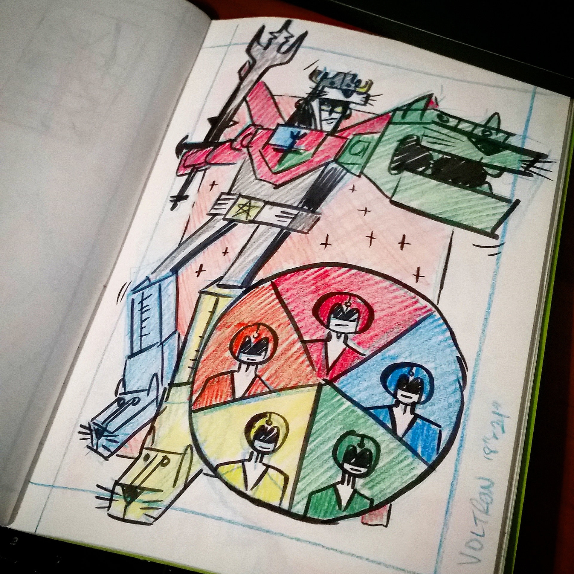
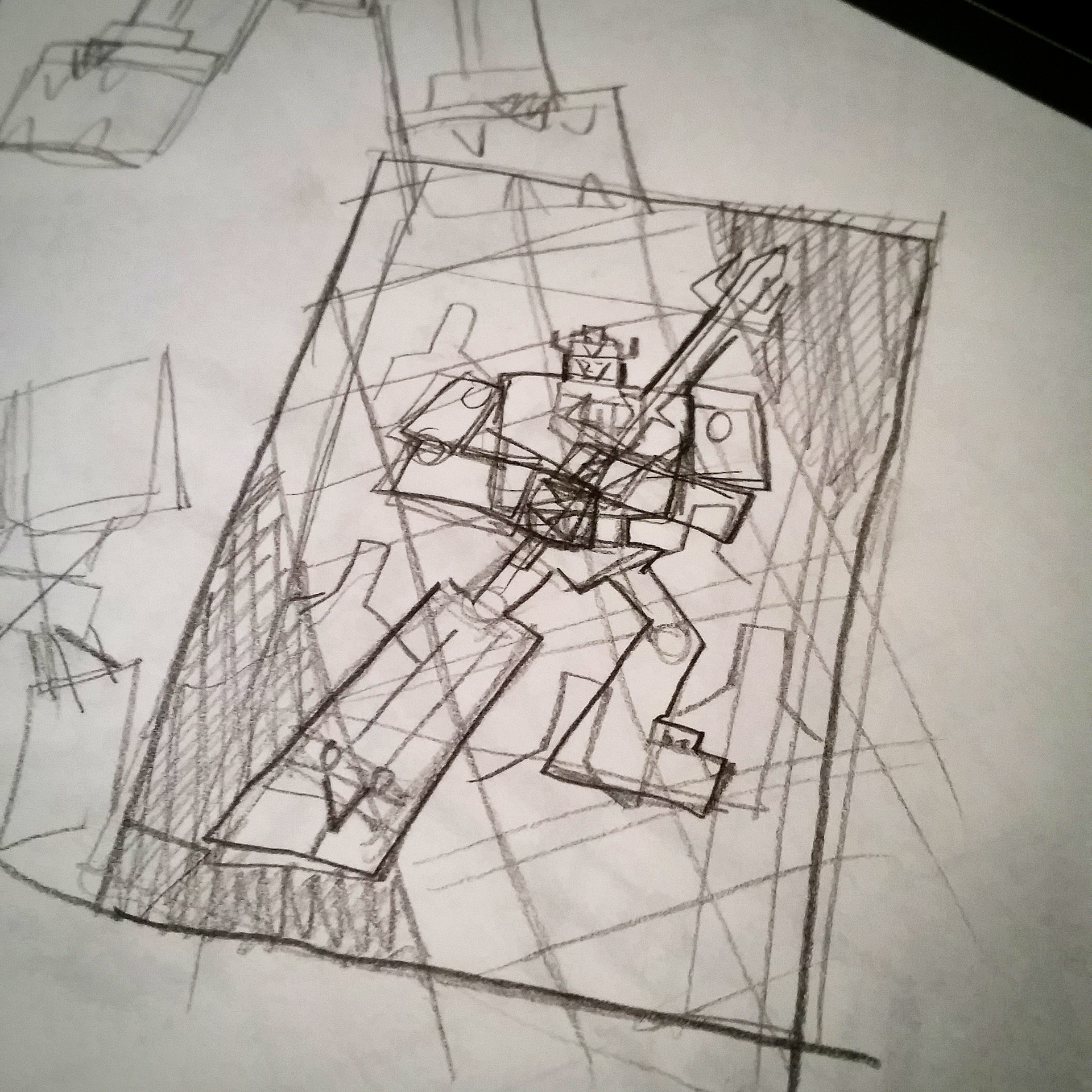
First up, if you just want to snag one of these posters, here's the link to do that. But if you want to learn more about the poster, there are nine images that we're going to put in order throughout the interview which will give you an idea of Glaubinger's process, along with the interview. Let's go.
The Making of Ian Glaubinger's Voltron Poster
Tell us about your personal relationship to Voltron? What was it about the property that made you want to do the piece?
I loved Voltron as a kid. I watched the cartoons all the time. I had the old metal (or was it plastic?) one that was about 7" or 8" tall. You could play with the lions separately or connect them all together. However, I distinctly remember the mechanism that kept the legs connected becoming very loose and they would constantly fall off. I seem to recall the silver paint on the individual lion legs and the sword chipping off too. They don't make 'em like they used to!
Now as far as getting opportunity to work on a property, I was approached by Acme Archives asking if I had any interest in working on a licensed Voltron piece. I definitely couldn't pass up that opportunity. Since getting into the pop-culture art scene I've been very fortunate to get a chance to tackle one childhood memory after another and it's been a nothing short of a dream come true.
How many different iterations did it go through?
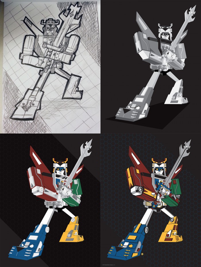
Before I even started thinking about what I wanted to do for the actual poster layout and design, I wanted to come up with my own version of Voltron. I didn't want to deviate too much from the original look and feel because then people may not even recognize it as Voltron but at the same time, I definitely wanted it to be different enough from other incarnations. This is true for almost all properties I work on. You have a bit of leeway between being "100% on model" and putting your own spin on the character(s) but in the end, they still need to be almost immediately recognizable to the viewer.
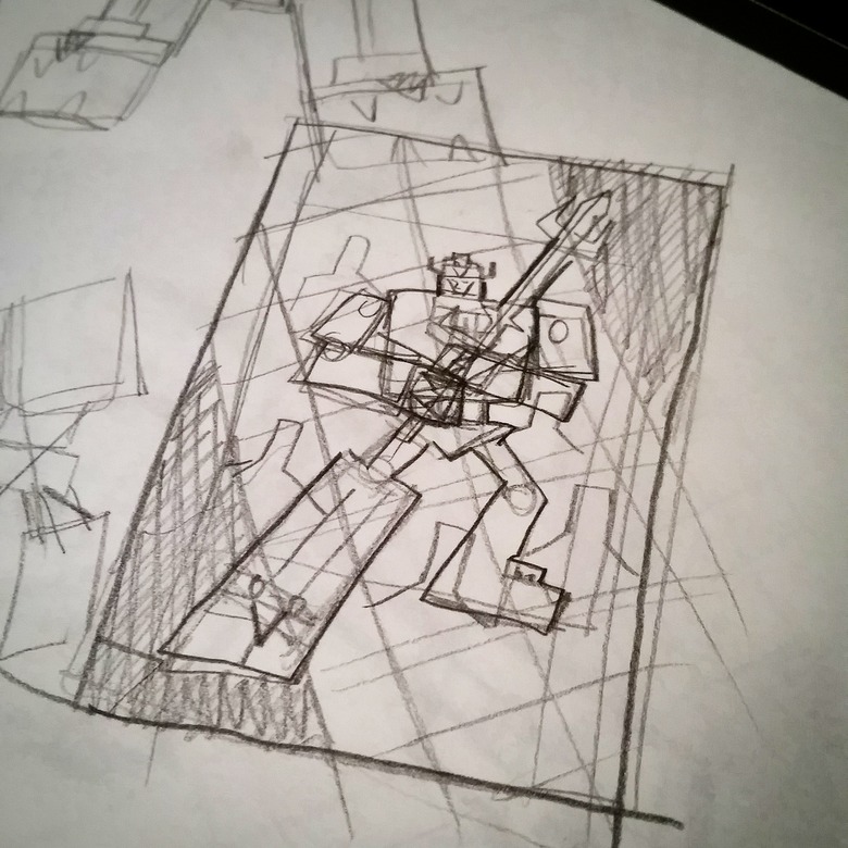
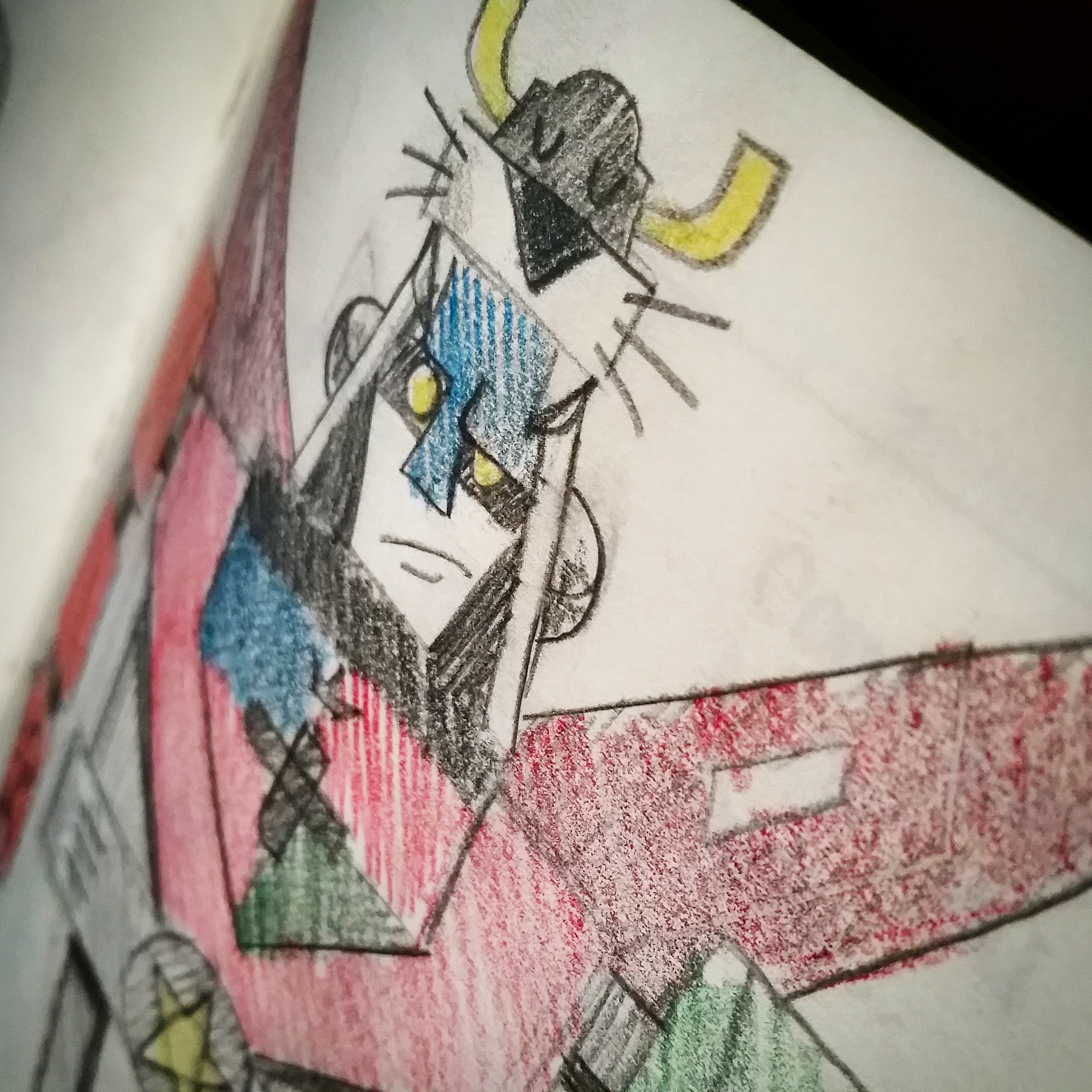
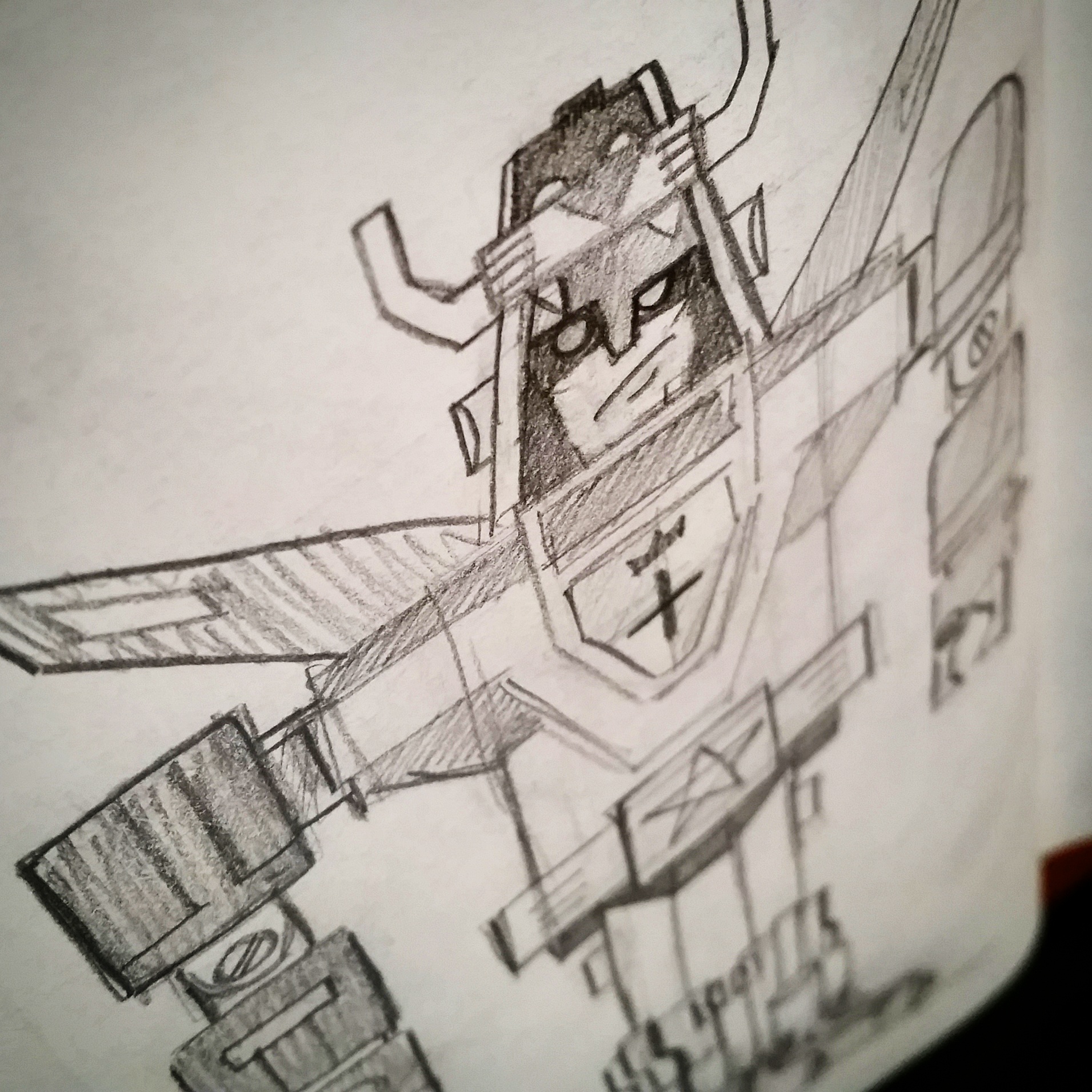
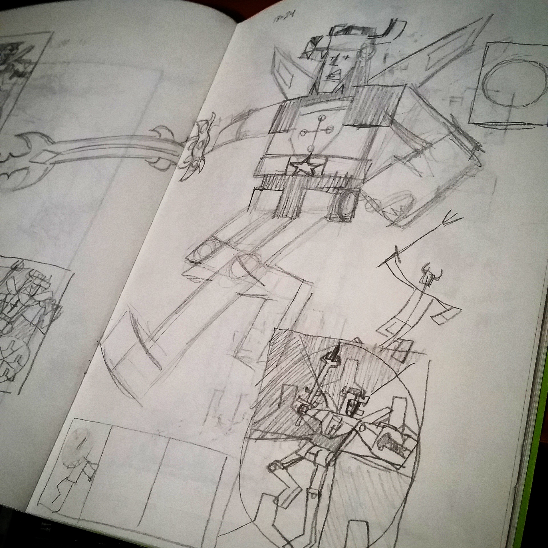
I went through 2 different versions; a VERY cartoony (this one even had whiskers which didn't make the final cut) and a fairly close to "on model" with some exaggerated "Glaubinger" proportions (see also: large head, small torso, skinny arms and long legs). I ended up somewhere in the middle. After I nailed down "my Voltron" I went through 2 or 3 concepts before landing on the final poster design. I came up a rough pencil sketch which depicted Voltron and each pilot. After that I moved on to a rough digital color version in which I changed the layout slightly and added a large bust shot of Voltron.
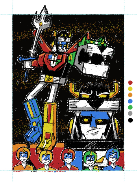
A lot of my work focuses on very expressive facial expressions so I thought this was a good choice. This design was ultimately rejected by DreamWorks (they own the Voltron license) but they wanted to see more. Believe it or not (and I'm paraphrasing here), they wanted "less on model and more Glaubinger". You typically don't get that the type of feedback on projects like this so I gladly went back to the drawing board and really pushed my style. In what became the final concept, I simplified the layout by removing the pilots and made Voltron's pose much more dynamic. I stopped looking up images of Voltron and started looking up images of barbarians and sword stances to get inspired which I think worked much better. In the end I got approval with the new concept almost instantly and I was much happier with where I ended then where I started.
How did you develop your unique style?
I used to draw "the Marvel Way" or at least I thought I was. That was my trajectory. Then 2 things shaped my "unique style" in the early 2000's. They were "fun" and "style".
Fun: The amazing Walt Simonson, my sequential illustration teacher during my junior year of college. He noticed my sketches and thumbnails had much more life and movement but when I moved into the finalized pieces they often became very flat and stiff. He encouraged me to work in a more fun style as it might better suit me and he was totally right on that one.
Style: Believe it or not, the very short lived cartoon "Clerks: The Animated Series" literally changed they way I would draw forever. The way artist Stephen Silver designed those characters and that world basically changed the way I would draw forever. From the bizarre shapes of characters, getting likeness with very few (specific lines), the line thicknesses, even to the way I draw hands and fingers (I call them french toast stick fingers). Now my style has since evolved and changed a bit since then but I feel it all really started for me when I saw that cartoon in the early 2000's.
 Voltron is a property that a few other artists have done. Did you look at those to make sure you didn't duplicate it?
Tom Whalen, Dave Perillo and James White. I had all 3 of their pieces up on my screen at ALL times to ensure I wasn't subconsciously ripping them off without even knowing it. I even sent my piece to Tom while working on it for a few pointers and suggestions. It was actually Tom's idea to add some kind of gear/joint mechanism to Voltron's elbows and knee areas. My original design kinda looked like his elbows were connected by Laffy Taffy or marshmallows.
With so much pop culture art out there, how do you think you've been able to slowly and steadily grow your popularity?
I try not to retread what others have done. Even if I'm tackling properties that have been done before by similar artists, I always try to add my own unique spin on it. Sometimes I try to add humor, self awareness or a retro spin to it. And then sometimes I just throw it all out the window and draw a giant robot made of smaller robot lions who flies around space with a big stinkin' sword and a big old cocky smirk on his huge metal face. Adding some metallic inks doesn't hurt either. It can't all be Shakespeare, right?
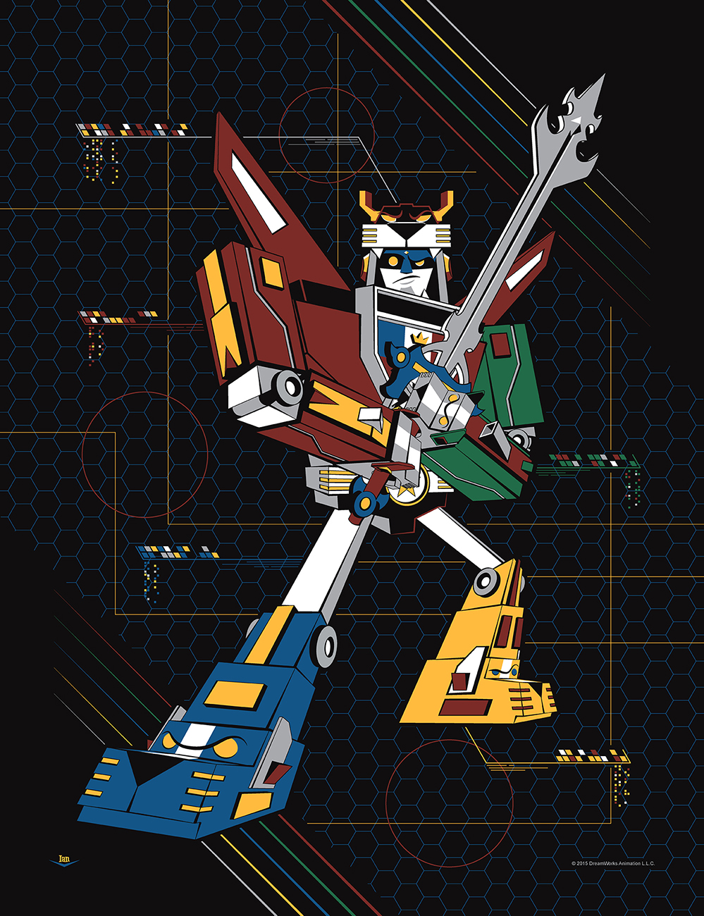
And here's the final result:
For more on Glaubinger, visit his official website.