Alternate Horror Villain Designs That Would've Blown Everyone Away
At the beginning of every filmmaking process, artists from across the industry will come up with an initial round of sketches, mockups, and designs for what every character in the film should look like. This is usually an explosion of creativity, one that can be difficult to fully rein in. There are so many incredibly talented artists with so many fun ideas to play with. However, in the end, everything gets whittled down and one design moves forward.
In the boundlessly creative genre that is horror, every character possesses its own charms that, ultimately, we wouldn't trade for anything. However, it's always fun to see just how many different versions exist of every on-screen horror villain. Alternate designs and pieces of rejected concept art have never been more accessible in the age of the internet, whether in an artist's virtual portfolio, the pages of fully published art books, or even test footage. If anything, learning about what could have been (and, sometimes, what should have been) can give you a new appreciation for every choice, big or small, that went into crafting the industry's most memorable big bads. Who knows, you may end up preferring what got left on the cutting room floor.
M3GAN (M3GAN)
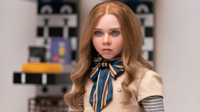
Blumhouse swooped into 2023 in a big way with "M3GAN," one of the year's biggest box office success stories and the ushering in of a new camp horror icon. She may be the latest in a long tradition of walking and talking killer dolls, but you don't see Annabelle fending off Twitter beef or inspiring TikTok dance videos. It's hard to imagine M3GAN serving any harder than she already does. However, thanks to a wealth of alternate designs posted by concept artist Jared Krichevsky, we now know that M3GAN barely went off.
Krichevsky provided Blumhouse with several different versions of the AI antagonist, including alternate hairstyles, facial features, and dresses. Some of these mockups bear a slight resemblance to the final product, while others feel like they belong in a totally different movie. One especially stark design sees M3GAN sporting a fierce black bob, a short-sleeve dress, and much sharper facial features. Reminiscent of "Alita: Battle Angel" and even "Coraline," this version of the character gets under your skin from the jump. In the face of criticisms claiming "M3GAN" didn't go hard enough on the horror, these designs would surely satisfy. Then again, people need to feel inclined to actually buy the doll, so perhaps it was the right choice to reel it back. Now that we know what M3GAN is capable of, perhaps Blumhouse won't be so coy for the sequel.
Ghostface (Scream)
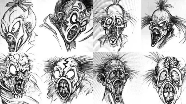
For a moment, Ghostface was going to look a lot different. After discovering a ghostly mask in an abandoned house they were scouting, "Scream" producer Marianne Maddalena convinced director Wes Craven that this was the look of their killer. However, the mask was a product sold by the costume company Fun World, which still owned the copyright. As Dimension Films began negotiating a licensing deal, Craven and crew were running low on time and needed to start shooting with something resembling the final costume.
Effects company KNB EFX was called in to create an alternate version of Fun World's mask but came up with several different sketches. Many of them strayed greatly from the source, sporting big bulging eyes, gnarly teeth, and even decomposing skin. These don't particularly scream "Scream" but that doesn't make them bad. In fact, they're all awesome, incredibly detailed designs to the point that they each feel like the stars of their own bizarre creature feature or kooky horror comedy. "Scream" enthusiast Mikey Aspinwall took one design that skewed closer to Fun World and made an entirely new mask. The result is obviously different but definitely captures Ghostface's signature wailing look.
Dimension and Fun World would eventually ink a contract mid-production. However, Craven had already shot several scenes with KNB's mask and didn't have time for reshoots. As a result, the alternate mask can be seen in the final film, including its now iconic opening sequence.
Annabelle and Bathsheba Sherman (The Conjuring)
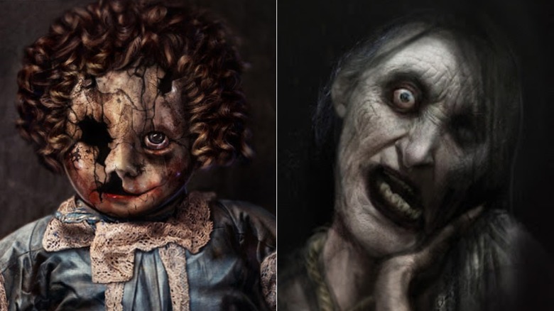
Two characters for the price of one? Sounds like the ever-expanding universe behind James Wan's "The Conjuring." Horror's highest-grossing franchise to date premiered in 2013 with humble beginnings, introducing genre fans to possessed doll Annabelle and Satan-worshiping witch Bathsheba Sherman (Joseph Bishara). The former would, of course, go on to headline a film series of her own but Bathsheba's time on our earthly plane was a one-and-done. However, both went through extensive development processes and two uncredited concept artists have posted separate libraries of their contributions.
Luca Nemolato focused exclusively on Annabelle with two specific designs, both of which feature curly red hair and significant cracks in her skin. This is a far more haunting take on the Annabelle we know and love, topped with blonde pigtails and a complete face. However, it does harken back to the real-life inspiration for Annabelle: a haunted Raggedy Ann doll. Meanwhile, Jerad S. Marantz had his take on Annabelle but the majority of his designs focused on Bathsheba. Though he goes uncredited, some of his designs come close to what would be Bathsheba's final look. Many others, however, push her much further, including blank eyes, bodily contortions, and even baldness. These are much more intense looks, which could have made Bathsheba a more compelling villain overall. As of now, she remains one of the franchise's less memorable spirits. Maybe it's about time Bathsheba got a prequel, eh, James?
Pennywise (It)
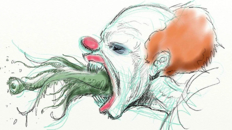
The success of Andy Muschietti's "It" obscures our memories, but it took many years and many different visionaries for Pennywise to make it into the modern age. Some fans will remember when writer David Kajganich and director Cary Fukunaga were attached to the remake but did you know that Vincenzo Natali also threw his hat in the ring? It was not widely reported on until 2015, when the "Splice" director tweeted pieces of concept art from both him and previous collaborator Amro Attia. Even more pieces can be found on his website, where he notes that the art was used for a pitch to Warner Bros. Of course, by this time, he was long off the project.
While we love Bill Skarsgård's horrifying take on the dancing clown, you can't help but be blown away by these designs. Many of them suggest Natali's version of Pennywise is truly a creature of the sewer. The recurring motif of green tentacles bursting out of the creature evokes something chilling. Another incredible concept in these designs is Pennywise's literal duality. One killer clown is scary enough, but to suggest another form of King's ancient entity would present the character with two faces presents the best kind of double trouble. Add one more and you would have a trio of red-nosed Deadlights! And speaking of red noses, the nasal damage in Attia's designs is maybe the most playful element. It's never just for giggles with Pennywise — there's always something lying underneath.
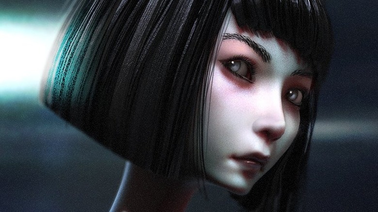
Vecna (Stranger Things)
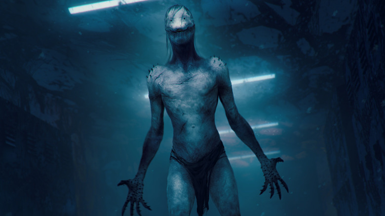
"Stranger Things" Season 4 raised its own bar with Vecna (Jamie Campbell Bower), the alarmingly unforgiving Oz of the Upside Down. Loosely based on the "Dungeons & Dragons" character of the same name, the fleshy trauma demon epitomizes nightmare fuel in its current form, but senior concept illustrator Michael Maher, Jr. went through many, many iterations of the character before settling on the one we know today.
Posted on Instagram as well as his website, Maher Jr.'s mockups took inspiration from a variety of sources, from horror classics like "Hellraiser" and "A Nightmare of Elm Street" to prehistoric fish and gangrene. It's a beautiful multiverse of Vecnas; one sports a cloak, another an asymmetrical tentacle, and another full body-plated spiked armor. Even closer variations feature distinct differences that would have made for a very different villain. So much of Vecna is in his sunken but very present eyes, so it's surprising to see versions of the character with more beady peepers, or eye sockets covered up by lines of flesh. One iteration features just dots for eyes with a scraggly smile, which skews closer to Ditto than Vecna. Even Maher, Jr. admits in his notes, "not sure what I was thinking here..."
Any of these Vecnas would have been a sensational series villain, but Maher, Jr.'s collection stands as a beautiful look into just how wide-ranging the development process can be. You never quite know where you'll land, but it's going to be awesome either way.
The Meg (The Meg)
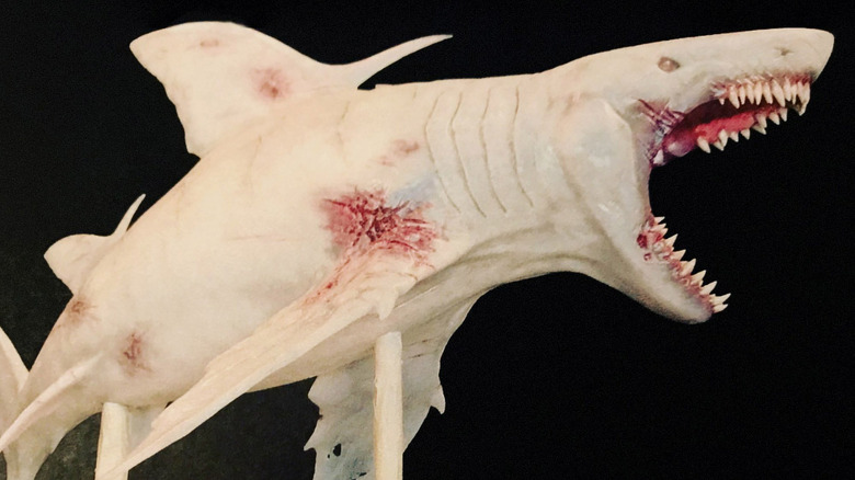
"The Meg" may be a mixed bag of a duology, but The Meg itself ranks as a staggering horror villain. Not since "Jaws" has a shark movie antagonist evinced so much personality from sheer size alone. That said, this mighty megalodon was slated to be a whole lot nastier in earlier iterations. Years before Warner Bros. would produce the blockbuster, "The Meg" author Steve Alten collaborated with friend Nick Nunziata (2010's "Don't Be Afraid of the Dark") and prospective director Jan De Bont ("Twister") on a version for New Line Cinema.
In a since-deleted 2018 Instagram post, Nunziata shared some concept art and even a maquette from the development process. Despite this limited look, it's clear that De Bont's take on The Meg was much mangier. Not only are its teeth chompier (notice that extended sabretooth), but it appears to have taken some damage. The designs show cuts on the sides of the shark's mouth and the maquette even reveals a visible wound near its right fin, suggesting it survived a fight or two. This would make for a feistier villain overall, though it would contradict the notion that this creature was previously undiscovered. Then again, that's prequel material right there.
Sadly, unlike The Meg, Nunziata and De Bont's vision never surfaced. However, in a 2019 tweet, Nunziata boldly claimed his version would have been superior. It's not a high bar to clear, but we have reason to believe him.
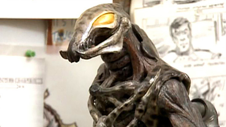
The Crooked Man (The Conjuring 2)
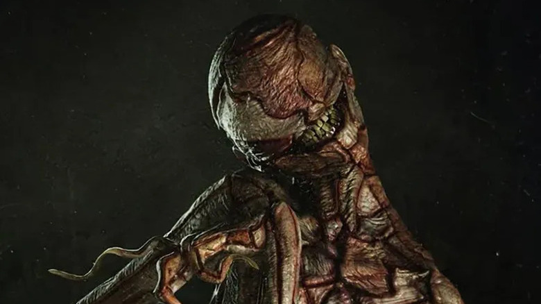
We have cycled back into the "Conjuring" universe, this time tackling its most outlandish character, The Crooked Man (Javier Botet). Though he only appears briefly in "The Conjuring 2," the nursery rhyme-inspired demon left such an impression on fans that director James Wan considered writing him a spin-off. This project was eventually scrapped, but a treasure trove of alternate designs from Jared Krichevsky proves there is plenty of material to work with should they revive it.
The majority of the designs retain similarities to the final version, including a tall, lanky body with brittle fingers and a cracked smile. It also appears that the hat and umbrella combo was a constant, though the former went back and forth between a bowler hat and a top hat. Ultimately, the bowler hat was the way to go, as it separates the character's eyes in an especially frightening way. Still, who says this fashionable ol' geezer can't switch it up for a special occasion?
The man's face is the design's most malleable element. Some versions have just a blank head sporting that wide, toothy grin. Others include eyes and spectacles in different configurations; the most oddly charming version has a very conventional face, as though it were a full moon twistedly grinning. However, the most stark design strips away all of The Crooked Man's charms and whimsy, leaving behind a pieced-together carcass of a body with tendril fingers. It's a good thing this character suits up.
Predator (Predator (1987))
The term "blown away" can mean many things. Most of the time, it means you're impressed. More loosely, it could mean you're shocked. In the case of what the "Predator" suit almost looked like, it's definitely that second one. Casual fans will be astounded to learn about the bullet we all collectively dodged.
In an interview with Stan Winston School's "The Monster Show," legendary effects artist Steve Johnson recounted the first meeting between director John McTiernan and the effects team at Boss Films. McTiernan presented production illustrator Nikita Knatz's initial designs and the response was not positive. "They were awful," he said bluntly. "The head sucked," he continued, referring to its two insect-like pincers and glowing green eyes. It was the cherry on top of a bizarrely disproportionate creature: bulky arms and a thick neck held up by spindly legs and chicken feet. "I told them it wouldn't work," Johnson insists.
Well, it didn't. In The Hollywood Reporter's oral history of "Predator," first assistant director Beau Marks recalled initially shooting with an all-red version of the suit designed to be keyed out with visual effects. Described as "a giant red rubber chicken," he knew it was a dud on arrival. "We shot some tests with it and it became quite obvious that this was a disaster." Production was eventually suspended, Boss Films was let go, and Stan Winston himself was called in to work his magic. The result? A legendary design that we are now especially thankful for.
Xenomorph (Alien)
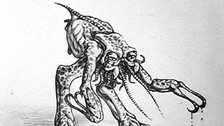
Speaking of scrapped silly designs, let's talk about horror's favorite alien, the Xenomorph. H. R. Giger's slender, phallic design remains uncontested as one of the most ingeniously crafted creatures in cinema, but you don't get there on a first try. In fact, before Giger got involved in "Alien," writer Dan O'Bannon collaborated with artist Ron Cobb on an initial design that is about as far from Giger's as you could possibly think up. Eyes? Check. Antennae? Check. Bipedal? Check. For crying out loud, the thing has hooks for hands!
Cobb's second piece of concept art is even stranger, standing the creature's hefty body atop four green legs like a gigantic locust. If you turned one of the prawns from "District 9" into a radioactive kaiju and gave him Wolverine claws, you might come close to recreating this hilariously unbridled display of creativity. It's a wild design for what would become "Alien," yes, but so chaotic and imaginative that this little bugger deserves his own gloriously campy B-movie. It's almost like something out of Mos Eisley from "Star Wars," an alien with so much going on that you're positive there's more story to tell.
Needless to say, these designs never made it past the development phase — though Cobb's idea to give the Xenomorph acid blood did remain in future iterations of the character. Instead, O'Bannon would introduce later director Ridley Scott to H. R. Giger — and the rest is history.
The Beast (Poltergeist)
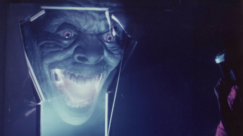
The wealth of distinct characters within the freaky frames of "Poltergeist" makes it no surprise that many ideas hit the cutting room floor — in this case, literally. Thanks to images from "Poltergeist" superfan Matt Knowles, who purchased strips of film amongst other concept art from eBay, we can marvel at the different versions of the main baddie, "The Beast."
The physical film is a series of test frames that feature a more human-looking Beast, specifically the form Steve (Craig T. Nelson) ropes out from the portal. According to the fansite that obtained Knowles' images, Steven Spielberg decided to reshoot the scene after deciding "the head looked too human." However, fans of the franchise will find it uncanny how much it evokes the Beast's actual human form, Reverend Henry Kane (Julian Beck). We doubt Spielberg (or director Tobe Hooper, for that matter) knew Kane was even a factor when designing the effect, but it's still nice to see a spiritual connection between the films.
Additional concept art shows the original version of the Beast's blindingly bright skeletal form that confronts Diane (JoBeth Williams) outside of Robbie's (Oliver Robins) bedroom. Rendered by effects supervisor Richard Edlund with green hues and, seemingly, without a head, this too is a vast departure from the final film. It has a far fatter body as well, almost like a larva; the film's bone-thin version is far more terrifying, not to mention it has far wavier locks — another link to Kane, perhaps?
Jason Voorhees (Friday The 13th)
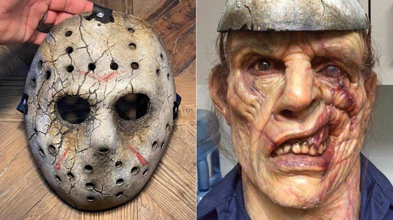
Can you believe it has been well over a decade since the last iteration of "Friday The 13th?" Hollywood can't seem to get a new film or television series into our eyeballs, though fans almost got another reboot and a television series for The CW around the same time. Both projects were eventually scrapped, but behind-the-scenes photos provided to fridaythe13thfranchise.com give fans a taste of what Jason Voorhees may have looked like.
Sota FX was tasked with developing the character's new look for the film and series — suggesting the two may have been connected in some way — and they clearly came up with a lot of material: bloodied masks and machetes, fully sculpted maquettes and molds, even full makeup and costume tests. It's an astounding amount of work and it's all, frankly, remarkable. Jason's weathered, scarred look channels "The Final Chapter" but with more expressiveness. You also have to appreciate the evolution between their bald, younger Jason and their wispy-haired Old Man Jason. Add to that a beautifully cracked mask and a razor-sharp machete (certified with a note from Sota FX owner Roy Knyrim), and you have all the makings for a strong, new vision for Jason Voorhees...which makes it all the more frustrating it isn't happening! We have no clue who is working on the prequel series over at Peacock, but let's hope they take a clue from Sota.
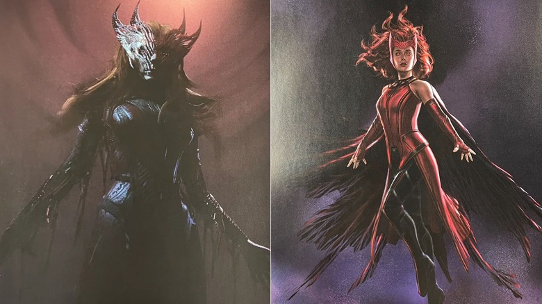
Wanda Maximoff / Scarlet Witch (Doctor Strange in the Multiverse of Madness)
Hey, it counts! Haters gonna hate, but Sam Raimi made a horror movie, so Wanda Maximoff (Elizabeth Olsen) is a horror villain.
Sure, Raimi's wacky visual style can feel at odds with the homogenous Marvel Machine, but Wanda's evolution into the Scarlet Witch is one element of "Doctor Strange in the Multiverse of Madness" that feels fully realized. Olsen revels in every delicious monologue as she becomes a full-on horror queen before our very eyes. It's hard to be upset with the version we got, but — if it wasn't already clear after watching the movie — Raimi seemed ready to go much further with Wanda's occult characterization.
In September 2023, the film's art book from author Jess Harrold was published and photos of unused concept art promptly circulated online. Many pages are dedicated to alternate Scarlet Witch designs, but one from visual development supervisor Ian Joyner stands out. "My idea was that her crown wasn't just an adornment," says Joyner, "but was actually infused into her flesh." His artwork features a much larger crown, including one with four horns instead of two, that grows to cover her eyes and fuse with the skin of her face. Other images reveal alternate designs for Wanda's cape, jagged but sprawling like a crow's wings. These visuals would have really sold Scarlet Witch as a more traditional horror villain, something none of us would be opposed to should she live to see another movie.