Why Guardians Of The Galaxy 2 Avoided Using The Color Purple
The very best directors out there will use every single tool to tell their stories, and one of the single best tools at their disposal is a simple one: deciding what colors to use from scene to scene. Color theory is particularly fascinating to me because it's almost like subliminal messaging. It's the director and their crew telling you how to feel while signaling intent.
For instance, "Jaws" is my all-time favorite movie, and once you know to keep an eye out for the color yellow, you'll notice that Steven Spielberg uses it to represent the shark. The Kintner boy's raft and his mother's hat are both yellow. The barrels Quint uses to keep the shark afloat are bright yellow. That's not a coincidence. Whenever you see yellow in that film, the shark is close by.
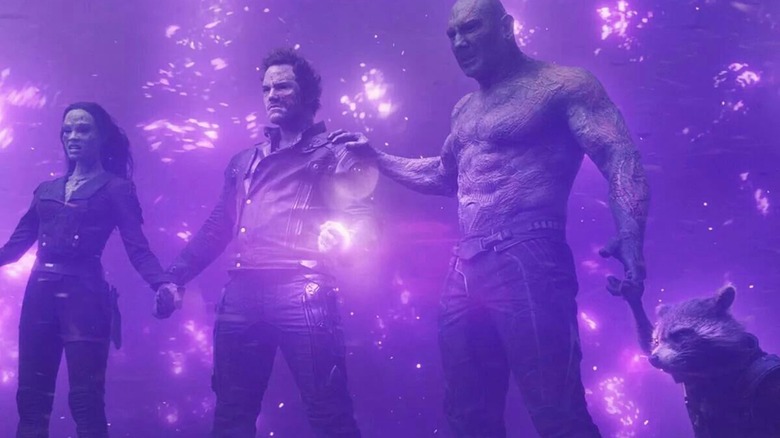
The dominant color in the very first "Guardians of the Galaxy" was purple, and for good reason. One, it's the movie that really introduced Thanos as a character, not just a smirking figure in the background, but more importantly, the MacGuffin of the movie is the Power Stone, which is very, very purple.
The visual representation of the Guardians forming as a team is damn near nothing but purple. You'll remember Star-Lord grabs the Power Stone, and before it can destroy him, the other members of the team grab him, sharing in the burden of the power of the stone. If this scene was any more purple, it'd be curled up inside the Grimace.
Purple was banished from Vol. 2
So, when Gunn was going into "Guardians of the Galaxy Vol. 2" he wanted to do everything he could to deliver a whole different experience for the viewer. That first film took everybody by surprise and in order to recapture that feeling Gunn decided to do whatever he could to keep things fresh.
So if you think back to Vol. 2, the colors that pop into mind are what? Gold. Blue. Not purple. And that's all by design.
In a 2018 interview with Deadline, VFX Christopher Townsend talked about how that mandate came directly from Gunn:
"Before we sort of used all the colors all the time, and we wanted to keep it to two basic colors per scene, so there's very much of blue and gold, and orange and teal. We tried to have it a little more consciously designed in that sense throughout the film. (Gunn) speaks about how he used too much purple in the first film, so he said, 'Use any color you like, but let's not use purple.'"
The whole idea was to give people the emotional through-line they were invested in (mostly around the whole found family vs. blood family storylines), as well as keep the film visually surprising. Gunn continued that into Vol. 3, although he didn't seem to mind folding purple back in a bit.
You could say that Vol. 3 wrapped up Gunn's "Guardians" trilogy not just on paper, but visually as well, folding in the color palettes of both Vol. 1 and Vol. 2.
If you want to know if a movie is taking the details seriously, pay attention to what they do with color. The really good ones will be using them to do more than just painting a pretty frame.