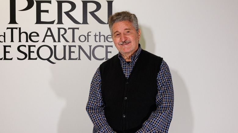
Movie Title Designer Dan Perri On Taxi Driver, Star Wars, And A New Museum Exhibit [Exclusive Interview]
Nothing sets a movie's mood like a good title sequence and one of the best to ever design them is Dan Perri. An apprentice of legendary graphic designer Saul Bass, Perri has been putting together title sequences since the 1970s. He's designed sequences as varied as the slow-motion, classically-scored opening of "Raging Bull," to the operatic text crawl of "Star Wars," to the terrifying teaser for "A Nightmare on Elm Street III."
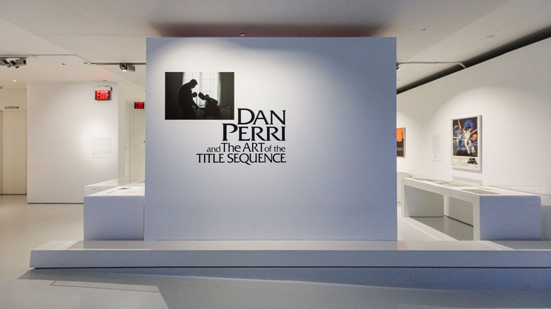
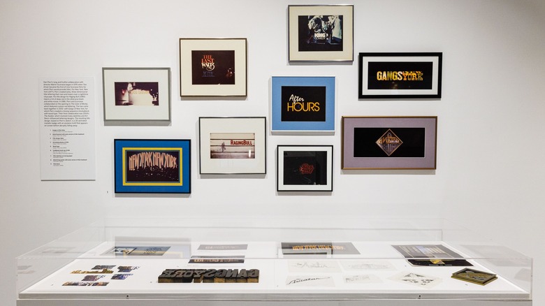
Now, a collection of images from Perri's career are in residence at The Museum of the Moving Image in New York City. "Dan Perri and the Art of the Title Sequence" is organized by Barbara Miller & guest curator Lola Landekic and aims to spotlight and educate about 50 years of work in one single exhibit.
I had the privilege of speaking with Perri over Zoom about not just this exhibit, but his long and ongoing career working with all sorts of celebrated filmmakers.
'There's talk now of this show traveling to other museums'
Can you tell me about the genesis of this exhibit?
Well, I have a... I don't want to say program, but more a plan that I've put into place relative to my career. And it comes about from my desire and my need to share my work with students and people who like it and care about it and so on. I'm fortunate, I think, that I've found something to do in my life that is constructive and I'm giving to the world and designing things that people are liking and using and appreciating and so on. So I feel obligated to give back to the world. The conduit for that is students [...] I've been doing a lot of teaching all over the world the last couple of years, sharing what I know and what I've done.
So there's three parts to that. The first part is what I just described. The second part is that I wrote a book about my career, which I self-published and is in fact at the museum where the show is, and it is on my website and people are buying it all over the world. And they all come to me with the orders, so I know who they are. I've been personally shipping out books literally all over the world, all over Europe, Sri Lanka, and parts of South America and so on. So that's the second phase. The third phase to reach more people, so I can share my work, is exhibitions [...] When I learned of the Museum of the Moving Image, I reached out to them and wound up talking to Barbara Miller, the head curator, and she loved the idea of doing an exhibition. I happened to be in New York sometime after our conversation, so I met with her and she showed me the space and we talked about how we could fill it and what materials I had, beside the obvious of the actual title sequences, which were available on digital and DVD and whatnot.
But I happen to have a lot of artifacts from the jobs I've done. So the golf ball from "Caddyshack" and the license plate from "Star 80," and many others. So all of those are in the show, in glass cases and posters on the walls. So it's really fleshed out very nicely with enough material that a person who is not perhaps familiar with my work can learn about it by seeing all these things and seeing the videos of my interviews. So it's worked out very nicely.
And there's talk now of this show traveling to other museums. The Museum of the Moving Image has connections with many of the museums around the world — they've traveled shows to those places before. And I'm in conversation with the Design Museum in London for the possibility of the show going there at some point. So I'm realizing my goals of those three steps to share my work.
'It became known as slit scan'
Were there any particular parts of your career you wanted to highlight?
Yes. Well, it seemed like, just looking at the work, that I happened to, just by accident, work on a number of films that either are set in New York or about New York in one way or another. So many of the sequences that are in the show are representative of those kinds of films and films located out of New York, and so the story takes place there. It was influencing my design because of the characteristics of New York, the personality of New York, which I brought to the designs in order to emphasize that aspect, as well as the story that the film was telling.
Since you mentioned New York, can you give the story of how you created the "Taxi Driver" title sequence?
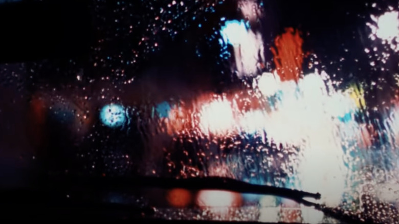
Yes. Well, it came out of, first, my viewing of over 200,000 feet of second unit footage, which was shot all over the city at night to capture the taxi cab moving around town and the smoke and the steam and the colors and all the textures of a New York night. So I viewed a lot of footage and I started to realize that a sequence of those details, introducing the city to the viewer and the character at the same time, what I call the underbelly of New York, where this character lived and worked.
And as I collected shots and created a sequence and ordered it so that it told this little story as well, I came to realize that these images had to be presented in such a way that it captured the richness, the rawness, and the saturation of the colors that are part of the city, all these neon signs and so on. And that the blacks had to be really black, which is a horrific feeling that comes out of that because of the character living in this horrible place.
So in order to accomplish that, I knew from experience that if I copied these shots from a color print [...] I would capture all that saturated color and get really black blacks. And so I shot the sequence from that, and then I came upon an effect that had just been created at that time by visual effects people that I was working with. It became known as slit scan, which was a process of photographing a shot and then winding back and photographing it again, but slipping it one frame.
So we wound up, after testing it, [with] 12 exposures, 12 passes of a shot with a one frame staggered each time, created this streaking, trailing effect, which the shot of the POV looking through the windshield of the taxi to the street in front of it is the main shot of the sequence. That really managed to succeed so well that it became representative of the sequence. And then the slow motion also was an effect that I brought to it to further emphasize a feeling and emotional condition of the character as well.
'Say hello to Bernard Herrmann'
Then the titles themselves, I wanted to capture the authenticity of the letters and the type that's all over the city on the street signs. So I went to the city of New York's traffic department and I asked them to tell me what font, what type style they used for all the signs that are on the street, on the poles, on the corners. Not the ones that say "Speed Limit 35," and that sort of thing. It's a very condensed type style. So I set all the titles in this very condensed, tight style to duplicate the look of the signs. And then I arranged them either flush left or flush right to further mimic the look of the signs. And I placed them high in the frame whenever I could. But they then became the graphic representation of the city by virtue of the type style that the city used.
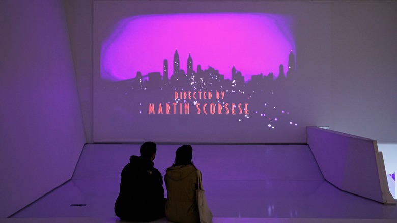
I'm very proud of [the "Taxi Driver" title sequence]. I think it was quite successful. And unfortunately, I didn't have the opportunity to work against music, which I normally do, because Bernard Herrmann, it was his last score. He died just two weeks after the film was completed, and we did a special commemorative title to him, but I was not able to work against the music because he hadn't finished it by the time. But it just was so perfect for — he might have been able to work to my images because I was showing things to Marty [Scorsese] along the way. He wasn't able to see the finished product because I finished it after he finished the score.
But the day I delivered the sequence to Marty on the rerecording stage where they were finalizing the sound, including the music, I brought it up to the projection booth, I remember coming down into this dark room. They started to run the opening sequence to reel one, which was my titles. So the Columbia logo came up, which I had also affected with the contrast and saturation of the colors. And then this amazing music started that was so effective and really made the sequence work even that much better. We viewed it together and then the lights came up and Marty came rushing toward me to congratulate me on what I had done. He was so happy with it. And then he said, "Say hello to Bernard Herrmann." And I turned to my right and there was this little tiny man standing there. He was very well dressed, who grinned at me and we shook hands and congratulated each other because he saw how my images really made his music work, the same as his music really made my images work. So it was a wonderful moment I'll never forget. All of that together made that my most favorite thing I've ever done.
'His hallmark, I think, is his ability to collaborate with his fellow artists who he's chosen'
"Taxi Driver" was just one of your many collaborations with Scorsese. Can you talk about how he evolved as a director and how your working relationship with him changed over time?
We first met on his previous film, "Alice Doesn't Live Here Anymore," which he wanted me to do, but at the time I wasn't very well-known. The people at Columbia, the head of post-production, Rudi Fehr [...] when Marty asked to add me to the film to do the titles, Rudi Fehr said, "Who's Dan Perri?" So he wouldn't let him use me. But Marty promised that I would do the next film, which was "Taxi Driver." And then I did the next seven after that. Then he moved over to Saul Bass, who was my mentor, and Saul did five of his films. Then Saul died, and then Marty came back to me for two more.
But we always had a really wonderful relationship, both being Italian, both from New York, we'd think alike and we both talked fast. [laughs] We had all those things in common and we always really liked each other. Marty would include me in other parts of his life. We'd, many times, have dinner at his family's house and hang out and that never changed. Though I saw him certainly grow as a director, his hallmark, I think, is his ability to collaborate with his fellow artists who he's chosen.
I see that just the way he casts the right actors, he casts the right editor and the right costume designer and the right title designer and the right cameraman. They all give him their best because he's so collaborative and encouraging and supportive. When every creative person on the film is giving their best, which allows him to give his best, that's why the films are so good. That's partly why my work is so good on his films, because of his support and collaboration and encouragement. Overall, I think I've done my best work on his films.
'Those are the original remains of the concepts that I showed [George Lucas]'
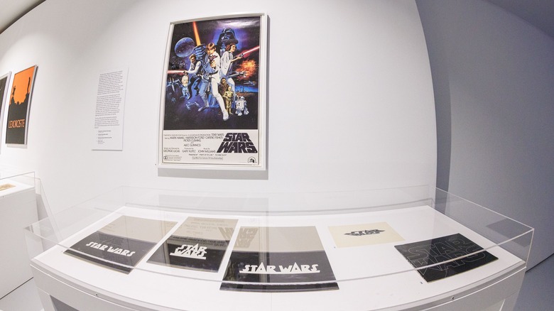
I noticed one of the features in the exhibit is different versions of the "Star Wars" text logo. What was the process for designing that and how did you settle on the final one?
Yes. I worked on the film for about three months, and the last month was the actual production, putting into place the idea that was finally approved. But prior to that, Lucas gave me a lot of films to look at as inspiration, all the "Buck Rogers" serials and the "Flash Gordons" and all those things. I looked at those endlessly. And then I started looking at feature films he recommended and others I thought there might be something to see about them. And finally, I came across a Cecil B. DeMille film from 1940 called "Union Pacific," which is about the making of the American railroad. So the first shot of the film is the camera looking down these empty railroad tracks that just go away from the eye. And then from below camera, the titles roll down the tracks. First "Union Pacific," and then the "Joel McCrea" and the actors in the film.
And so I suddenly envisioned that in space with this logo which I had already designed, or redesigned, from a brochure that Lucas had made to try to sell the film to different studios. And it was full of pictures of pre-production and illustrations and so on [...] The brochure was square, and it had this logo, this hairline "Star Wars," which the W was straight up and down instead of having the angles on the sides like a W has. But it had the S connected to the T of "Star" and the R connected to the S of "Wars." So I adapted that and expanded it to fill the aspect ratio of the film, which is widescreen. And then I thickened the lines enough so that it could live on film cause hairlines just won't — film resolution couldn't hold them up. And then I made various adjustments along the way to come to the logo that we used.
But as I was looking at different films and so on, and I was hearing about the story being set in space and about spaceships, which of course, the "Buck Rogers" and "Flash Gordon" references came out of that, or the story came out of those characters and space adventures and so on. So I was designing things that were very industrial and futuristic and very bold and solid and massive and muscular. So those are among the things I showed him. Now, there was quite a number of them that I designed, but somehow, many of them are gone. But what remains are these four designs that are the original tissue drawings that I did by hand, which I always do. And then I glued them to a piece of cardboard and I put a flap on them and I brought them out and showed them to George. So those are the original remains of the concepts that I showed him that are now in the exhibit.
'The combination of all those insignificant pieces make a very significant whole'
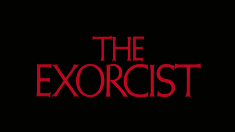
You've also designed titles for horror films like "The Exorcist" and "A Nightmare on Elm Street." How do you make a title sequence scary?
Well, the obvious elements would be that the titles be red like blood. That perhaps there's blood dripping off of them, perhaps the characteristic of letters, the shapes, are more as if they're wet blood dripping and changing shape and falling off the screen as if it has just been splattered onto a surface and now they're running off, dripping down. So those things are obvious ways to convey horror. In the case of "The Exorcist," the film was so sophisticated and so elegant and graceful that certainly red letters would be the right way to go, but the letters had to convey the characteristics of the film and the story. So I chose a type style that had these lovely graceful points to the letters and the body. It was thin enough to be graceful, but thick enough to be strong.
So just the right combination of letters and spaces between the letters and the way that the lines are stacked up and how they come in and out, which was a graceful, elegant fade that brought them in and out, and then playing against the music. All of those things individually are small and less significant than its final. So "less is more" is how I approached it and the combination of all those insignificant pieces make a very significant whole.
'I was considered to direct [A Nightmare on Elm Street 3]'
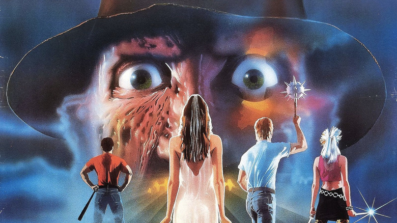
You were the second unit director on the third "Nightmare on Elm Street," and you designed the teaser for it. Was it at all different from just being the title designer?
Yes, certainly. I was considered to direct the film and so as a consolation, after they chose Chuck Russell for "Part Three," they gave me the second unit to direct, which when I actually did the work and when it came out, I bought a VHS tape of it, which DVD didn't exist then, and I copied all my shots. I'd done almost 40% of the film, including cleaning up after Chuck on every scene that — he was given only so much time and when that time ran out, they literally dragged him to the next set and whatever wasn't done, I'd come in, including directing the actors in dialogue and so on, which is not really allowed. And then all the work I had to do, all the second unit shots that were with actors, but there was no dialogue. So I really played a very significant role in the making of the film.
I had a lot of fun, was able to visualize really interesting graphic shots, but I feel my job as the second unit director is to reflect and mirror what the first unit director's doing, not to have a whole different style so it looks like two people directed the film. It's got to look like one storyteller doing the whole film. So I confined myself to doing what I thought Chuck would've done on those shots that I was doing. But I was very happy with the work and the film was very successful. I wound up, then, directing the title sequence for "Part Four" as well. And the original was just graphic design — I didn't shoot anything, except for the title screen and so on. And that came out of deconstructing the type, which I designed by hand so that it was damaged and had been affected by Freddy in an attack by him. So that was the feel of that.
'The horror escalated into that final bloodbath'
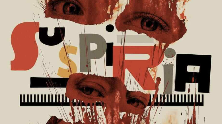
Some of your most recent work was on the "Suspiria" remake a few years ago. Did you look to the original film at all when you were designing the titles?
Well, I chose not to. And in my conversations with Luca [Guadagnino], the director, on doing my work, he himself didn't even look at the original until sometime while he was shooting. I think when Dario Argento came to the set and visited, Luca realized he should see what Argento had done so he could talk to him about it as a courtesy and respect. Anyway, I didn't see the film until I was hired to design the ad campaign after doing the titles. So I was drawing off of only what Luca did and what he showed me of the film, so I could get my own authentic emotional reaction to the film the way he was telling the story.
Out of that, there was a series of chapter titles that I designed as well that had to reflect what was happening in the story. So there's things that were happening to the type from one chapter to another, to another, which was giving the audience a little of a hint of what was to come as the horror escalated into that final bloodbath of the last reel that was full of very, very violent bloody scenes.
'Michael Douglas hated the title sequence'
Have you ever designed some titles that went unused or where you had to go back to square one at the very last minute? Have you ever had any experiences like that?
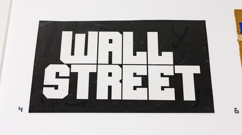
Yes, twice. The best example would be on "Wall Street" with Oliver Stone. I saw the film. I immediately said to Oliver, "This film is so muscular, so big and so bigger than life." The character is — I wanted the titles to go off the screen, be bigger than the screen. And I love the idea. So I wound up doing these big, massive, thick, muscular titles that became windows that you saw the shots that he wanted to put on the screen of the city of New York, playing against a song by Frank Sinatra. So I put all those shots inside these windows of these big letters, and they would travel in the screen. So from left would come "Wall" as a window with a shot inside, and from the right would be "Street." So all the titles played that way: Martin Sheen, [Michael Douglas], [Charlie Sheen], they all came in from both sides and they were windows. It worked really terrific against Sinatra's song.
I went ahead and produced it, spent the budget, and delivered it to Oliver. And the day I brought it to him, he was waiting for it because he was going to show the whole film to Michael Douglas. He was the lead actor and he won the Oscar for it. He wasn't a producer [on "Wall Street"], but he had been a producer, so he had things to say about the film and Oliver wanted to please him. So he was very happy with what I delivered to him. He cut it in and later that day, he showed it to Michael Douglas.
So about five o'clock, I got a call from Oliver and I could hear he was in a noisy restaurant where I guess they'd gone for lunch. And he was telling me very disappointedly that Michael Douglas hated the title sequence and didn't want him to use it, so he wanted to please Douglas. So he said, "We've got to do something else." So within about a week's time, I redesigned and used these tall, strong vertical letters and we just put all the titles over the shots of New York that were inside the windows of the letters. Now this sequence, I have a copy of it on film, and I transferred it to video and it's now in the exhibit. [And] the story that I just told you, that's part of an interview that I did about that experience.
'That's how I approach every project I'm doing'
A lot of movies today don't have title sequences in the way you design them. It'll just be music swells, smash cut to title card, and that's it. Could you talk about why you think title sequences are such a vital part of movies?
Well, yes. And I talk about this if you've seen the little four minute film that was done by the Academy on me, where I talk about how much titles can bring to a film beside the obvious of introducing the titles. It can touch upon and reach the viewer about the setting of the film, the era, the timeframe, details about the character, all those things that can happen as the titles are being presented. So I always try to find something that is essential to the character or the story or the setting, and try to emphasize that in the title sequence so that the viewer gets more of a sense of why they're there, what they're going to see, almost a preview or even a trailer that will bring them inside the film without giving it away. So setting them up to being ready to receive the story and the speed of the story and how the story's told. The method, the style, and the approach of the director can be brought to the titles to help that along. That's how I approach every project I'm doing.
And it seems like the assignments I've gotten lately, they want a whole sequence, the whole complement of regular titles, the technical department heads and things like that. So they're gravitating back to that and they're happy to see that one of the people who did that originally is still around and still working. So it's been nice.
Although I've never gone away. For a while, I did do those abbreviated title sequences because that's what directors wanted. But then everything's put to the end of the film and you've got to design something for the end that properly presents — but it doesn't have the opportunity to bring the viewer up to speed before the film, because now the film has ended. They had to find a way without the help of titles and sequence.
"Dan Perri and the Art of the Title Sequence" runs until January 1, 2023 at the Museum of the Moving Image in Queens, New York.