Why The Animation In 'Spider-Man: Into The Spider-Verse' Looks So Revolutionary
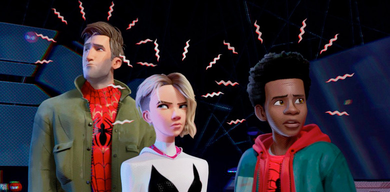
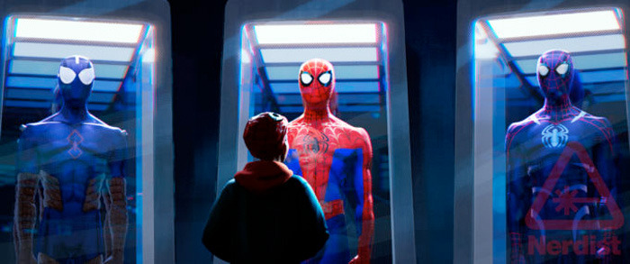
Spider-Man: Into the Spider-Verse has shot to the top of my must-see list this winter. The film, which follows Miles Morales (Shameik Moore) as he becomes acclimated to his new spider powers and is mentored by the forever-broke Peter Parker (Jake Johnson), looks like it'll be charming, heartfelt, and poignant, especially with the smattering of father-son dynamics the film provides (with Brian Tyree Henry playing Miles' police officer father, Jefferson Davis). Also, it looks fantastic. In fact, I'd say it's the best animation has ever looked in the 21st century.
To be more laser-focused, my gripe lies squarely with the tastemakers who believe that 3D is now the only way to tell a story just because the technology is still considered "new," even though it's been in use over 20 years at this point, even before Toy Story came along (let's not forget Reboot, the first 3D-generated TV show ever, and a show that was rich in story as well). There's also the idea that there's only one way 3D characters can look and act in order for it to be deemed as "lucrative." For me, Spider-Man: Into the Spider-Verse, a film combining both 2D and 3D animation techniques, not only allows audiences to rediscover the power of a 2D-animated film, but it also broadens what 3D animation can do.
A Sea of Sameness
Ever since Toy Story, Pixar has dominated the look of 3D films so much so that every other studio has designed their characters off the Pixar mold. So what's the Pixar mold? Generally, it involves creating characters who look smooth and clean, almost like well-sculpted figurines. There's always an issue when it comes to women characters' designs in animation as it is – there's a lot of sameness with big eyes and round, blank faces. But even with male characters, who thankfully do have different silhouettes, there's still a sameness, a polished slickness even, that make the designs slightly underwhelming. I just have a big sigh at the lack of grit there is for my eyes to latch onto.
This same polished slickness is something that's carried over to Dreamworks, Illumination Entertainment, and even Spider-Man: Into the Spider-Verse's home studio Sony, despite Cloudy with a Chance of Meatballs and Hotel Transylvania being films that actually embraced the limitlessness of animation as a storytelling medium. (Let's not also overlook that 99% of the cast of characters in these films are all white, adding to the sameness.)
So, the state of 3D movies isn't the fault of the technical application itself. It's the fault of those who feel like there's only one way a successful 3D movie can look and feel. Despite its age, perhaps 3D animation still isn't old enough to have developed into offshoots of different styles and phases. Throughout Disney's domination of 2D, its house style changed with the passing decades from heavy rotoscoping (such as Snow White), flat Xeroxed cel animation (a process that defined the look of Disney films in the '60s such as 101 Dalmatians and Robin Hood all the way up to the '80s Oliver and Company), and what we consider the classic look of the Disney Renaissance from the late '80s to 2000, as showcased in The Little Mermaid and Aladdin, The Lion King all the way up to Tarzan.
Similarly, with the rise of Disney came other animation houses that gave fans alternative spins on the Disney formula. Of course, there's the obvious titan Disney has always had to contend with, Warner Bros. But there were other smaller production houses who managed to cut in on Disney's power substantially, like Don Bluth Productions (also known as Sullivan Bluth Studios) which put out a range of weird and fascinating films in the '80s and '90s, including The Chronicles of NIMH, An American Tale, The Land Before Time, All Dogs Go to Heaven, Rock-a-Doodle, Thumbelina, and The Pebble and the Penguin as well as their adjacent work on Anastasia and Titan A.E. Rich Animation Studios (now called Crest Animation Studios) is best known for the 1994 film The Swan Princess as well as late '90s and '00s films The King and I and The Trumpet of the Swan. There was also Ralph Bakshi in the '70s and '80s, who created highly adult and sometimes disturbing work like Fritz the Cat (the first animated film to get an X rating from the MPAA and the most successful indie animated film ever), The Lord of the Rings, and Cool World.
Each of these films are distinct from each other and provide a different point of view other than just appealing to kids or all-age families. For instance, despite some racial and sexual orientation stereotyping that looks really ugly in the cold light of the 21st century, All Dogs Go to Heaven features adult themes such as crime, drinking, murder, existentialism and the afterlife, including a vision of Hell. An American Tale expanded the notion of a "children's film" by allowing its young audience to feel complex emotions such as loss and anxiety while watching Fievel, a lost immigrant mouse, find his family in New York City.
Yes, there are are a lot of different production companies now that make 3D films, but it's difficult to say if there are any major indie houses who have been able to act as intense competition. The competitiveness is part of what made the 2D animation world more exciting. Despite the Disney style pervading the times, there was still enough leeway in the system to where if an animator wanted to form their own company, they theoretically could and create a splash big enough to be taken seriously. In fact, many of the indie houses mentioned above were, in fact, headed by former Disney artists. Maybe it's just that the times are different; in this age of conglomerates and sequels-as-business-practices, it's hard for an animator to think about leaving what is a cushy position. Just think about Illumination–it's the most prominent 3D animation studio that isn't spearheaded by one of the big corporations. The animation world has gone from several players in the animation scene, filling all levels of popularity, to just one lone player in a sea of bigwigs (and the smaller companies they contract for service work).
A Bold New Look
Long story short, with little competition and little stylistic evolution in the past decade, the animation game feels like it's once again in a stagnant mode. Enter Spider-Man: Into the Spider-Verse, which shakes things up. It's a film that doesn't look like a 3D film, but it is, in fact, fully CG. Producer Christopher Miller (who co-directed Cloudy With a Chance of Meatballs and The LEGO Movie) said the film is a new process treats CGI with "line work and painting and dots and all sorts of comic book techniques" in order to create what they call a living painting, looking as if it's all done by hand. The end result finally gives 3D animation a wake-up call and a jolt of energy.
It could be argued that Miller and frequent collaborator Phil Lord (who also wrote Into the Spider-Verse) have always been some of animation's new renegades, since Cloudy and The Lego Movie film series have given shocks to the 3D animation system. But this time, Lord and Miller have definitively raised the bar as to what 3D animation can do. By combining the style of 2D and injecting the art style of Miles Morales' co-creator Sara Pichelli, Spider-Man: Into the Spider-Verse has created a 3D film that can stand on its own. It redefines what audiences might think of as a 3D animated film, and I think, it'll have people asking for more from future films.
It should certainly give the big studios pause and make them ask themselves how they can raise their game going forward. For many of the studios, there's a formalized way of doing things, it would seem. But if you want to really make waves, you have to get out of the standard mode sometimes and break the rules. Lord and Miller have done this throughout their career, and it's surprising how few times 3D animation studios decide to draw from the Lord and Miller playbook of "No Rules Is The Rule." Is it that the bigger studios no longer feel threatened by competition, or is it that they're so big they can't recognize that the proper way to respond to competition is to adapt and adjust? Who's to say. But with a statement as loud as Spider-Man: Into the Spider-Verse is in animation landscape, they'd be unwise not to listen.
Squash and Stretch
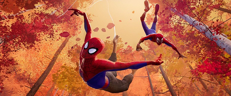
Spider-Man: Into the Spider-Verse's style plays right into what's so amazing about 2D animation. The style has the ability to defy conventions, but it also has the ability to subvert physics, which makes the sky the limit for showcasing action. What better way to capture the image of our web-slinging superhero flying through the city than with a medium that allows you to do whatever you want?
One of the most iconic tricks in animation is "squash and stretch." The principle of animation helps objects and people feel as if they're moving in space, and if exaggerated enough, can convey emotion and supercharge a scene with visual excitement.
As video game animator Daniel Floyd discusses in the YouTube video series Extra Frames, squash and stretch is something that lends itself well to 2D animation because, as Floyd says, drawing distortions in characters is easy to do since it's all done with your hand. But while applying limiting amounts of squash and stretch can be done in the computer, squash and stretch is, overall, a lot more difficult because it's harder to work around the skeleton frame made for characters. When it comes to computer limitations, it would require a lot of extra work to incorporate squash and stretch. This is one reason why many 3D animated films seem more stagnant. In some cases, that comes off as "realism." But in terms of animation, it can sometimes seem like the storytelling ability of the animation is being held back in exchange for the technological capabilities of rendering complex objects.
Even though it is more challenging, there are some 3D films that do apply squash and stretch to the extreme, such as the Hotel Transylvania series. The main reason this film series feels more like drawn animation in terms of character flexibility is because of director Genndy Tartakovsky, who comes from the world of 2D animation and has made popular shows such as Dexter's Laboratory and Samurai Jack. In Hotel Transylvania, the characters are constantly exaggerating their bodies for comedic effect as well as for the sake of characterization. The overall effect creates a film that feels more like a traditional cartoon rather than 3D figures moving about in a scene.
Another example of squash and stretch in a limited, but effective capacity is in The Incredibles, when Dash runs from Syndromes goons. The effect is used around Dash's arms and legs to make it look like his really is racing for his life. In fact, while there are many uses of squash and stretch in The Incredibles to convey action, this scene probably has the best use of it, since it's a primary driver of the action for that scene in particular.
However, in a lot of 3D films, there's still a static quality to the characters because some of the things that worked in 2D just can't translate 100% to a computer. However, Spider-Man: Into the Spider-Verse looks as if it's intent on bridging that gap.
Bridging the Gap
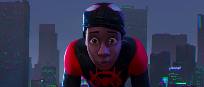
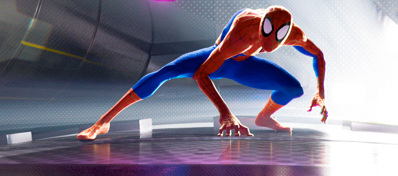
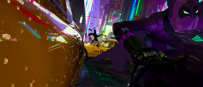
From the trailers, some of the action sequences give us an indication that quite a lot of squash and stretch is going to be used to bring the cartoony element of the comic book pages to life. Squash and stretch is going to become even more apparent when we see more of Miles Morales in action. In the footage we've seen, you can see small glimpses of Miles's body pulled out and squashed in in order to give him gravity and speed as he flies through the air. The technique is also used on Peter Parker himself; in one of the final frames of the main trailer, Peter, in his Spider-Man suit and mask, is reacting to Miles, and you can see Peter's mask stretch vertically as he opens his eyes wider, giving the character a sense of liveliness.
Some squash and stretch is also seen when some of the film's villains are fighting Miles. They don't just merely punch; their fists morph through the air as they try to connect their punches. Like with Miles, the technique adds weight and speed to the punches so that they look devastating and impactful.
Unfortunately, we can't see a ton of Miles or Peter in action in either trailer; clearly, they're trying to save all of the best parts for the feature release. But just from what we've seen, Spider-Man: Into the Spider-Verse is going to use squash and stretch as much as they can to add characterization as well as heart-dropping stunts so that you feel like you're falling with style through the air just like Miles.
The use of squash and stretch also blends into another principle of animation, exaggeration. Once again, exaggeration is tougher in 3D than it is 2D, but Spider-Man: Into the Spider-Verse is intent on bringing the 2D concept of animation to the 3D world.
A Return to Exaggeration
Throughout the trailer, much of the excitement and action generated comes from the exaggeration of movement. As Miles swings through the city while gaining control of his powers, you see his legs and arms move frantically in the air, conveying how he's clear he doesn't know where he's going to land. His arcs of motion are generally wide, impressing upon the viewer that this action is not only happening in a realm of spatial depth, but it's happening to a skinny kid who doesn't have control of his body.
The exaggeration also comes in the form of the amount of comic book texture that's layered over this film. The villain's punches and explosions, for instance, are coupled with direction lines, comic book dots, and impact statements like "BOOM." The exaggeration can also be found in the overall film's style itself, with the rich, neon colors suggesting a heightened, more fantastic image of New York City.
Overall, Spider-Man: Into the Spider-Verse achieves something I've always wanted from 3D animation, which is to be blown away. Up until now, the technique has been cool for subtle storytelling, but has never given me the same feeling I used to get watching 2D animation. However, with this film, I feel like I'm a kid again watching larger-than-life characters doing amazing things. Spider-Man: Into the Spider-Verse is pushing 3D into the future by combining old-school elements of its 2D past. Let's hope the rest of the industry takes note.