Nerding Out: How Pixar "Monsterized" The World Of 'Monsters University'
A couple weeks ago I visited Pixar Animation Studios in Emeryville, CA to learn about the five year process of creating Monsters University. The clever folks at Pixar organized the day into a series of classroom environments, each with a teacher who served as a department head on the film. One of the coolest classes explained how Pixar's art directors created the "monsterfied" college world of MU.
I must warn you, the following report is very NERDY. You're going to learn a lot of information on the little subtle details that go into the architecture and lightening of this incredibly well-thought out computer animated world. You shouldn't however worry about spoilers, as the details are pretty much spoiler-free. Any information discussed in terms of plot could be gained through the trailers and marketing released thus far, so don't worry, you're in safe hands.
 Monsterizing the World:
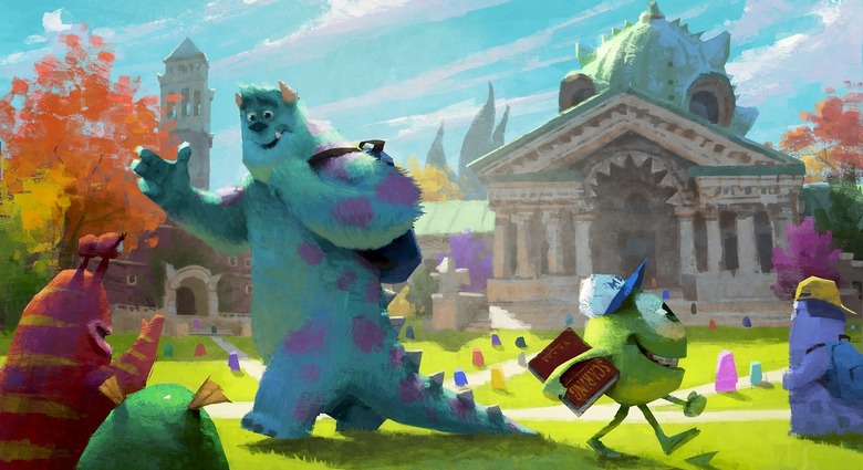
So what does it take to make a "monstery" building? Pixar art designers had to put on a monster hat and become monster architects to try to figure out what are some of the problems they might encounter with the architecture for the campus.
One of the problems that they had to design for in the architecture of the campus is is scale. Monsters come in all sorts of sizes, big and small. That meant the buildings needed to accommodate both.

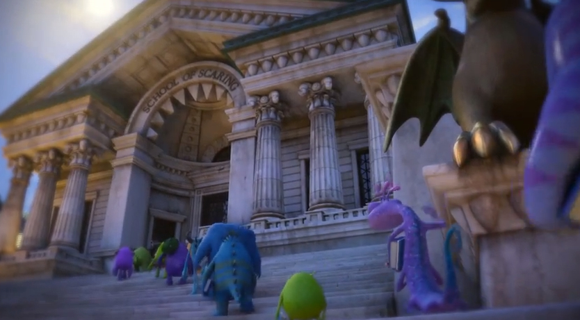
The Scaring School building was built to house really big monsters. So the doors in the front are gigantic but there's also some smaller doors that monsters of Mike and Sulley's scale could also enter the door. A lot of the doors on campus have doors within doors, allowing little monsters to have a little place to enter, a small handle to reach, but also allowing bigger monsters access to larger doors with bigger handles.
The water fountain on campus has many levels, allowing bigger monsters to drink comfortably and not have to stoop too low. And little monsters don't have to stretch too high to get a drink of water.
A more subtle detail at the scare school is stairs which have steps within steps, allowing two scales of monsters to climb up to the entrance.
Pixar didn't just have to consider big and small monsters, but also weight and strange shapes, drawing some inspiration from the character designs. A lot of the monsters have a trapezoid shape, as a kind of a hefty shape that felt weighted at the lower end. So they incorporated this shape in a lot in the architecture of the campus. You will notice the shape in almost everything from the window frames in the dorm rooms, to even the bricks of the buildings.
Some monsters fly, so they needed to consider this when designing the architecture. One example is that the aviation school has perches that allow flying monsters to land and enter at the top floor of the building. Some monsters are underwater creatures, so they designed part of the campus, the underwater school, which is actually submerged in the river.
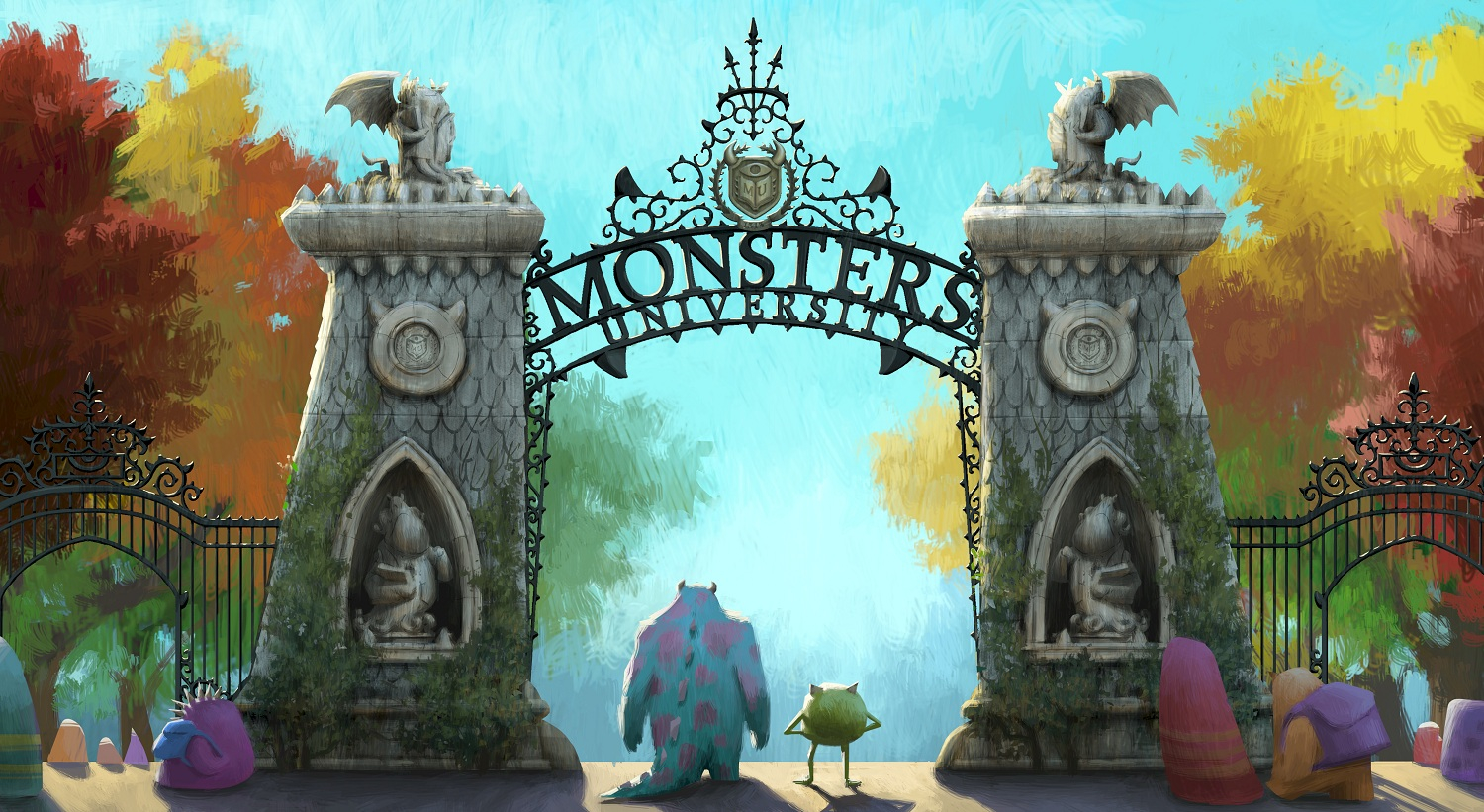
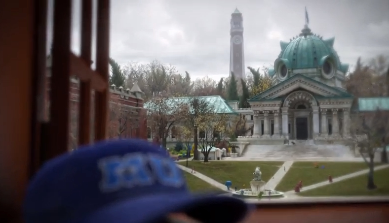
The Pixar team visited a lot of universities for inspiration. A lot of people in the art department actually went to art school, which is very different than the traditional university experience. They visited universities on both the east and west coast.
The Monsters University campus is older than anything we've seen on Monsters, Inc. in terms of architecture, allowing the designers to be a lot more like sculptors.
"We love this idea that monsters love hiding tentacles and eyes and sights and horns all throughout the details of their buildings," says Robert Kondo, Sets Art Director for Monsters University. "We took things like classic kind of motifs. Like egg-and-dart motifs that show up in classic architecture in the human world, we took it and made it into eye-and-dart motifs. And things like that. We've kind of hidden faces in some of the buildings."
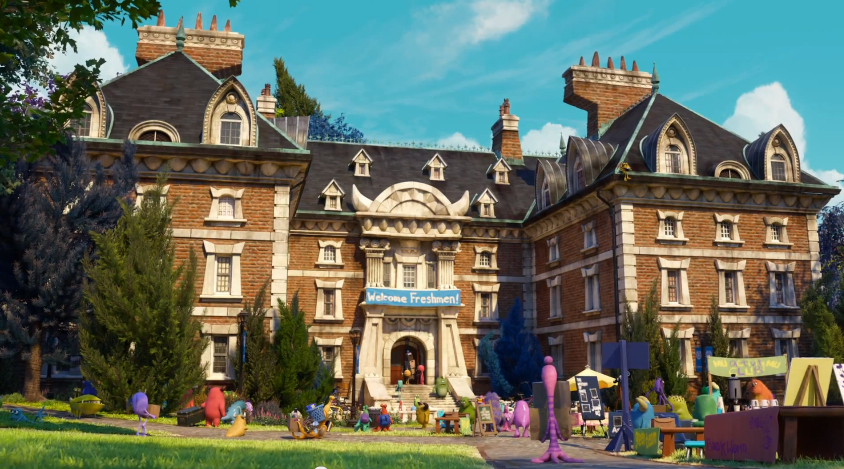
Many of the buildings in Monsters University have hidden monster features, horns, mouths, eyes. The shapes are dialed down so they don't become too distracting.
The scare school exterior has two eyes on the dome and the portal on the front looks kind of like a mouth.
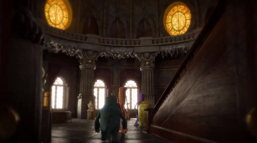
The same idea carries to the interior of the scare school, where the theater stage in the front is kind of meant to look like this mouth and those same eyes, but on the reverse.
Since the Monster world is powered by screams, that concept is built into the world. So instead of gas meters on the side of their house, they have little scream meters which kinda look little monsters on the sides of their house. You'll find pipes running throughout the interiors and even some of the exteriors of the buildings, running to anything that requires energy.
The campus has a lot of vegetation, and the art team at Pixar found opportunities to hide spikes and horns in the trees. Ivy sometimes integrates with the architecture to create tentacled looking monsters on the front facades of the buildings.
"I'd love if the director stop the film to talk about just the sets and the history of our campus" says Kondo. "But of course that never happens. So just like these scream cans, it's something that we needed to kind of communicate visually."
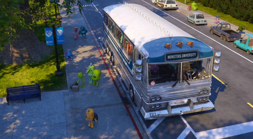
Even the buses have spikes.
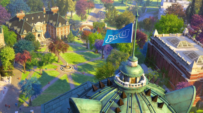
The quad is the oldest part of the school so they designed little dirt paths where the grass no longer grows; the idea is that for generations now, students have been running late to class and cutting across the grass. It's also where you'll find the oldest, biggest trees on campus.
The front paw of a statue in front of the scare school has a more polished brass look because they wanted to imply a bit of tradition: Lots of famous scarerers have actually come through the hallways of Monsters University, and one of the biggest traditions there is to actually rub the front paw of this foot before the first day of class for good luck throughout your semester. (That might be inspired by the plaque at MIT depicting Kodak founder and one-time anonymous beneficiary George Eastman. Rubbing Eastman's bronze nose was an old MIT good luck charm.)
 The Color and Lighting of the Monsters University
Like every other Pixar film, the studio created a color script for Monsters University which is basically a visual roadmap of the story. It follows color and lighting and keeps track of things like emotion, time of day, seasons, and weather.
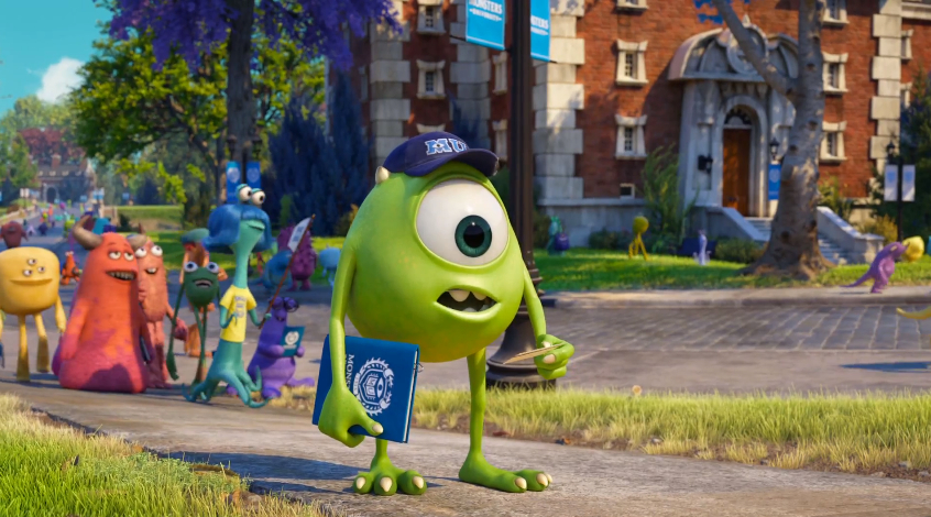
When Mike first arrives at school and he steps off the bus there's a shadow over the bus, and he steps into the morning sunlight. The lighting is designed to emphasize that he is starting a new chapter of his life. Presented with the vast campus of MU we're still looking towards the light, indicating that this sort of hopeful new future is ahead of them.
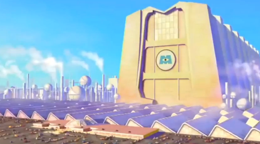
The Monsters, Inc. building from the first movie has an iconic morning light hitting the front side of the building. In Monsters University, Mike's ultimate goal is to graduate to be a scarer, and go to work for Monsters, Inc.
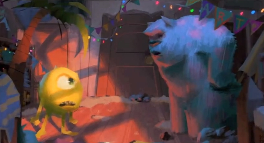
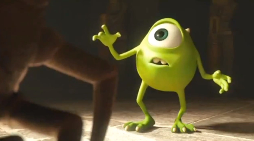
Mike's obstacle elements are almost always backlit. In one scene Mike steps into the shadow form the light, and of course the shadow is cast by the scare school. This lighting is used as a motif to indicate that this is something he has to overcome before he reaches his dream.
Dean Hardscrabble is lit almost entirely from the back side, leaving her face is always in the shadow. Not only does that make her intimidating, but it also indicates that she's an obstacle he has to overcome to achieve his dream.
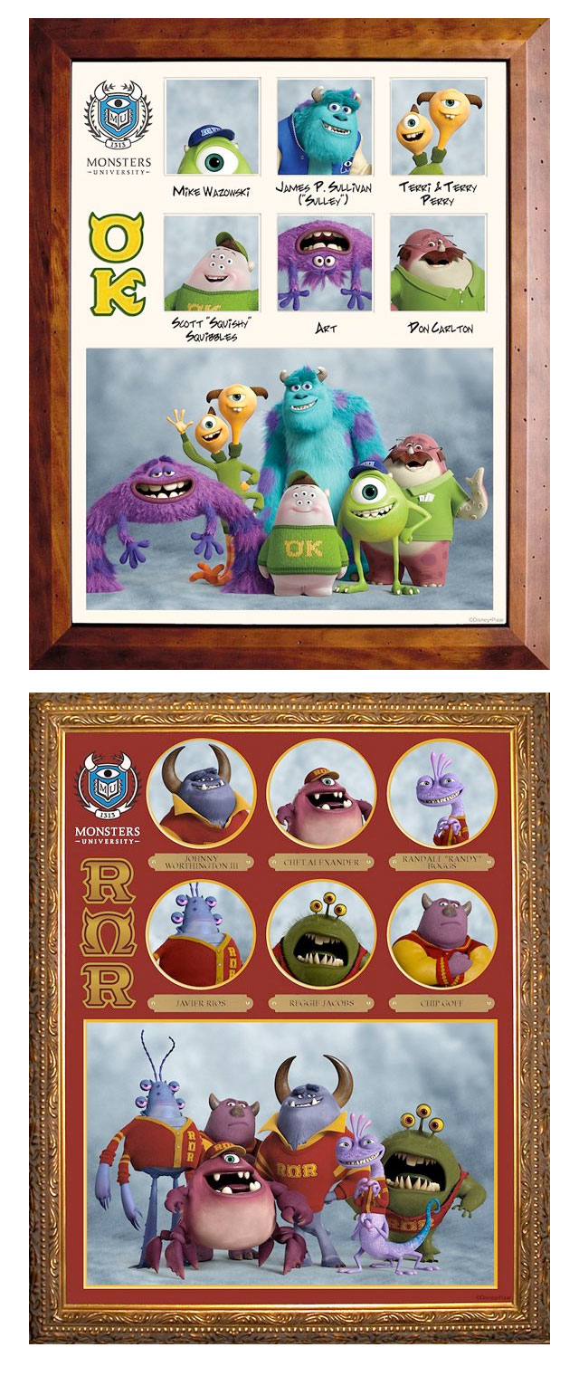
The different fraternities and sororities all have their own identity colors, each of which were designed carefully. OZZMA KAPPA is green and you'll notice it's Mike's team.
Roar Omega Roa has the opposite complimentary color – red, because they are the main advisories in the Scare Games.
"The lighting choreography we had a lot of fun playing with for this film," says Dice Tsutsumi, Color and Lighting Art Director. "It requires a lot of coordination between departments. It's a really challenging thing but we were able to kind of pull it off. Basically in a major story moment, we have our main characters like Mike and Sulley interact with light and shadow." ... "So every department has to kind of work together, to kind of achieve this choreography."
Monsters work at night, so they feel more comfortable in the shadow. So they worked around the idea that going into light is actually intimidating for monsters. So there are certain intimidating moments in the film that the characters are forced to enter harsh light. This is used to indicate an emotional or intimidating situation.
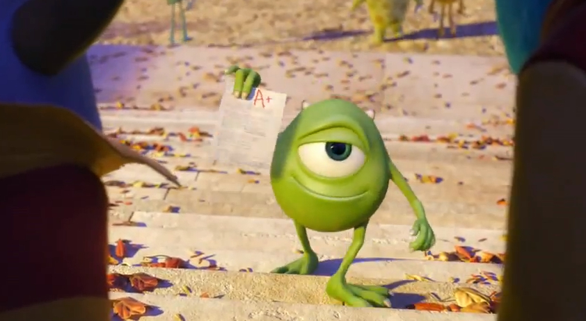
They sometimes used the light to indicate the status of Mike and Sully's friendship. The story is very much about how they become best friends. In the beginning of the semester, Mike has a lot of work ahead of him to beat Sulley. So in the early scene, Mike is in the shadow in his classroom, while Sulley's in the light. As the semester progresses, Mike works really hard and he starts to catch up, he finally passes Sulley, leaving Sulley behind in the shadow and Mike enters the light and he wants to show his grade. At the end of the semester, they're standing exactly where they were in the classroom, but this time Mike is in the light and Sulley's in the shadow.
"It's very subtle, almost to a degree that it doesn't become a distraction, just to really support the feel of the story" says Dice Tsutsumi, Color and Lighting Art Director. "But we did this kind of light choreography throughout the film. When you see the final film, you can see the careful choreography we did all over the place, just for the audience to feel, not really to notice so it becomes a distraction. But really to feel the story that we're trying to tell."