The Making Of "Clock Tower Valley": How Artist Scott C Created His Incredible 'Back To The Future' Print
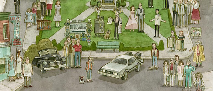
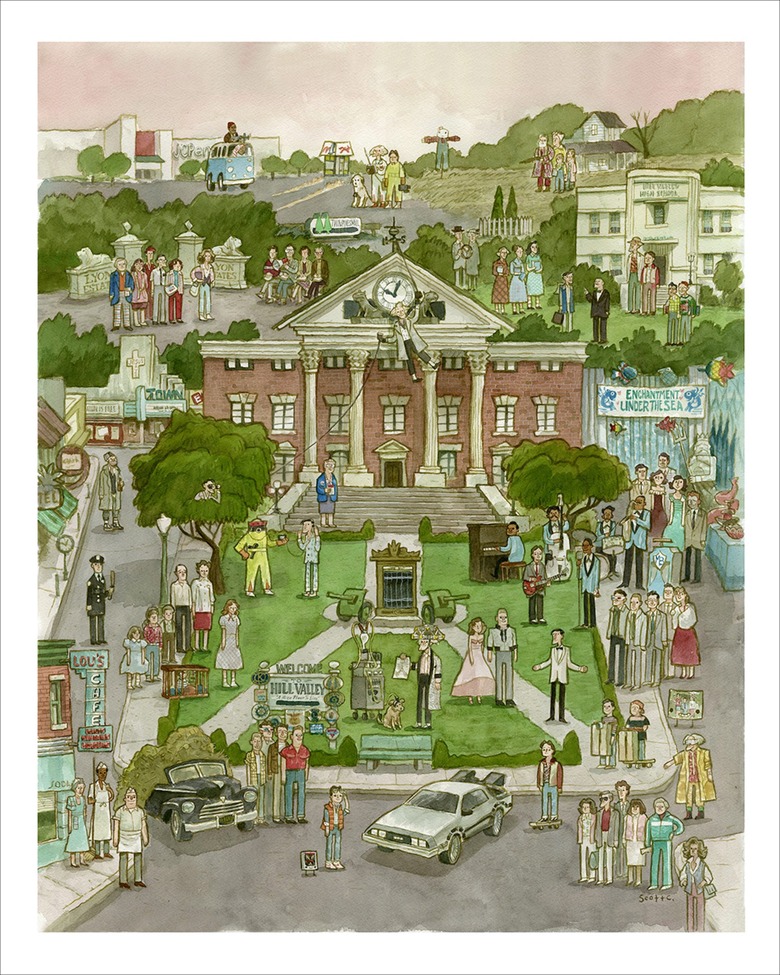
(Artist Scott C is known all over the world for his charming and distinctive pop culture art, but he has outdone himself with the Back to the Future-inspired "Clock Tower Valley." We invited the artist himself to share his process, including photos and videos, guiding us through the creation of this ambitious print. There are numerous references, characters, and locations scattered throughout this piece, each of them requiring care and attention to detail...and Scott offers us a step-by-step look at how it came together. For more of Scott C's work and to pick up a print of "Clock Tower Valley" for yourself, you can visit his shop here.)There are some films that should be held up to the sky and rejoiced. Back to the Future is one of those films. It is a world that I want to live within and explore, so I wanted to create a piece that celebrated every square inch of this film. I wanted it to feel like a Disneyland map or a medieval tapestry with flattened perspective, where one could get the lay of the entire land and decide where and who to visit. I named it "Clock Tower Valley" and I would like to take you on the journey through it's conception and creation. It is a valley of clock towers, prom dresses, undersea dances, cutting edge inventions, hazmat suits, wooden crate scooters, and VW vans. There is a famous orange vest in this painting and a car that travels through time. Let us embark.
Initial Sketches
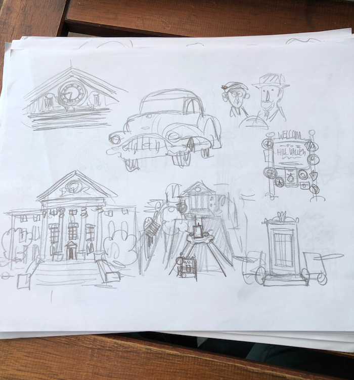
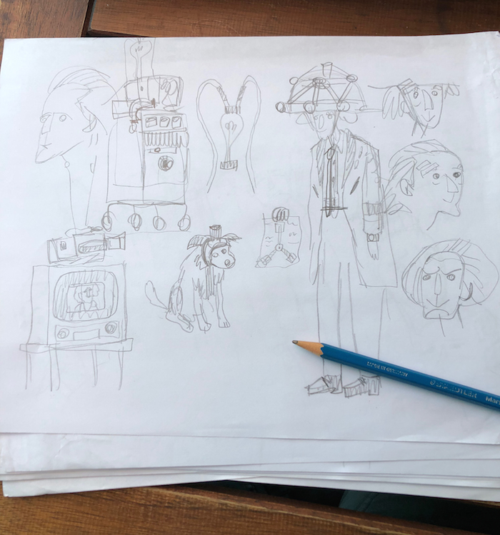
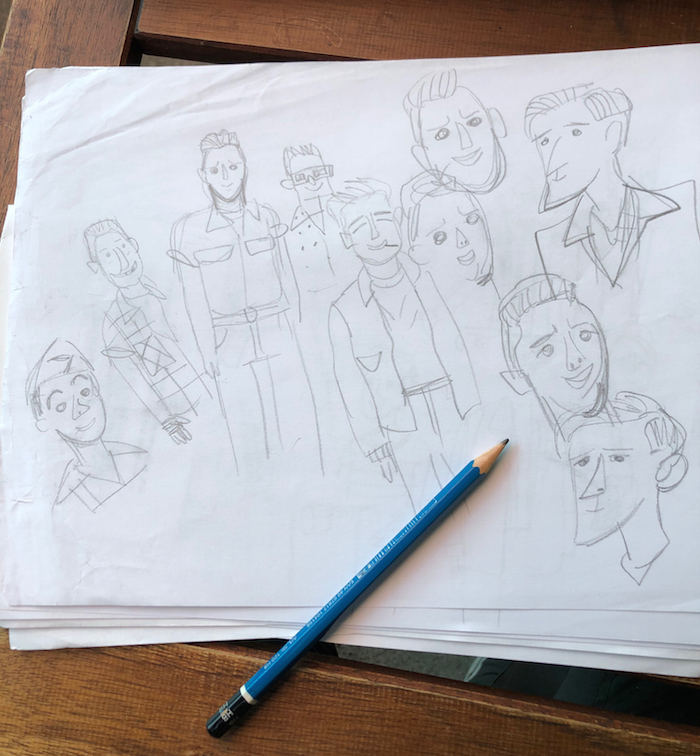
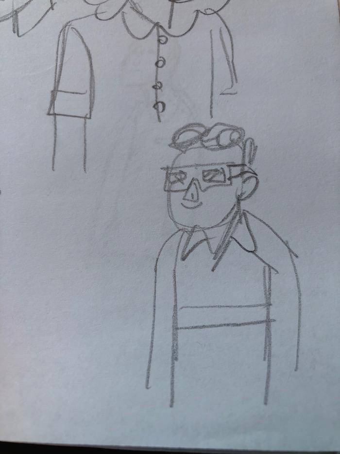
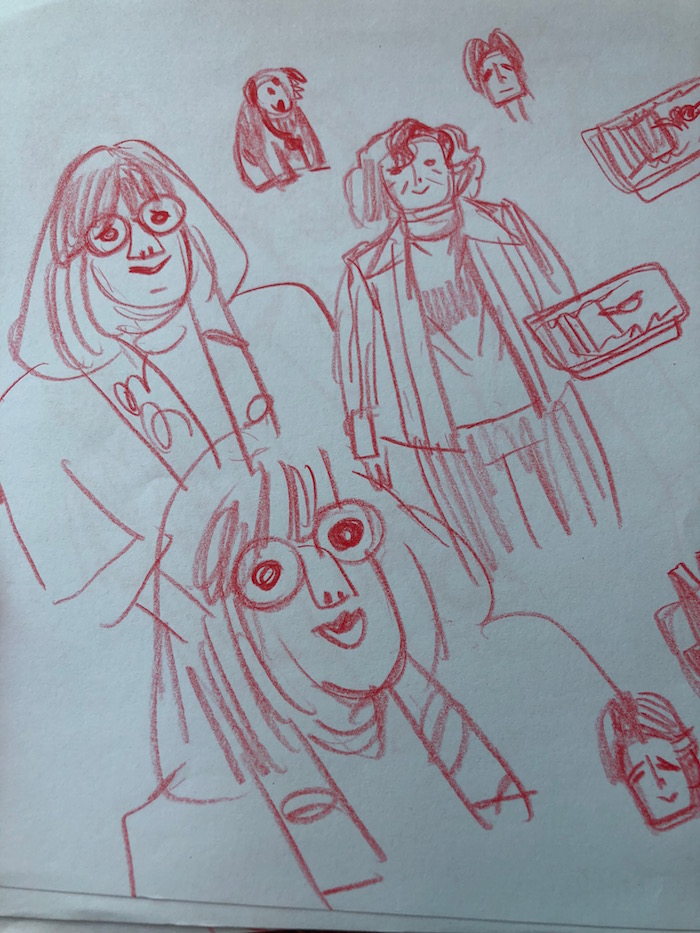
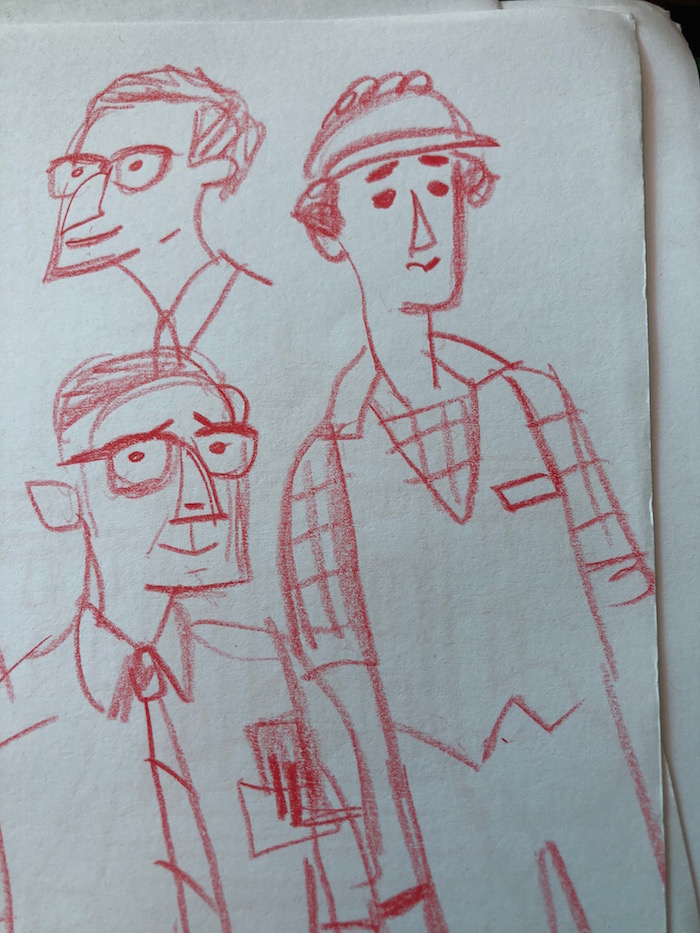
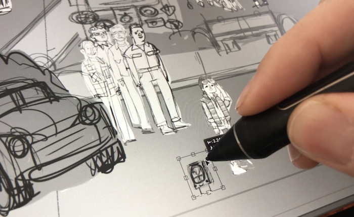
I began by watching Back to the Future for the 128th time, taking screenshots as I went. The film is so iconic that even the most insignificant moments have stayed with me. Background characters and seemingly throwaway moments are just as memorable as some of the main sequences. I wanted it all. I wanted to experience every last detail.Over the next few weeks, I spent time with these screenshots, this mountain of film references. I began sketching these characters, objects, and spaces. I did not know exactly what the final drawing would contain, so it was better to just draw everything and trim it down later. I did thumbnails of what the scene might look like as a whole. I knew that the clock tower and plaza should be the main special element and that everything else should just live around it, so I sketched some thumbnails of that.
Composing the Painting
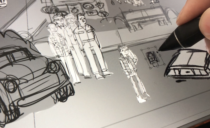
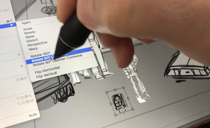
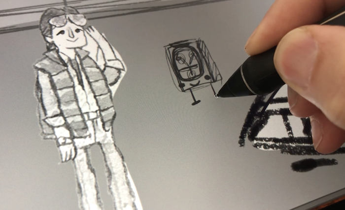
I gathered all of these drawings and scanned them into the computer to compute the heck out of this thing. I cut all of the little elements out of the drawings and began to assemble them in photoshop. I started by enlarging the thumbnail of the entire space and just laying all the cutout characters and elements into the drawing like a puzzle. This is when I decided what things would make the final drawing and what things would be cut. I arranged and rearranged until the scene felt just right.It was at this point that I reached out to my good friend Peter Sciretta over at /Film for his advice on the drawing. I knew that this was his absolute favorite film and wanted to put that knowledge to good use. He suggested adding a few elements, like the photograph of Marty and his siblings. It was difficult figuring out how to incorporate that photograph into the drawing since it was such a tiny little thing, but we both agreed that people would enjoy seeing it. I ultimately solved the problem by just putting some eyes and legs and a little smiling mouth on the photo, like I always do. It really had it be its own character. I did the same with Little Flux. I like bringing objects to life in paintings, so they can hang with everyone.
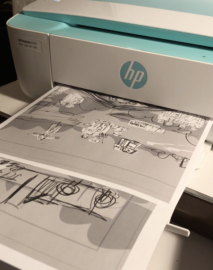
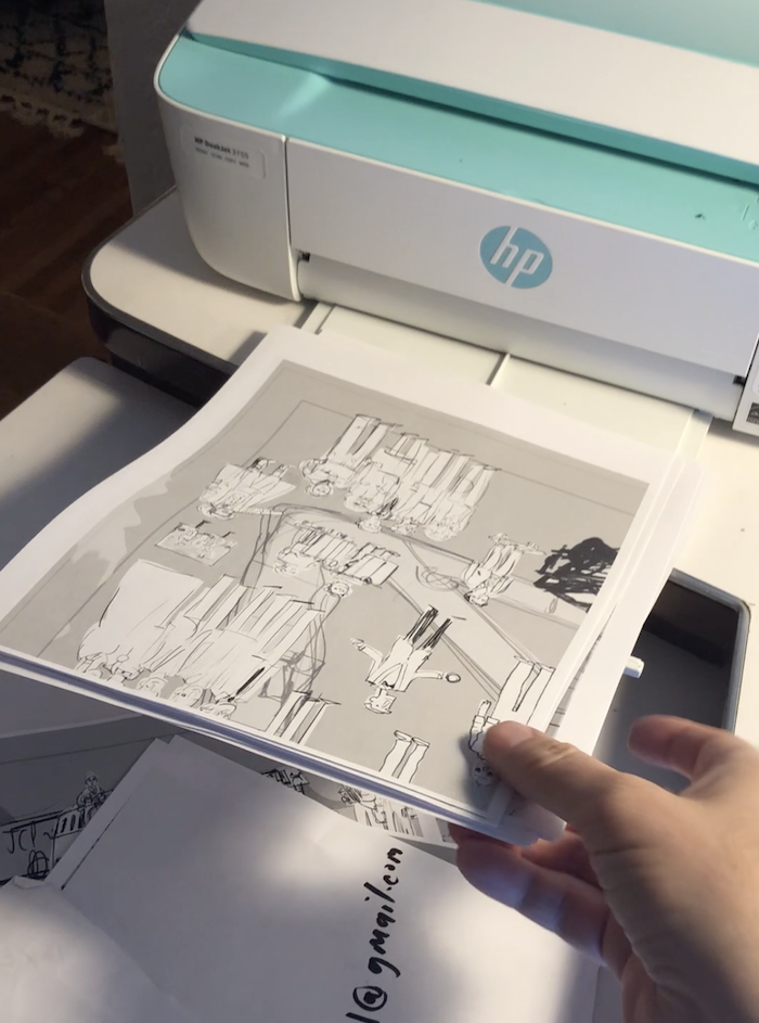
Printing It Out
Once the overall drawing was as final as it was going to be, it was time to print it out so I could trace it onto watercolor paper to be painted. However, the drawing was still fairly rough at this point. Likeness is sometimes a finicky little beast. If I feel like I have nailed the likeness of a character too early in the process, I become fearful that I will fail with the likeness in the final piece. It's just an inner battle I always have with myself.
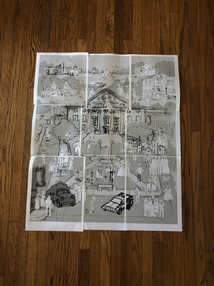
Taping It Together
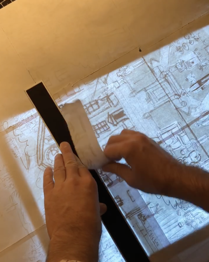
My printer only prints on 8.5" x 11" sheets of paper and this was a big painting. So I needed to tape the pieces together to make it nice and big.
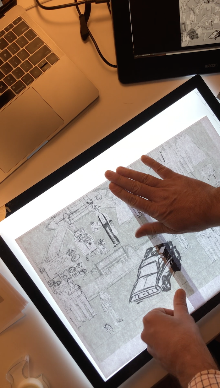
Tracing It Onto Paper
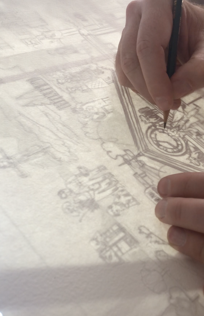
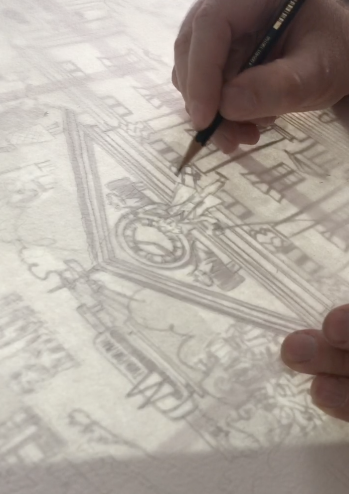
I brought the taped-together Frankenstein paper over to my light table to trace the drawing ever so lightly onto my big piece of watercolor paper. I used a 4H pencil to ensure that the drawing remained light. Too heavy of a graphite line would muddy up the paints later on.
Color Swatch Time!
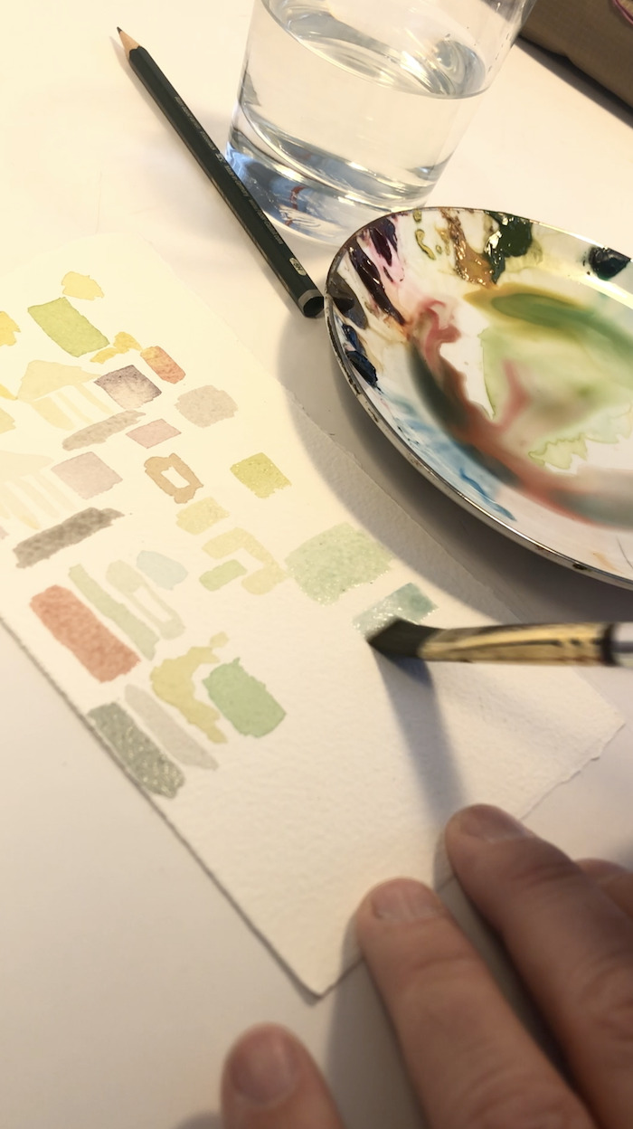
Once the drawing was there on the paper in all its faint splendor, it was time to figure out the color scheme. In a painting with so much going on, it is a good idea to simplify the color scheme as much as you can. I selected a few basic colors as a road map to stick to for the background elements. I painted little squares of color that professional artists call swatches. Feel free to call them swatches even if you are not a PROFESSIONAL. You can live your life how you like!
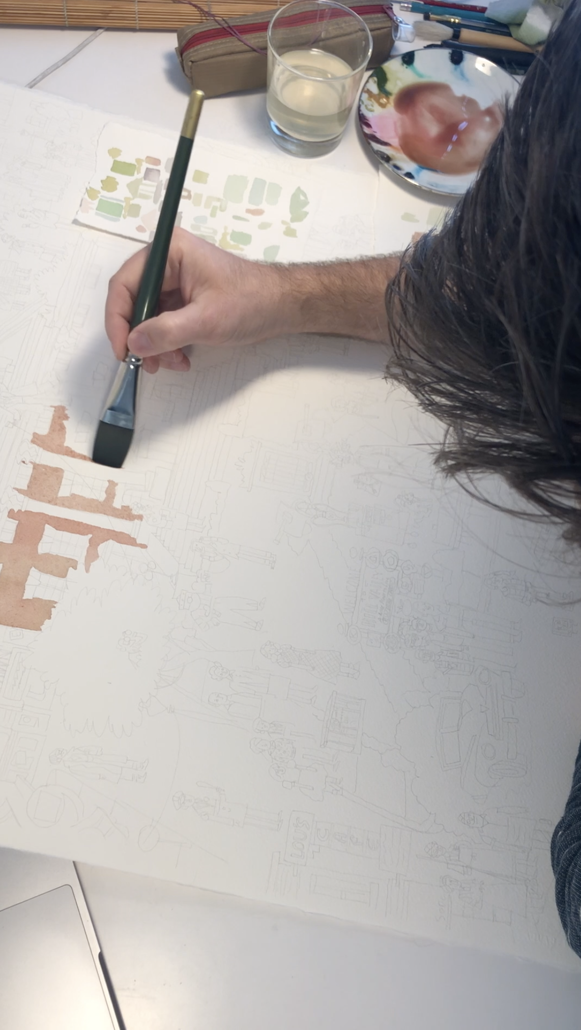
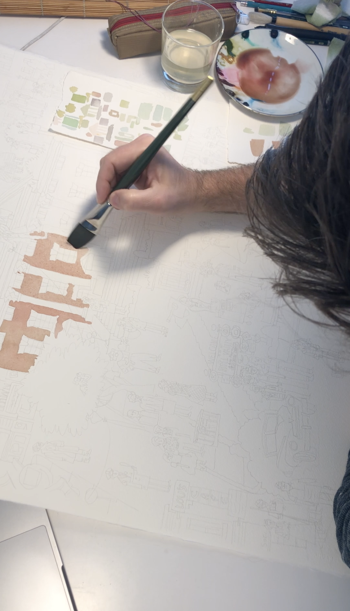
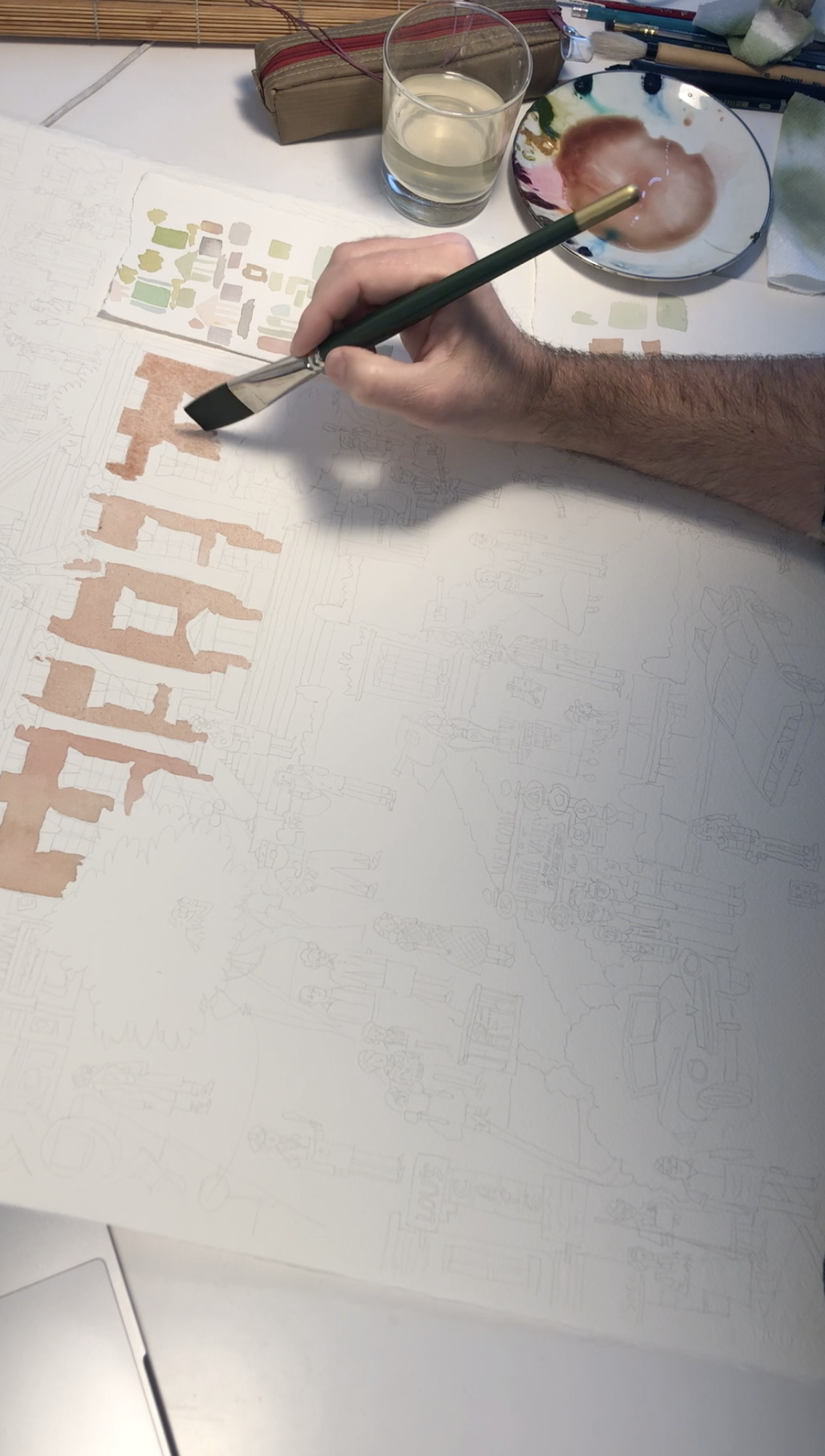
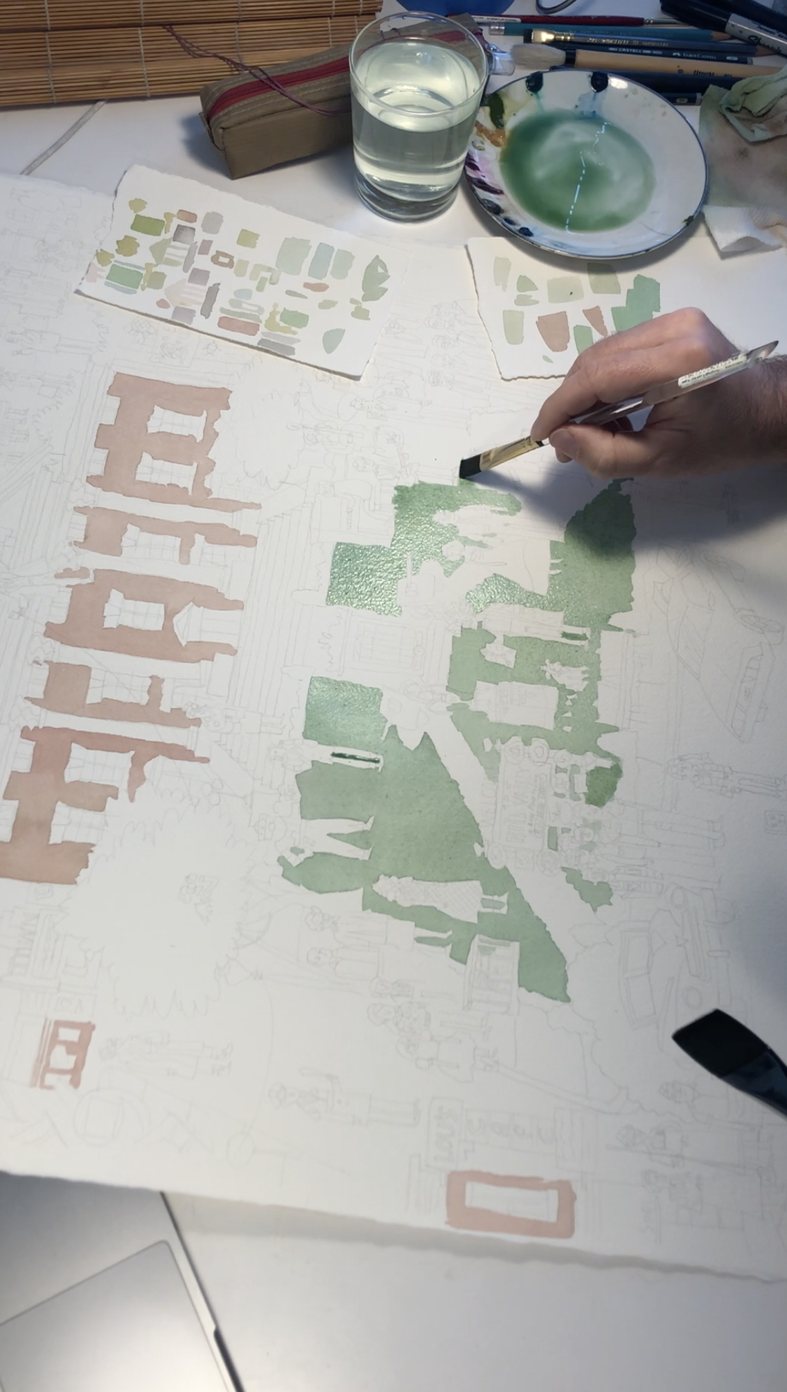
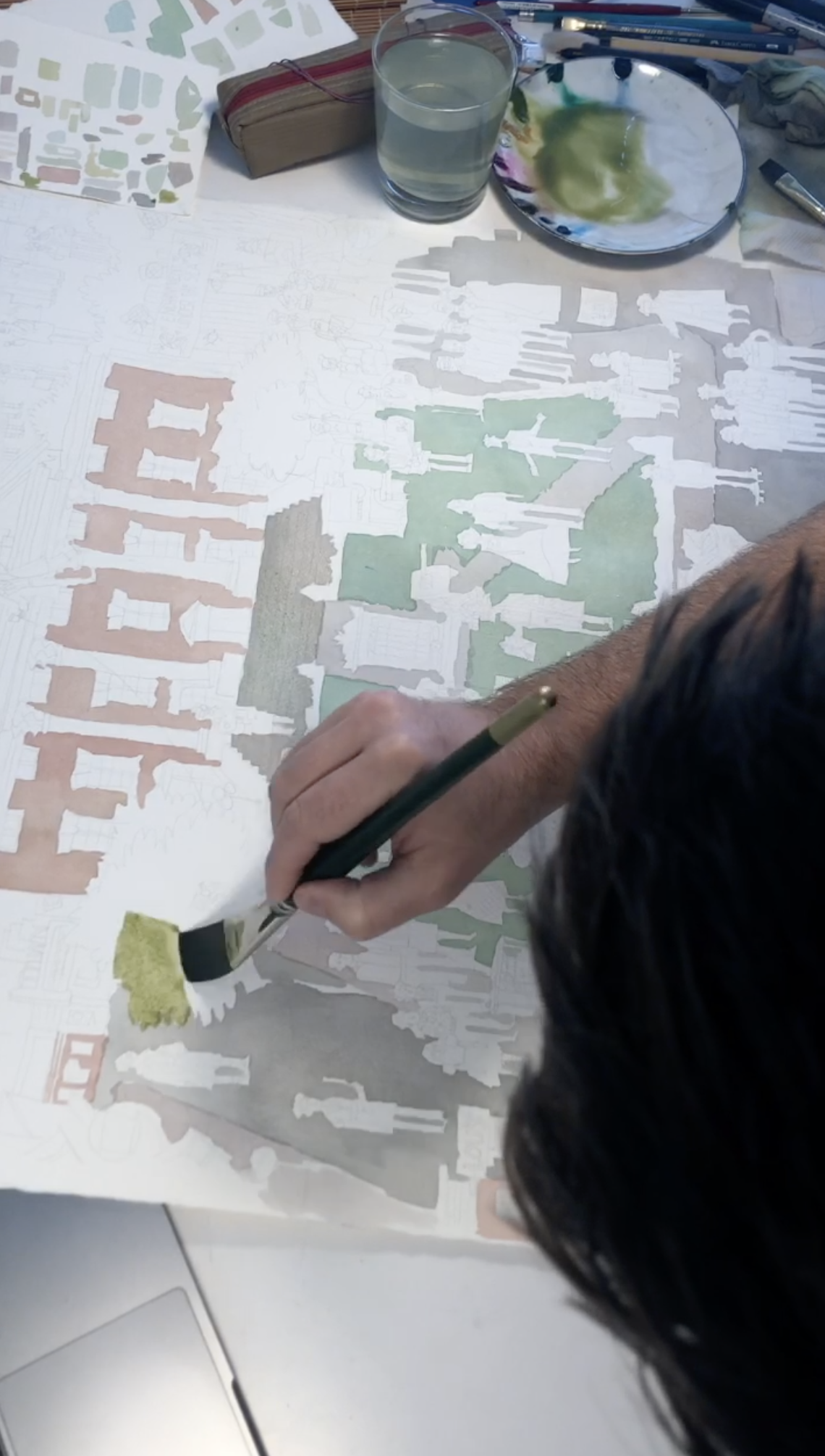
Blocking in the Big Shapes
It was time to really get started. I began by laying in the big areas of color. I like to do this first – it feels like I have accomplished big things right up front, getting an overall feeling for how things will look.

Character and Object Colors
Initial colors often take the longest to get in there because decisions need to get made. Luckily, the color schemes of the outfits have already been chosen by the costume designers on this film, so I just looked at my reference. I gave myself a bit of a break on this and just plugged everything loosely in there. It always looks like a real mess at this stage, but that is how it goes. We will save it later with lines!
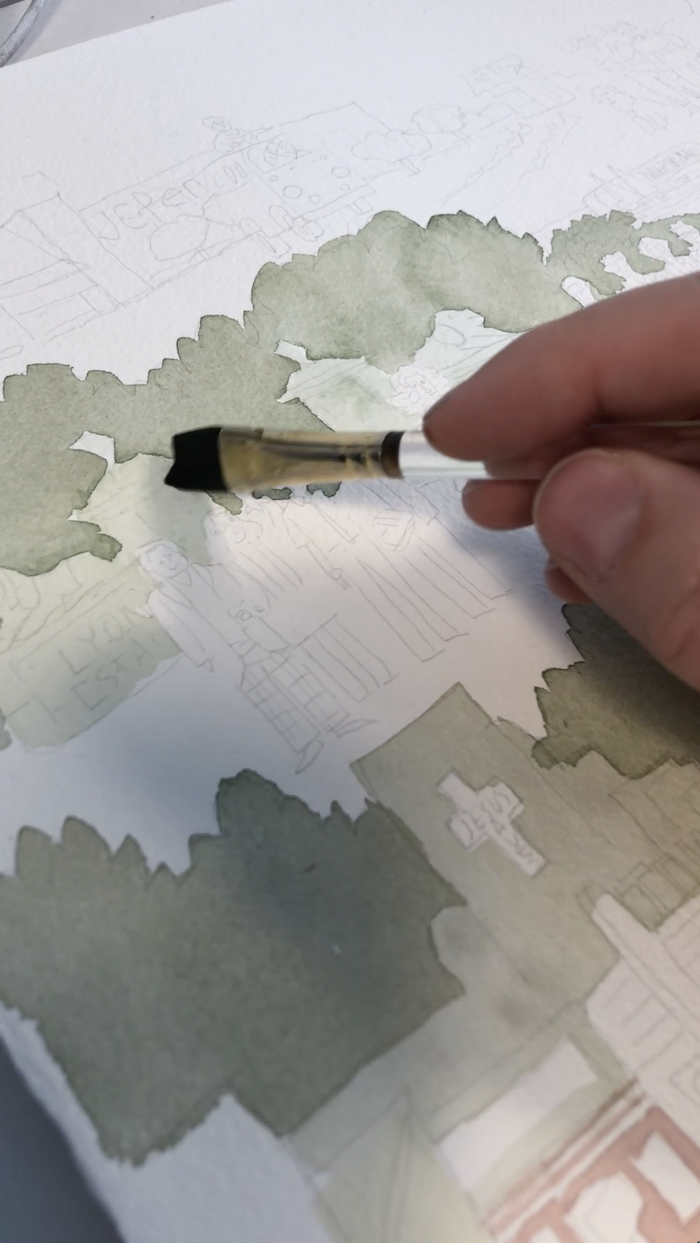
Mixing Up That Line Color
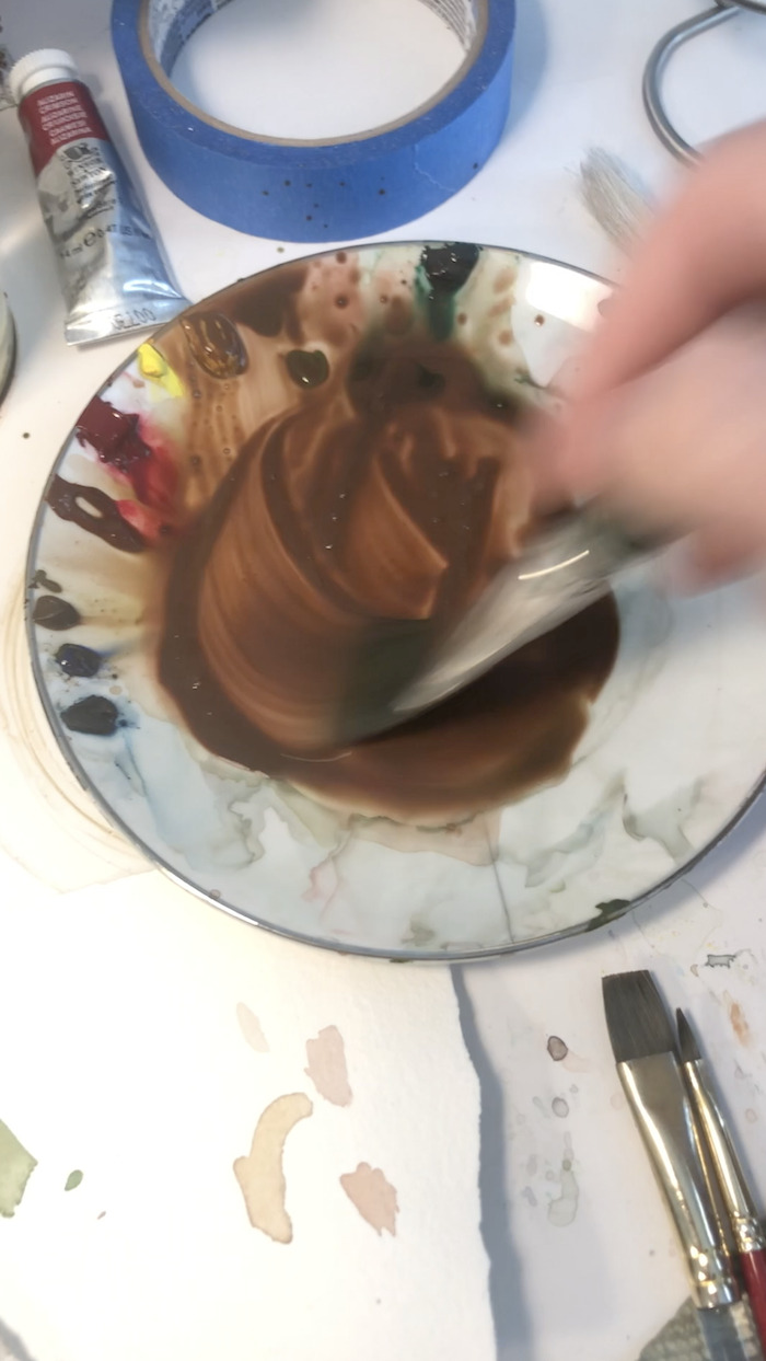
Once the basic colors were all blocked in, it was time to mix the big batch of dark reddish brown for the linework. I put some burnt sienna in there, yellow ochre, olive green, vermillion green, some blue...heck I put almost every single color in there.
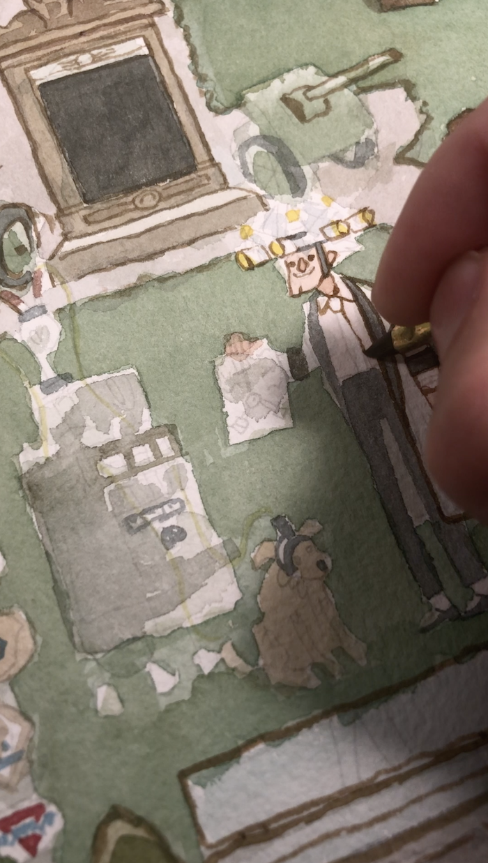
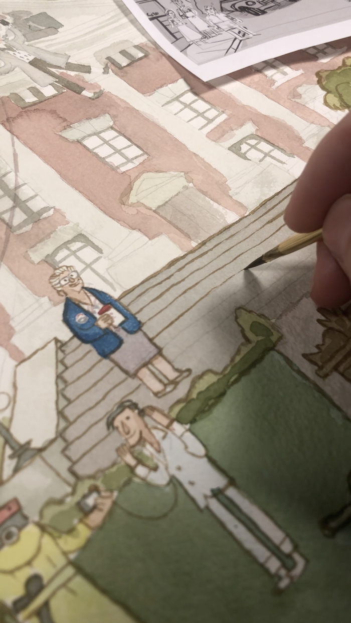
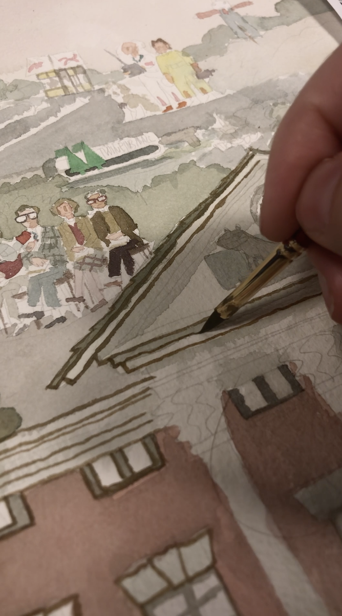
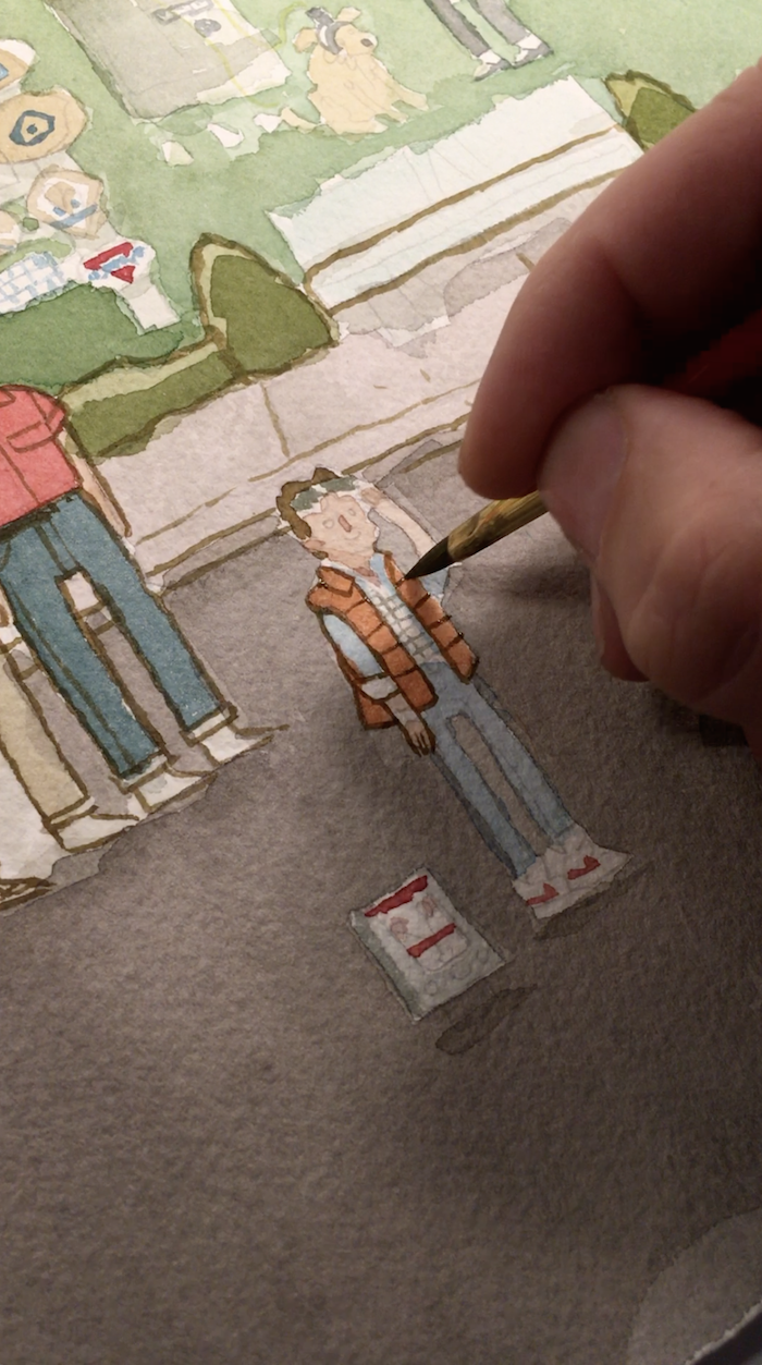
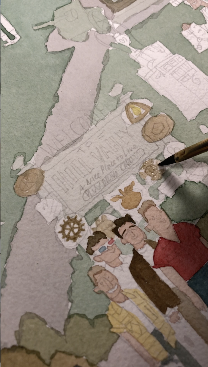
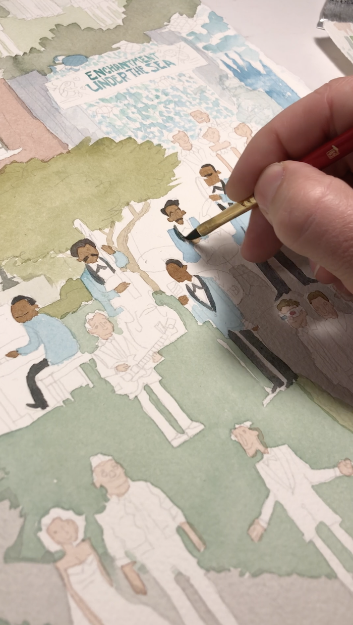
Linework Time!
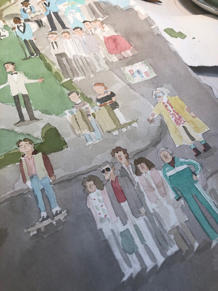
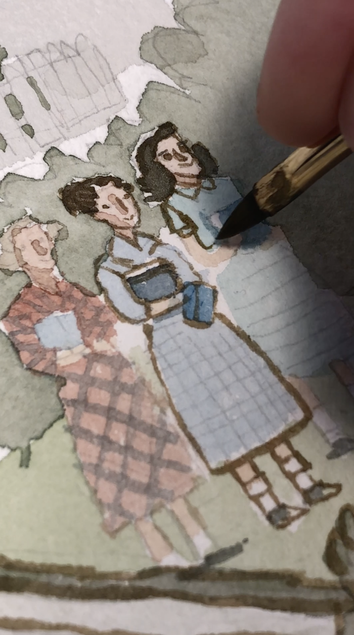
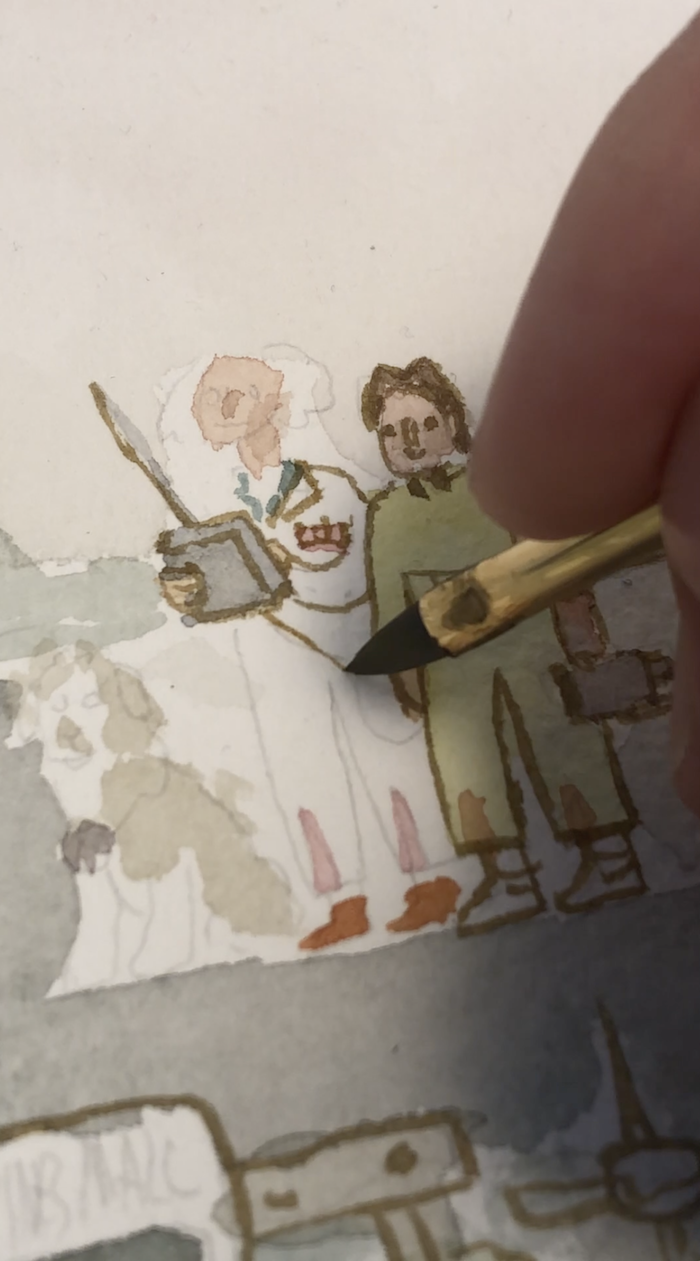
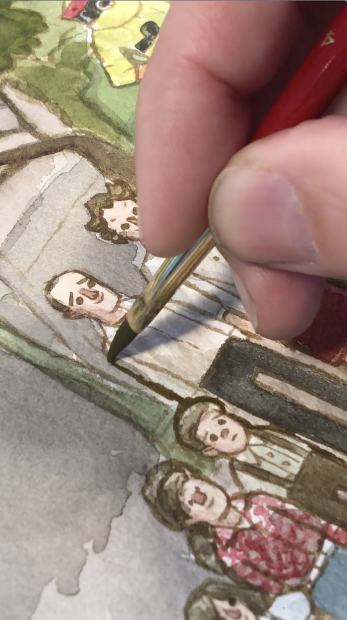
My favorite time! Linework time! This was when those blobs of color that vaguely look like characters and buildings began to take shape. But this was also a rather stressful time because this was when the likeness of the characters either hit and miss. Some of the likenesses felt like successes while others felt a bit like misses. But you can't win them all. If any of the likenesses were just too overwhelmingly bad on a character, I just got my paper towel wet and wiped that part out and started over. Watercolor is quite forgiving in that way. If you don't like what you painted, just wipe it out and do it again! I definitely did that in this painting here. Especially with Marty's face. His face was tough to get right.
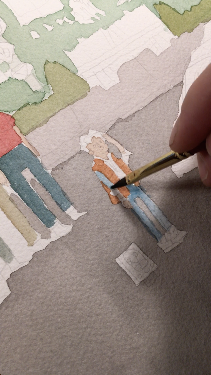
Punching Up the Values
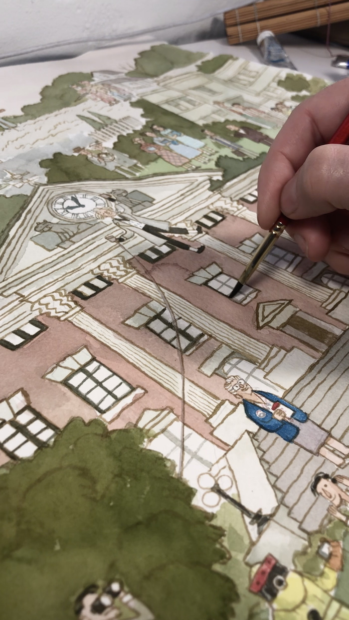
Once all the linework was in there, it was time to relax! I just needed to punch up all of the values. The colors were all quite faint at this point, with limited value contrast. I like to push the darks as much as I can, varying the levels of the mid tones.
I like to listen to podcasts at this point in a painting because my brain can finally enjoy things again. I listened to a lot of Comedy Bang Bang and Unspooled during the course of this painting. In the early stages, where I had to use my brain for drawing and composing, I listened to lot's of good old EDM. That stuff is like a little repetitive brain massage.
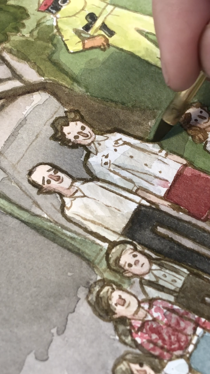
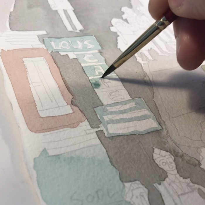
Popping Those Outlines
This thing was almost done at this point, but the time came to go back and heft up some of the outlines on these characters to help them pop. This is a little cartooning trick, you guys. Make the lines on the inside fainter and thinner than the lines on the outside. Sets that character right in there on top of the background.
Colored Pencil Accents
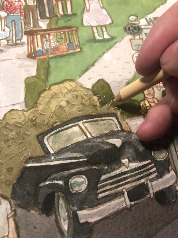
Some parts of the painting needed some light colored lines. I brought in my colored pencils for the rocks and pebbles, stripes on shirts and dresses, and bits of hay in that pile of manure.
Calling It Done
At some point, you need to call that painting "DONE." I could probably work on a painting indefinitely, but I do not have infinite hours to work on a piece. I just need to call it DONE, so I can walk away and get some fresh air and shift focus onto new projects. So I called this thing DONE! I now present it to the masses!And that is how the story goes. I hope everyone enjoyed this little journey through "Clock Tower Valley". This was a piece I have wanted to paint for a long time and it felt good to revisit the movie that helped shape my world so much.