The Nerdiest Controversy Ever: The Wrong Font Was Used In 'The Force Awakens' Opening Crawl

Star Wars: The Force Awakens is one of the most popular movies of all time, and we've posted about all the hidden Easter eggs, seen many video essays about the plot comparisons to A New Hope (which even Abrams has admitted was by design) and seen a bevy of posts and videos pointing out the film's flaws. But one error I haven't seen mentioned many places in the mainstream press is the fact that Star Wars: The Force Awakens opening crawl features a different font from the previous six live-action films. And there's almost nothing nerdier than typography and font geekery, but if this kind of thing interests you, hit the jump and find out how it's wrong.
An essay on Medium by FixTheCrawl was the first to point this out:
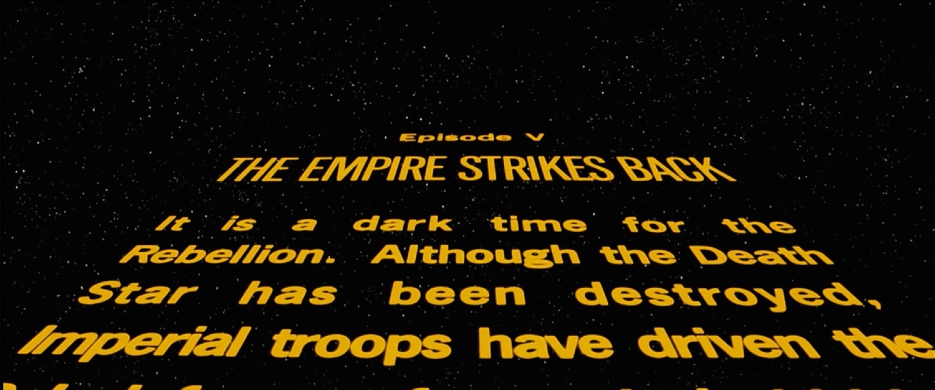
The 'roll-up' has a very specific typographical treatment in the previous six films – and the font used for the episode title, "The Force Awakens", is wrong. Really wrong. The Star Wars opening crawl is perhaps the most famous narrative device in cinema history. Star Wars has many stylistic hallmarks, such as the Kurosawa-inspired scene wipe. But the opening crawl has become so associated with Star Wars that no other film could possibly use it without seeming like a blatant lift. In fact, you might say that the opening crawl is the thing that makes a Star Wars film feel like The Real Deal™. When series creator George Lucas got his chance to make the first sequel to Star Wars (1980's The Empire Strikes Back), he made a very controversial move — re-titling his original blockbuster, Star Wars, by appending Episode IV — A New Hope. With this in mind, he decided the visual consistency of the opening crawl across all future episodes would be so sacrosanct, that he completely re-shot a new opening crawl that contained the new title and episode number. Ever since, every main saga episode of Star Wars has contained the Episode number, typeset in the News Gothic family, and the title of the film itself, typeset in the Univers family.
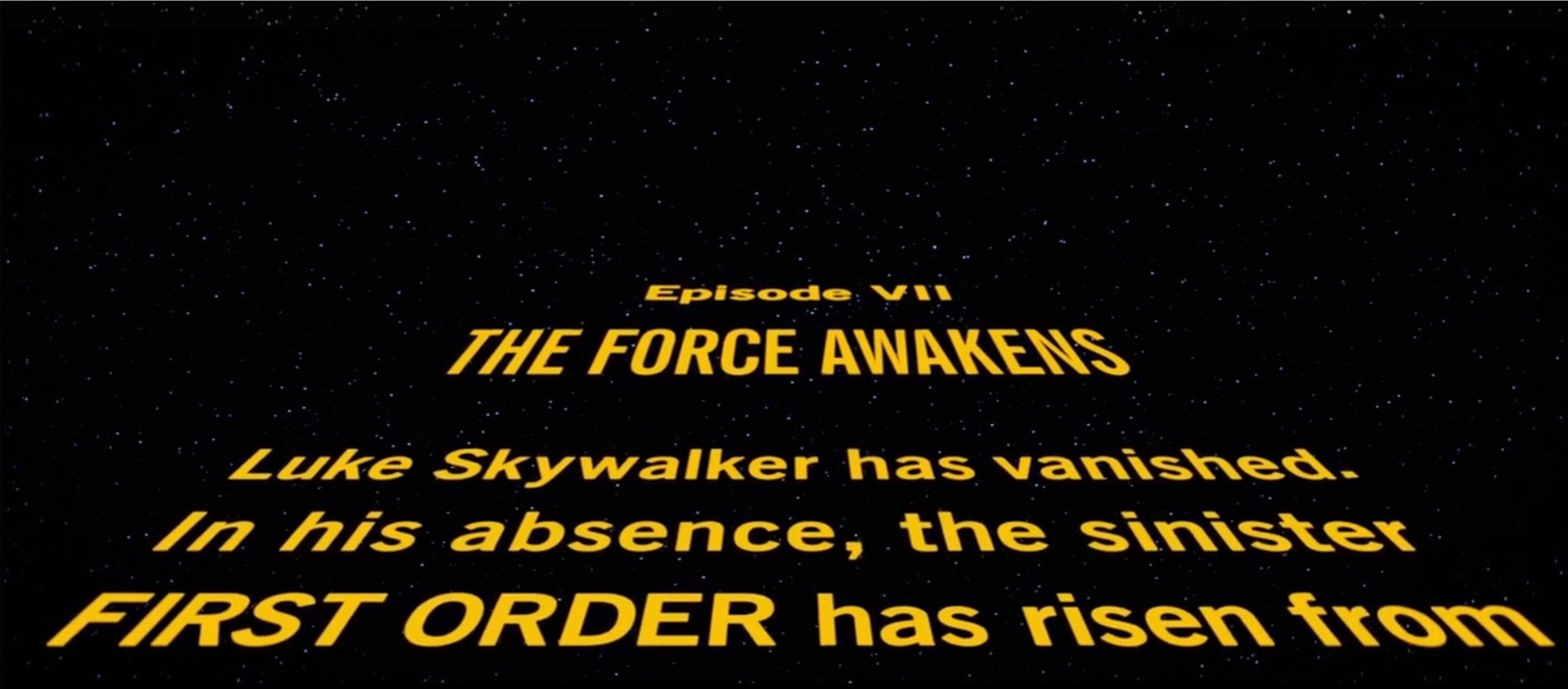
But apparently Disney got it wrong with The Force Awakens opening crawl. The episode's title is set with a condensed version of News Gothic, when it should be set in Univers, Ultra Condensed. I'm not nerdy enough to explain how it's different, so here is another excerpt from FixtheCrawl:
News Gothic (also used for the body text) is very round, friendly, and readable, whereas Univers gives the title of the film some stately heft – telegraphing the impression that the events about to transpire are carved in the stone of destiny (or something). ... It's subtle, but noticable. The 'S' and 'R' glyphs, in particular, are very different. Overall, it's boxier, and feels more staid. Less urgent.
The latest episode of Moisés Chiullán's podcast Electric Shadow delves into this story, and even talks to original Star Wars opening title sequence designer Dan Perri. In the podcast, Perri reveals that he heard that J.J. Abrams and Bad Robot tried very hard to duplicate what he had created, including the flaws. Perri has not yet seen the new film so he had not noticed the error, but when told that the scroll used New Gothic, ultra condensed, the original Star Wars crawl designer said:
Oh, Oh my God, thats way off. I know the New Gothic lines well and I can tell you I used it on Raging Bull because it was from the era, from the '40s and '50s. No I would not have used New Gothic on Star Wars.
For the Star Wars prequels, George Lucas tasked Visual Effects Supervisor John Knoll to get the Star Wars crawl right.
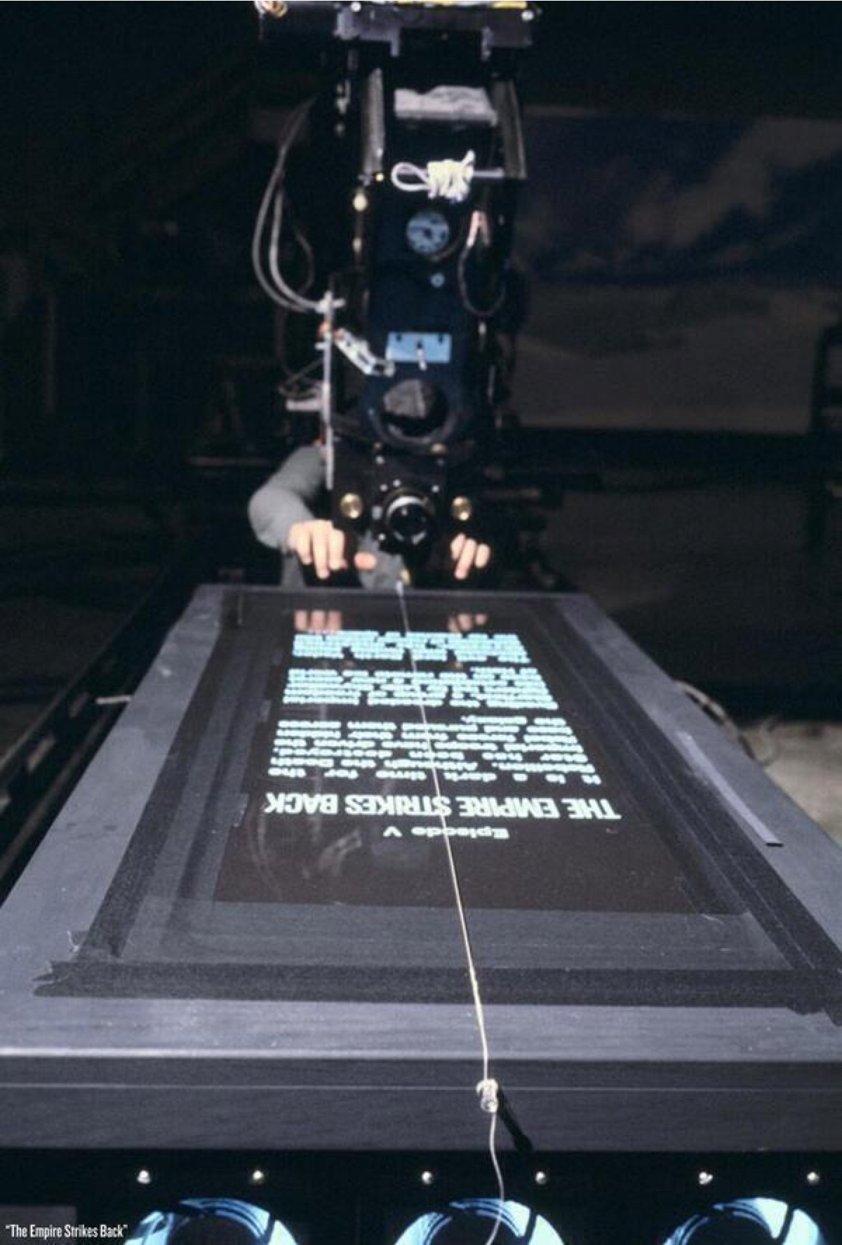
For the classic Trilogy, a high contrast film of the text was laid out flat on a long lightbox (a transparent table lit from underneath), with a camera set up on rails running parallel to the lightbox. The camera was controlled by a computer to make sure the scrolling speed remained constant: that's what we call a 'motion-control camera'. To create the illusion of text disappearing on the horizon, the special effects guys tilted the camera at an angle and ran it down the track. A star field was later optically added to complete the footage.
In trying to recreate the iconic crawl in a computer, Knoll admitted that the big problem was that "nobody took precise notes when they were shooting those sequences." Knoll and his team were able to reverse engineer the exact fonts, taking into account the curvature created by the 24mm camera lens, which they also had to recreate in the computer. There is a whole article with quotes from Knoll talking about the extensive amount of work that they took on to make sure the opening crawl for The Phantom Menace (and the subsequent prequels) matched up exactly to the crawl for the original trilogy films. (It should be noted that even the original trilogy films aren't completely consistent, and Electric Shadow delves deeper into that hole.)
Strangely, most of the promotional material for Star Wars: The Force Awakens got the font correct, such as the official online Star Wars Crawl Creator and television commercials. So the question, then, is why the font was changed for The Force Awakens. The only real answer we have comes from Lucasfilm Story Group head Pablo Hidalgo who admits that the crawl "that was approved by the director changed things around." So there you have it, J.J. Abrams made the change.
We also know that J.J. Abrams is notoriously a typography and font nerd. He has a favorite font that is used at Bad Robot on almost everything. So it's not like Abrams made the change without a lot of perspective. I wonder what his reason was for this change. For now it's something that will continue to annoy font and typography geeks for years to come. As for whether Rian Johnson will "fix the crawl" for Episode VIII, he's not saying:
And we don't know if December's Star Wars: Rogue One will even feature an opening crawl. It's possible they could avoid a crawl to help distinguish the "A Star Wars Story" films from the Skywalker series, although many other non-Skywalker series Star Wars projects have been released with a crawl including the recent LEGO Star Wars short films.