2008 Box Office Graphed
We may receive a commission on purchases made from links.
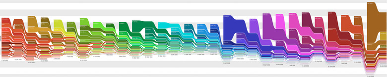
Inspired by stream graphs and the works of Edward Tufte
, Xach.com has developed a new way to display Box Office information graphically. Each graph shows the trends in the top 25 movies at the box office each weekend throughout a year of time. The color is based on the movie's debut week. The idea is that the long-running movies will gradually start to stand out from newer movies with different colors. The above graph shows 2008 so far. Click on the image above to see it in full resolution. Look at how Iron Man (blue), Indiana Jones (Purple) and The Dark Knight (Brown) stick out. Head on over to Xach.com to see more.