Confirmed: Slusho.jp Is A Cloverfield Viral Website
 Update #2: Watch Five Minutes of Cloverfield Right NOW! Update: One of our reliable studio sources/spies has confirmed that this website is a part of the viral marketing campaign.
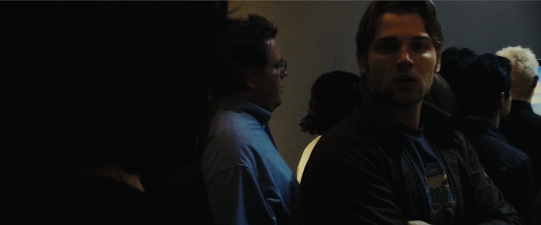
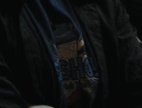
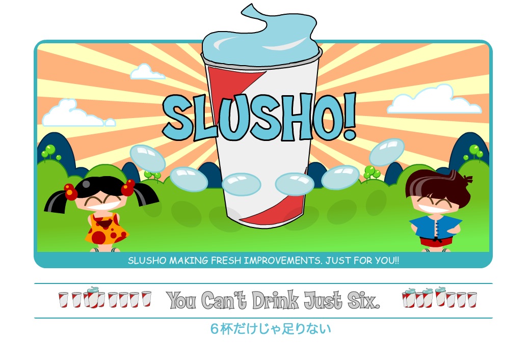
We can now confirm that the Slusho.jp site is a part of the Cloverfield viral marketing campaign. I just spent the last half an hour watching and re-watching the Cloverfield trailer when I realized that the guy (Mike Vogul) who appears 52 seconds into the trailer is wearing a Slusho brand t-shirt. Click on the photo above to enlarge or check out the cropped photo to the right. The same guy can be seen on the official 1-18-08.com website pouring a beer into Rob's mouth. But in that photo his t-shirt is blurred so that you can't read what it says. The logo too closely matches the logo on the Slusho.jp website, seen below.
The Slusho.jp website was registered a week before the worldwide release of the Cloverfield movie trailer. So unless the website was registered by someone who was on the cast or in the production, this site is 100% part of the viral campaign.
As we've previously told you, one of Cloverfield's on location production titles was Slusho. Hardcore fans of Abrams' Alias may remember as the Slurpee-type beverage that Vaughn offers to Sydney in the second episode of the series. The website seems to be for the Slurpee-type beverage.
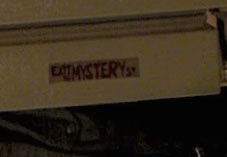
We also found what we think might be another clue. On the refrigerator is two pieces of tape that say "EXIT MYSTERY ST" or something to that effect. This could be nothing. Our 
first thought was that the label was a real life sign for the nearest exit. But we found no Mystery St listed in Los Angeles or New York City. So it seems to be a prop. And most of the other props in the apartment seem to be from Ikea or Urban outfitters. While these two small labels/signs seem to be custom made. Anyone have any ideas? Check out the photo captured from the 1080p resolution trailer to the left. We turned the image sideways to it was easier to read.