Alternate Sci-Fi Villain Designs That Would've Blown Everyone Away
Science fiction has gifted us some of the most iconic villains in cinematic history, from the imposing presence of Darth Vader to the dread-inspiring Predator. It's hard to imagine that these menacing figures could have sported entirely different appearances. In the world of movies and TV, the creative process often calls for exploring multiple paths before settling on a final look. What if these other designs had been embraced? Could V'ger from "Star Trek: The Motion Picture" or the "Forbidden Planet" Id Monster have been more effective if they weren't the figures we know today? Would the title creatures from "The Thing" or "Alien" frightened us so much if they had been imagined in other ways?
These distinct designs provide a rare glimpse into the untapped potential of characters and beings we love ... and love to hate. Such remarkable variations might have redefined our perception of these antagonists. Sometimes, the road not travelled leads to captivating destinations. Let's embark on a journey to an alternative reality of science-fi villain "what-ifs."
John Carpenter's Thing
The signature feature of the eponymous creature from John Carpenter's "The Thing" is that it doesn't have a fixed form. The shape-shifting creature doesn't exhibit a default morphology, constantly transforming from one thing to another and sprouting tendrils, limbs, and toothy maws as needed. But before effects artist Rob Bottin took the reins to bring the creature to hideous life, a wholly different approach was in the works.
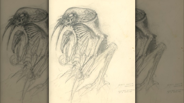
Originally, Dale Kuipers, whose previous credits included 1981's "Caveman" and "The Howling," was hired to conceptualize and build the Thing. He decided it was an alien bioweapon that would latch onto a victim's skull, and sink a million hair-like needles into their brain until it possessed the knowledge to reproduce its unwilling host and its behavior perfectly. It would then dissolve the body, consume it, and form a duplicate of the victim around itself. When discovered or threatened, it would exit this human shell starting from the most prominent orifice, the mouth. It would split the body open and latch onto anything or anyone it could use to extricate itself.
But before production could begin, an accident left Kuipers incapacitated for two months. Being Hollywood, the project didn't stop, and Rob Bottin was hired to create and realize his own versions of "The Thing." Kuipers was understandably bitter at losing the opportunity and critical of the finished film. "Though Rob is a great tactician and a fantastic craftsman, I feel that his designs go so far as to be borderline cartoonish," he wrote in an article preserved via The Thing Legacy on Facebook.
Darth Vader
The first Dark Lord of the Sith stands as the most iconic sci-fi villain on this list. When "Star Wars" premiered in 1977, the audience instantly recognized his evil nature. With his black garb, flowing cape, skull-like face, and helmet, he could be nothing other than a villain.
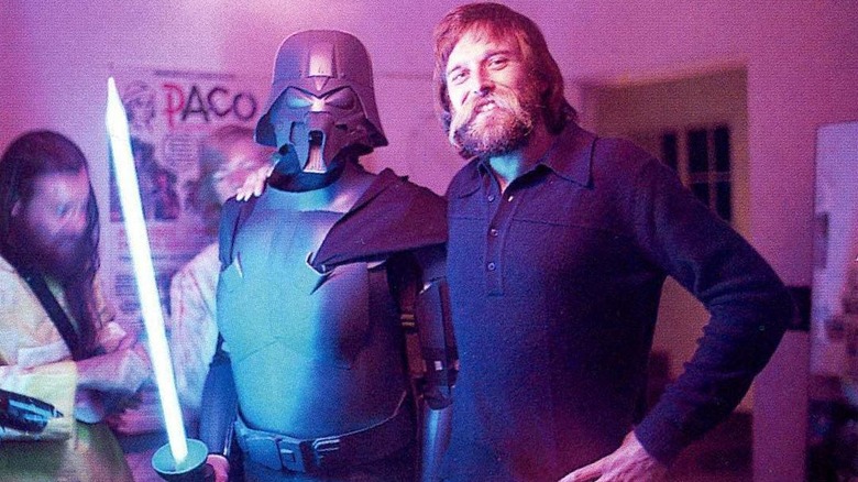
However, this wasn't always the plan. In the early stages of developing what was then titled "The Star Wars: From the Adventures of Luke Starkiller," Darth Vader had a relatively minor role and didn't wear a mask. This changed as artists tried to visually represent George Lucas' ideas. A key artist in this process was Ralph McQuarrie, who raised questions about how Vader would breathe when transitioning from one spaceship to another. This implied a breathing mask with goggles, which is what he drew. This concept evolved in a feudal Japanese direction, with Vader's face covered by something resembling a samurai's face armor, topped with a kabuto helmet. Lucas loved the idea so much that he created the character's horrifying backstory to explain it.
The final result was a combination of elements from the works of several artists, particularly costume designer John Mollo, but with McQuarrie being the prime influence. As archived via StarWars.com, one of McQuarrie's variations was built after-hours by Joe Johnston for Industrial Light and Magic's 1976 Halloween party, complete with neon lightsaber. Whether this version or the look costume is more striking and intimidating is a matter for you to decide.
She-Hulk's K.E.V.I.N.
The meta-humor in "She-Hulk: Attorney at Law" included prominent fourth-wall-breaking moments. A particularly noteworthy one closed the finale, in which a classic comic book concept came to life: a character meeting its creator.
In "Whose Show Is This?" Jennifer Walters/She-Hulk (Tatiana Maslany) expresses dissatisfaction with the expected Marvel Cinematic Universe-style climactic battle she's been assigned by the narrative. This leads her to leap out of the thumbnail of her show on the Disney+ landing page and embark on a journey to confront her true antagonists: the show's writers. It all leads to a face-off with Kevin Feige, the head of Marvel Studios. The punchline: Feige isn't portrayed as a human being but as K.E.V.I.N., a giant A.I. brain.
K.E.V.I.N. went through many concept iterations. Artist Jeff Simpson's explorations of this cyber-Feige were inspired by various technological eras. As called for by the script, all the designs shared one common feature: each wore a hat resembling Feige's trademark baseball cap. Ridiculously, the real Feige deemed it was illogical. In a show about a superhuman green lawyer, a robot wearing a hat was over the line. Head writer Jessica Gao later told The Hollywood Reporter that she joked, "Kevin, if you don't let me put a hat on that robot, then I quit."
Hulks don't compromise, but the production team did, so while the ball-capped "Akira"-esque early version wasn't chosen, the final version of K.E.V.I.N. does feature a design element suggesting Feige's characteristic chapeau. An actual baseball cap would have been funnier, logic be damned.
The Xenomorph
One reason the title creature from "Alien" was so memorable was that it wasn't intended to be a movie creature at all. It originated as a figure in surrealist H.R. Giger's painting, Necronomicon IV. Giger's signature style combined elements of the organic and the mechanical. Eerie, elongated, and twisted forms evoke a sense of dread and fascination. Biomechanical elements, such as grotesque skeletal structures and sinuous tubes, are interwoven with organic forms, suggesting a perverse fusion of man and machine. Upon being introduced to Giger's work, director Ridley Scott knew he had his man.
Before Giger's involvement, others had attempted to envision the alien that would become known as the Xenomorph. Screenwriter Dan O'Bannon and artist Ron Cobb had their own ideas regarding the creature's appearance. Cobb's approach leaned towards realism and biology, demonstrated in his previous alien concepts for the "Star Wars" cantina, and the extraterrestrial beings of "The Last Starfighter." Despite its paired meat-hook claws, Cobb's versions ended up more peculiar than fear-inducing. The O'Bannon sketch seen here is far more horrifying than Cobb's drawings. It could have made a terrific monster, but what can compete with Giger's nightmare fuel?
Not every Giger design was a winner, though. His unused Chestburster looked something like a plucked bird carcass with a mouth at the end of its neck, which could have evoked horror, laughter, or both.
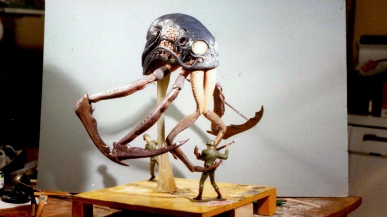
The Monster from the Id
From a practical standpoint, invisibility is a terrific solution to depicting alien beings. It obviates the necessity of creating convincing yet potentially costly on-set creatures. And — bonus! — an unseen threat may elicit more fear, as the power of imagination often surpasses what can be simulated by a person in a suit, a mechanical puppet, or staccato stop-motion.
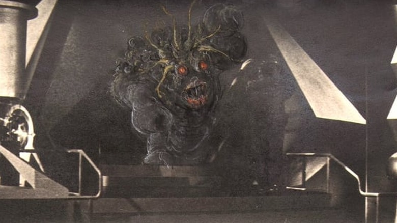
However, the filmmakers of "Forbidden Planet" recognized the need to reveal their "monsters from the Id" in some form to avoid the audience feeling cheated. Their inventive solution was to suggest its shape via hand-drawn animation to depict its energized contours as it collides with an energy fence. MGM artists proposed numerous concepts for its form, but the ultimate creature design was crafted by independent animator and artist Ken Hultgren and brought to life by Disney effects animator Joshua Meador.
But showing the creature "in the flesh," so to speak, was considered. When Dr. Morbius (Walter Pidgeon) finally confronts the malignant manifestation of his own subconscious, it would briefly become visible. Multiple concepts were painted directly onto frame enlargements of the climactic moment, depicting all manner of monstrosities, as seen in a Heritage Auctions catalogue of the original concept sketches. All were ultimately discarded. The most disconcerting versions possessed Morbius' face, proving conclusively Commander Adams' (Leslie Nielsen) realization: "Morbius. That thing out there. It's you."
Heptapods
Although the Heptapod aliens in Denis Villeneuve's "Arrival" ultimately prove to be friendly, they are perceived as an existential threat by certain countries and groups. It doesn't help that the abstract concept of a "weapon" is misunderstood, leading to tragedy. The two Heptapods we meet, nicknamed "Abbott and Costello," are portrayed in a significantly different manner than described in the story on which the film is based, Ted Chiang's Nebula-winning novella "Story of Your Life."
A film adaptation of "Story of Your Life" was announced in 2012, and by early 2014, Villeneuve was attached as the director. In 2015, two artists were tasked with conceiving the ships and their occupants. Peter Konig's initial "Arrival" designs included versions with no definite front and eye-like organs on every side. Meinert Hansen's first doodles, seen on his own blog, leaned towards the original novella description, but his directive was to "design something we haven't seen before." He ventured in a direction that he felt was a bit too abstract for the audience to identify as beings and was ultimately satisfied that they didn't make the cut.
Ultimately, Carlos Huante defined the Heptapods, describing them to IndieWire as a "bizarre upper-torso kind of a thing, an anthropomorphic whale creature with the spider hand creature at the end of an umbilical cord."
The Predator
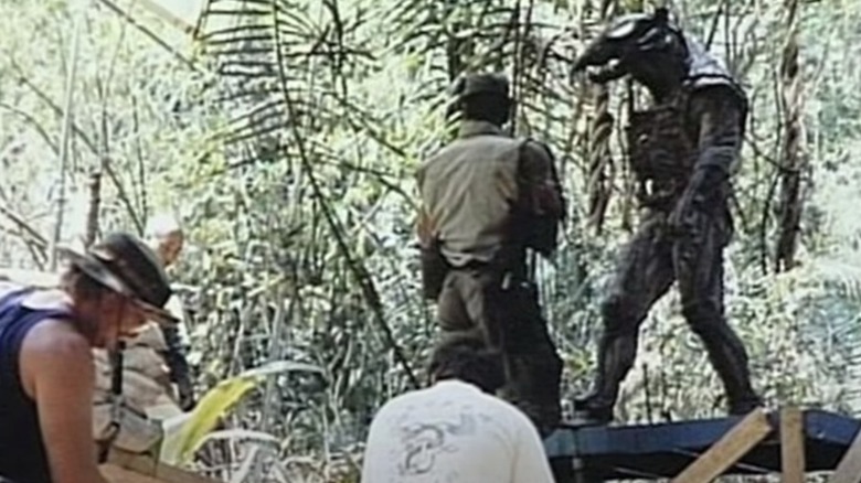
The original "Predator" features a striking looking villain — that is, when its cloaking device lets us see it. While it may not quite reach the level of H.R. Giger's Alien, it's memorable nonetheless. However, what Arnold Schwarzenegger battled to the death was Predator 2.0.
As documented on the Stan Winston School YouTube channel, the original suit design was approved despite the objections of the company contracted to build it. Its digitigrade legs and proportionally long arms required limb extensions, making it very difficult to work with. The man inside the suit was the not-yet-famous Jean-Claude Van Damme, whose martial arts skills were meant to make the alien hunter stealthy. However, he expressed strong objections to the suit, citing its inflexibility, heat, and even the look of its head. Since the digitigrade leg extensions couldn't be used for walking, any shots where the Predator's feet were visible required Van Damme to be suspended from wires. Shooting on location in a jungle added to the complications. After only a few days, the decision was made to scrap the suit and let Van Damme go.
Desperate measures were taken to save the movie. Production was halted, and the Stan Winston Studio took on the nearly impossible task of creating a completely new design and a finished suit in just six weeks. What they delivered is the Predator we all love to fear. But it's fun to look at that first Predator and imagine what could have been, had the effects technology of the time been up to the task.
The Green Goblin
Sam Raimi's 2002 "Spider-Man" was a big hit, but there were elements of it that were controversial. One was that Peter Parker (Tobey Maguire) developed organic web-shooters. Another was the appearance of the Green Goblin (Willem Dafoe). The primary complaint about the latter was that it was a head-to-toe suit of armor with an immobile mask that completely obscured Dafoe's face. Sure, this works for Darth Vader, but for the unhinged Green Goblin?
But long before Dafoe was cast, Amalgamated Dynamics/Studio ADI created and tested an entirely different approach, devising an Animatronic Make-Up Hybrid that faithfully mimicked the look of the comic book character but was capable of amazing expressions, as seen in a behind-the-scenes test video now seen on the studio's YouTube channel.
The downside? It was complicated, and extremely time-consuming to put on. Furthermore, the actor would not be in control of the mechanisms that articulated the eyebrows, which would limit his ability to fully drive the performance. Impressive as it was, Raimi opted not to use the articulated mask, and the crew moved on to create the helmet that would end up being used in the film. It's a safe bet that many fans would have preferred the more true-to-the-comics look seen in the tests.
The Kilrathi
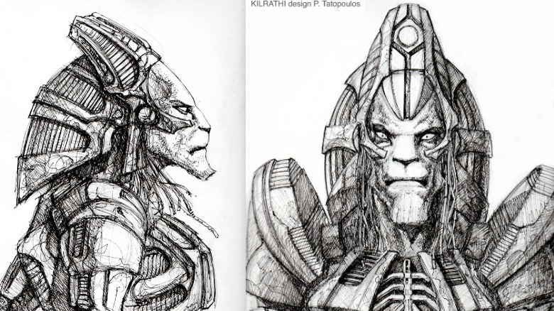
Few remember 1996's "Wing Commander," a movie that bombed so badly it killed the gaming franchise that birthed it and dashed the nascent directorial career of its creator, Chris Roberts (who would later find success as a movie producer). The film suffered from questionable casting and a predictable plot, but one thing on which nearly everyone could agree is that the design of the film's villains, the Kilrathi, sucks asteroids.
In the games, the Kilrathi are giant catlike creatures, as furry as Chewbacca. In the film, they're mostly hairless and resemble trolls more than felines. Even the animatronic Kilrathi in the "Wing Commander III" game cutscenes outshines what ended up on the silver screen.
Roberts had wanted to hire Patrick Tatopoulos, the creature and production designer for "Stargate," "Independence Day," and other '90s blockbusters. Tatopoulos' Kilrathi sketch reflected his work on "Stargate," portraying a noble and lionesque being. But his half-million dollar bid to build them was too high for the cash-strapped production to afford without making cuts elsewhere. Producer Todd Moyer chose to hire an effects house whose bid was significantly less than half of what Tatopoulos proposed.
As he would later recall in an email to the fansite Wing Commander News, Roberts only saw the results the day before they began shooting, and one day of filming convinced him that these villains were "a bust." When the distributor refused to provide funds to digitally redo the Kilrathi, their scenes were pared back. By cutting costs, they ended up with results only suitable for the litterbox.
V'ger
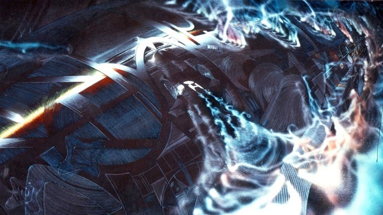
Audiences of "Star Trek: The Motion Picture" didn't get a full view of the colossal V'ger antagonist until 2001's "Director's Edition," and many felt that reveal was a letdown. This reflected the concerns of some on the original production in 1979, who felt the best way to sell its enormity was never to show its entirety. Art director Mike Minor's "golden snake" design for V'ger was so long one end could not be seen from the other. A miniature of this was abandoned when Paramount upgraded what had been a TV movie to feature film status.
With the onboarding of Robert Abel and Associates for the visual effects, a completely new concept emerged. As effects firm's own Richard Taylor later described in an interview with Third Wave Design (accompanied by some early concept illustrations), it was a long, curved, streamlined shape, like a squid. This V'ger was to epitomize the "living machine" Spock described, featuring undulating surfaces that would change colors in response to the Enterprise's proximity. For its climactic transcendence, vast, translucent surfaces would unfurl, suggesting a butterfly emerging from its chrysalis. Those acquainted with Abel's distinctive candy-colored neon effects can imagine the breathtaking potential of this moment.
However, Abel's team was abruptly dismissed due to slow progress, budget overruns, and studio politics. VFX pioneer Douglas Trumbull assumed control, and V'ger was entrusted to visual futurist Syd Mead to reimagine. To meet the film's immovable release date, the intricate organic surfaces were sacrificed in favor of a more solid, mechanical design, with a far less dramatic evolutionary exit.
The Vs
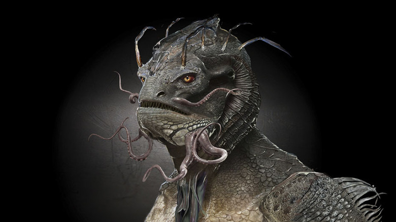
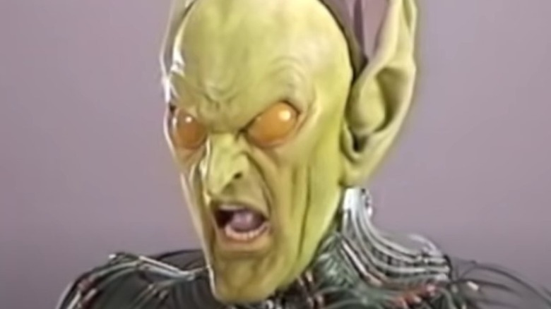
Kenneth Johnson's 1983 miniseries "V" and its follow-ups feature villainous alien Visitors whose proportions closely resemble humans. This served a practical purpose, as they needed to wear human-like rubbery disguises to win over the Earthlings. However, this often seems implausible, particularly when Diana (Jane Badler) yells, revealing her human-like mouth all the way to her uvula.
The constraints imposed by practical effects makeup didn't hinder the 2009 "V" reboot series, as CGI allowed for greater creative freedom. Nonetheless, the series chose to withhold the full appearance of the Visitors — aka "the Vs" — tantalizing the audience with partial glimpses and suggestions of their true form. This suspense builds until the second season finale (which ended up being the series finale), when the audience finally gets a proper view of what lay beneath those human skinsuits.
Actress Morena Baccarin, who portrayed Anna, appreciated that the Visitors' appearance defied recognition, describing it as a blend of various lizard-like characteristics with a prehistoric touch. However, not everyone shared her sentiment. Fans could hardly be blamed for being disappointed that the silhouette resembles a blend of a lizard, an ant, and H.R. Giger's aesthetics, with an ant body, a fish head, and chicken legs. Artist John Gallagher's fascinating alternatives for the Visitors, shared via his own portfolio, suggest roads sadly not taken.
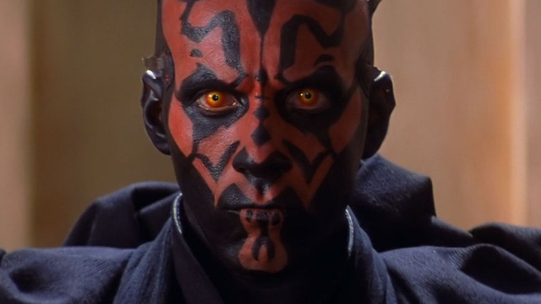
Darth Maul
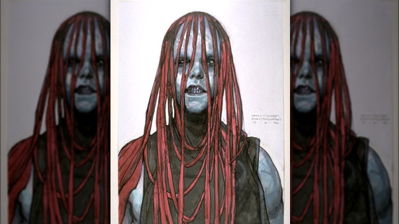
Darth Maul is a striking visual creation. Artist Iain McCaig's red and black markings echo the muscle patterns underneath. Of course, this iconic design was the end result, not the starting point. When McCaig was first brought in as a concept artist the working title of "Star Wars Episode I" was simply "The Beginning," and there was no script. His first approach to this new Sith was to try to "out-helmet Darth Vader." Realizing the futility of trying to top Ralph McQuarrie's classic, he decided to explore the face instead. When the script finally turned up, Darth Maul was simply described as "a vision from your worst nightmare." McCaig had just such a nightmare ready.
In an oral history on StarWars.com, he described that nightmare. "Like a cross between a ghost and a serial killer staring in at you, and it's raining, and the rain is distorting the face. So I drew that, a stylized version of it, red ribbons instead of rain, and put it in a folder, and at the meeting passed it over to George. George opened it up and went, 'Oh, my God,' slammed it shut, handed it back, and said, 'Give me your second worst nightmare.'"
Too bad Lucas never thought to realize that original concept for some other hideous servant to the Dark Side.