Movie Title Designer Dan Perri Explains How Taxi Driver's Memorable Title Sequence Was Made [Exclusive]
Martin Scorsese's 1976 drama "Taxi Driver" opens on a large white plume of steam, billowing from a vent in a street in New York City. It is night, and the plume captures the garish white light of a nearby streetlamp. Plaintive, scary Bernard Herrmann jazz plays on the soundtrack. An NYC taxicab then pushes its way through the cloud. It is a shining beast of a car, heavy, and threatening. It looks like a tank, rolling its way through the acrid, death-scented smoke of a World War I battlefield. As it passes, the film's title appears on the screen.
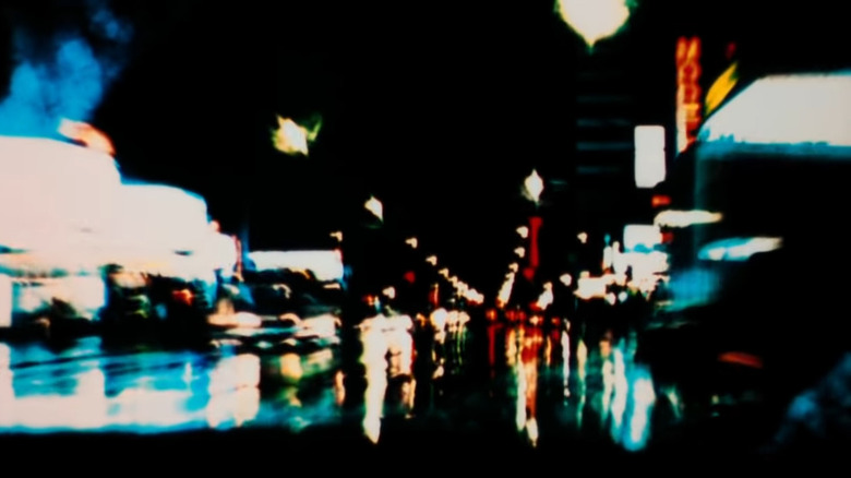
Cut to: a closeup of Travis Bickle's eyes. He is bathed in red neon light. He stares, baffled and judgmental, at the world. The exteriors of New York are jittery, smeared, abstract chaos. He sees a world dissipating and incoherent. The world is reduced to the reds and blues of the wet, malodorous city streets. A story has already been told. In a dark, smoky, urban Tartarus, a fearful, confused man is lost. There will be no sanity here. It is one of the more striking title sequences in cinema.
The sequence for "Taxi Driver" was designed by celebrity graphic designer Dan Perri, the man responsible for the opening titles to "The Exorcist," as well as "Star Wars," "Saturday Night Live," "A Nightmare on Elm Street," "Wall Street," and "The Player." He most recently designed the titles for the remake of "Suspiria." Perri is, without exaggeration, one of the most noted artists in his field.
Recently, /Film's own Devin Meenan talked to Perri about "Taxi Driver," and some of the technicals that went into constructing its opening sequence.
The Hell of New York
Dan Perri understood that "Taxi Driver" was meant to be a tragic horror movie, and it was his job to make New York City look as Hellish as possible. He sought to introduce audiences to the dark world of Travis Bickle at the same time Bickle himself was taking it in for the first time. The opening sequence was constructed of second-unit photography and B-roll that Martin Scorsese allowed him to access:
"Well, it came out of, first, my viewing of over 200,000 feet of second unit footage, which was shot all over the city at night to capture the taxi cab moving around town and the smoke and the steam and the colors and all the textures of a New York night. So I viewed a lot of footage and I started to realize that a sequence of those details, introducing the city to the viewer and the character at the same time ..."
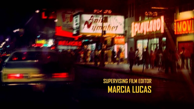
Perri also realized that the city had to look a very certain way. It had to be dark and garish at the same time, with deep shadows in between the blazing bright lights. One might notice that "Taxi Driver" has a lot of shadowy sequences, night scenes, and movie theater interiors that are bleak and opaque. Perri immediately set that tone, wanting the city itself to tell part of the story. Perri said:
"[T]hese images had to be presented in such a way that it captured the richness, the rawness, and the saturation of the colors that are part of the city, all these neon signs and so on. And that the blacks had to be really black, which is a horrific feeling that comes out of that because of the character living in this horrible place."
An effective use of slit-scan
In order to achieve the smeared visual "drift" of the cityscape, Dan Perri relied on a then-novel technique called slit-scan, which he describes thus:
"[I]n order to accomplish that, I knew from experience that if I copied these shots from a color print [...] I would capture all that saturated color and get really black blacks. And so I shot the sequence from that, and then I came upon an effect that had just been created at that time by visual effects people that I was working with. It became known as slit-scan, which was a process of photographing a shot and then winding back and photographing it again, but slipping it one frame."
Overall, Perri re-exposed the same film 12 separate times, giving the image a long, narcotic trail. Perri then slowed down the film to fewer than the standard 24 frames per second, adding the visual "jitter" one sees. The end result was a strange way to film in 1976, and nothing had been seen like it outside of underground and experimental film circles.
Perri also talked about his font selection. The name of the font is not given (apologies to graphic design fans), but Perri did say that he wanted the squared-off, aggressive, harsh letting to reflect on the movie. Anything with round edges and a utilitarian speed limit sign design wasn't going to work. Perri said he ended up visiting the New York City public works to find out the name of the font used on street signs.
It should be noted that the titles appear off to the left and right of the screen to denote their "street sign" nature as if the audience is reading them as they drive by. Apart from the title, nothing appears in the center.
An off-center world.