David Gordon Green's Halloween Trilogy Title Cards Are Actually Clever Easter Eggs
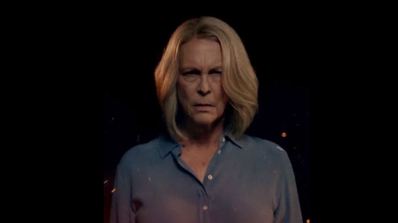
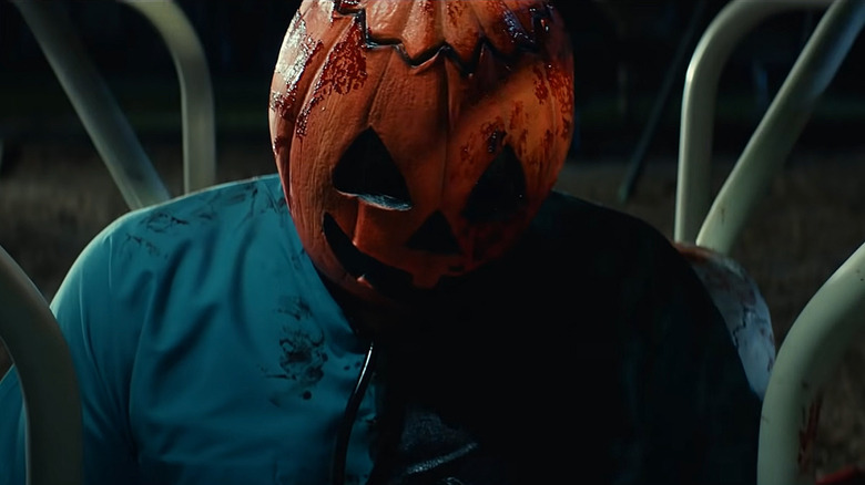
It feels like fall is finally in the air, now that the long-awaited release of "Halloween Ends" is officially here. True, it's only been a year since "Halloween Kills" upped the body count (34 dastardly deaths to be exact), but every time the month of October comes to a close, it feels like an eternity until Halloween rolls around again on the calendar. Now that this current timeline is complete, it's fascinating to take a look back at all of the homages and subtle nods these three latest films have cleverly inserted. From John Carpenter's continued involvement as a composer to "Halloween" 2018's direct connection to the 1978 original, David Gordon Green's new trilogy of "Halloween" films have made it a point to pay respect to what's come before (well, at least the films in the series they want to acknowledge).
Considering that Green's franchise entries completely disregard the original direct sequel "Halloween II" and all subsequent films, it's a little odd, however, that these new films continually take inspiration from those storylines and make direct visual connections to sequels they've chosen to ignore in this new timeline. The most obvious nods come in the form of the title fonts that all three new films have borrowed from the first three "Halloween" films: The OG slasher, the hospital aftermath of part "II" and, weirdly, "Halloween III: Season of the Witch."
The fans like this stuff, right?
The first title card for Carpenter's original is, without doubt, the most iconic of the bunch. Famously using the Serif Gothic Heavy type face, created by American designer Herb Lubalin and Italian Tony DeSpigna in 1972, those letters are just as iconic as what's now become known as the "Stephen King font" from designer Ed Benguiat. It makes perfect sense for the 2018 "Halloween" to reuse that original font, considering it's retconning the series and crafting a legacy sequel set approximately forty years later.
The "Halloween II" font is Standard CT Ext ExtraBold, a decidedly more '80s look than the '78 title card. "Halloween Kills" uses it just for the sake of uniformity and to highlight the fact that "Kills" shows the moments that occur right after an older, survivalist Laurie Strode traps Michael in a basement of fire. "Halloween II" and "Halloween Kills" both show what happened right after the night he came home, so again, it makes sense to connect the two.
But what about "Season of the Witch" and "Halloween Ends" being connected? Here's a side-by-side comparison of all six titles before we continue:
Same fonts, 40 years difference. #HalloweenEnds #MichaelMyers pic.twitter.com/T6QeHPy4jC
— HalloweenFanOfficial 🎃 (@_HalloweenFan) October 11, 2022
I'll admit, it is pretty powerful seeing such an amazing visual connection between these six entries. The blue neon, video game haze of "Halloween III" is especially goosebump-inducing. Title designer and VFX veteran John Wash outdid himself with that title card. Undoubtedly, it gets horror fans more excited to see "Halloween Ends" and shows that hey, David Gordon Green and Blumhouse Productions really do care about the franchise. And the homage is the perfect studio easter egg, because it makes you want to watch every movie again. Good thing there are still a couple of weeks left in spooky season.