'Borgman' Anatomy Of A Poster: Artist Brandon Schaefer Explains His Design Process
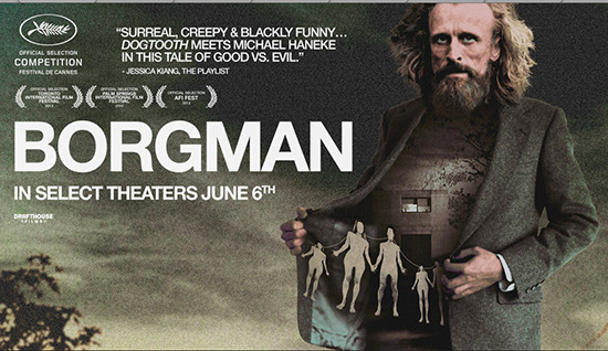
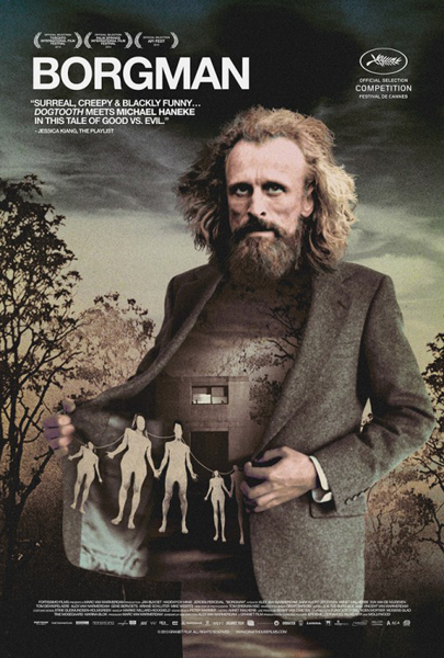
We've loved the direction that Drafthouse Films has taken in bringing the film Borgman to audiences. The trailer was terrific, and the key poster art is also great. The poster gets right to some of the important ideas in the film in a way that is enticing and mysterious without being blatantly overt. A conversation with Drafthouse led to the idea of doing a breakdown of the design process for that key art, which was created by artist Brandon Schaefer.
Initially we were going to set up an interview with Schaefer. Before that happened, however, he wrote up a description of his own design process. And, frankly, it is a lot better than any interview might have been. So what follows is essentially a guest post by Schaefer, in which he gives a full account of the process of creating the Borgman poster art.
What follows is all straight from Schaefer.
***
Art students were required to take two semesters of art history in their first year at the college I went to. There's nothing special about that, but they were the type of classes you dread when you're eighteen: 8am affairs set in a dark amphitheater with a professor who sounded like they'd been ripped out of a Peanuts TV special. At that age it's hard to see the point in staying awake to learn the names and dates of things that most likely would never cross your path again. A head full of Caravaggio trivia wasn't going change the direction of my career, and it had even less hope of making me a riot at parties. Sleep felt like a better way to make the time, so I tossed my head back and settled in for a nap twice a week for a year. I somehow managed a B.
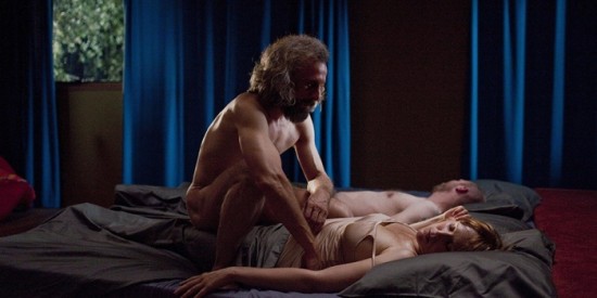
More than a decade later and what little I remember from when I wasn't passed out in the back of that room, sure enough, hasn't come up at any parties. But it saved me from torpedoing a job last November. I had agreed to work with Drafthouse Films on their one-sheet for the US release of Borgman, but was left scratching my head by the time I'd finished the film. A movie poster should aim to capture an idea or a tone from a film that can be communicated clearly to an audience, but Alex van Warmerdam's Dutch thriller is a puzzle-box. The story that unfolds has a destination but switches several different tracks on the way there, which makes a clear, obvious solution hard to grapple on to. It's not just about a home that is invaded, or the suspense born out of that event, but something far stranger. I couldn't put my finger on what that was exactly until I saw this.
And I remembered that I'd seen that image before. Twelve years earlier, cramming for an exam for a class that I'd been using as my own personal nap time, a painting from 1781 by Henry Fuseli. 'The Nightmare.'
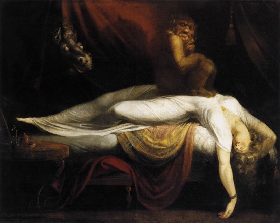
The painting is a portrait of an incubus atop a woman in the throes of a troubling dream, eerily similar to those scenes of the devilish Borgman crouched over a sleeping Marina, tormented by nightmares. Both take different approaches in the way they communicate their ideas, but each touches on external forces manipulating our defined roots in reality. Borgman's narrative became easier to read less as a home invasion thriller, and more as a surreal tale that's slowly being being twisted by a demonic power with malevolent ambitions. It might sound a little bizarre, but approaching the story from that angle helped clear a path forward.
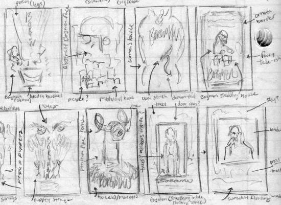
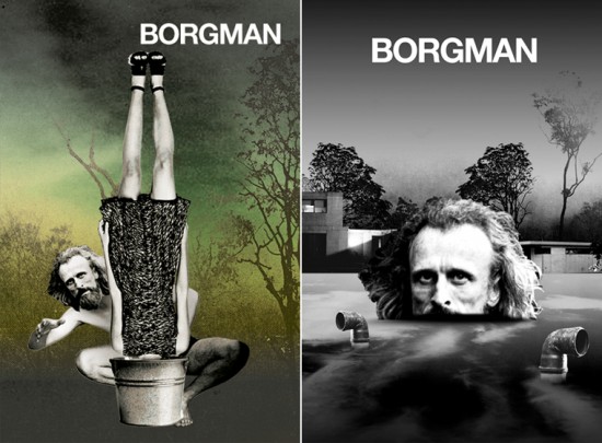
Most of my scribbles leaned heavily on joining surrealist imagery with my reading of the film. They focused on the titular character, either as a looming visage, a lurking predator, a trickster from a fairytale, or a puppetmaster. Each tried to sum up the film in a different way to varying degrees of weirdness, and in the end it became a question of appropriateness: is this strange for the sake of being strange, and is that alienating? What do these images mean to someone who isn't familiar with any of this? A one-sheet should get your attention, but should be an honest extension of the film it's championing. Otherwise it's either marketing without a soul, or art for art's sake. Design should be about hitting that spot in between.
It's hard to find that middle. Bringing everything on to the computer weeds out the more impractical ideas, but it still feels like searching for a lightswitch in a dark room. It sounds obvious but having others to bounce ideas off of helps cull things further.
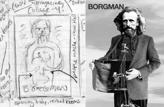
Talking it over with Drafthouse's Brand Manager, Jon Stobezki, everyone was interested in pursuing the direction with Borgman opening his coat. So for the next few weeks the idea was broken down and rebuilt into something that felt more complete. The sky was replaced by a corrupt landscape to ground the figure in. We also lost the dancing troupe – a play on the tricks Borgman had up his sleeve – and in exchange gained a family of paper dolls strung up in the clutches of a menacing trickster. Everything circled back to the film's surreal qualities, and the way in which that world becomes captive to the machinations of an evil spirit. The poster became less about an act of showmanship, and more of one man being a credible threat. Borgman is here to play, but the fun he's interested in having is less than kind.
Complicated films don't always ask for complicated imagery. You'd be surprised how often the best solutions are the ones that are the most direct. A film offers an extended period of time to draw an audience in, but a poster gets a single shot at making an impression. The quicker, the clearer, the better. But with a story as richly layered as Borgman, it felt like a disservice to the narrative to not embrace a more madcap approach. It was the clearest one to grab on to once the right reading was found. What we settled on was a strange mix of collage and photography run through my faded freshman memories of the art of Magritte. All thanks to a few classes an eighteen year old thought would were a waste of time.
***
Thanks to Brandon Schaefer for his detailed explanation of his own process. Follow him on Twitter at @seekandspeak. As a bonus, Schaefer has published his own conversation with poster artist Jay Shaw, who created another poster for the film. You can read that here.
Borgman expands into more theaters today. A full list of play dates is available at Drafthouse. You can watch the first five minutes of the film here.