'Star Wars: The Last Jedi': Let's Analyze The New Poster, Shall We?
Everyone is going nuts over the new trailer for Rian Johnson's Star Wars: The Last Jedi that was unveiled at Star Wars Celebration earlier today, but Disney and Lucasfilm also dropped the first real poster for the film at the same time. So while you're coming down off the high of watching the trailer, join us in a deep dive into that poster to see if we can learn anything else about the movie.
Here's the full Star Wars: The Last Jedi poster:
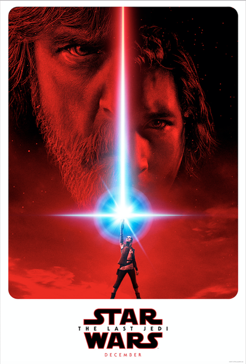
Let's start from the bottom and work our way up. The layout here is unique; no other official Star Wars poster has been designed like this, where it almost resembles a trading card instead of a traditional poster. As you can see with the background coloring, they're keeping the red theme alive that they established in the first teaser poster. So there's the title and release date – nothing too special there.
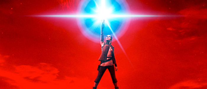
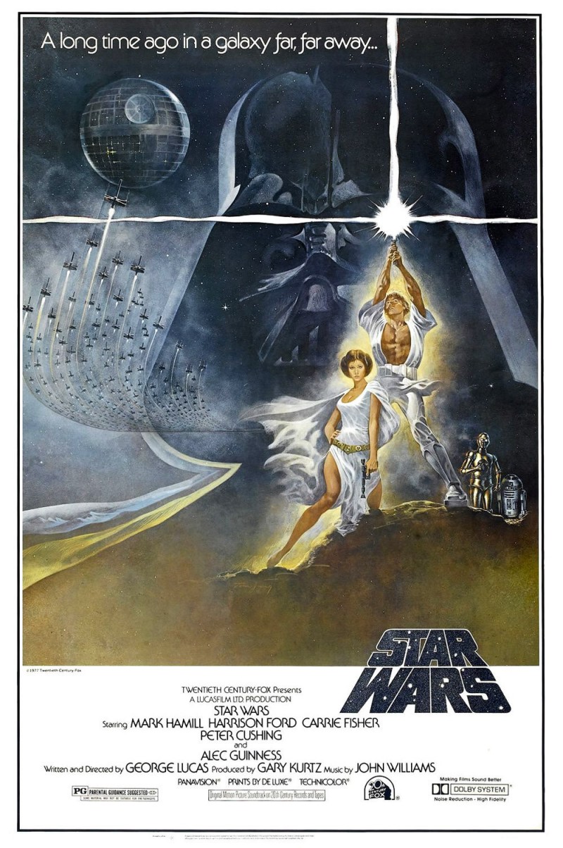
But Daisy Ridley's Rey stands at the bottom, thrusting a lightsaber skyward in a manner reminiscent of Luke Skywalker in the poster for the original 1977 Star Wars. This seems like a nice shout-out to the original film, and a way to pay tribute to the franchise's 40th anniversary.
The ignition from Rey's saber is bigger than Luke's in the older poster, perhaps indicating Rey has a purer connection to the Force (as implied by Rey's quick learning in The Force Awakens). Or maybe it just looks cool.
Following the saber blade up, we see that it separates two family members: Mark Hamill's grizzled Luke Skywalker and his nephew, Adam Driver's petulant Kylo Ren. Hamill's visage is much larger than Driver's, which could mean Luke has a larger, more impactful role on Rey in this movie. Or maybe it just looks cool.
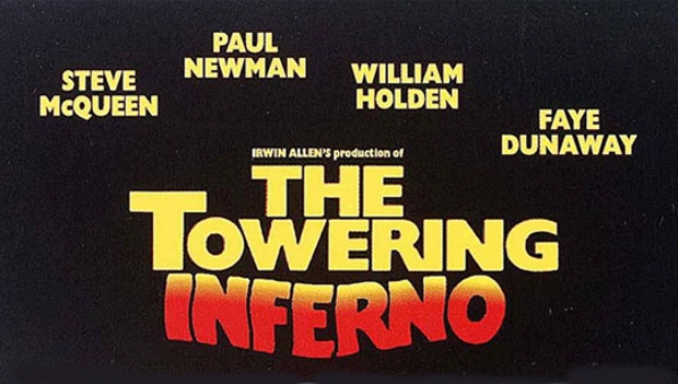
There's also a chance it could simply be a contractual thing, in which Hamill's agent negotiated that he be larger than anyone else on the poster. There are stories about how placement on posters can be important for actors, with a famous example being the 1970s disaster film The Towering Inferno, which starred Steve McQueen and Paul Newman. Both were massive superstars at the time of the film's release and wanted top billing, so a compromise was reached: Newman's billing would be technically higher on the poster, while McQueen's would be the first for audiences who read left to right.
In the case of The Last Jedi, it looks like Hamill ended up with the best of both worlds, being bigger, higher, and on the far left of the poster.
Finally, Rey's lightsaber blade turns from blue to red as it gets farther away from her. As you know, blue and red are important lightsaber colors in the Star Wars universe, having represented the light side and dark side respectively in the hands of Obi-Wan Kenobi and Darth Vader. In the new trailer, Rey mentions seeing a "balance" between the two sides of the Force. Could this poster be teasing the way Rey toes the line between the two sides in the new film? I'd also argue that the curved edges of the poster represent the same thematic point: instead of the binary light side going one way and the dark side going another way, the curvature may imply the secret lies somewhere between the two. Or maybe it just looks.
So what do you think? Is there something to this analysis, or am I just reading way too far into this poster?