The Best Screenprinted Movie Posters Of 2014: My 15 Favorite Prints
Screenprinted movie posters continued to explode in 2014. I drool over so many posters every year, it's very difficult to pick favorites. With movies, at least you know what you like and you don't like. Why something works and why something doesn't. Physical art is more subjective. Some art just hits people one way and others another. Such it is with pop culture posters. Maybe I love one subject more than another and that makes the art seem better. Maybe the art is absolutely incredible but, if I don't connect with the subject, it's harder to appreciate. Long story short, ranking them in any definitive ways seems futile.
That said, we figured it would be fun to at least call out a few of coolest screenprinted movie posters of 2014. Fifteen personal favorites that stand out, for one reason or another, to me. Posters are are beautiful, unique and make me remember their subject in a new, vivid way. Check out my favorite screenprinted movie posters of 2014 after the jump.
One caveat. Just to make things a bit more fair, I kept my picks only to screenprints. Posters that are individually made by layering one color down at a time. These are usually the most limited and sought after prints in the poster world, but it also just makes the decision that much easier because I can eliminate a ton of wonderful art printed in other ways.
Enough explanation, here are my 15 favorite pop culture posters of 2014
15. Matt Ferguson - Guardians of the Galaxy (24 x 36, edition of 150, Independent)
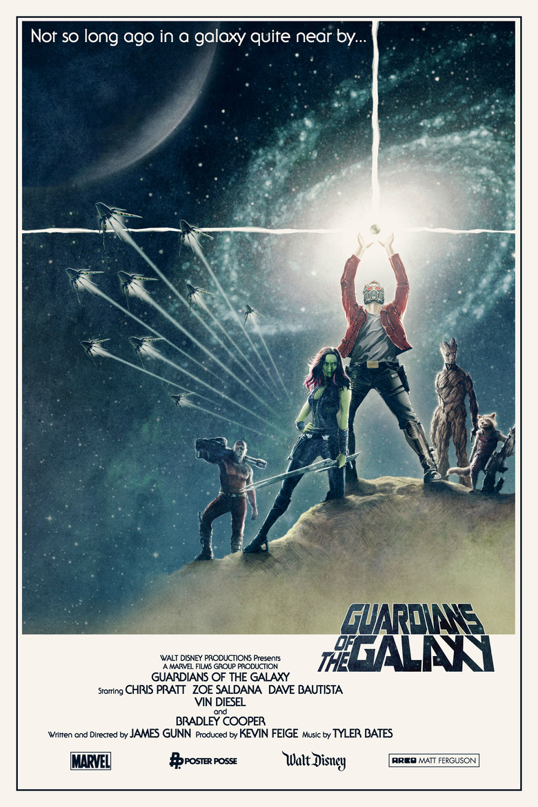
The idea was so simple it's brilliant. Take one of the most iconic Star Wars images and place characters from a Star Wars influenced film in it. The result was one of the year's most blogged about and reposted posters. Ferguson did a small private print commission of the image so a lucky few have this on their wall. If that's not you, at least you can appreciate the awesome way the artist represented the year's biggest comic book film.
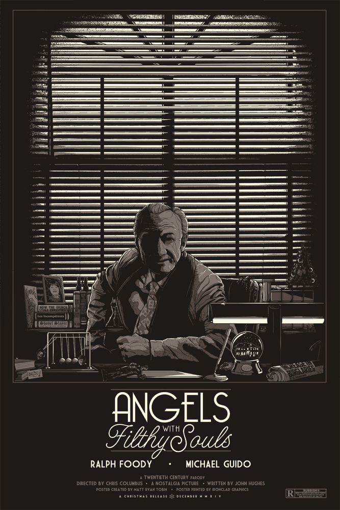
14. Matt Ryan Tobin - Angels With Filthy Souls (24 x 36, Independent)
Home Alone is one of this generation's favorite movies and the way Matt Ryan Tobin was able to represent it in a new and different way is just so cool. He took the movie inside the movie and made it into a poster for Home Alone, loading the image with dozens and dozens of nods to the film without directly being a poster for it. It's a smart, subtle way to pay tribute to one of the biggest comedies in history.
13. Lora Zombie - Slimer (16 x 20, edition of 300, Gallery 1988)
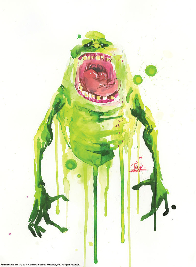
One of the biggest pop culture art events of 2014 was Gallery 1988's 30th anniversary show for Ghostbusters. Several major artists did prints based on the classic property but my favorite was probably the most simple. Artist Lora Zombie took everyone's favorite ghost, Slimer, and made him look like a paint splatter. The idea doubles as being aesthetically beautiful, but also a almost perfectly appropriate representation for the gross characters.
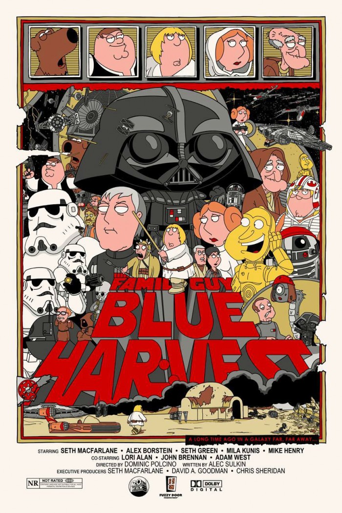
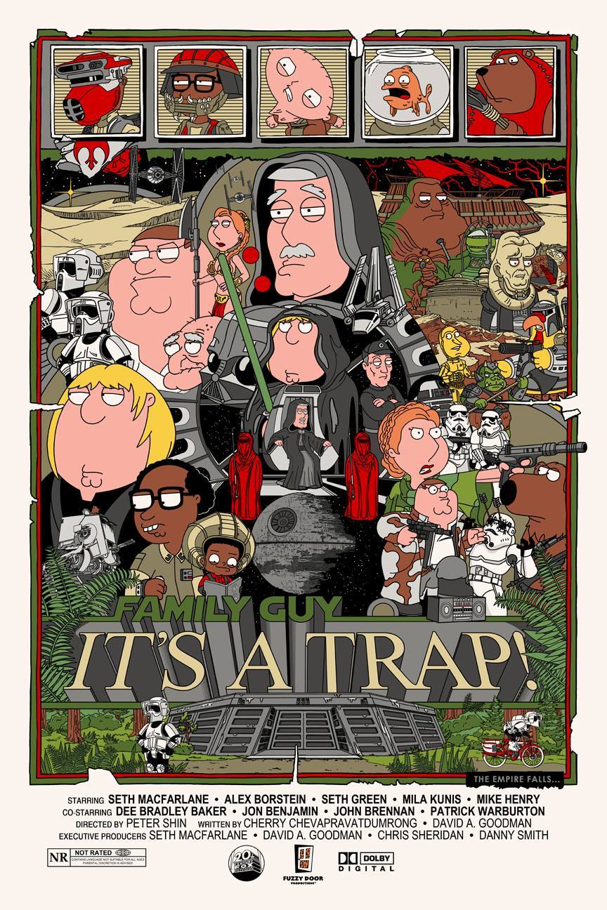
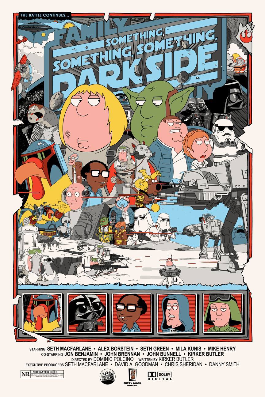
12. Jacob Bills - Laugh It Up, Fuzzball: The Family Guy Trilogy (24 x 36, edition of 30, Independent)
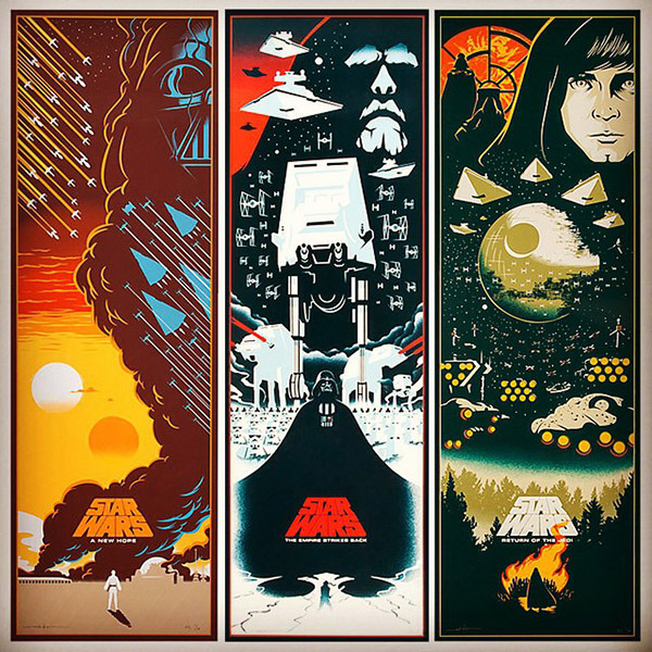
I'm not a Family Guy fan, but I am a Star Wars fan as well as a Tyler Stout fan. So when I saw artist Jacob Bills reimagine Tyler Stout's highly sought after 2010 Mondo Star Wars trilogy, as the Family Guy Star Wars trilogy, I was stunned. Every image is packed with beautifully illustrated representations of Seth MacFarlane's characters as their Star Wars counterparts. I can't imagine a better representation of the specials or ode to Stout's work.
11. Patrick Connan - This is Berk, Regular and Variant (24 x 36, edition of 165 and 100, Hero Complex Gallery)
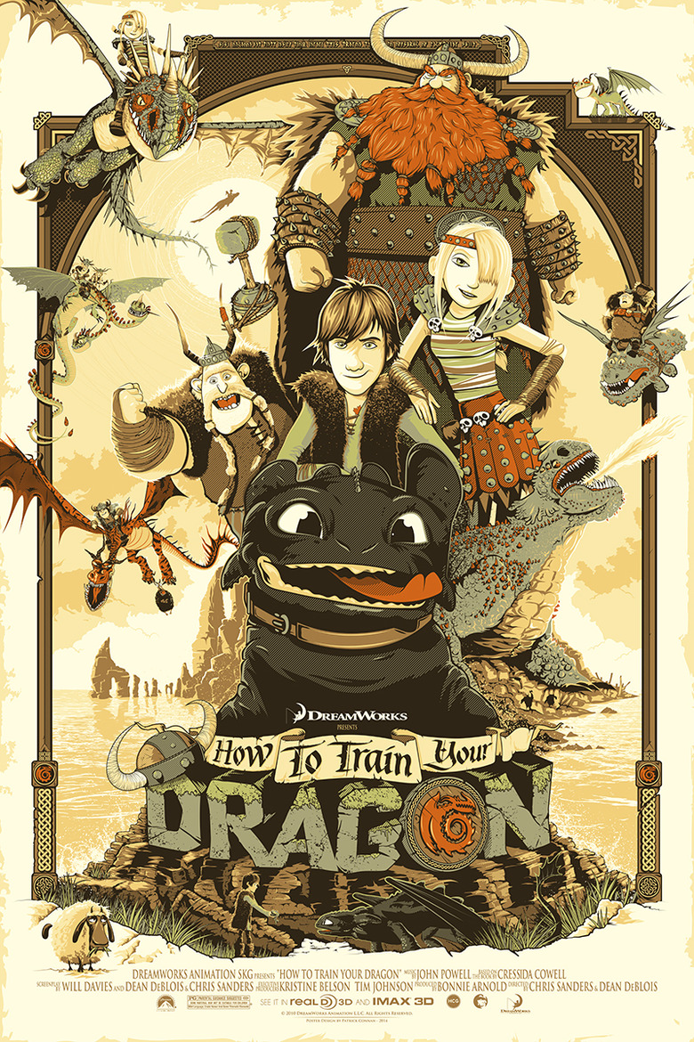
Remember this is a personal list. I like that "Kitchen Sink" approach to movie posters and one of my favorites in that vein is this print by Patrick Connan. Created for a special event held at Los Angeles' Hero Complex Gallery, it's almost a sin that an image this good is so limited. This film so perfectly captures the characters and tone of the film, it could have been the official one sheet.
10. Ken Taylor - Alice in Wonderland (24 x 36, edition of 490, Mondo)
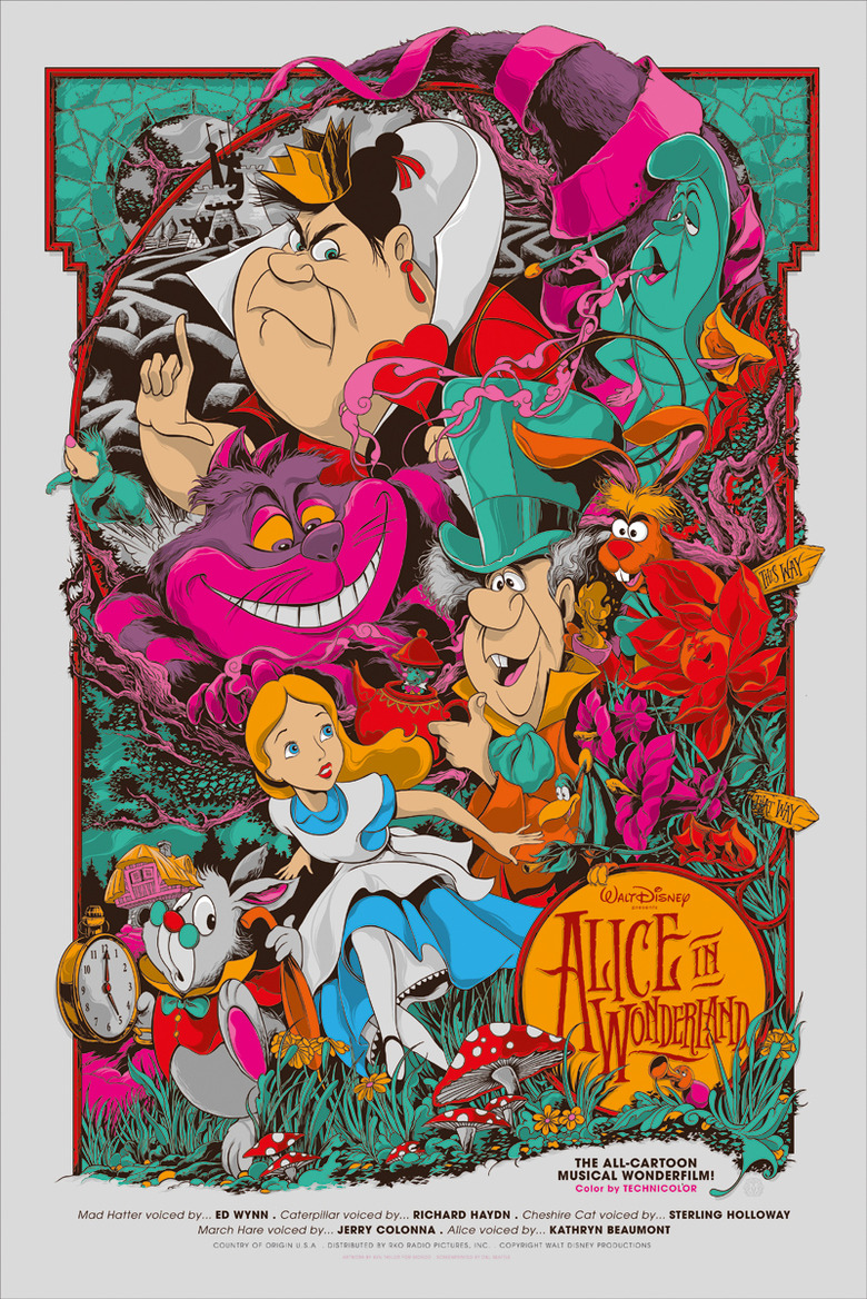
Ken Taylor's work is incomprehensible. There's almost nothing the artist can't do and this trippy, colorful explosion representing the Disney classic is proof of that. Seeing this poster online can't do it justice. The detail and likenesses of the character are second to none. Plus, it's so packed with things to look at, it simply never gets old. In that way, it's also very appropriately tied to the film, which makes it even better.
9. Martin Ansin - Batman 1966, Regular and Variant (24 x 36, edition of 375 and 175, Mondo)
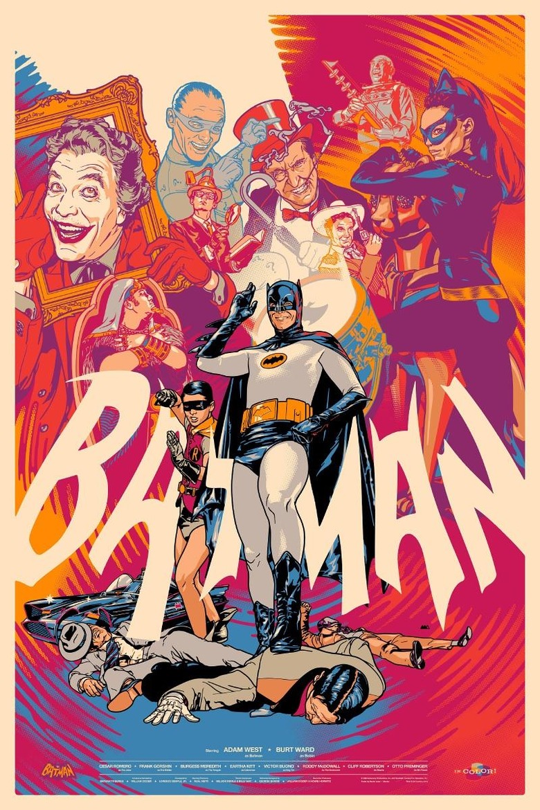
2014 was the year the 60's Batman show finally allowed licensing. There were toys, Blu-rays and this stunning poster by Martin Ansin. Ansin takes his realistic, moody style and filters it back through several decades to make this feel like it fits both when the show aired as well as today. You get to see all the characters you know and love together, represented in a familiar yet evocative and fun way.
8. Joshua Budich - To See With Eyes Unclouded by Hate (18 x 24, edition of 100, Spoke Art)
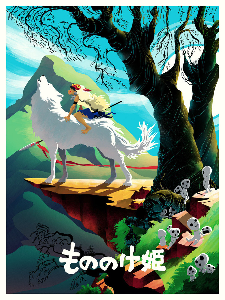
Most of Joshua Budich's work is recognizable. He's got a beautiful, distinct way of capturing a subject that shines a kind of humanity on them. But this poster, for Princess Mononoke, is something totally different. It looks alive. There's energy there, vibrancy, and it almost looks better than the Studio Ghibli film it represented. Almost.
7. We Buy Your Kids - White Men Can't Jump (18 x 24, edition of 100, Mondo)
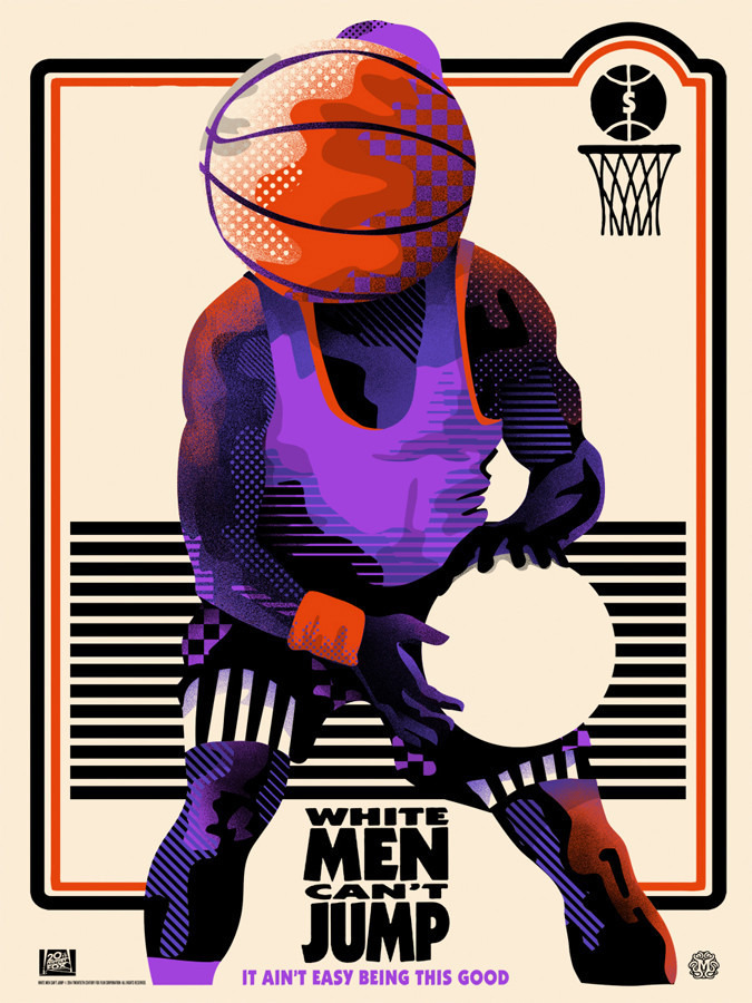
The fact there's a poster for White Men Can't Jump, at all, kind of ensured it would be on this list. It's one of my favorite movies of the Nineties for a ton of reasons. It could have been an image of Wesley Snipes' face and I would've been excited. But the cubism influenced work of We Buy Your Kids gives the movie an almost scary look. Has basketball gone to the characters head? Is he holding onto emptiness? I honestly don't know but I love that this seemingly stupid movie was made into something this crazy and beautiful.
6. Eric Tan - Star Wars Trilogy (12 x 36, edition of 100, Disney)
This list has already touched on Star Wars twice, and it's going to reference it much more directly soon. But first up is Eric Tan's unique representation of the trilogy. The one downside to this print series is that it wasn't made available at an affordable price point (you could only buy it framed for several hundred dollars on Disney's site). But the art itself is jaw-dropping. Tan used the long, skinny size to give Star Wars the scope it deserves. Each image stream lines each film's considerable imagery into a strong image showing the tasks Luke Skywalker must conquer in each film.
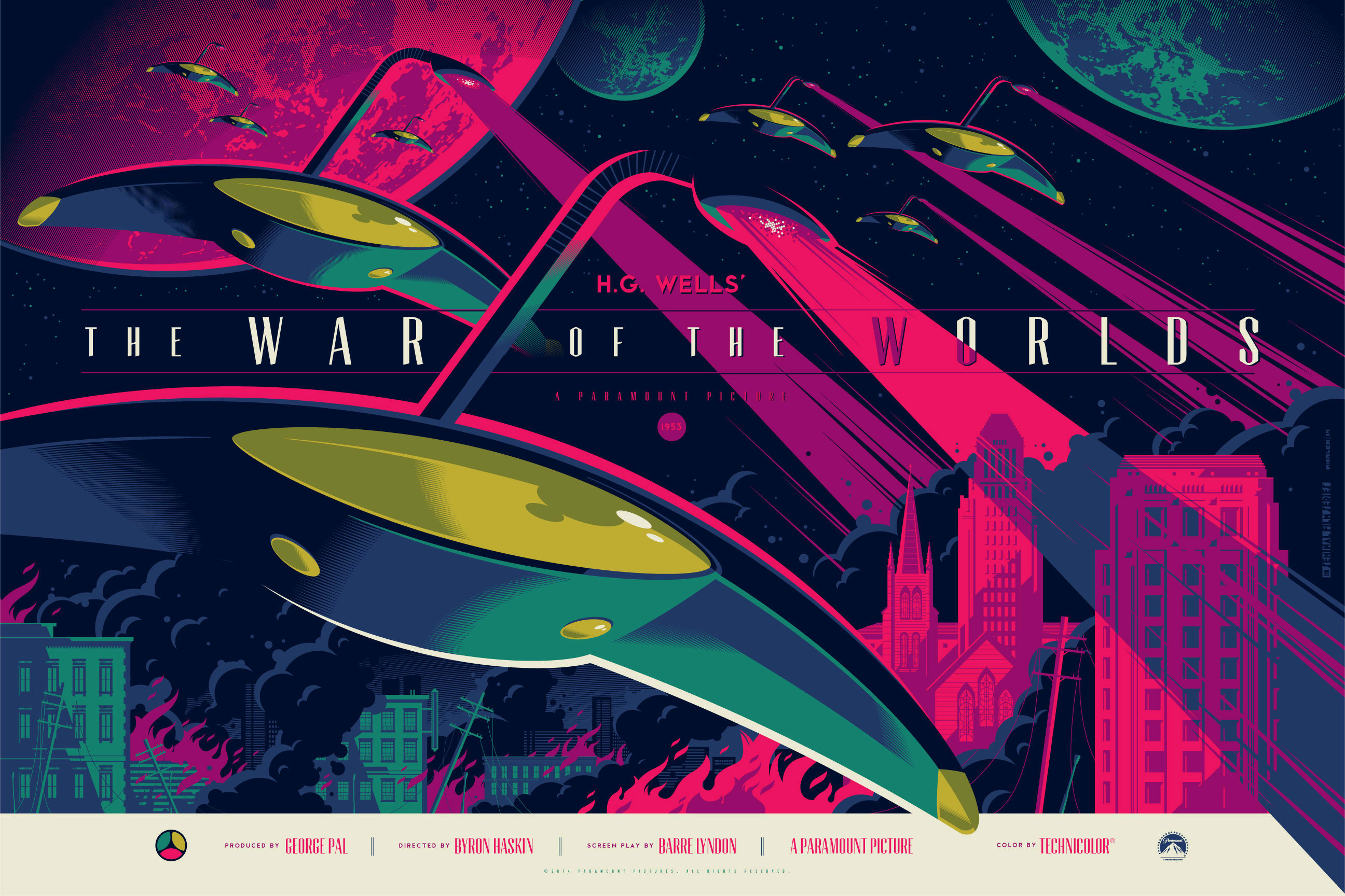
5. Tom Whalen - War of the Worlds, regular and variant (24 x 36, edition of 295 and 100, Dark Hall Mansion)
Tom Whalen's War of the Worlds, once again, is a case of an artist breaking out of their usual style int something extraordinary. Whalen's usual style is sleek and simple, using almost the bare minimum of actual drawing to make a perfect representation. But with this poster, he went huge, presenting a sweeping, massive, vibrant look at this legendary movie. This is an image so beautiful and striking that even if you took all the text off you, you'd want it on your wall.
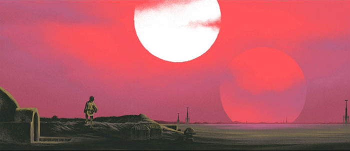
4. Mark Englert - "I'm Here To Rescue You" (12 x 36, edition of 150, Acme Archives)
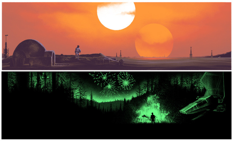
Sometimes you just want the most beautiful moments in your favorite movies represented as close to the image on screen as possible. And that's Mark Englert's strong suit. The detail crazed artist excels at making sprawling vistas into frame worthy art and what better panoramic shot than the two suns of Tatooine? As a bonus, in the dark, the top image glows with Luke buying his father, summing up the entire character on one poster.

3. Aaron Horkey - The Lord of the Rings The Fellowship of the Ring, Regular and Variant (19.25 X 39, edition of 606 and 361, Mondo)
You don't really know how detailed art can be until you've seen the work of Aaron Horkey. The guy is amazing and his poster for Fellowship of the Ring shows exactly that. Horkey takes arguably the films biggest moment – Galdalf vs. the Balrog – and some how makes it bigger, by adding his absolutely mind-melting line work. I haven't seen this poster in person yet but from the images like this on, I can't wait.
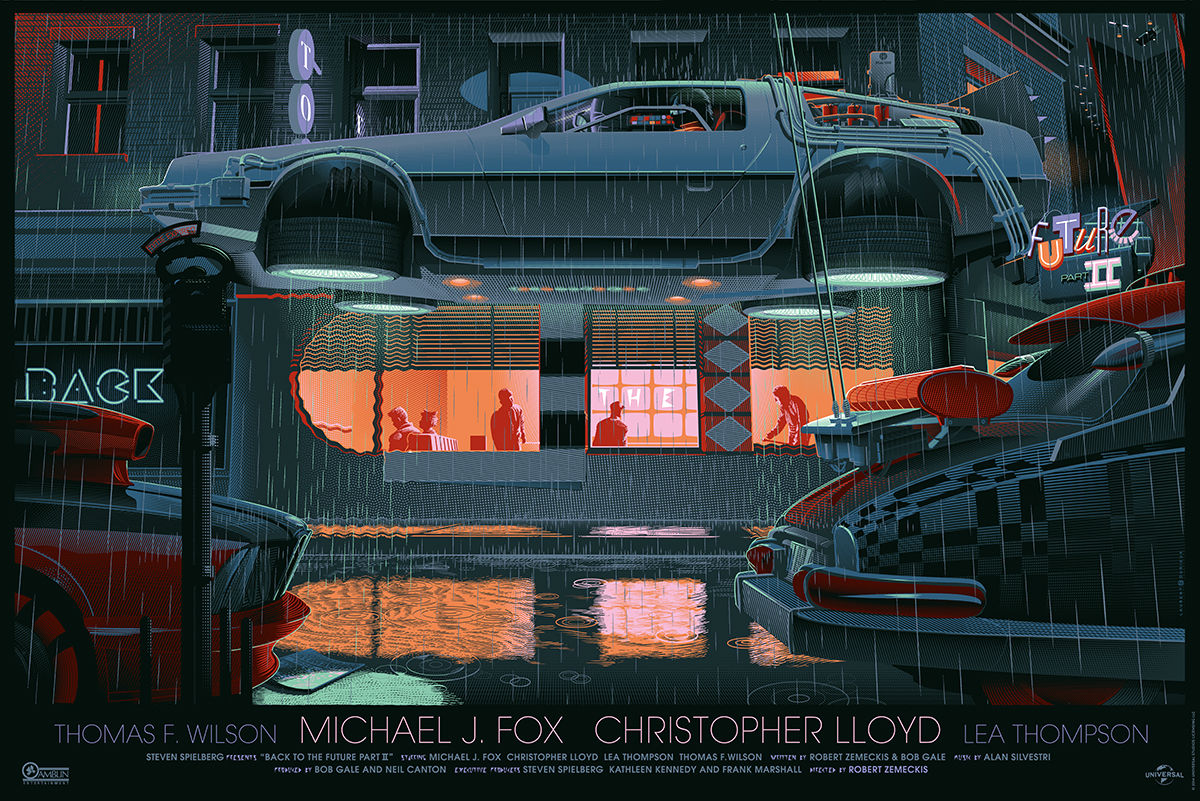
2. Laurent Durieux - Back to the Future Part II, Regular and Variant (24 x 36, edition of 575, 225, Mondo)
Back to the Future is probably the most used property in pop culture. Which is odd considering very few of the posters have the actor's faces. So you're left with basically the Delorean and Laurent Durieux did a trilogy of Back to the Future posters this year showing the DeLorean in various different states. My favorite of the three is the second film, which shows it flying. Besides that already cool image, the colors kind of tease the dual nature of the story, and the rain evokes the cliffhanger ending.
1. Craig Drake - Falcon (24 x 36, edition of 100 -also done on metal - Hero Complex Gallery)
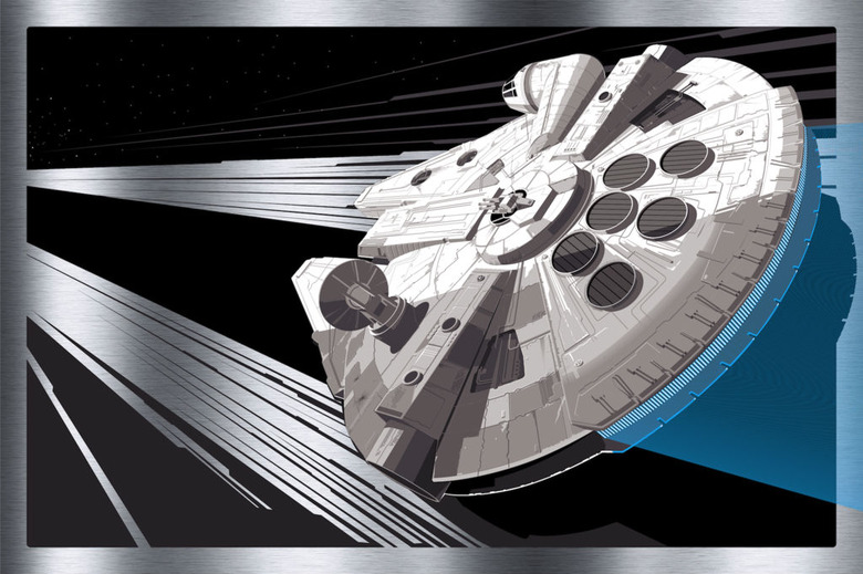
As big a fan of Star Wars as I am, I'm a bigger fan of the Millennium Falcon. And Craig Drake, a former Lucasfilm artist, made the best Falcon poster ever this year. The poster has just enough detail to be recognizable, but just enough sparsitiy to be unique. His composition gives the piece an undeniable movement and energy. It's so powerful, you can almost hear the hyperdrive while looking at it. There were lots of posters this year, but Drake's Falcon was my personal perfect cross section of subject, style and beauty.