Orange/Blue Contrast In Movie Posters
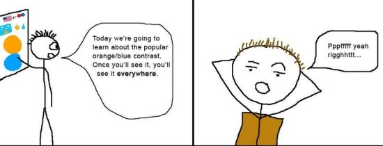
I'm sure you're aware of Hollywood's overuse of floating heads on movie posters... but have you noticed the excessive use of orange/blue contrast on theatrical one-sheets? David Chen happened to come across this comic illustrating the Blue/orange contrast, although I'm not sure where it originated or who created it (update, the creator has finally contacted me and his name is Justin Leduc). After the jump you will see a ton of examples of orange/blue contrast, however I must warn you — as the comic says, once you see it, you'll notice it everywhere.

Yes, Of course....
As Gravity13 points out: orange/blue just so happens to be the most common set of complementary colors because blue is "cool" and orange is "enthusiastic" and "energetic."

Here are a few more examples I was able to dig up:


via: reddit