MondoCon 2016: Olly Moss' Unreleased 'The Force Awakens' Poster And Other Unfinished Prints
Although the main draw at MondoCon remains the shops and booths run by talented artists from around the world, the convention offers more than just an endless series of excuses to spend money on pop culture art. MondoCon 2016 played host to a series of panels dedicated to exploring the world of pop culture collectibles and the Mondo Talk panel was, like in years past, the must-see event of the weekend.
The set-up is simple: Mondo's creative team (Rob Jones, Eric Garza, Jay Shaw, and Mitch Putnam) all sit on stage and share posters that never came fruition, various abandoned concepts, rough sketches that showcase just how much a print can change from its initial inception, and previews of things to come. The results can be aggravating (just look at Olly Moss' unused Star Wars: The Force Awakens poster!) but also exciting (Mondo is working on a Nickelodeon gallery show!). Let's run through everything that went down.
One final note: some of the art on display here was turned down or never produced for a reason and can be very, very NSFW. Use your discretion.
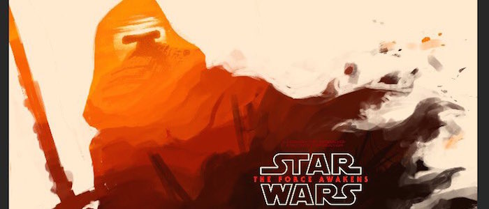
The panel decided to present the most crushing news first. Olly Moss, whose prints for the original Star Wars trilogy are among the most beautiful and sought after (and expensive) posters amongst collectors, did create a poster for Star Wars: The Force Awakens. As you can see below (Moss decided to share the art on Twitter after the panel), it follows the same style as his previous three prints – an iconic silhouette whose details are further suggested by other familiar imagery lurking within that shape. It's beautiful stuff.
Mondo talked about this yesterday, so I guess I can share. Early TFA sketch. I killed it because we weren't allowed to use a billing block. pic.twitter.com/PoZKdXvbWn
— Olly Moss (@ollymoss) October 24, 2016
Unfortunately, the poster never came to fruition because the poster was being created as part of a fine art license with Lucasfilm, which meant that the poster, while it could use the Star Wars title, couldn't be an actual movie poster. Which meant that it could not incorporate a billing block. That turned out to be a deal breaker for Moss, who, according to the panel, wanted it to stylistically align with his original trilogy poster (which had billing blocks) and just really, really likes billing blocks. Still, the panelists noted that this one could be resurrected in the future under the right circumstances.
Speaking of studios and specific licensing issues killing projects, here's the Apocalypse pin Tom Whalen designed to coincide with the release of X-Men: Apocalypse. While pins for various other X-Men characters were approved and produced (joining the large line of Whalen's already existing Mondo pins), Marvel inexplicably refused to approve the use of Apocalypse.
Interestingly, Mondo was also given a firm "No" on Spider-Ham, whose pin was also designed and never produced. The panel noted that some Marvel characters who already have pins, like Nightcrawler, are currently tied up in limbo as well and no one can secure the rights to them.
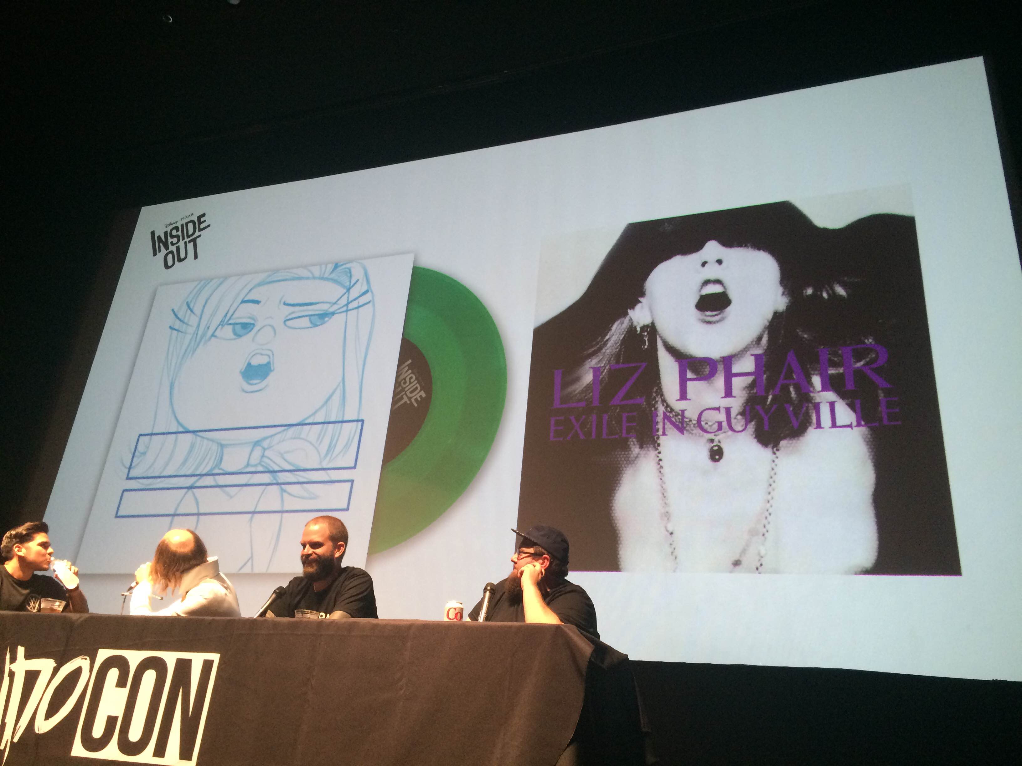
Next, the panel shared a look at the creation of the various LPs Mondo created for the Inside Out soundtrack, revealing that the original inspiration for Disgust's cover was Liz Phair's Exile in Guyville. Unfortunately, it was decided that it wasn't instantly recognizable when translated to another character, so the concept was changed.
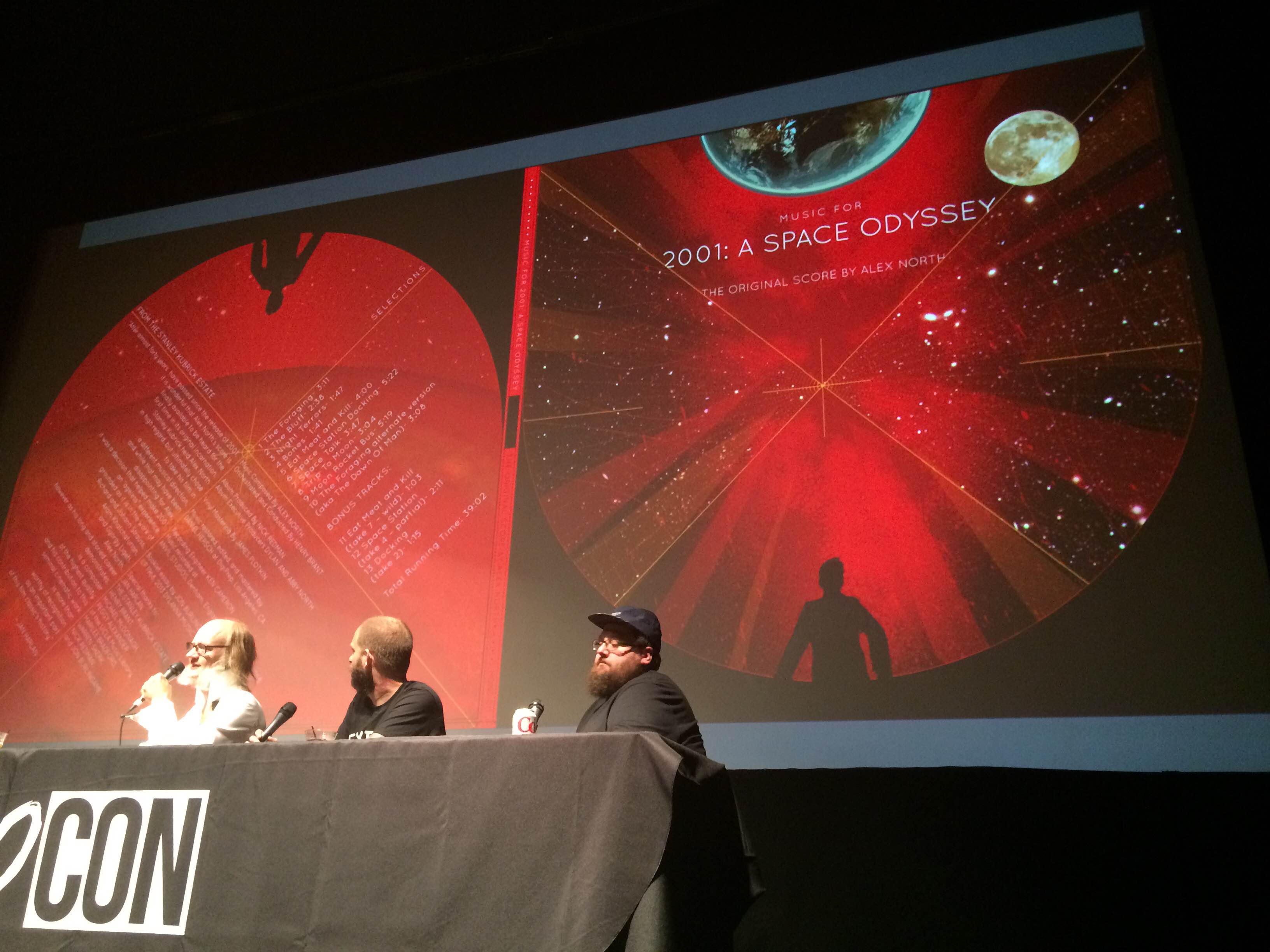
The next abandoned concept was this album cover by Kevin Tong, created for Alex North's recorded (and never used) original soundtrack for 2001: A Space Odyssey. It was a tricky project, as Tong was legally unable to utilize any familiar imagery seen in the actual film. The resulting art was abandoned for a simple black cover, which was intended to act as a wry stand-in for the iconic monolith from the film.
Artist Randy Ortiz is typically known for his more gruesome and horror-themed work, so his attempt at a lovely Rocket and Baby Groot poster represents a huge step away from his normal work. However, Ortiz quickly tired of this change of pace and decided to go back to more familiar territory after a few note sessions.
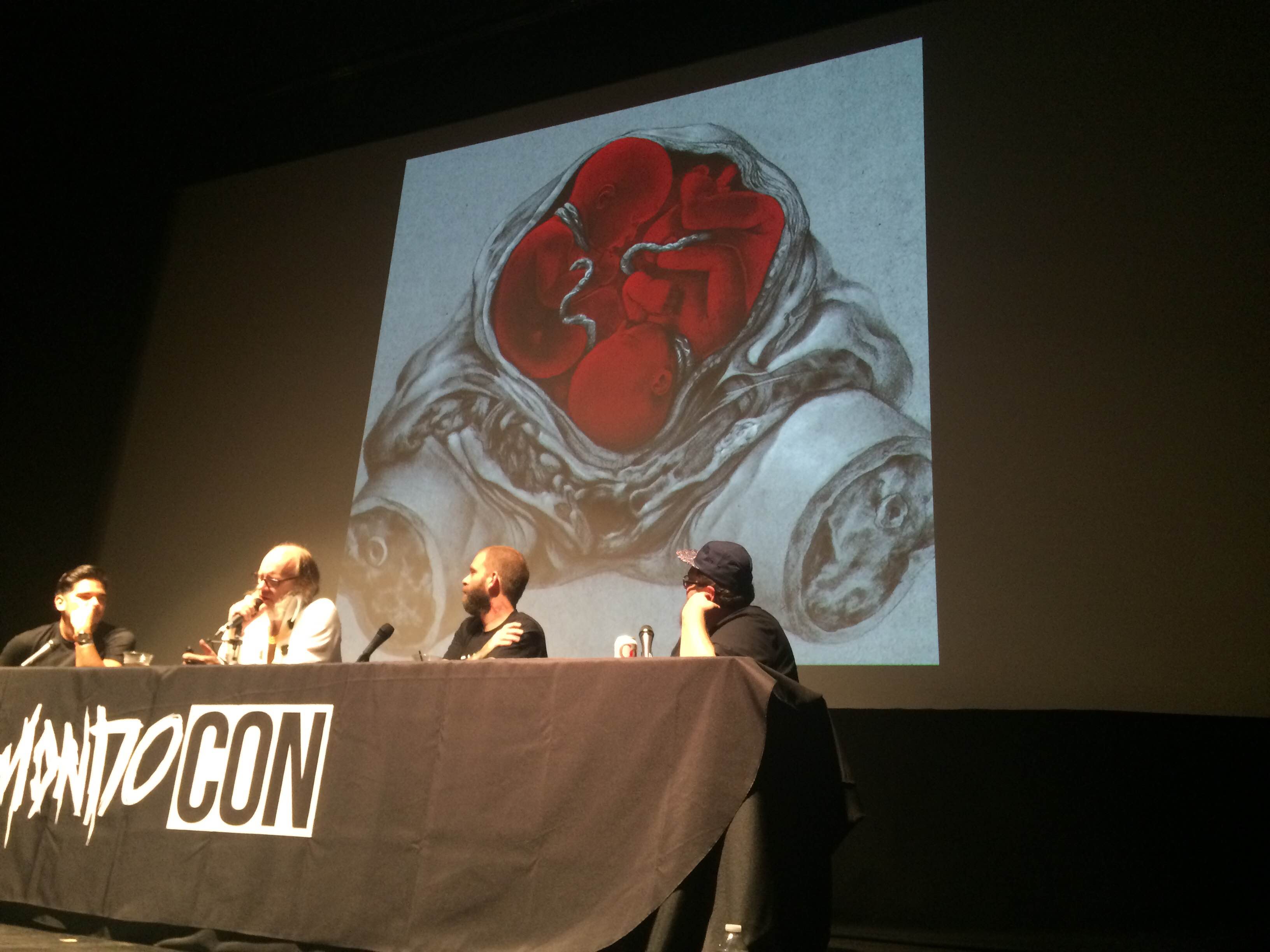
So Randy Ortiz went ahead and drew this cover for Mondo's vinyl release of the soundtrack to David Cronenberg's Dead Ringers. Composer Howard Shore (rightfully?) balked at the hideous (but thematically appropriate!) imagery. The final version was significantly toned down.
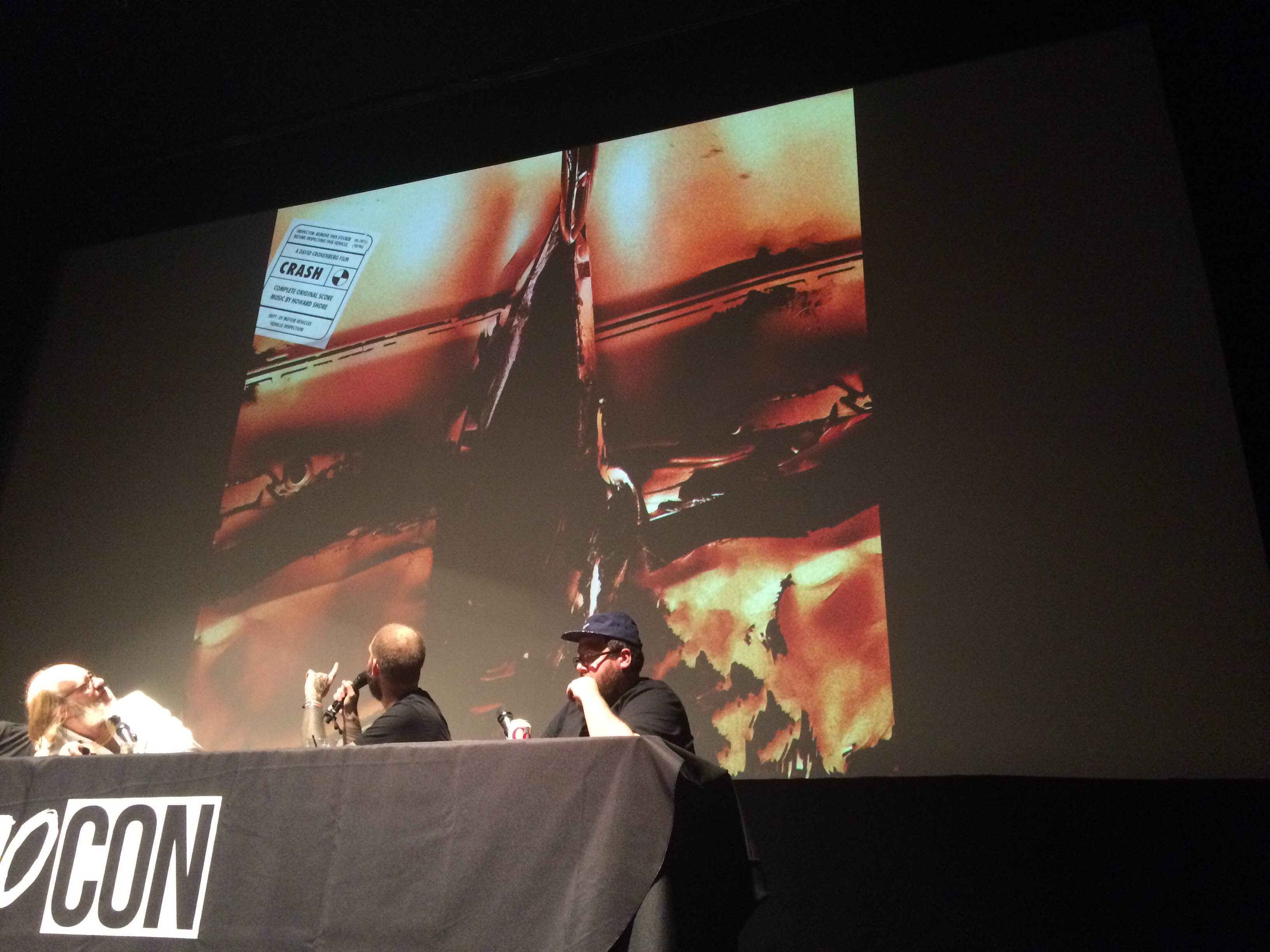
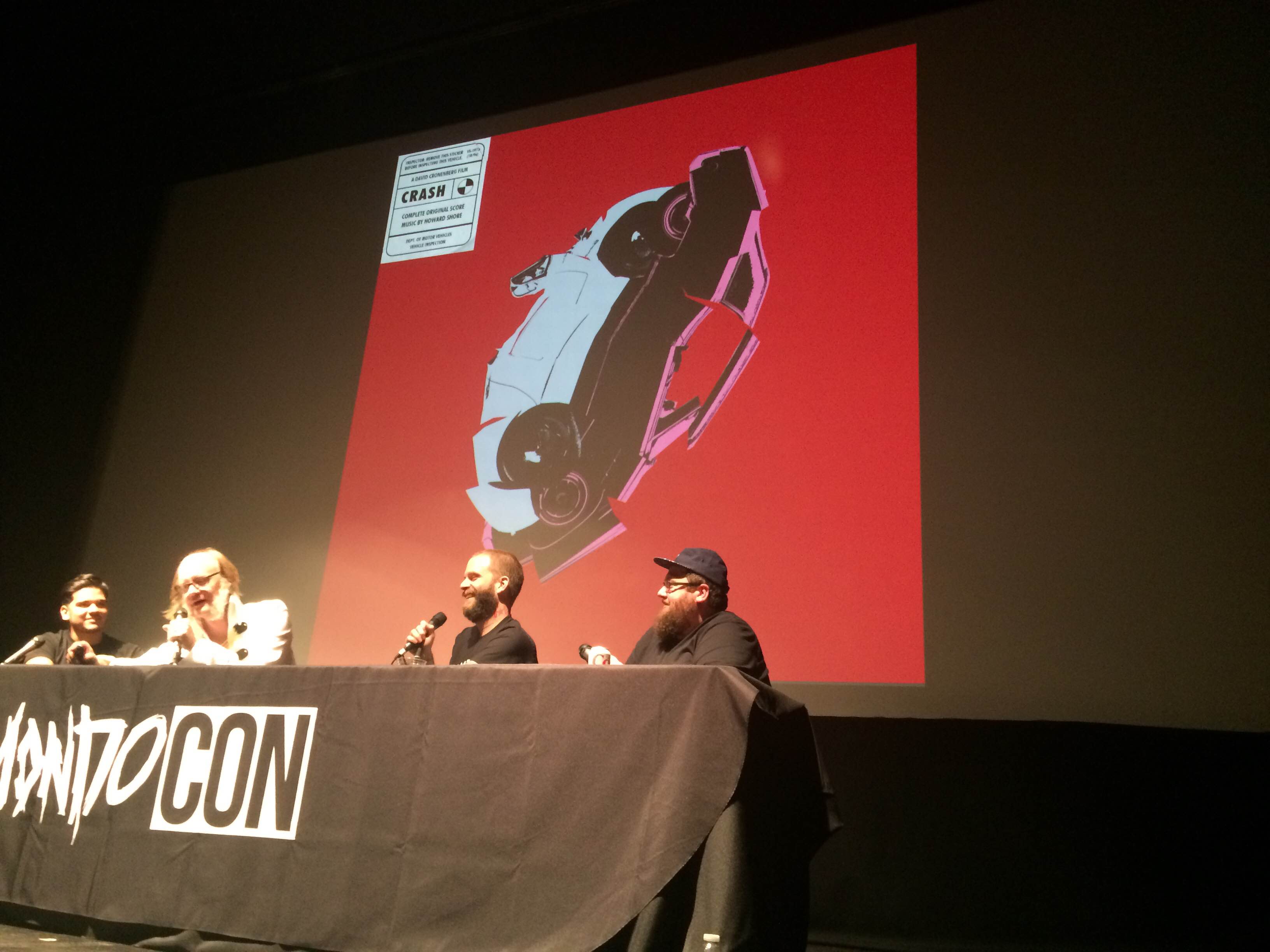
And that wasn't the last time Mondo and Shore didn't see eye-to-eye while they were working on the Cronenberg soundtrack series. Jay Shaw took the first stab at designing a cover for the Crash soundtrack...and if you've seen the movie, it speaks for itself, really. Howard Shore requested that they tone down the overt sexuality, but the concept was ultimately abandoned.
Shaw made one last attempt at a Crash album cover, taking James Dean and Jayne Mansfield's cars and mashing them together so they appeared to be colliding and...well, you know. It's a work of brilliant bad taste, but it was also turned down.
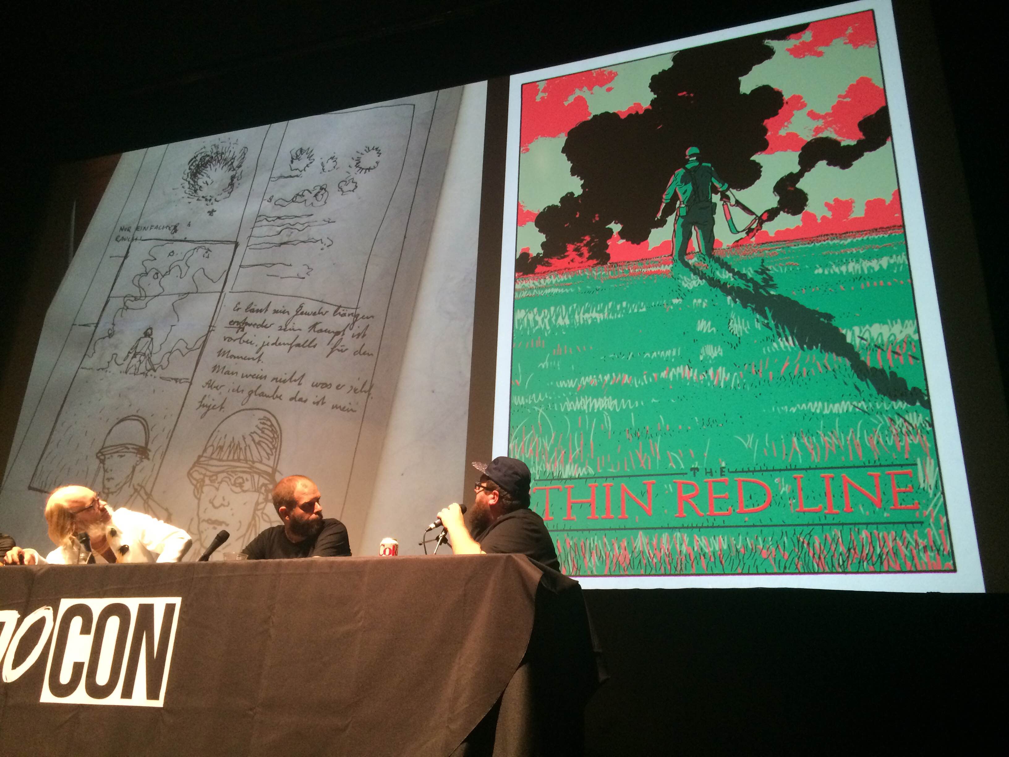
Meanwhile, artist Jared Muralt turned in dozens of sketches for a The Thin Red Line poster that never came to fruition.
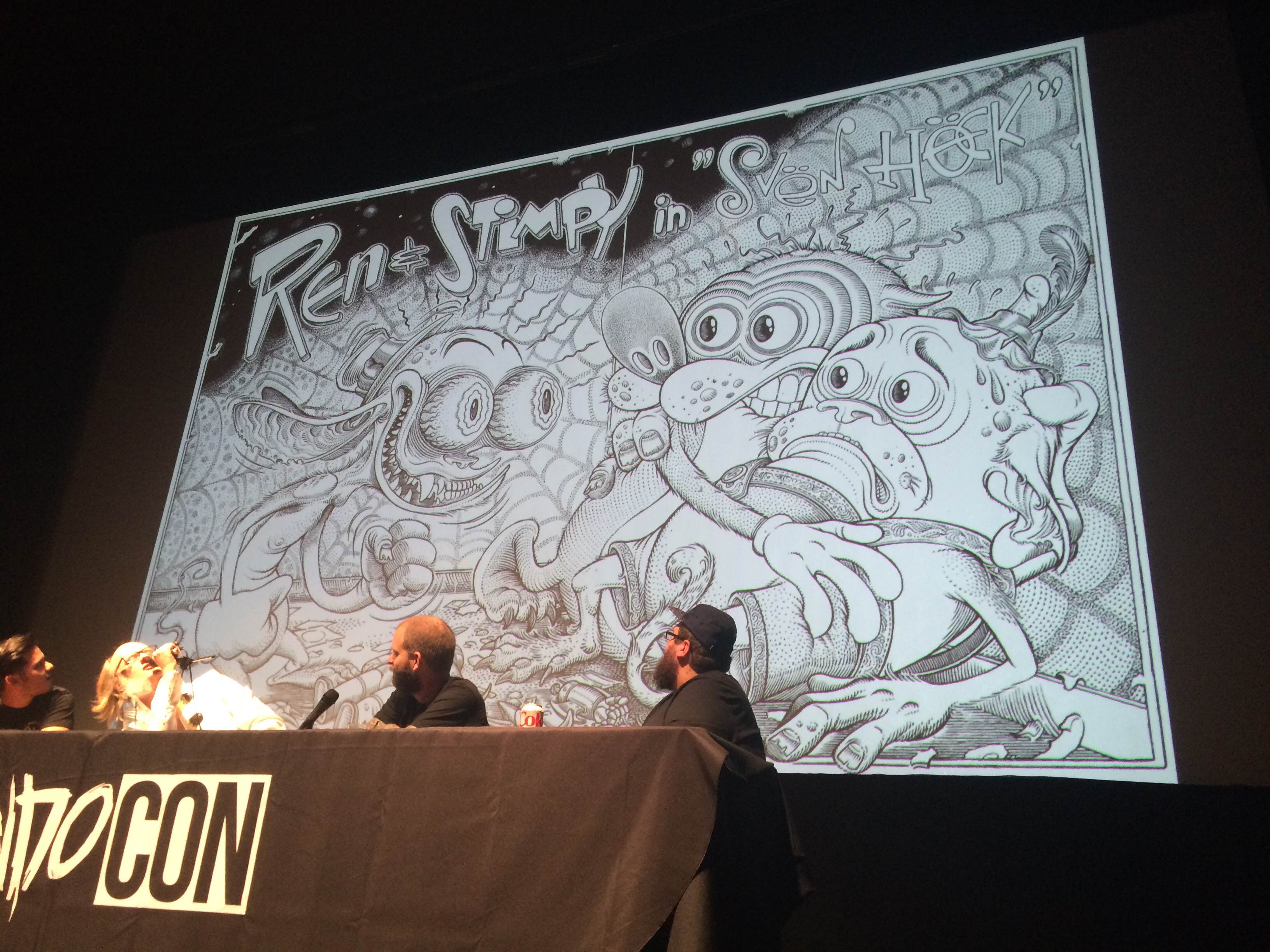
At this point in the panel, everyone received some good news. Mondo is currently working on a Nickelodeon-themed gallery show that will debut later this year and they previewed Florian Bertmer's Ren and Stimpy sketch as proof. Later in the panel, it was confirmed that The Legend of Korra would also be included in the show.
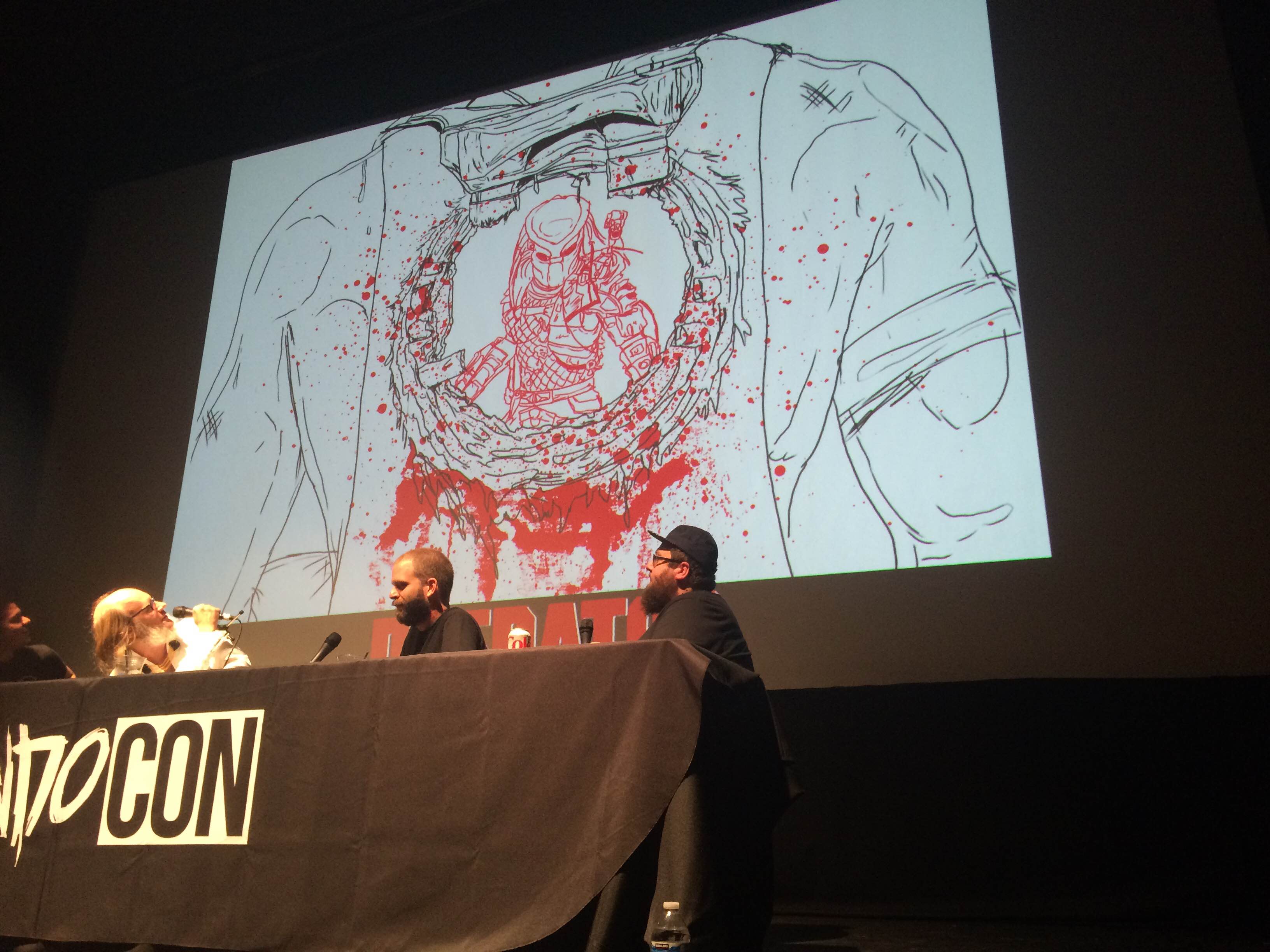
This Boneface design for a potential Predator poster is amazing and disgusting and hilarious and it's a shame that it never got past this rough sketch.
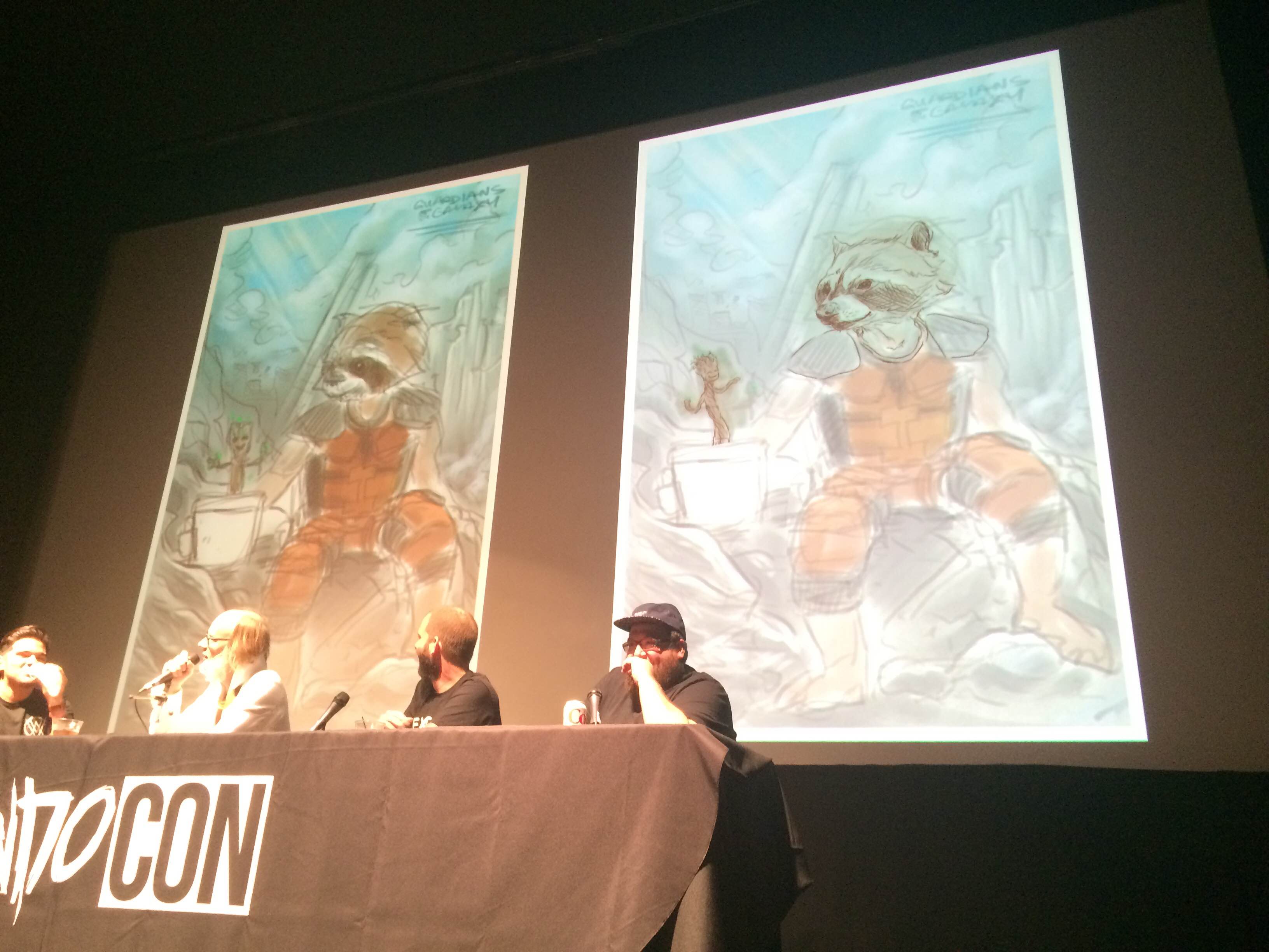
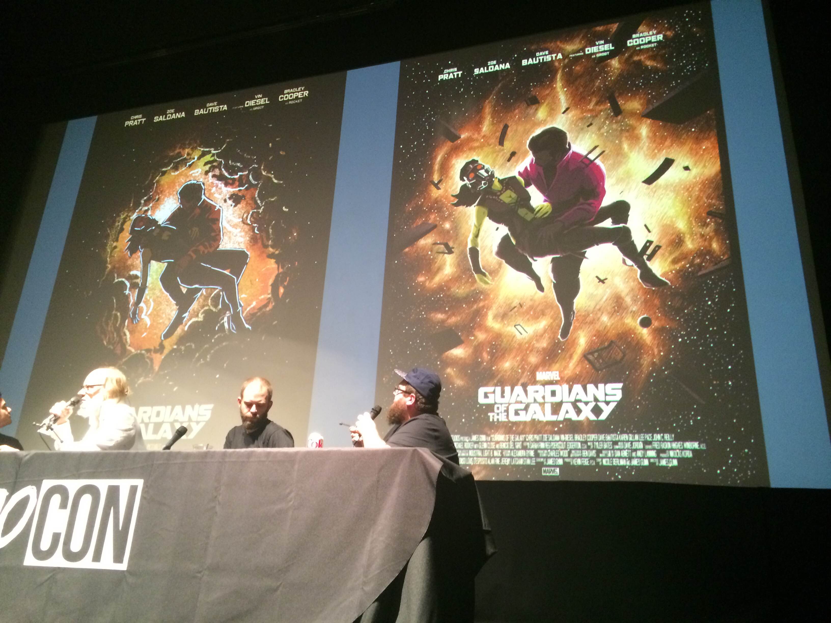
The panel didn't shy away from the fact that, sometimes, certain artists don't gel with particular subjects. As an example, they shared this Guardians of the Galaxy poster from Coke Navarro, which everyone liked in rough format (the one on the left) but didn't work at all when it was finished (the one of the right). Despite the design being completely finished, the Mondo team decided to not print it.
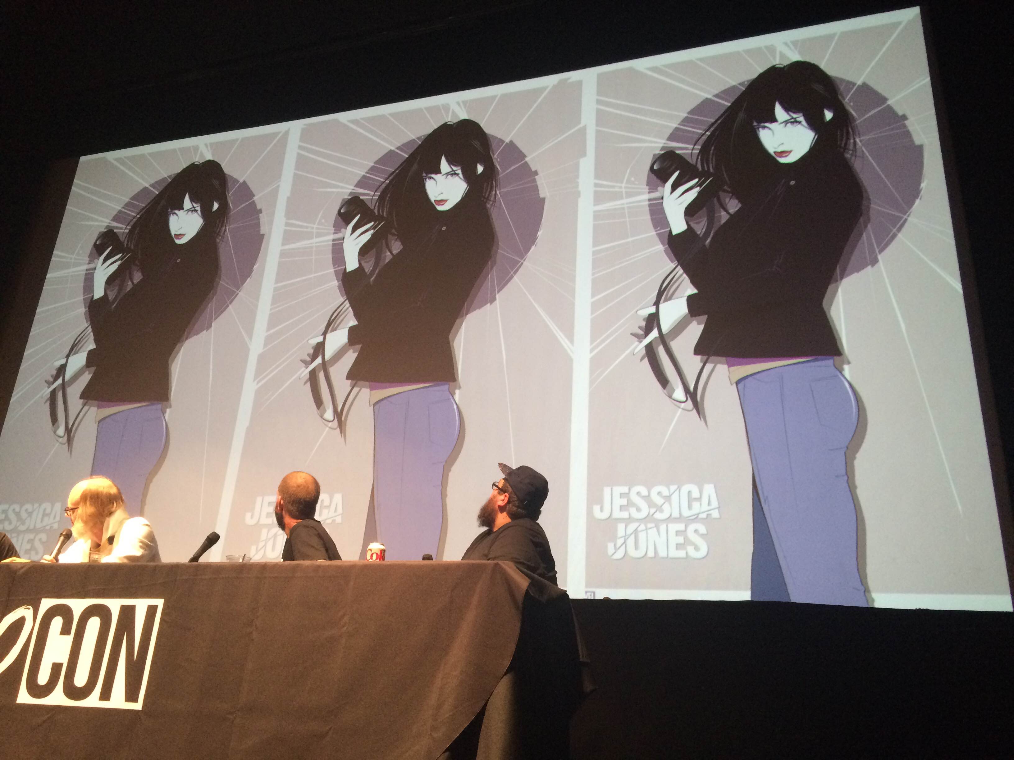
Now this one is a bit heartbreaking. Craig Drake designed this astonishing poster for Jessica Jones (a perfect marriage of subject and artist), but Marvel ultimately wouldn't sign off on it.
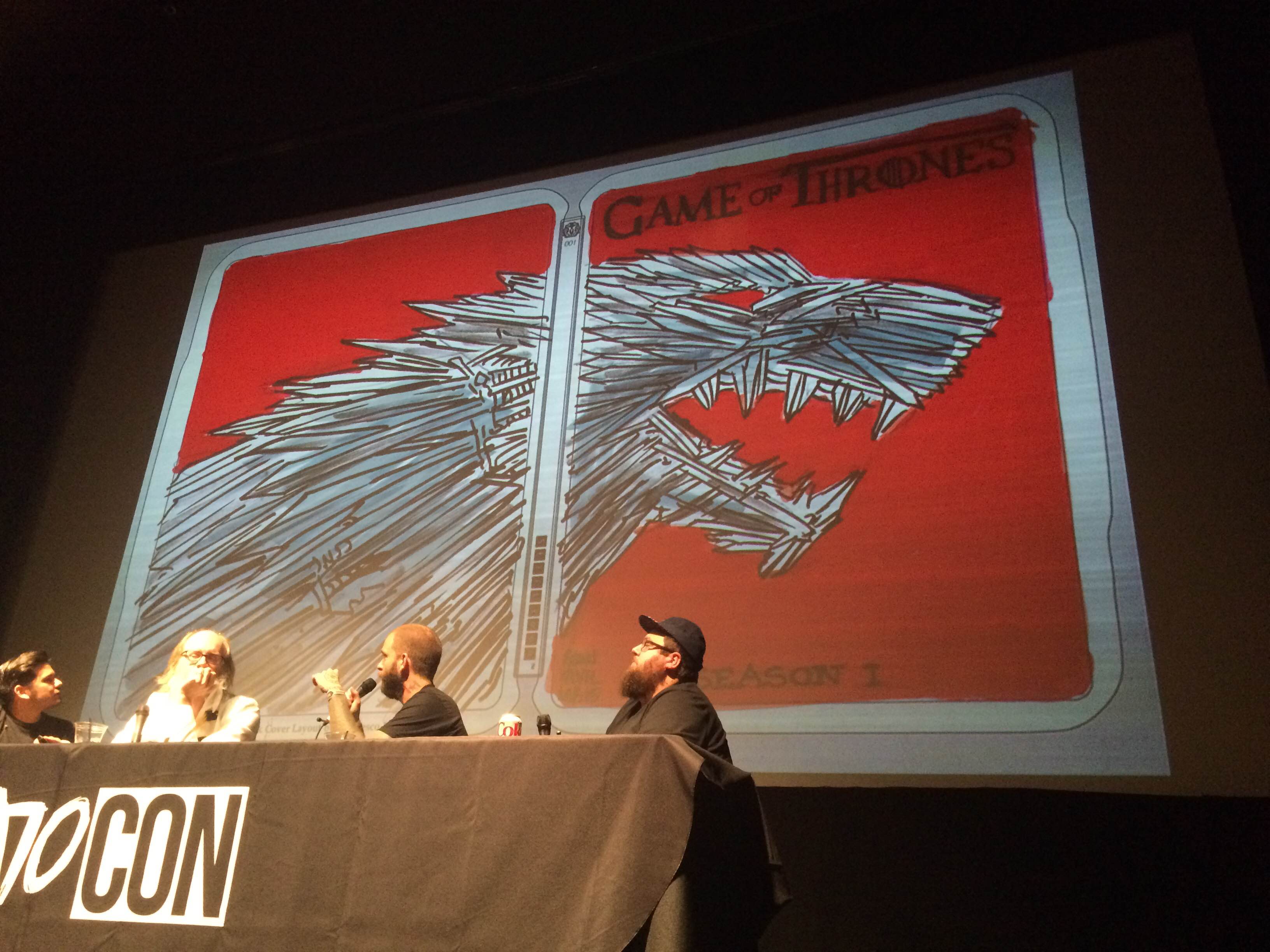
And that brings us to the panel's second most heartbreaking stretch: a Game of Thrones series that never came to be. Initially, HBO approached Mondo about creating art for a series of Blu-ray and DVD steelbooks and Mondo reached out to three of their most popular artists to supply pitches. First up is Francesco Francavilla's concept, which recreates the Stark sigil out of medieval weaponry.
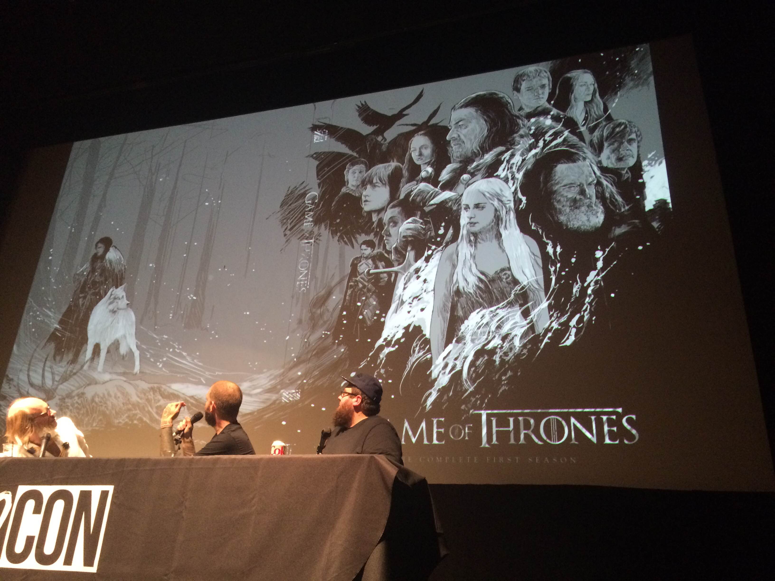
Artist Ken Taylor went all out in his designs, creating concepts for the first three seasons. Although rough, these sketches are beautiful and anyone who has seen Taylor's work before can imagine what the final versions would look like.
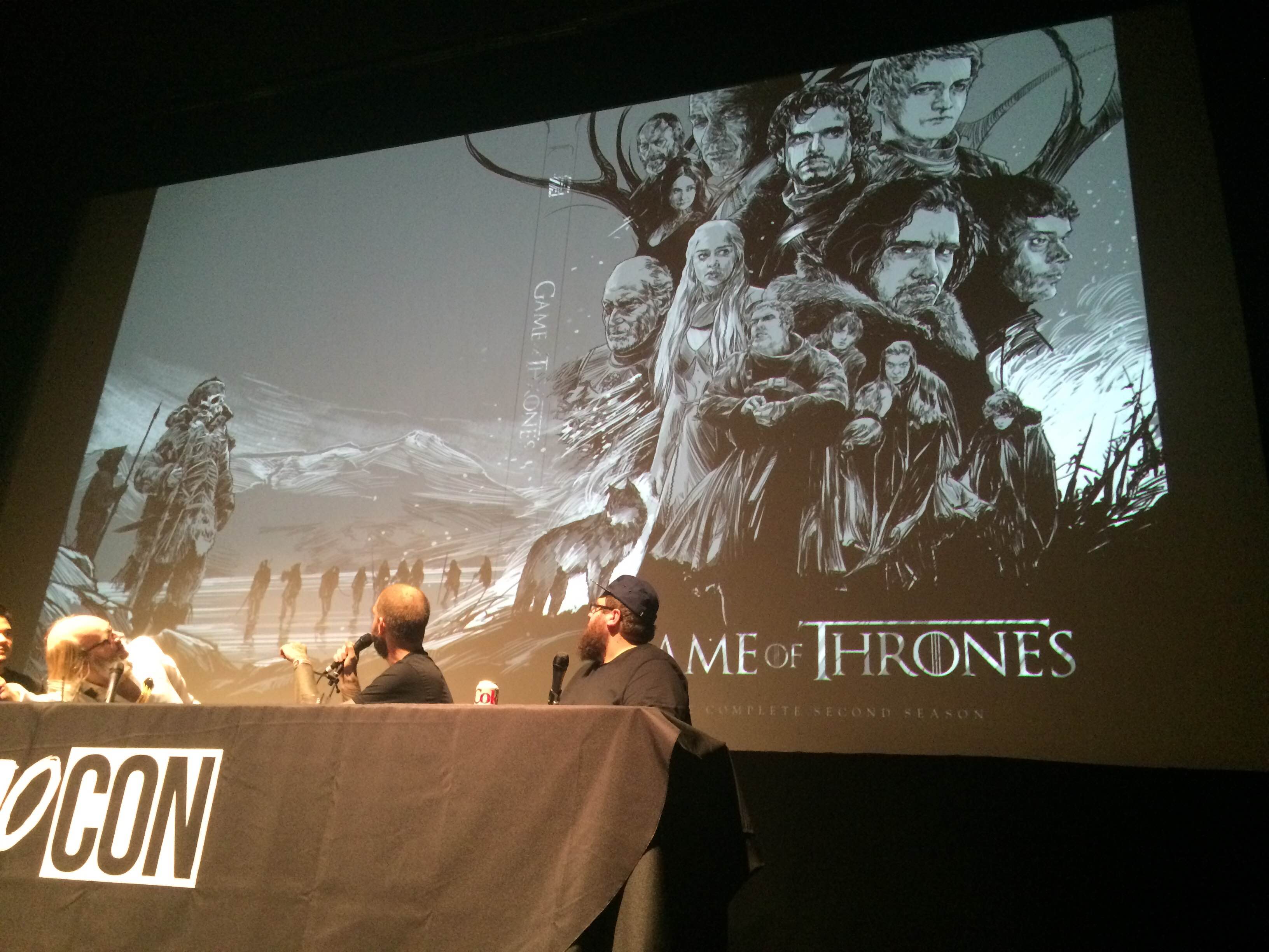
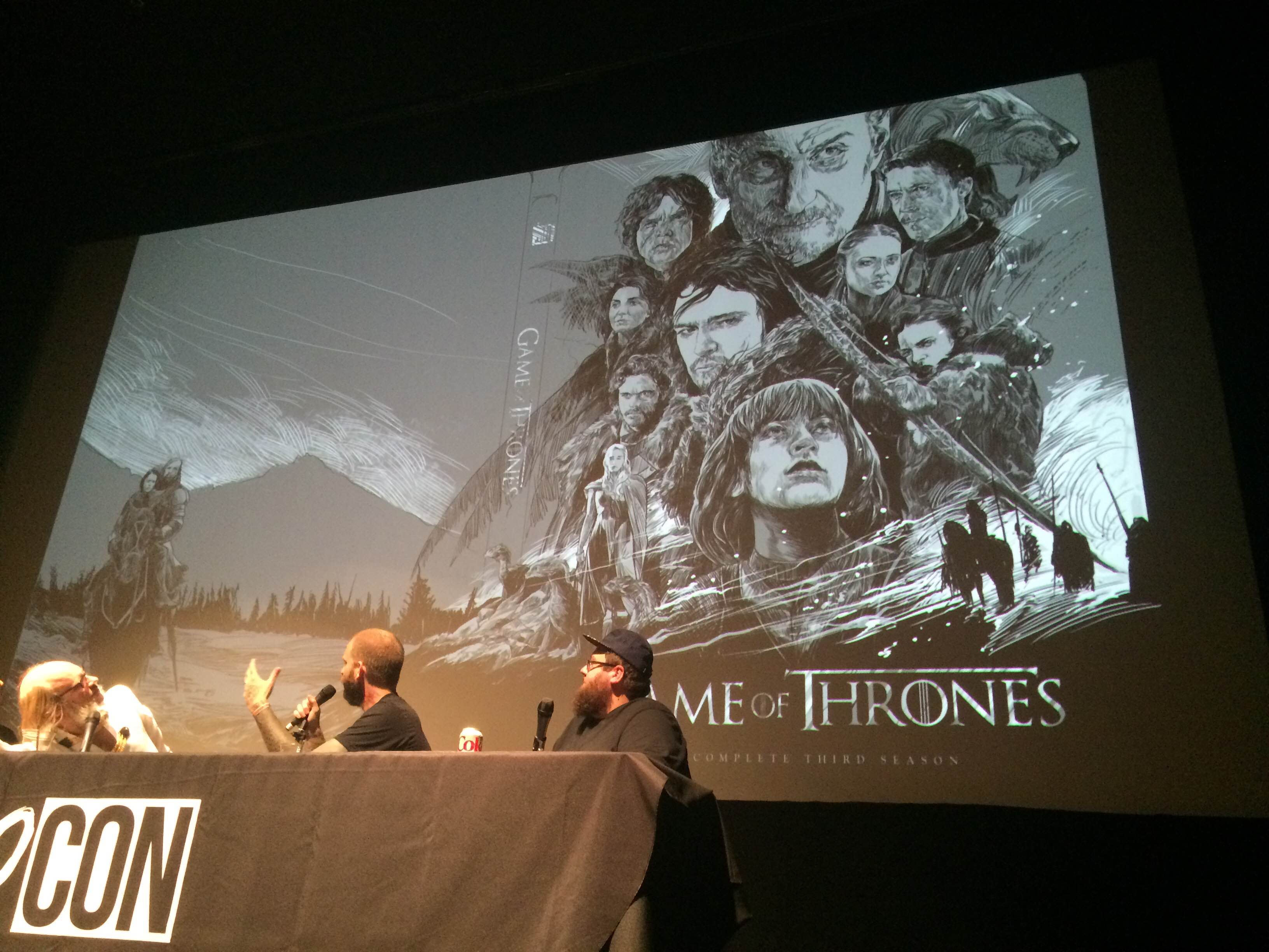
And finally, Martin Ansin (my personal favorite working artist) contributed a few concepts and they're simply stunning to behold.
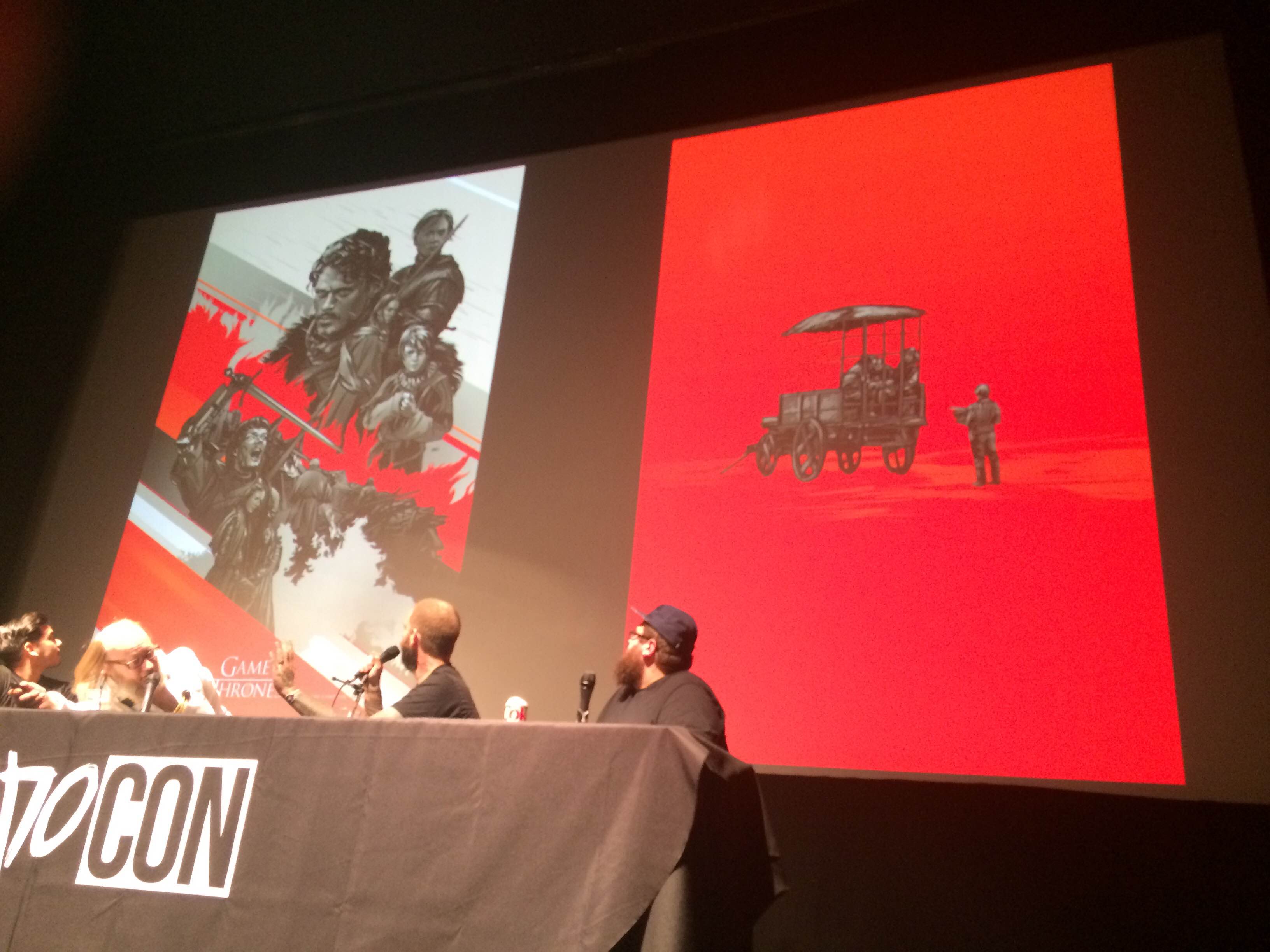
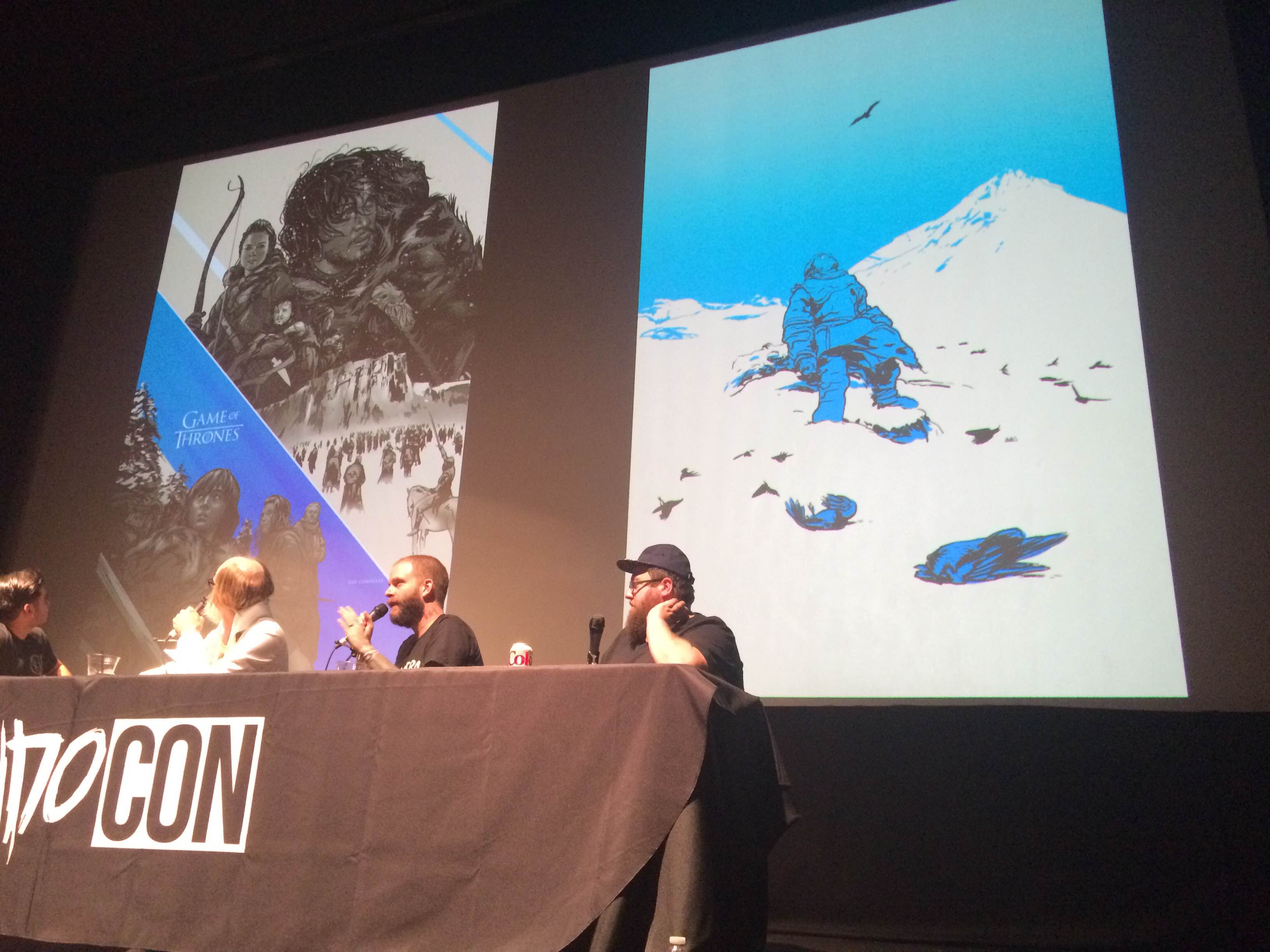
The good news is that HBO loved all of the designs, decided to find a way to incorporate every artist's ideas, and even considered extending the deal to include poster versions of the art. Unfortunately, the final person at the top of the food chain who had to say "yes" to the deal said "no" instead, opting for covers using photographs instead of original art. However, the panelists noted that they still have hope for this series and would like for it to see the light of day.
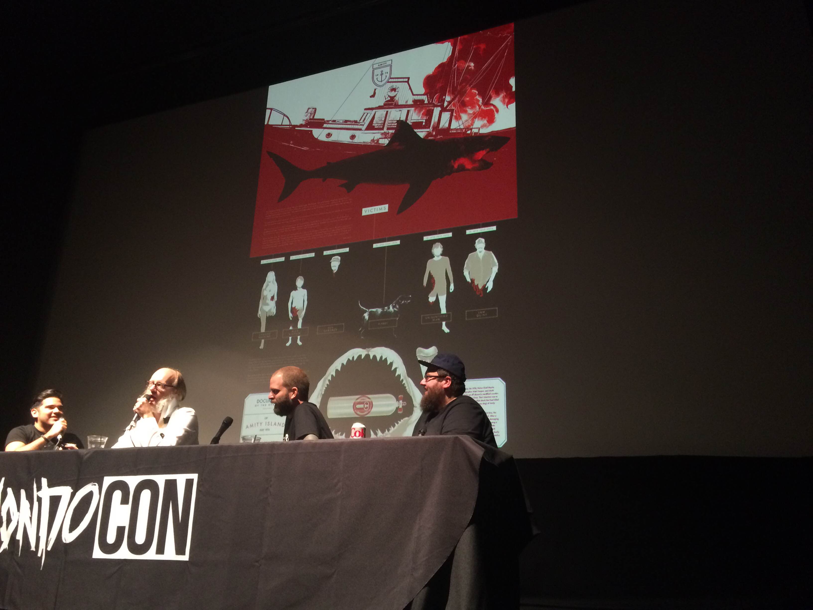
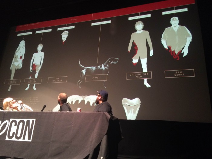
Do you remember Matt Taylor's Jaws poster from Mondo's Info-Rama gallery show, which transformed beloved movies into slick infographics? Go check it out. That's the only way to truly appreciate this hilarious and unused variant, which received an instant "NO" from Universal the moment they tried to send it in.
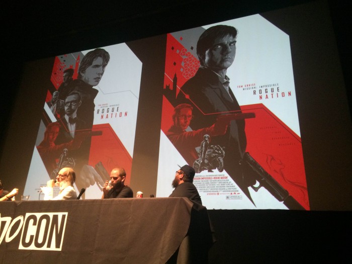
If you're curious why there wasn't a Mondo poster for Mission: Impossible – Rogue Nation, the panel has the whole story. It begins with Paramount's request for a poster that pays tribute to the entire series, the hiring of artist Ken Taylor, and the request to create a poster that doesn't lean too heavily on Tom Cruise (a studio request that will make more sense in a moment). The resulting sketches were pretty much nothing but Tom Cruise.
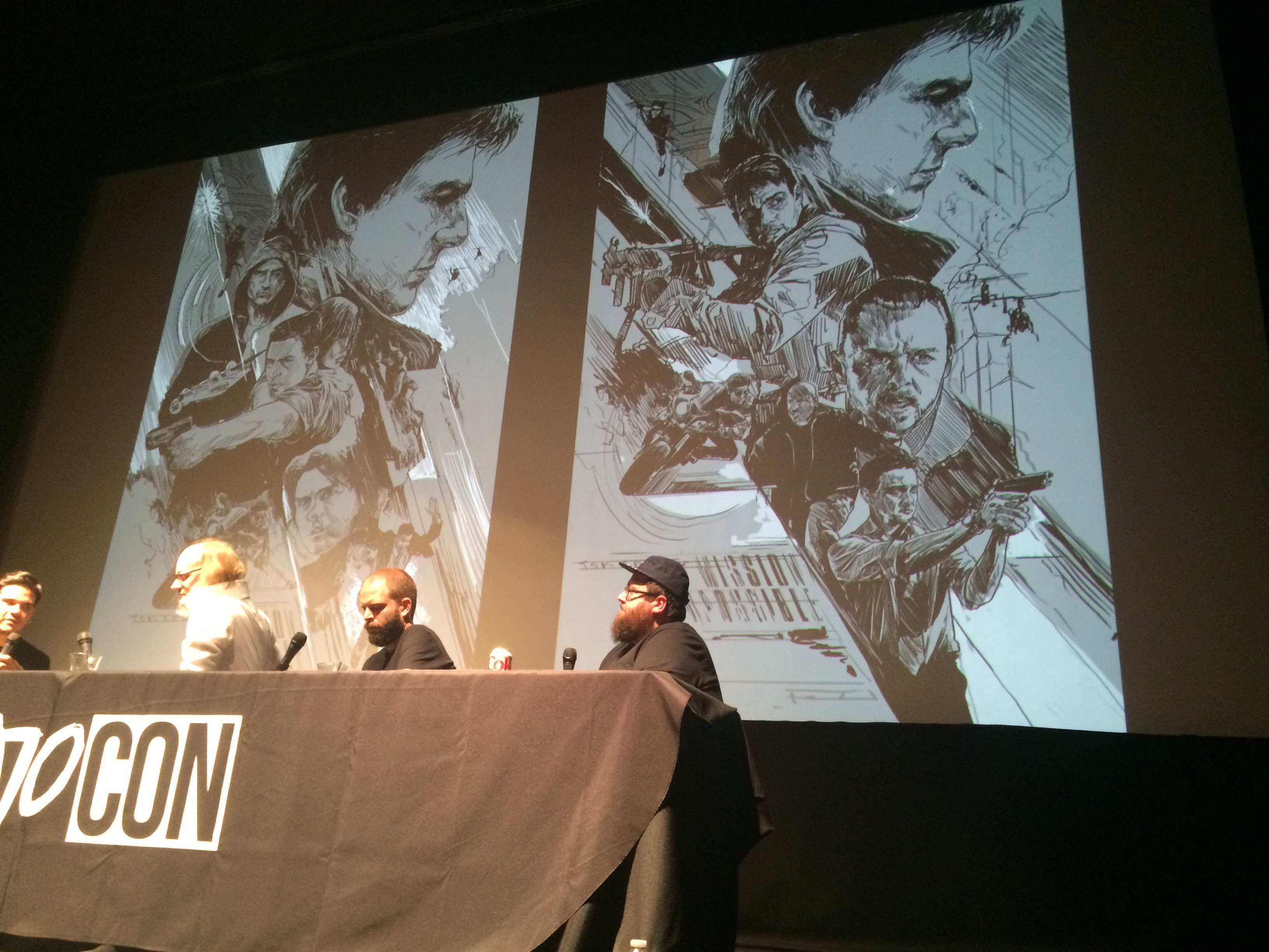
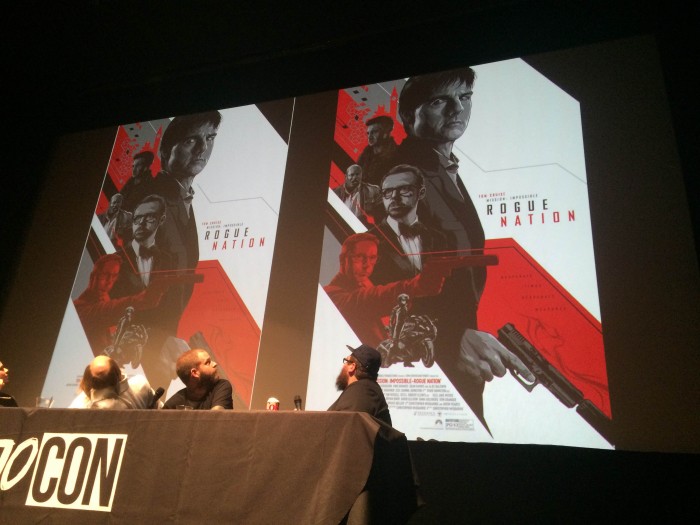
From there, the decision was made to focus solely on Rogue Nation, which resulted in these two posters. While the rest of the cast signed off on their likenesses, Tom Cruise's camp turned out to be difficult, requiring that Taylor only draw Cruise as he's depicted in a series of pre-approved photos. The results didn't quite capture what Cruise looks like these days (or how he looks in Rogue Nation).
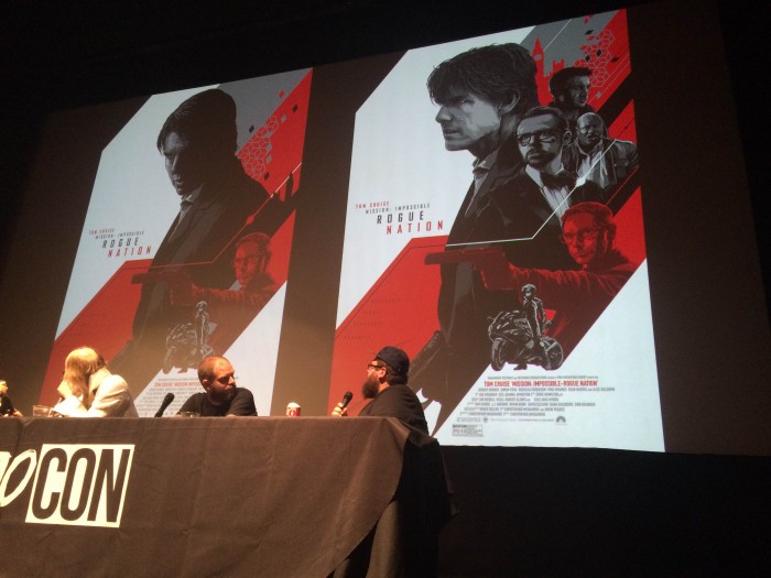
Eventually, it was requested that Taylor remove all of the shadows from Cruise's face, resulting in that boyish and somewhat disturbing depiction on the left (the panel dubbed it the "Lestat" version).
With Cruise's likeness rights still being the main issue with getting the poster finished, the studio ultimately pulled the plug...but not before Taylor produced two more versions where Tom Cruise is almost right.
The panel ended with an interactive portion, where the audience was enlisted to help a Mondo artist decide which version of a poster he was going to finish. The artist in question is Jock, who debuted a new Star Wars poster at Comic-Con earlier this year. Naturally, he wanted to tackle a The Empire Strikes Back poster next and gave the audience two options to choose from. The first concept finds Luke plummeting into the bowels of Cloud City following his duel with Darth Vader:
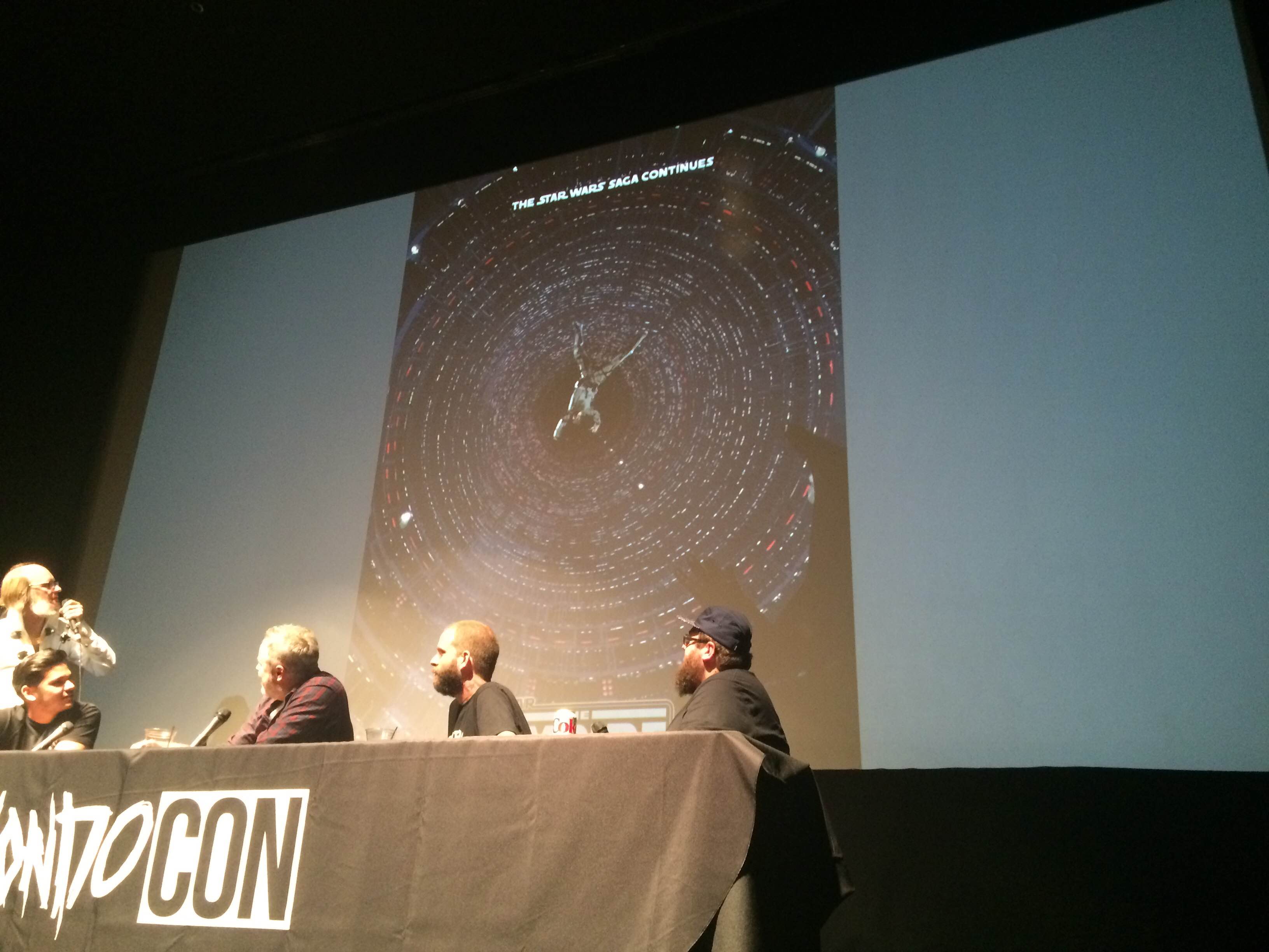
The second is more action-packed, offering a unique angle on Luke as he takes down an AT-AT Walker with his lightsaber during the Battle of Hoth. Jock made it very clear that he preferred this second version more, but the Mondo team was divided on the issue, with half of the panelists supporting the first option and the other half agreeing with Jock.
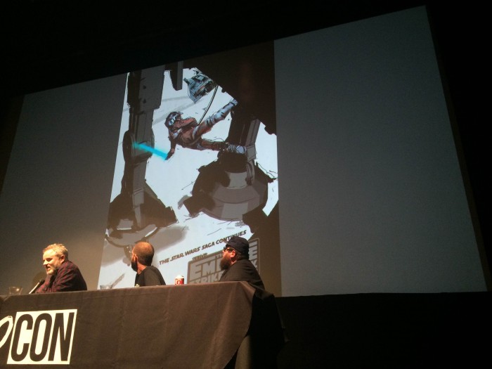
And the audience ultimately agreed with Jock, as that design ultimately won more applause (measured with a decibel app!) than the first design. So when the finished version of Jock's The Empire Strikes Back poster arrives in the future, you now know who you have to thank/blame.