MondoCon 2016: What Happens When Three Artists Try To Design A Poster Live On Stage?
What happens when you take three popular artists with very different design aesthetics, put them on a stage in front of a live audience, and ask them to design a movie poster together based on a title thrown out by the crowd? Well, a MondoCon 2016 panel decided to find out.
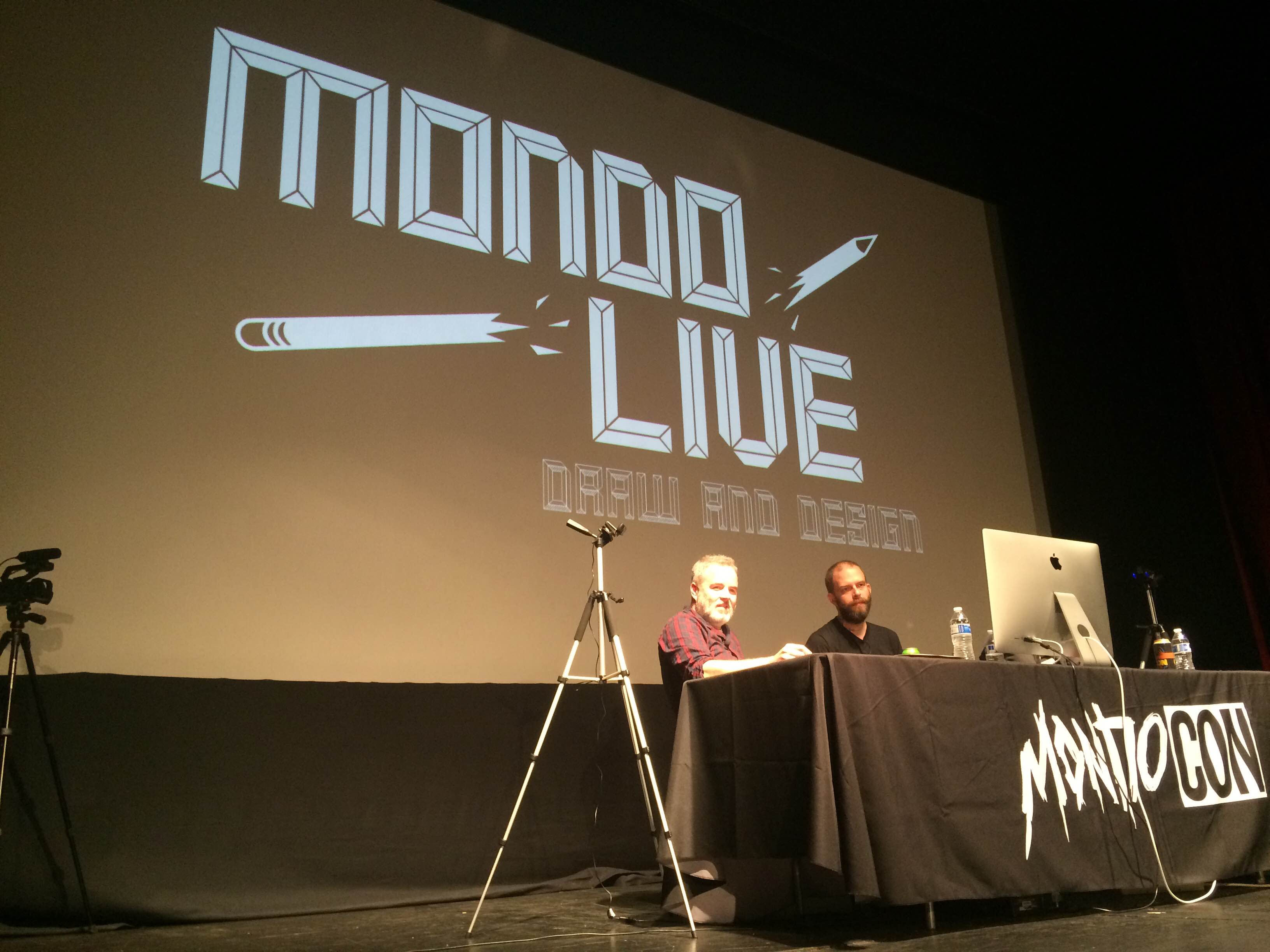
Despite the unassuming title, the Mondo Live: Draw & Design panel was a highlight of an already excellent weekend, taking artists Jay Shaw, Olly Moss, and Jock and asking them to race against the clock to create something that wasn't a total disaster. Succeed or fail, it was destined to be a memorable time.
This is the point in the article where I apologize for the photo quality. Photographing a bright stage with an iPhone camera that has seen better days is not ideal, but you'll get the point.
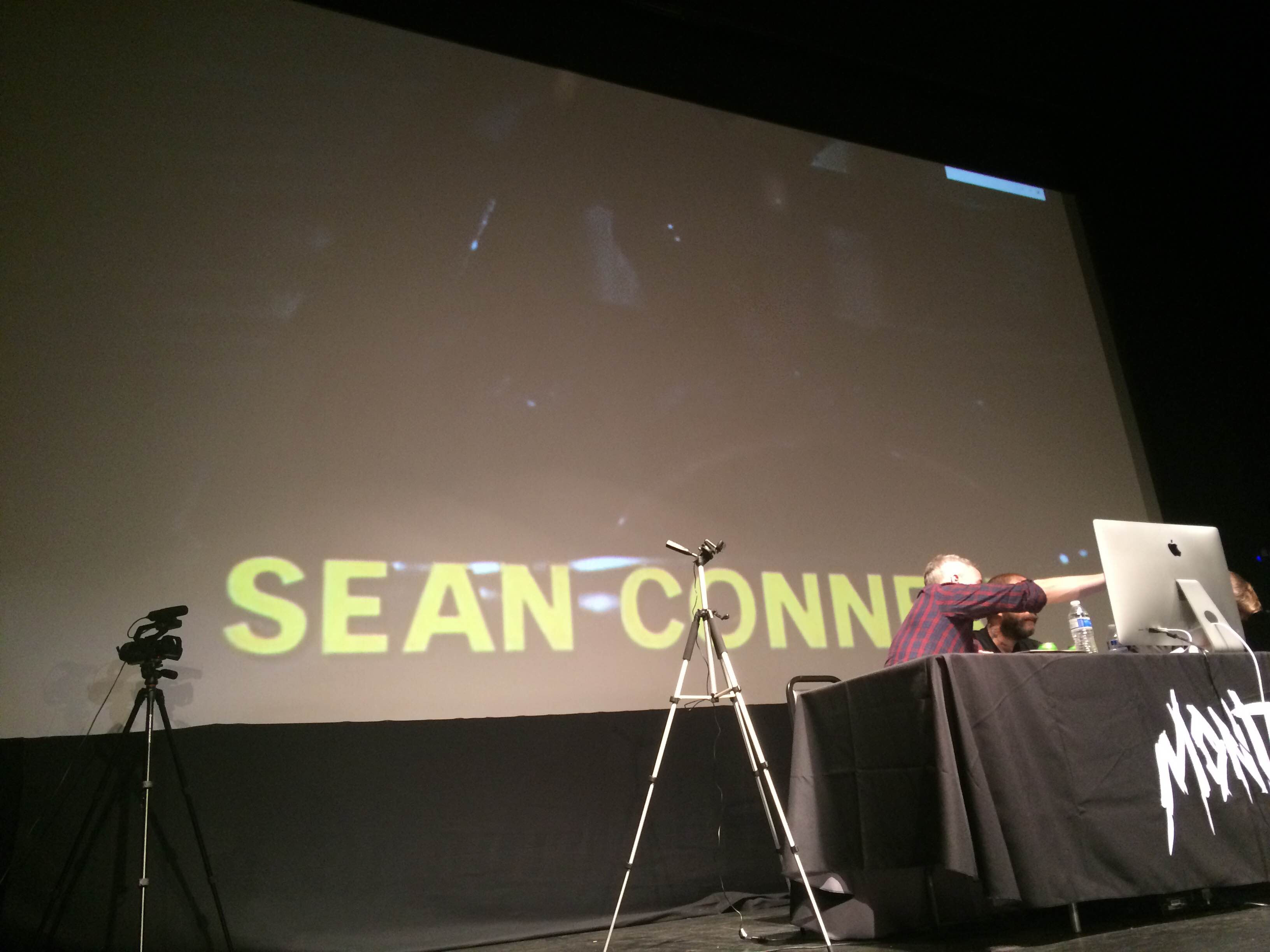
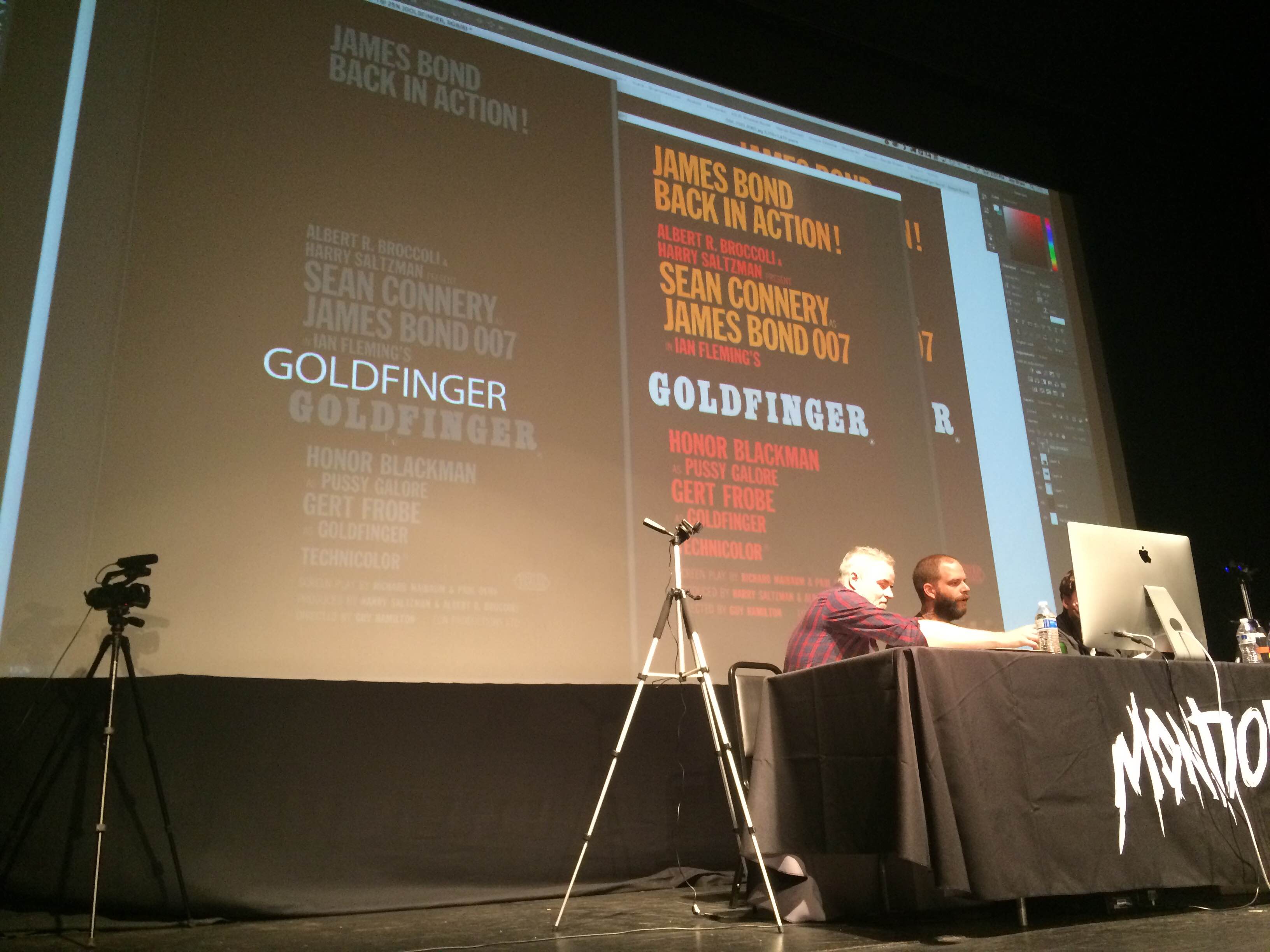
Let's set the stage: the artists are, from left to right, Mark Simpson (AKA Jock), Jay Shaw, and Olly Moss, who is currently hidden by that computer screen in the first photo. When they sat down, they had no idea which movie they'd be tackling. All they knew is that they had one hour to do it. Live on stage. In front of 300 people. With cameras tracking their every move and decision.
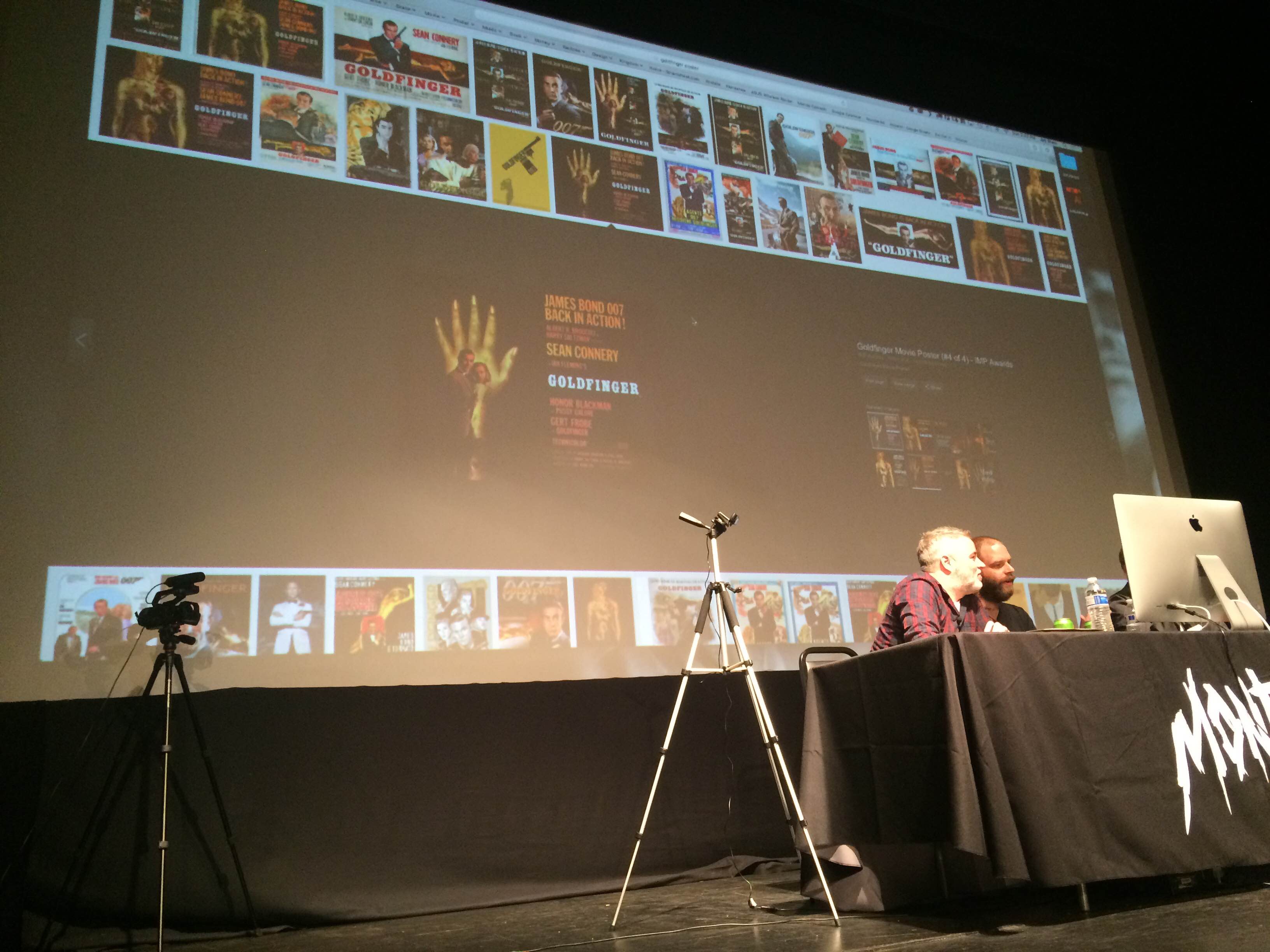
The first task was to pick a movie and they threw the idea out to the crowd. There were dozens of suggestions (the guy behind me really, really wanted Con Air), but ultimately, the audience and artist rallied behind three movies: Goldfinger, The Wicker Man, and National Treasure, with the latter feeling more like a dare than a real suggestion. In a contest of judging applause by volume (true democracy!), Goldfinger was the clear winner and the artists immediately leaped into action.
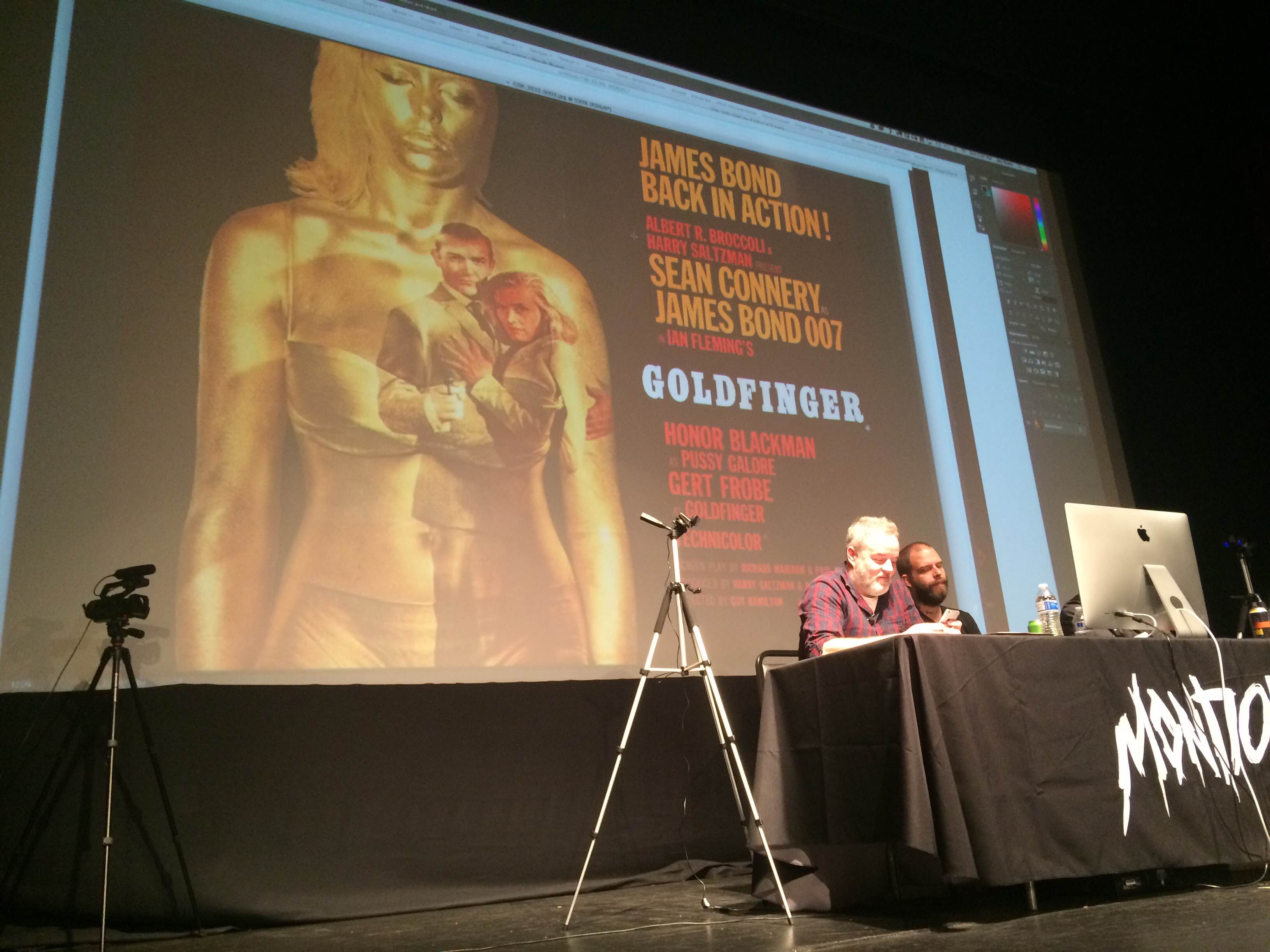
Step one was a visit to Google images, because all three artists noted that there is nothing worse than having a great idea, working on it, and realizing that someone else has already done it. The trio spent a few minutes looking through the film's original posters and a few fan-made creations, with Shaw ribbing Moss after discovering a truly terrible poster created in Moss' signature style.
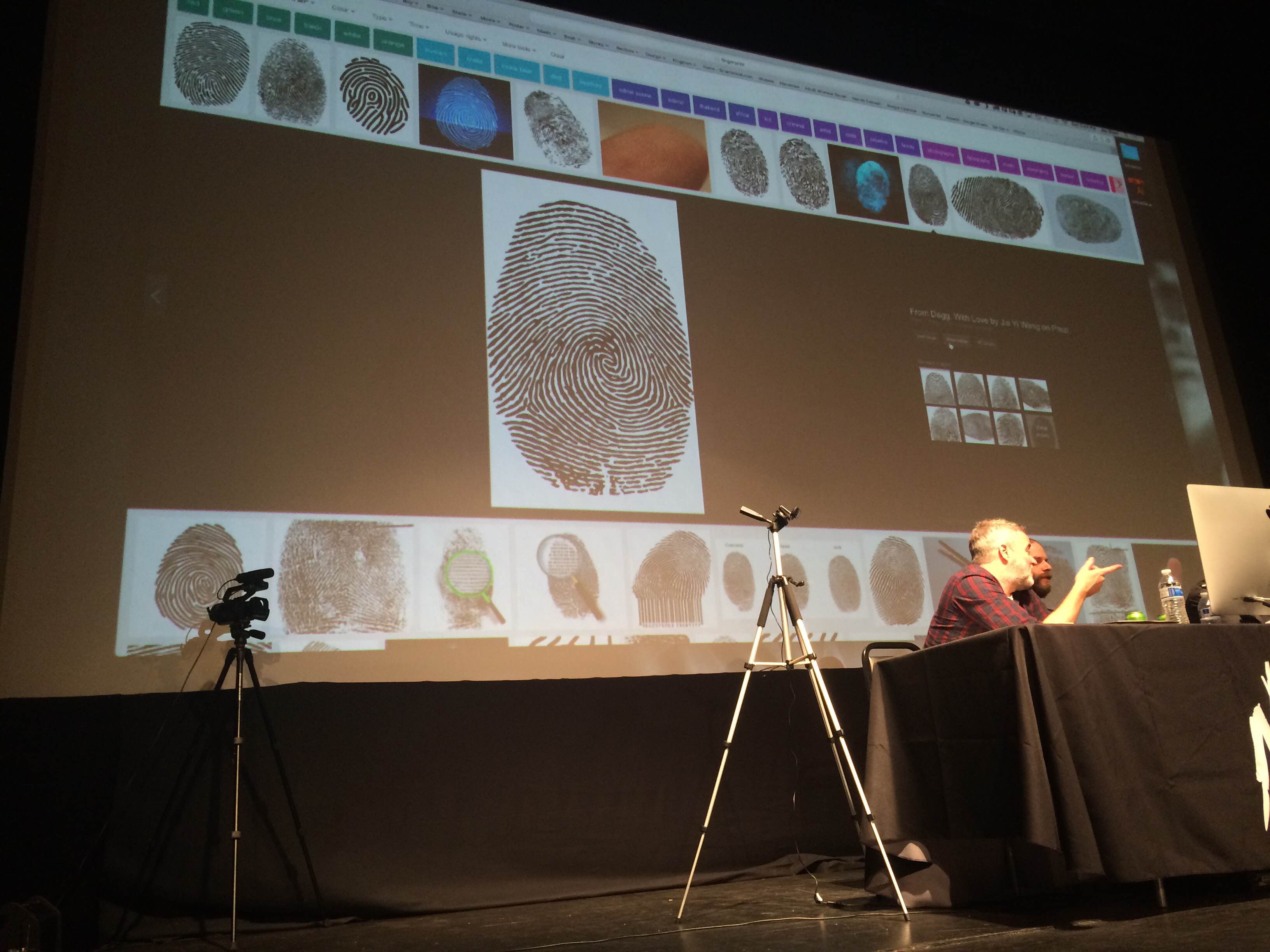
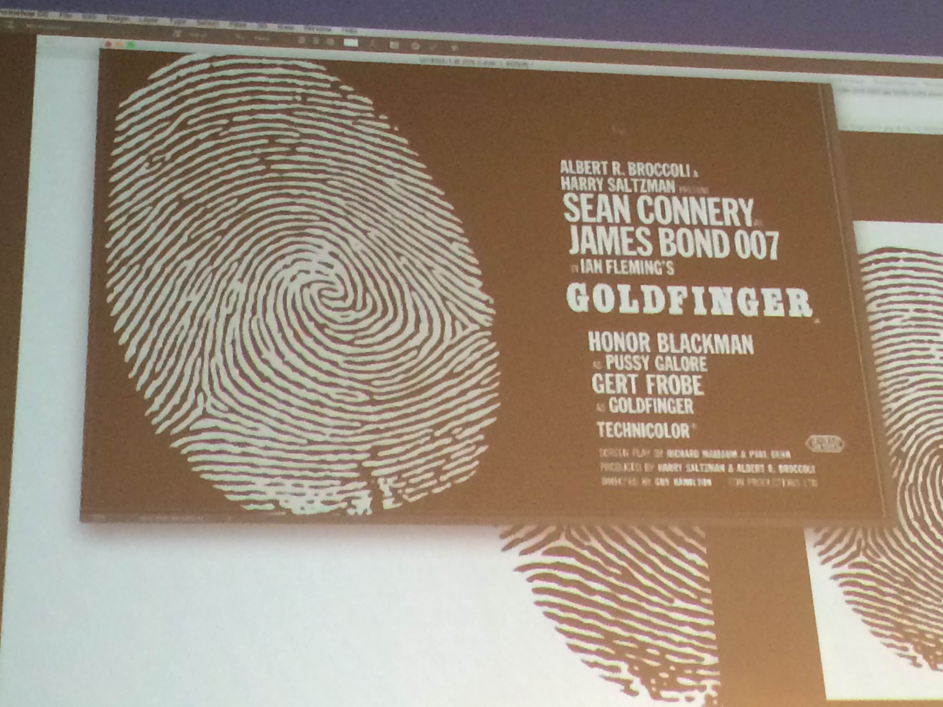
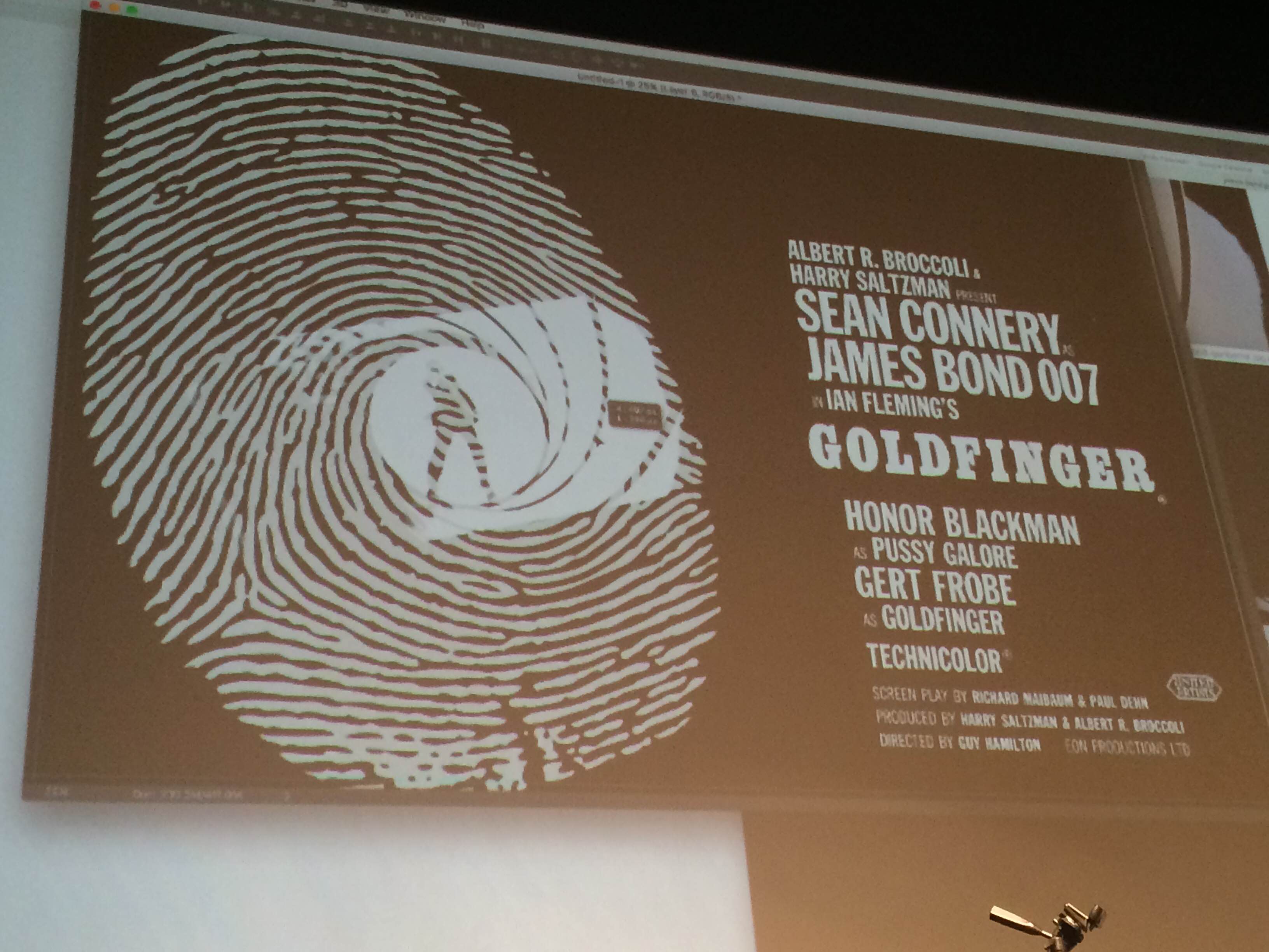
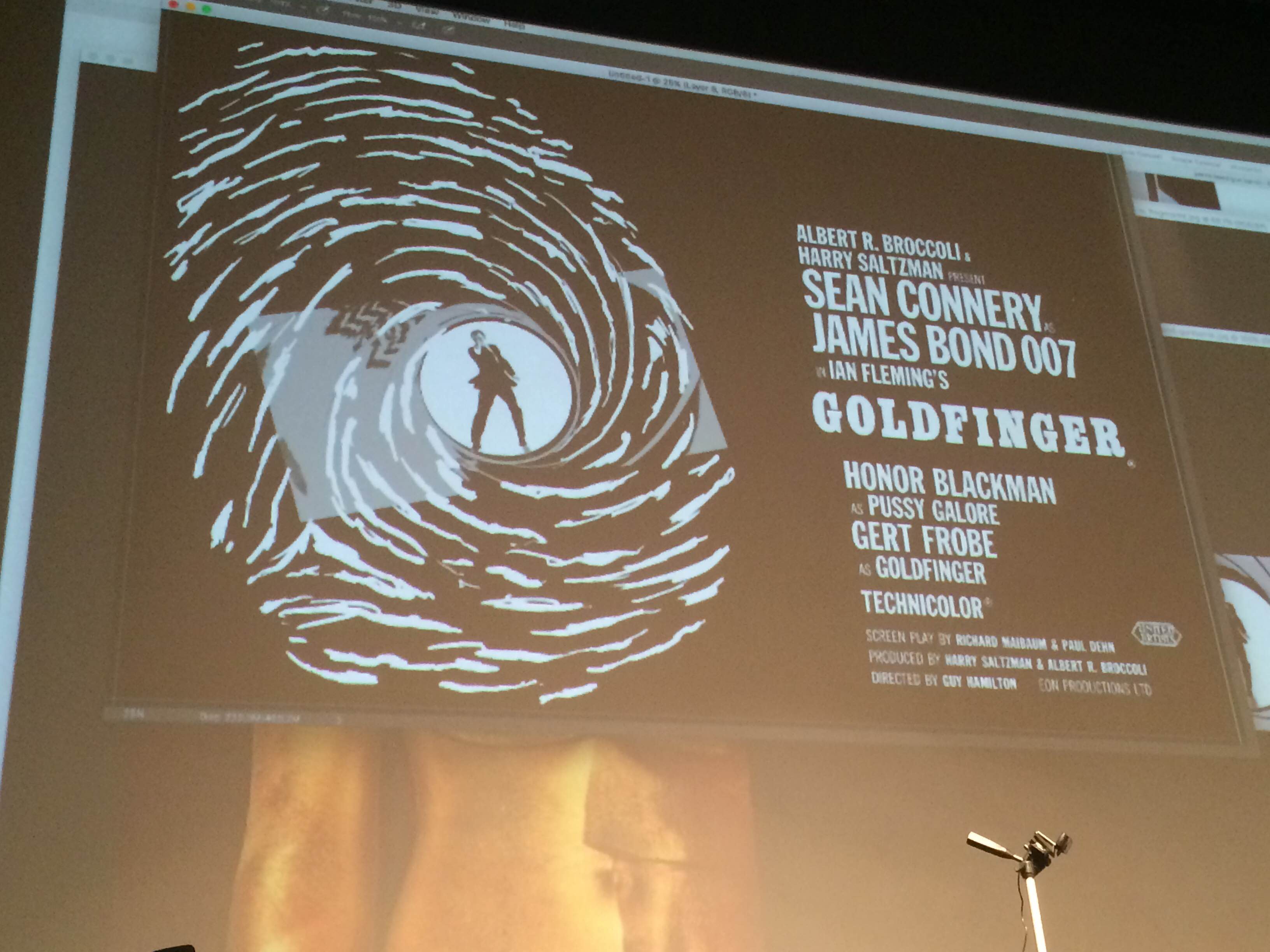
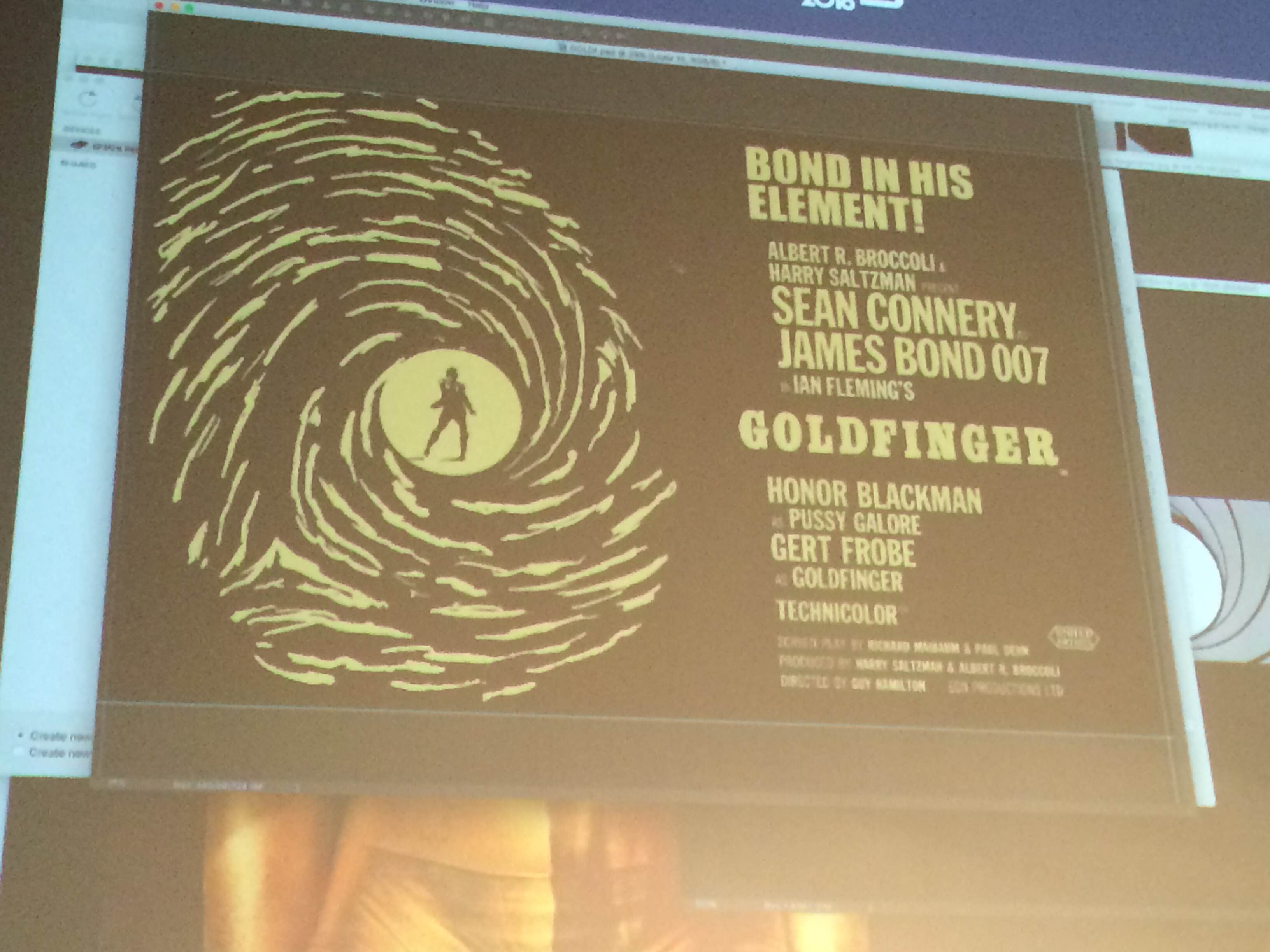
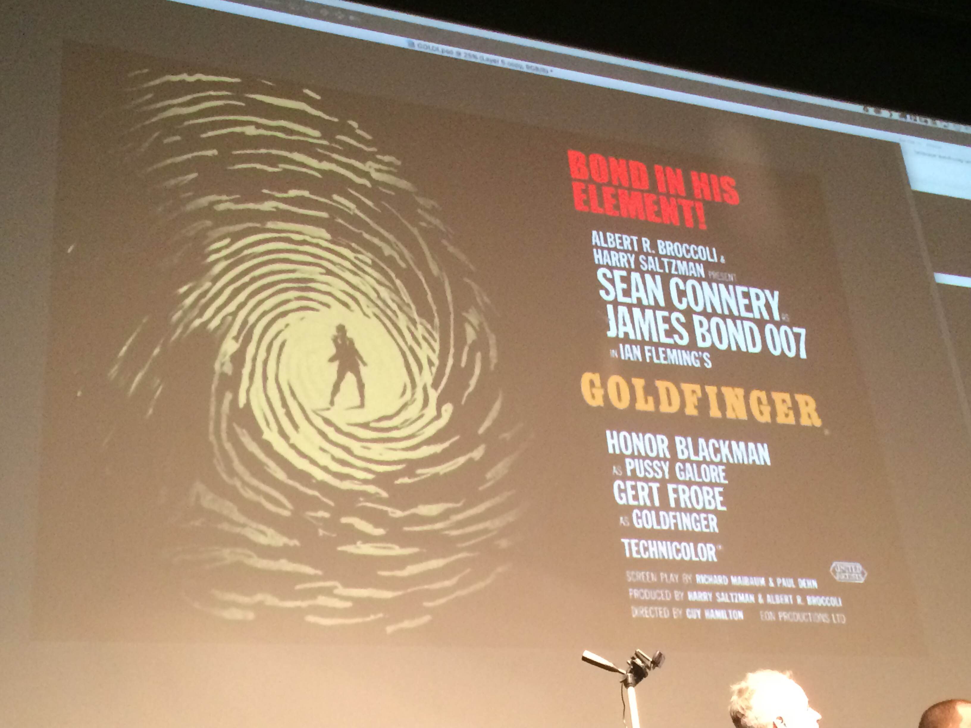
Shaw, Moss, and Jock decided on a central concept surprisingly quickly: they'd take the title literally and build the poster around a large gold fingerprint. They'd bring James Bond into the poster by placing him in the middle of the finger, inside that classic gun barrel shot that opens every 007 movie, which would slowly unravel and transform into the lines of the finger. Since fingerprints are so detailed, the group found a reference for their work, noting that if this was an actual project, they'd use a licensed and legal image instead of something just dredged up on Google.
As they searched for the necessary elements to create the poster, they watched the original trailer for Goldfinger to refresh their memories about the film's characters, story, and tone.
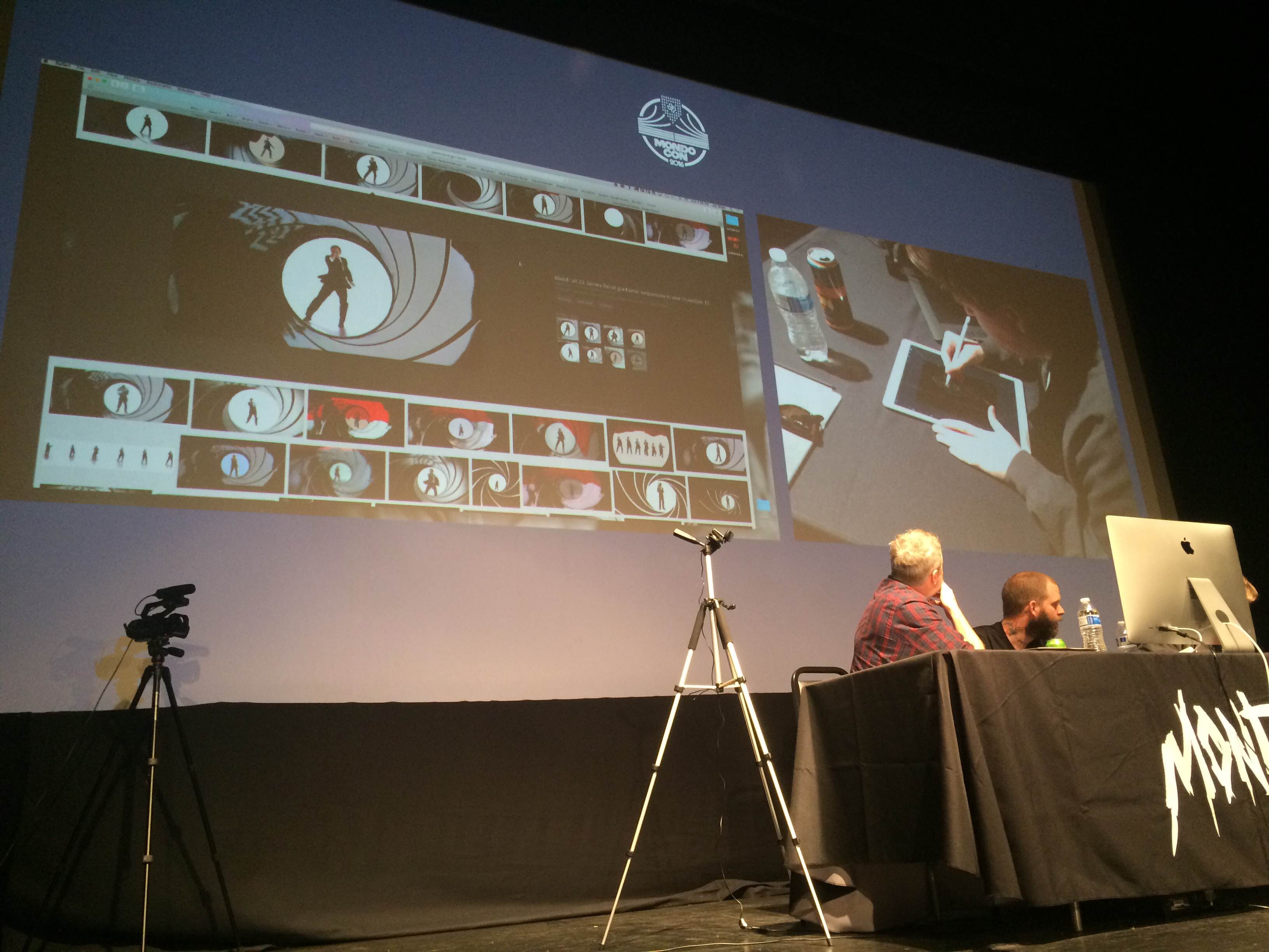
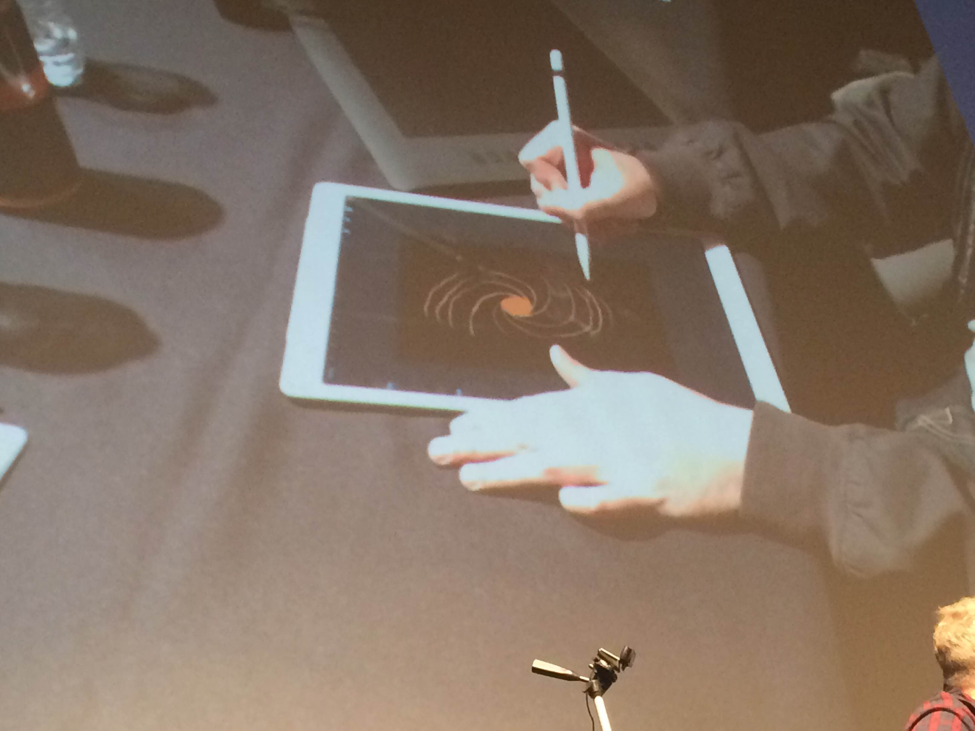
While Moss used his tablet to draw a fast and dirty thumbnail for reference, Shaw found an image of the classic James Bond gun barrel that would act as a stand-in while they designed the rest of the poster around it.
Everyone agreed that the poster would need a credits block, so the decision was made to borrow and modify the credits from one of the film's original posters. Naturally, an actual poster being produced on a realistic timeframe would create this element from scratch.
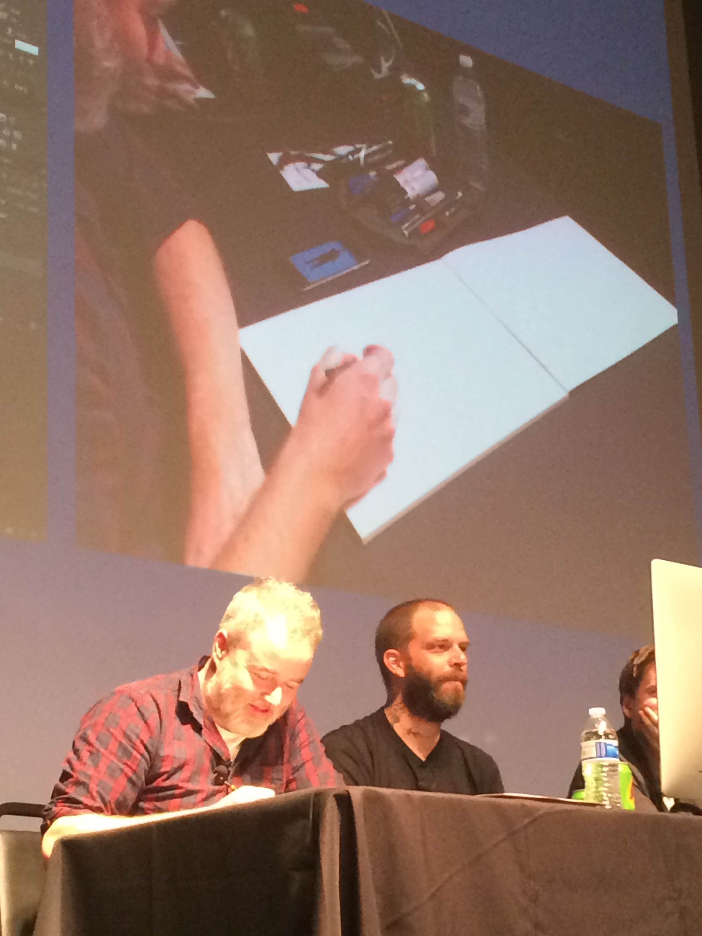
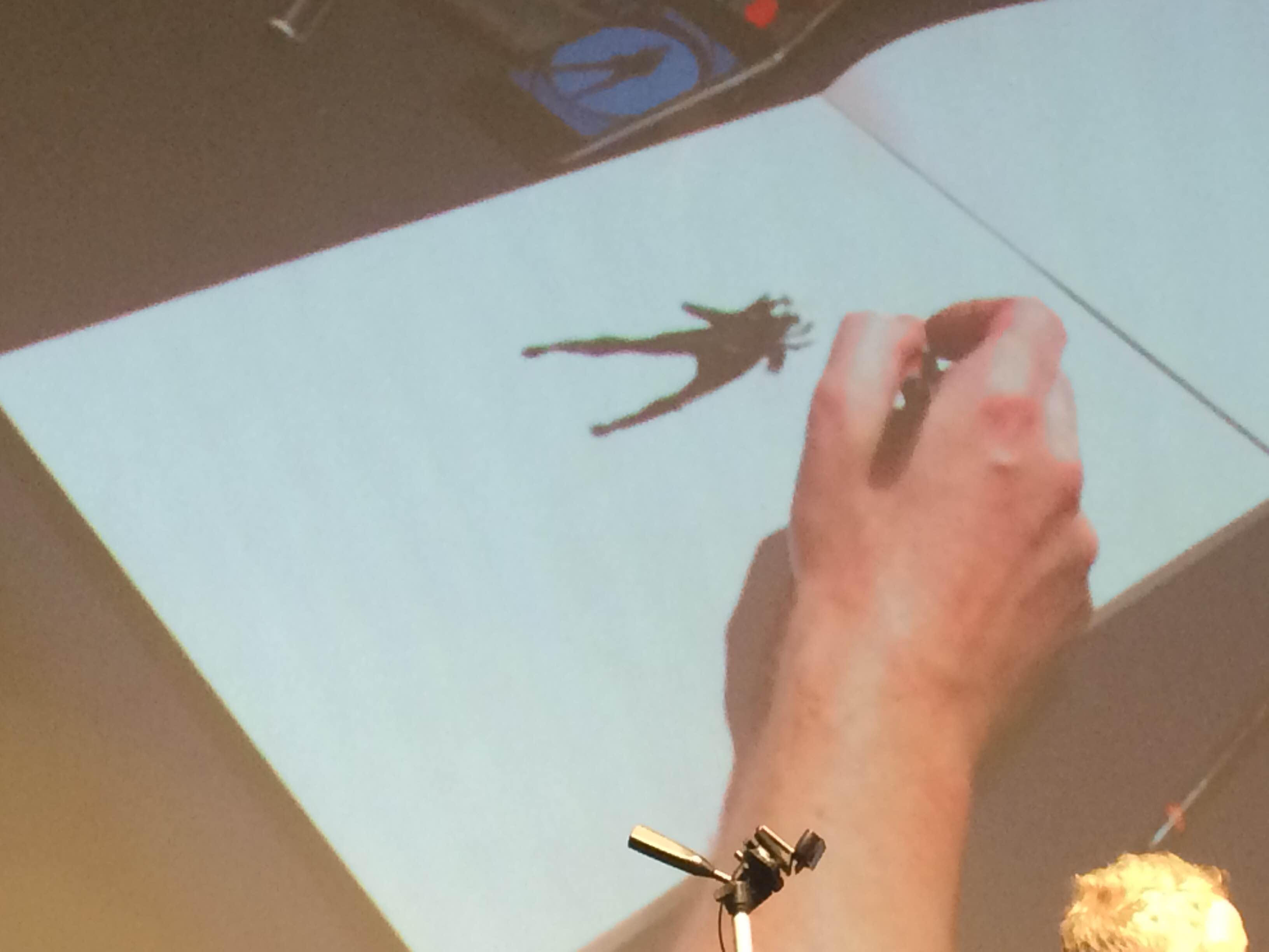
As Shaw got to work assembling the basic shape of the poster (which they decided would be a horizontal 36" X 24") and inserting the borrowed credits block, Jock decided that he would need a photographic reference if he was going to draw James Bond in his classic gun barrel pose. This lead to him posing with a water bottle while Moss snapped a photo.
Unlike Shaw and Moss, who do much of their work on a computer, Jock does the bulk of his art with pen and paper. While he sketched Sean Connery, Shaw and Moss experimented with new fonts for the title.
Soon enough, the structure of the poster was starting to take place: a borrowed credits block and a borrowed fingerprint image on a black background. It's not much, but it's a foundation.
Around this point, Moss paused to appreciate Jock's work, noting that his skills as a designer don't translate to pencil and paper and that he's terrible at actually drawing. It was genuinely fascinating to watch three artists with such different approaches work together like this.
The next step: bring that borrowed gun barrel image into the poster as a stand-in until they can draw their own.
From there, the image was made transparent, so it could act as an easy reference.
Moss used his tablet to show Shaw how he was envisioning the poster and it's a simple idea with a difficult execution. Transforming those "swirls" around the 007 gun barrel into an intricate fingerprint design is easier said than done.
Shaw plowed ahead, initially tracing the gun barrel design...
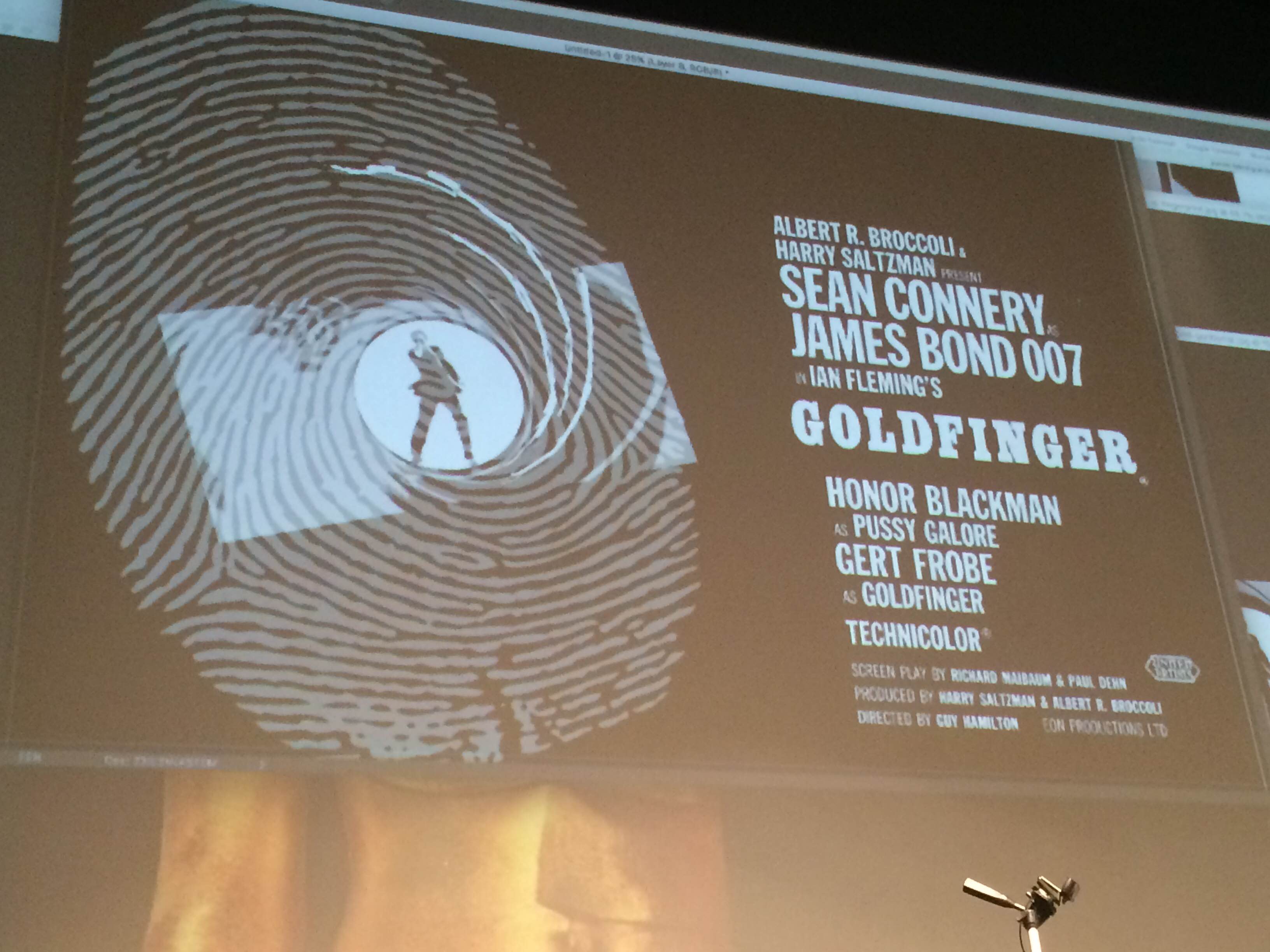
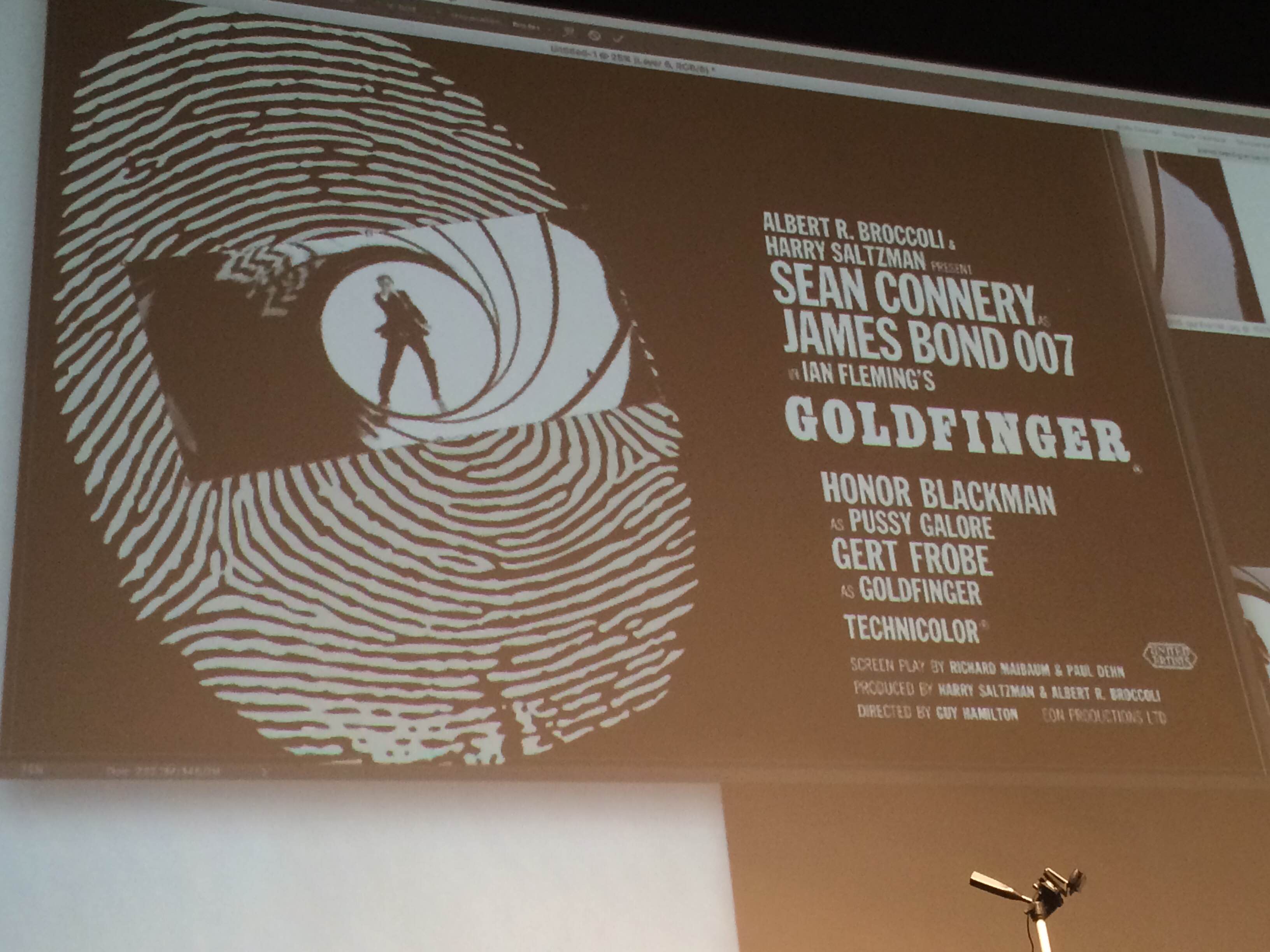
...and using those lines to connect with patterns in the fingerprint itself. The real trick seemed to be finding a way to maintain the visual integrity of the gun barrel as it transformed. The image had to be recognizable as a finger and a piece of James Bond iconography.
At this point, Shaw removed the original source photo, revealing a work-in-progress that almost looks like a fingerprint while also maintaining that classic gun barrel look.
Meanwhile, Jock's James Bond drawing was quietly taking shape.
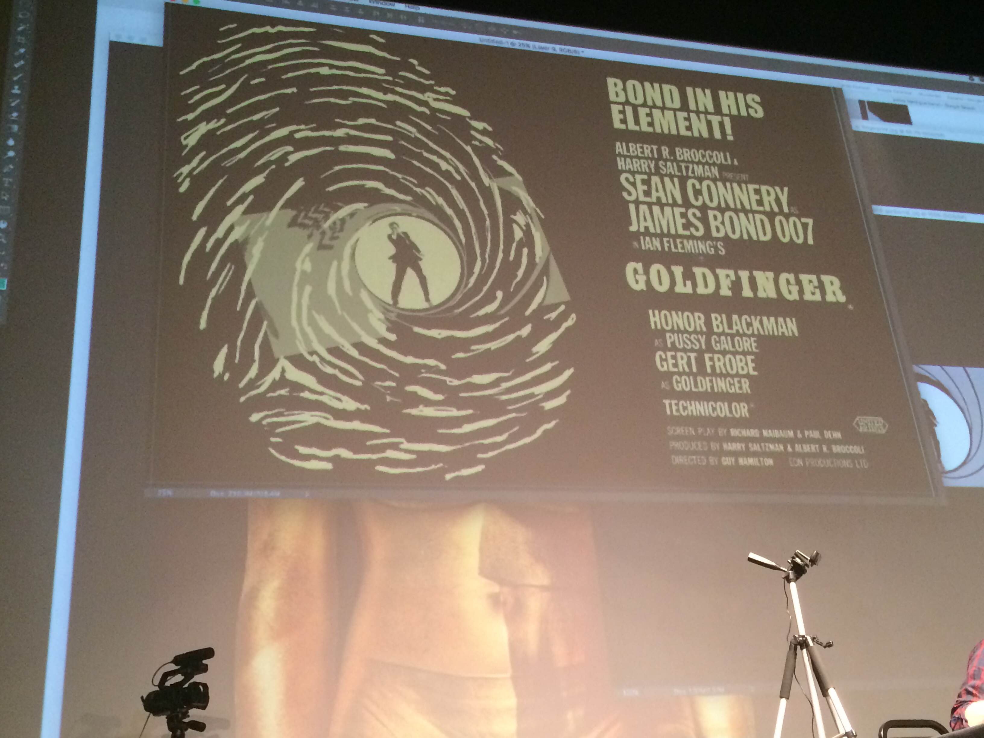
Around this point, two things happened. First, Shaw and Moss made the entire poster gold, because of course it all has to be gold. Second, they requested a new tagline from the audience and after enduring a few stinkers, they struck, well, gold. You can see the tagline inserted into the poster below: "Bond in his element!"
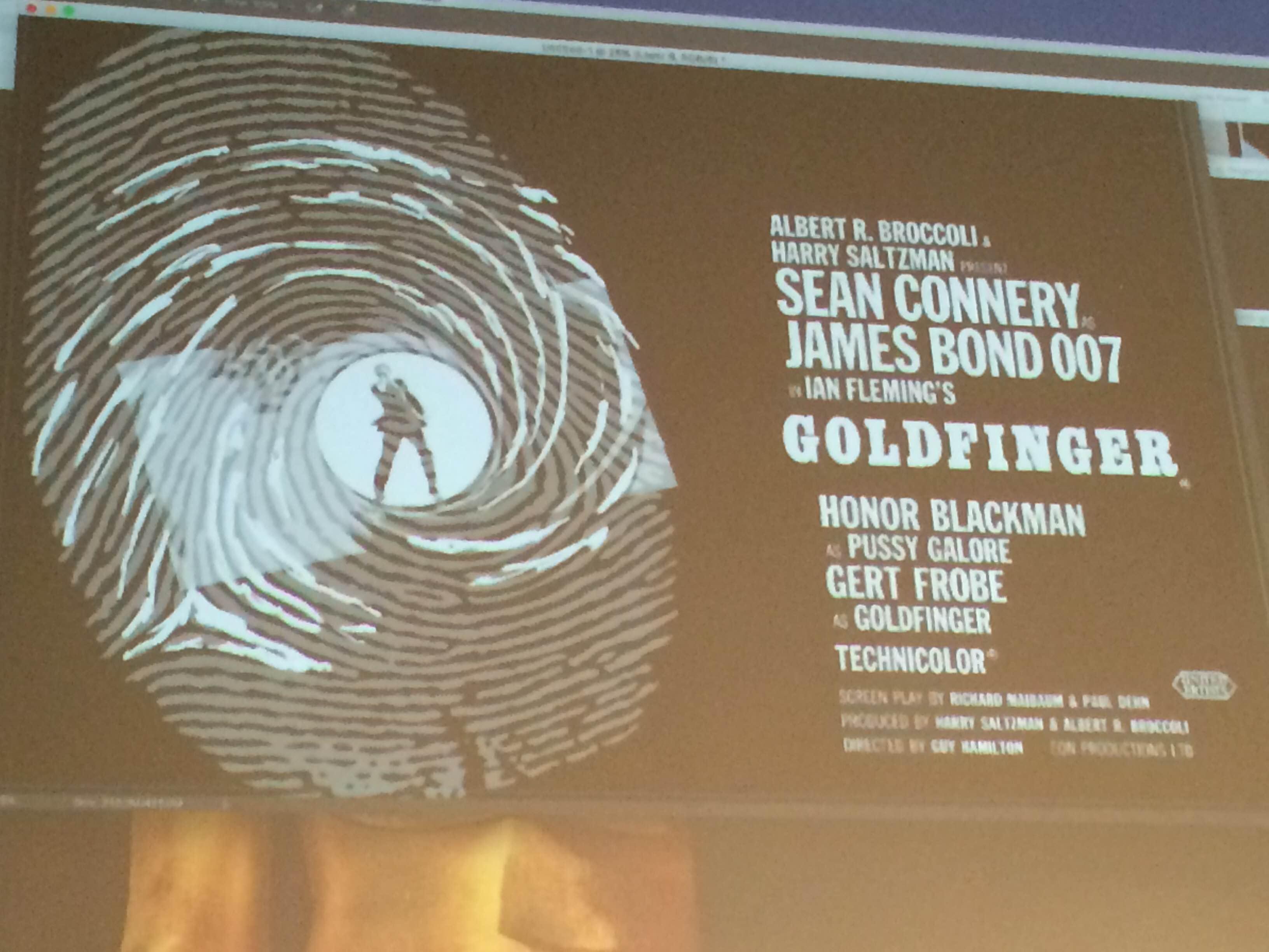
At this point, Jock finished his James Bond sketch and scanned it into the computer.
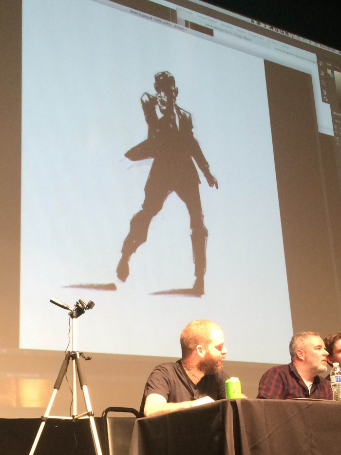
After spending a few minutes with Photoshop to clean up the rough edges, Jock decided it was ready to be inserted into the poster. And here it is!
With time running out, the trio began to pick up the pace. After deciding that they didn't like how bold the fingerprint was, they experimented with fading the edges, giving it a more mysterious and shadowy look.
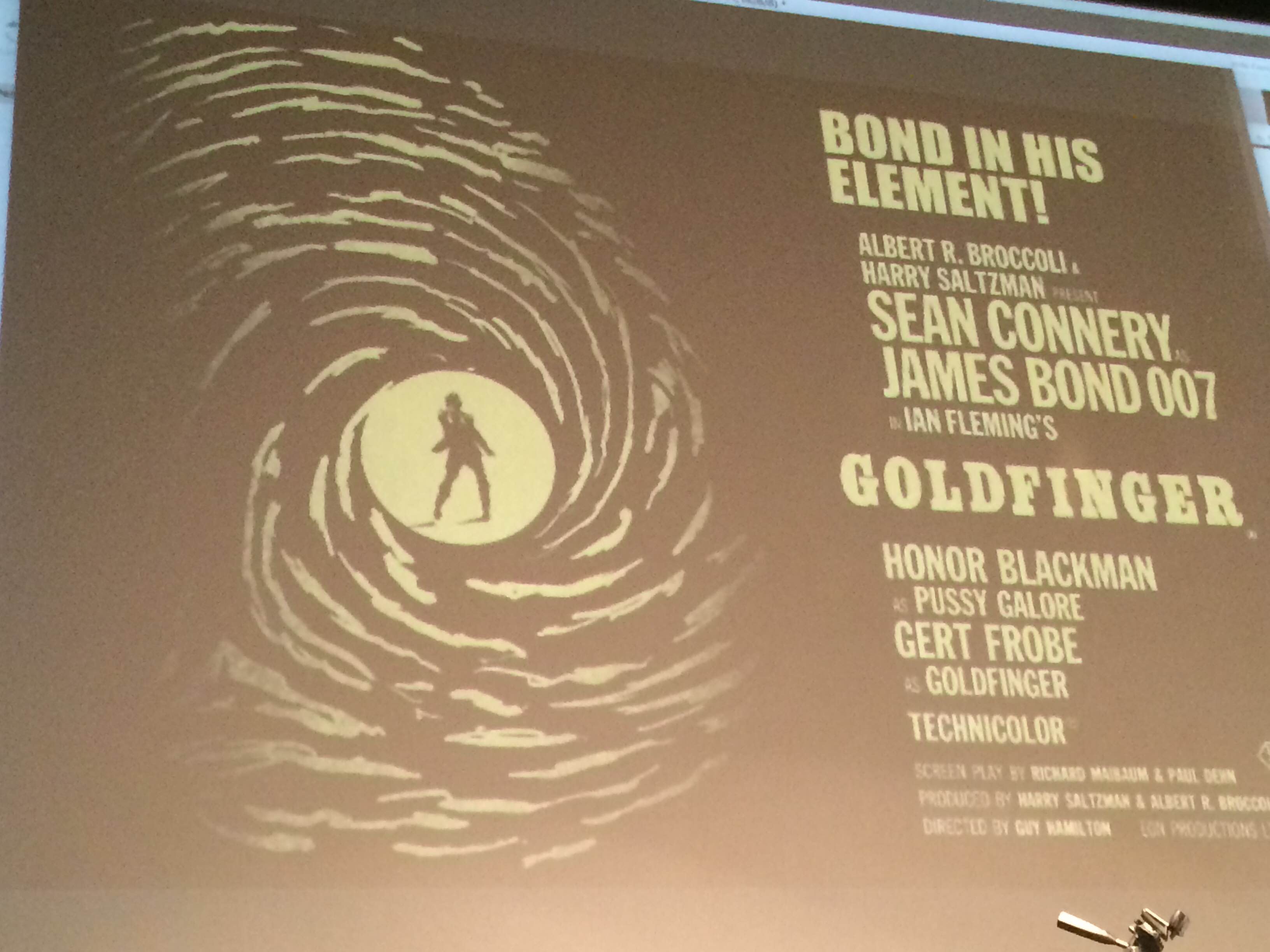
They also realized that the gold text didn't look especially great next to the gold art, so they played around with colors until they landed on this combination.
Still, Shaw was unhappy with the fingerprint itself and brought the original source fingerprint back on screen and started working with it to create more lines and make it clearer that we're supposed to be looking at a fingerprint. In the panel's only moment of direct conflict, Moss disagreed with Shaw's choices, noting that the gun barrel effect was being lost as more fingerprint lines were added.
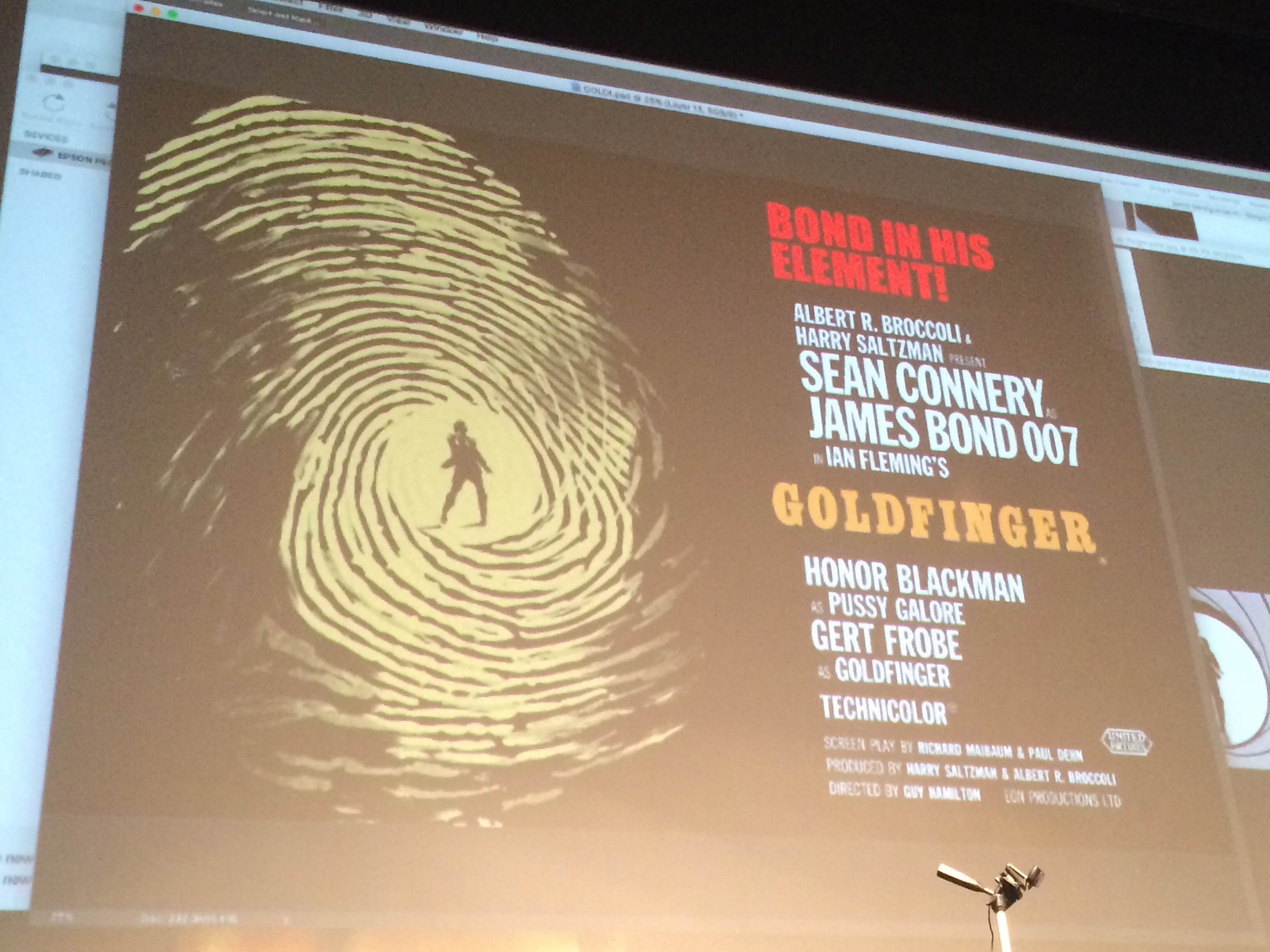
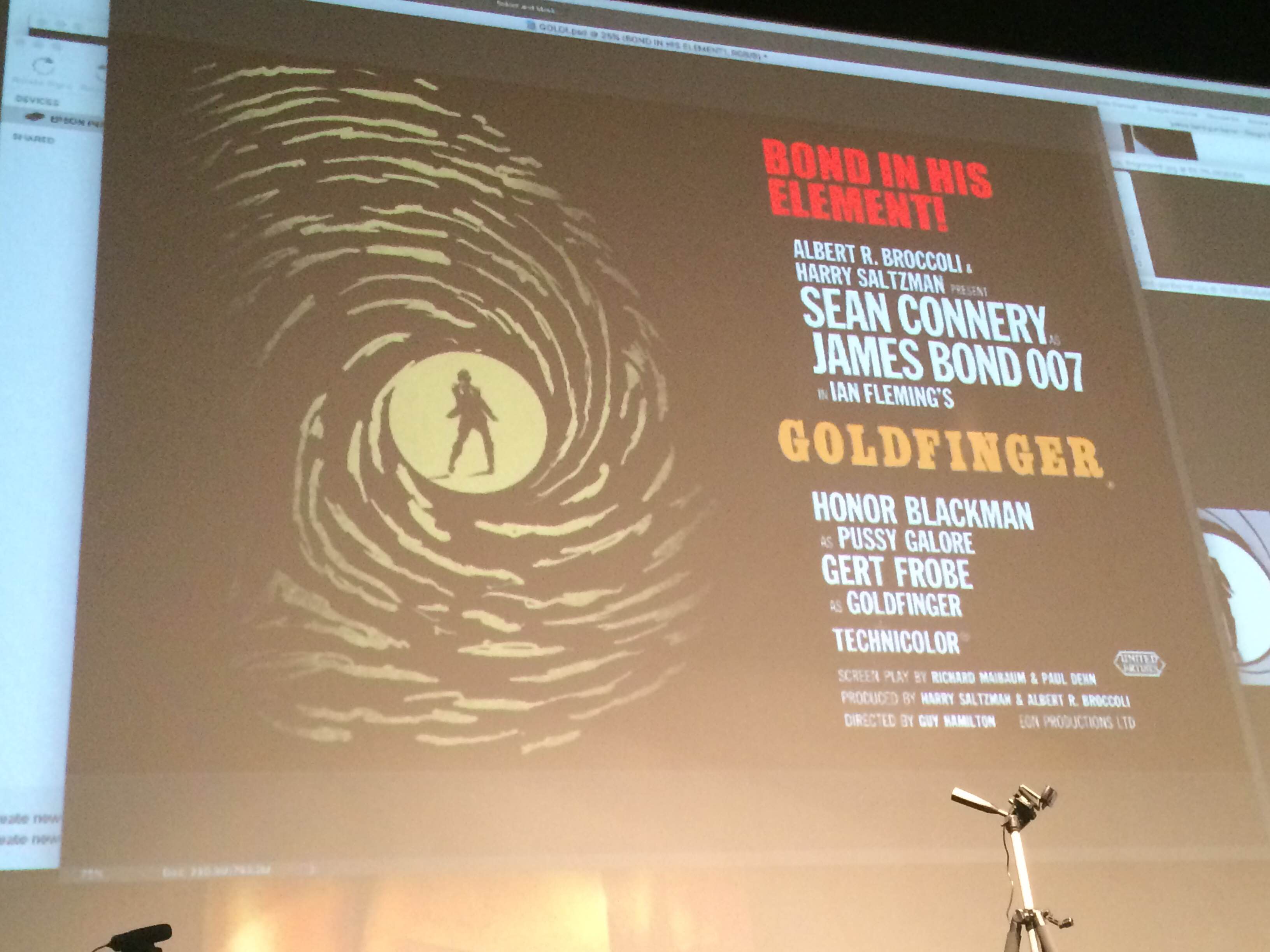
But even a minor disagreement couldn't derail the team and when the panel ran out of time, here's what they had.
The final step was to invite Rob Jones, one of Mondo's key creative leads, on stage to inspect their work. Considering that this was a group collaboration created in an hour, he was impressed. It's not the kind of rough version you'd ever send to a studio or a client, but it is the kind of rough version an artist would send to Mondo for initial feedback. Jones went on to note that the James Bond license is notoriously difficult to acquire for poster companies, but that seeing this work-in-progress left him feeling just inspired enough to go after it again.
The panel itself was a fascinating experience and a fantastic look at seeing how the poster sausage gets made, so to speak. A finished version of this concept could look absolutely stunning, but it will only get there after trial and error and Google searches and second guesses and backtracking and careful font selection. The fact that, in one hour, we got the promise of a cool poster from three brilliant artists is truly astounding.