Mondo Live: How A 'Beetlejuice' Poster Was Designed On Stage In One Hour
The artistic process can be painful and awkward. Artists toil away in isolation, working through a hundred bad ideas before settling on something that works. Only after much trial and error, after much experimentation, does something beautiful actually take shape. It's a private process. A personal process. A mysterious process.
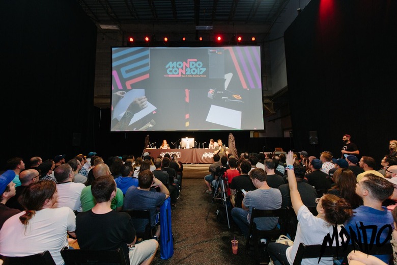
And that's what made MondoCon 2017's Mondo Live panel so damn fascinating and such a wicked concept. Three artists are put on the spot: they must design a poster for a movie live on stage, in front of an audience, in one hour. And while that sounds like a recipe for an entertaining disaster, the results were anything but. Instead, Mondo Live showcases how artists think and collaborate and slash through terrible concepts before arriving at something that clicks.
Artists Jay Shaw, Becky Cloonan, and Alan Hynes designed a Beetlejuice poster live on stage and the results were...well, you'll just have to see for yourself.
The panel began with a reminder that last year's Mondo Live saw three artists designing a poster for the James Bond film Goldfinger...a poster that would never get made because the Bond rights are notoriously difficult to secure. So the crew had one request: the audience should recommend a movie that they could conceivably license so they could actually finish the poster and print it (possibly for MondoCon 2018).
Actually, they had two requests. The second was that they wanted to do something horror or horror-adjacent, something that would be ideal for Halloween. And then the crowd suggestions began: Re-Animator, The Wicker Man, The Fly, Killer Klowns From Outer Space, Critters. The crew seemed excited by The Shining, but Shaw quickly noted that Mondo was already working on something related to Stanley Kubrick's horror masterpiece.
Eventually, it came down to Tim Burton's Beetlejuice and Dario Argento's Suspiria. In a show of hands from the audience, Beetlejuice was the overwhelming winner. (It should be noted that Beetlejuice was not recommended by an audience member but from the panel's moderator. Did the artists game the system because they wanted to do a Beetlejuice poster? Maybe! Possibly! In any case, the audience still picked it.)
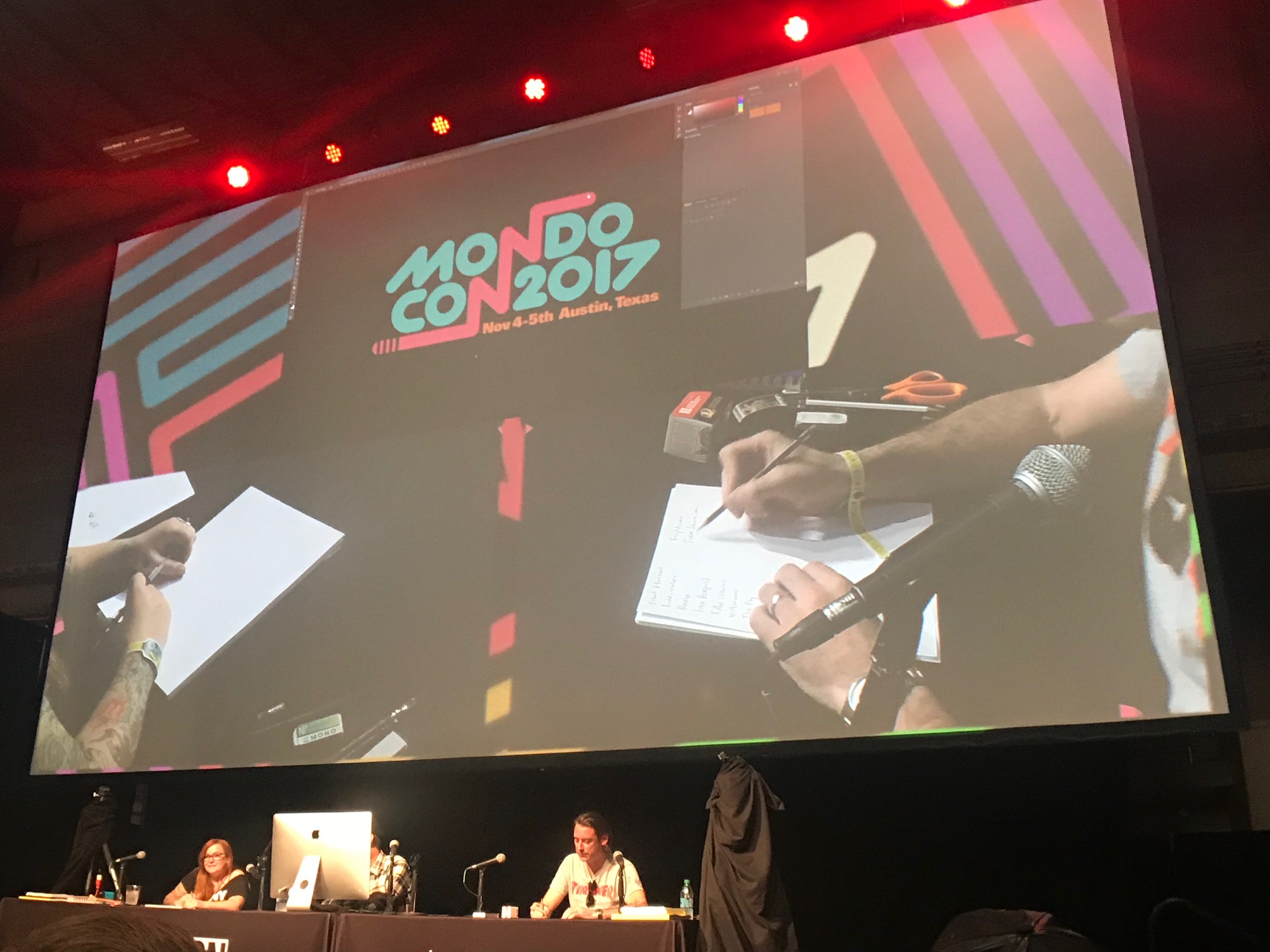
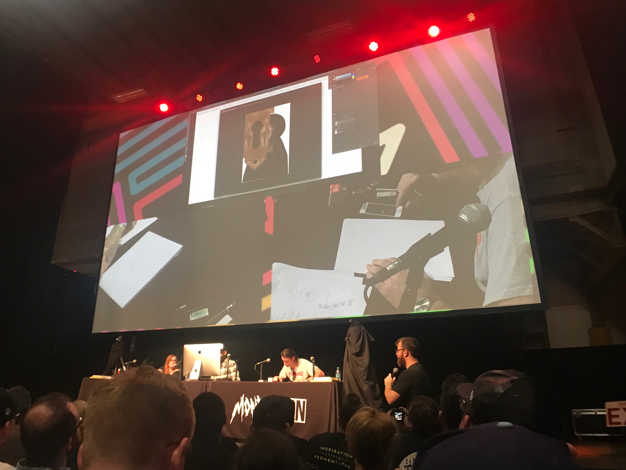
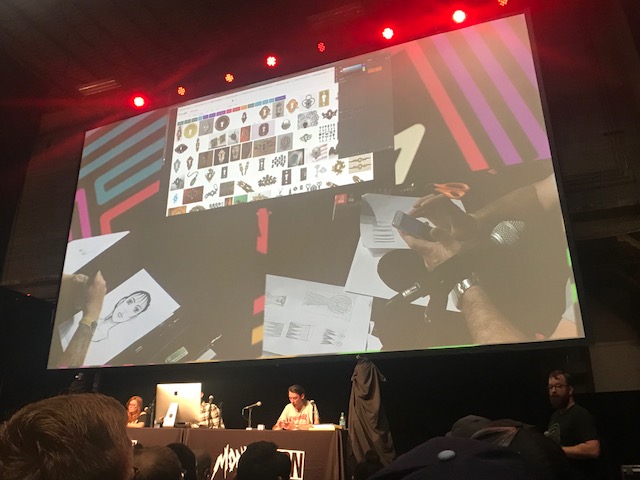
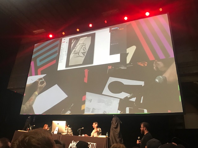
The trio got to work immediately. Cloonan, an illustrator, decided that Winona Ryder's Lydia should be the focus of the poster and immediately began sketching. Hynes started taking notes, jotting down every memorable image that stood out to him from Beetlejuice (Worms, striped suit, etc.). Shaw, being a graphic designer first, used Google image search for inspiration, scrolling through dozens of images before landing on a picture of Lydia holding her camera.
As they worked, the group kept in constant conversation, shouting out ideas and shooting them down. Most of them sounded awful, and Shaw noted that "99% of your ideas are bad" and that it's vital to the process to spit them out so you can get to what works.
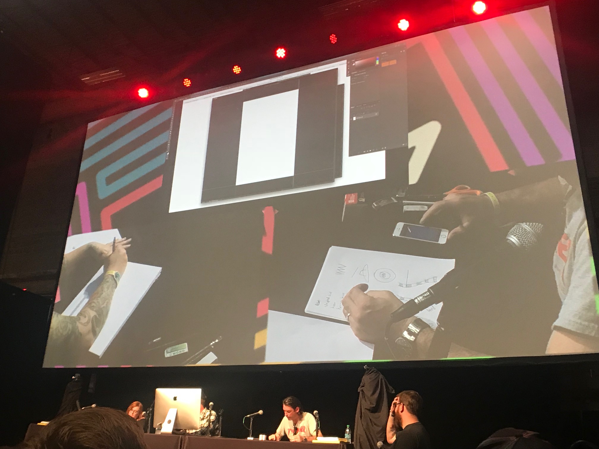
Shaw fired up Photoshop and asked the audience a crucial question: what size and what dimension should the poster be? Ultimately, everyone agreed that 24" x 36" would be ideal: it would be the best format to show off Lydia's giant hat, and it would be theoretically easy to frame.
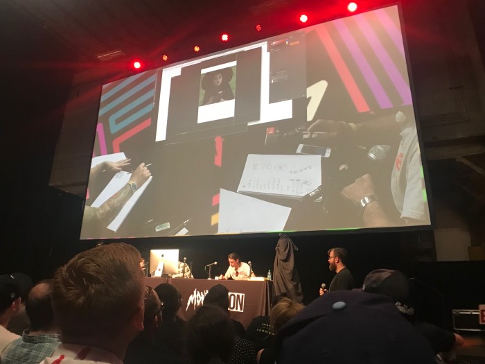
As Cloonan drew a rough thumbnail of Lydia for a warm-up and Hynes sketched scarves and hats, Shaw dropped an image of Lydia into Photoshop. They'd use this image as a template to build on as they worked.
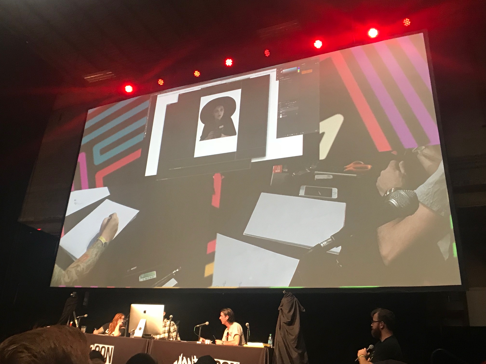
As Shaw cropped the image of Lydia, he noticed that her hat and body shape reminded him of a keyhole. This was the the good idea that took root – Lydia would be seen through a keyhole formed by the shape of her hat, a gateway to the ghostly realm and a stand-in for the haunted house where she lives.
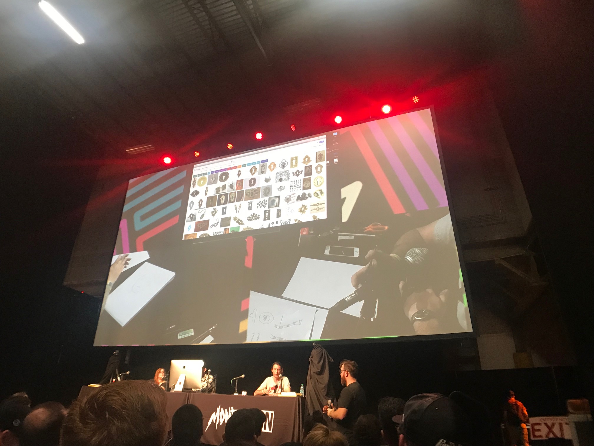
So naturally, Shaw immediately googled keyholes and grabbed a temporary placeholder image. The group used this time to discuss the poster's color scheme, agreeing that it should it should either be black and white or feature minimal color. While the film itself is colorful, Lydia and Beetlejuice himself are very much black and white, and they wanted their poster to reflect that.
"I goof around until something makes sense," Shaw said as he maneuvered the keyhole image over Lydia.
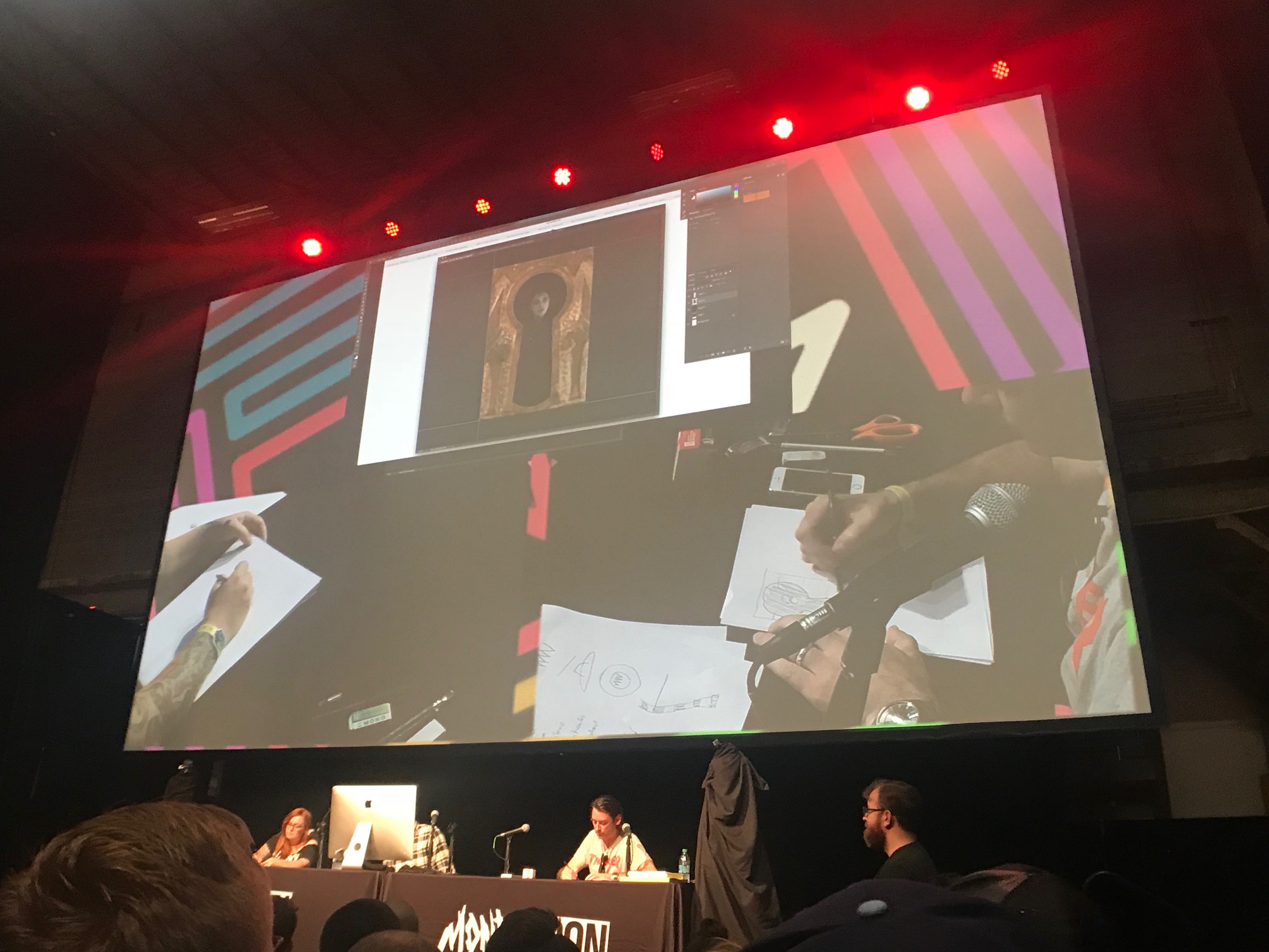
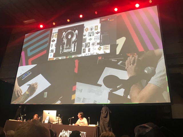
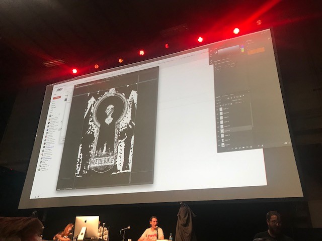
With the basic shape of the poster in place, the group agreed that the edges of the keyhole would be ornate and decorative, featuring creatures, characters, and images from the film as a bas-relief. This way, they could work in many memorable images from the movie while keeping the focus on Lydia.
Shaw played with colors for the keyhole while Hynes took out scissors and paper and began cutting out shapes, which he described as part of his process. He doesn't even touch a computer until he's figured everything out.

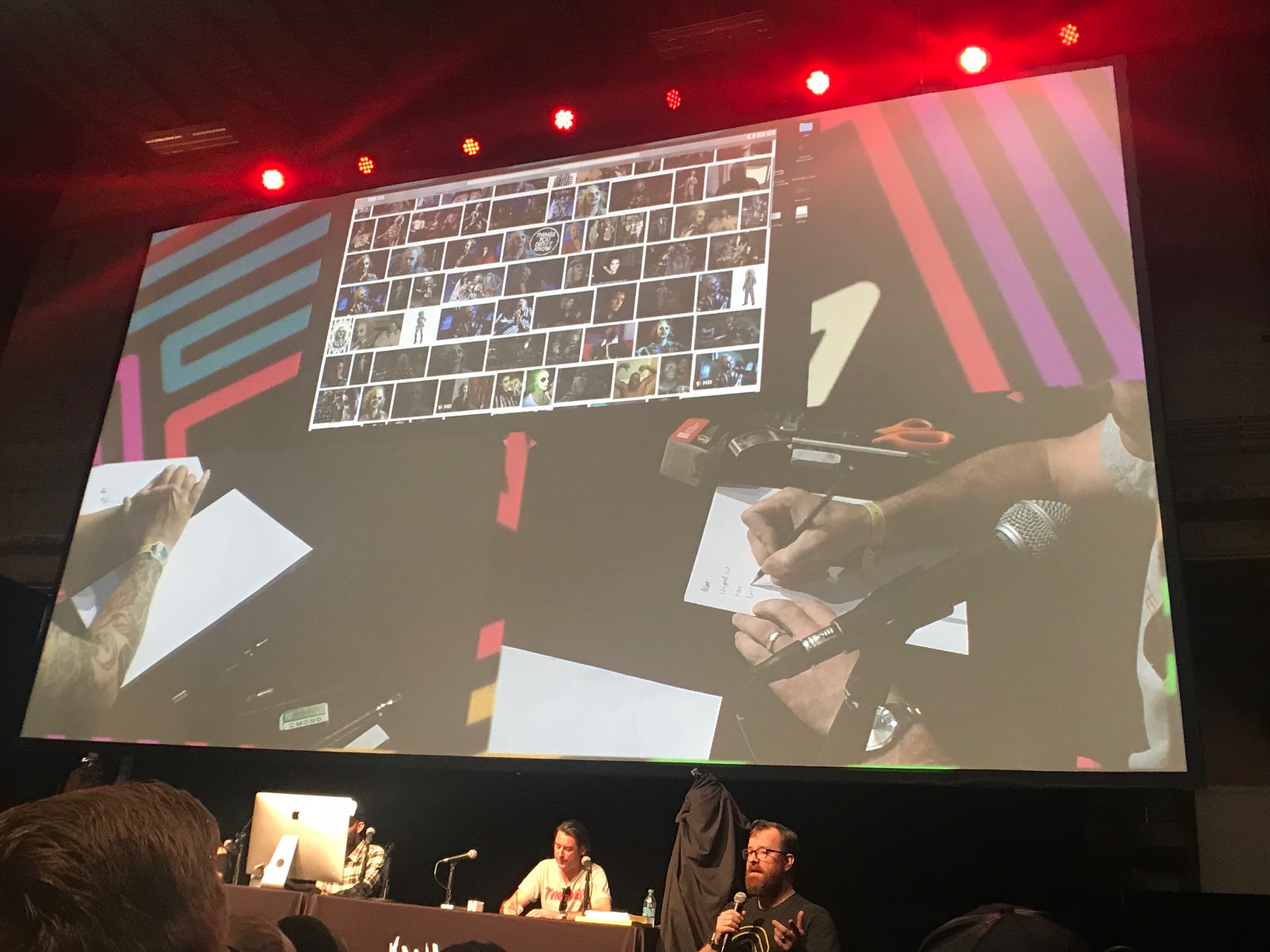
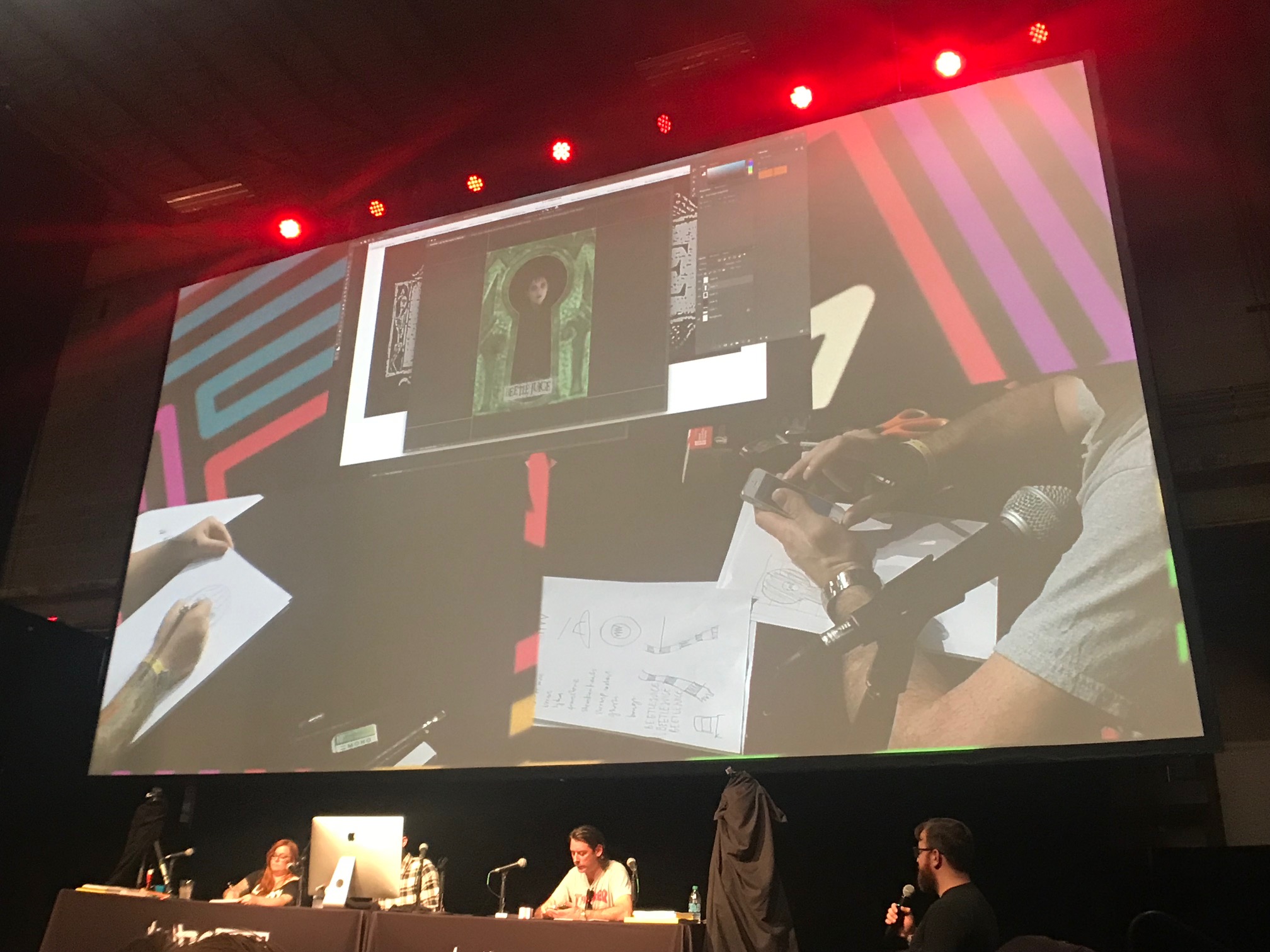
After perusing Google images again, Shaw realized that they couldn't improve on the original title treatment for the film and decided to drop it into the poster. Naturally, this is the kind of decision that would require approval from the studio.

With Cloonan's sketch of Lydia coming along, Shaw inserted an image of the house at the center of Beetlejuice. Everyone agrees that something is missing – Lydia should be holding something to tie the enter poster together because she was just floating in a black void.
Shaw asked the audience for suggestions. What would we like to see? Any bright ideas? One idea immediately struck a chord with the team: a sandworm ouroboros wrapping the edge of the keyhole. Shaw announced that he would steal that idea and immediately began googling "ouroboros."
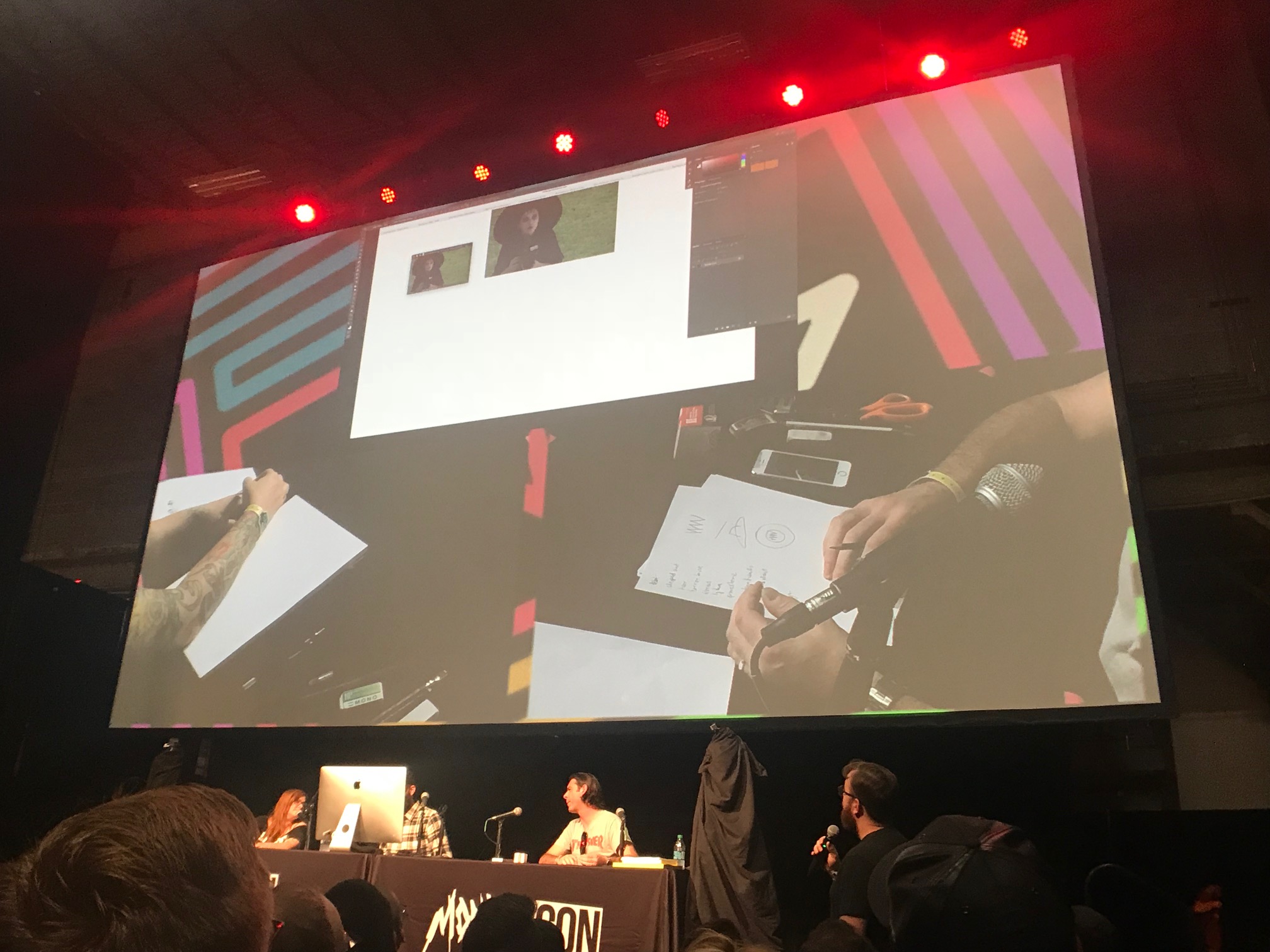
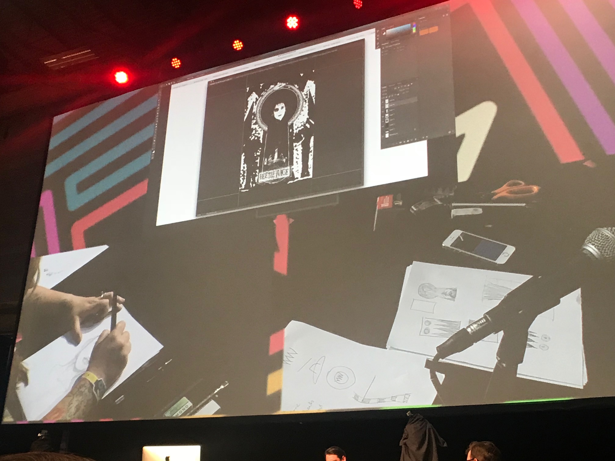
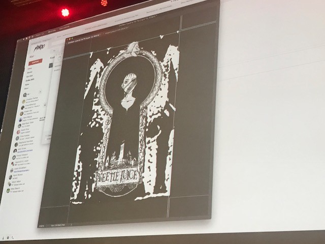
You can see Cloonan's Lydia taking shape in the image above. She noted that she's not exceptionally skilled at capturing likenesses, but Lydia has so many instantly identifiable characteristics (the bangs, the dark circles under her eyes) that she will be immediately recognizable. But even if her Lydia looked nothing like Winona Ryder, they would still need to secure her likeness rights to make the poster actually come together.
Eventually, the artists realized that there was no Beetlejuice in their Beetlejuice poster. Cloonan suggested that they make the sandworm into the giant snake monster that Beetlejuice transforms into in the movie, an idea that was instantly approved by Shaw and Hynes.
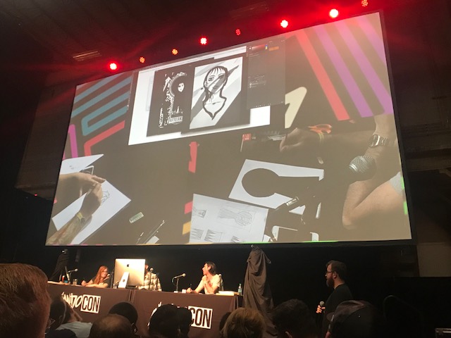
With her Lydia sketch finished, Cloonan jumped right into drawing Beetlejuice's monstrous snakehead. When the scanner on stage didn't work, Shaw photographed Cloonan's drawing and emailed it to himself. This rough and tumble approach (they were fighting the clock, after all) resulted in some shadows running across the art, but they decided to just roll with it.
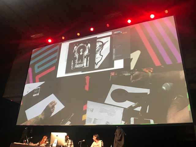
Shaw cropped Cloonan's Lydia sketch and dropped it over the source photograph. Shaw noted that they had a pretty good "napkin sketch" going, something they could show to Mondo before they did a more refined version to send to the studio to secure the licensing rights.
Shaw quickly finished the Beetlejuice head, which he photographed and emailed to himself.
A few minutes later, the Beetlejuice ouroboros was complete (even though the lower half of its body was just a bunch of scribbles Shaw created just to fill in the space because they were running out of time).
And then the panel was over. Looking at the "finished" product, it was decided that Lydia should be holding her camera, with the lens hovering over the house to simulate the moon. But other than that, the trio seemed pretty pleased with their poster. It wasn't even close to being something they could print (let alone send to Warner Bros.), but it was the kernel of something that could, with a lot of work, be good.
Will they get around to finishing the poster? Will it every get printed? I guess we'll find out next year.