Six 'Dark Knight Rises' Character Posters Improve On Theatrical One-Sheet
Monday's reveal of what's likely the final theatrical poster for The Dark Knight Rises was met with considerable venom. "This was done in 20 seconds" said Zach H in our comments. "This will be the next instagram feature. Instant-movie-posters," wrote ThatEuropeanGuy and Bryan C simply said "How terribly uninspired." The poster even inspired a truly hilarious GIF showing how the poster combines elements from The Dark Knight Rises teaser poster and The Dark Knight theatrical poster.
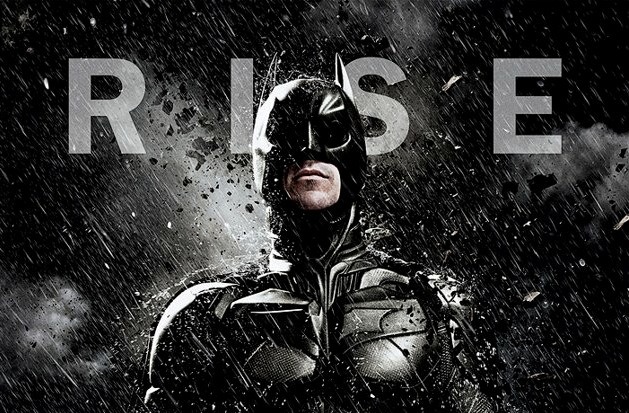
Hopefully everyone will be slightly more satisfied with these new character poster just released by Warner Bros. There are two different styles. One is simple, yet striking. The other is a little more muted and evocative. Will fans like these? Comment below to find out.
Here are the posters via Yahoo Movies and the film's French Facebook page.
First of all, these are likely international-only posters (definitely the second three, but the first three originated on Yahoo UK before the US) so don't bank on seeing them in local theaters.
That said, I definitely like the first three better than the theatrical poster because they stick with a theme and put the characters in your face. The dark eyes are especially a nice touch and the rain/debris gives a good sense of the terror in the film. As for the second three, they just seem a bit too simple for me. Snow is definitely not as menacing as rain and concrete.
However, do posters for this movie even matter? Doesn't everyone already know this movie is coming out, especially if you're walking around a movie theater? I was sitting at a taco truck in downtown Los Angeles this weekend and overheard an elderly couple talking in Spanish. The only words I understood were "new Batman movie." There's no shortage of awareness for this one.
So what do you think? Are these better than yesterday's poster? Which set do you prefer?