The Halloween franchise has seen several sequels and reboots over the years, but there are a bunch of bizarre Halloween sequels that never came together.
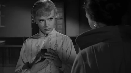
When the Star Trek episode 'Metamorphosis' needed someone to step in for the amorphous Companion on-set, costar Elinor Donohue was more than happy to oblige.
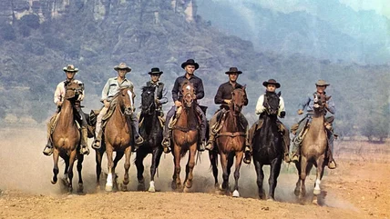
John Sturges was a crisis-averting machine, which came in handy when he faced an impending actors' strike while making his 1960 classic The Magnificent Seven.
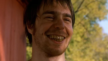
Sam Rockwell's Green Mile character, 'Wild Bill' Wharton, is a real scumball, and Rockwell (plus some nasty egg white spittle) brought him to life perfectly.