One of 2023's best films, Past Lives, has multiple connections to Luca Guadagnino's romantic drama Challengers (including one you definitely didn't know about).
A24 put Ari Aster's Hereditary in select IMAX theaters for one night only. Here's what it was like to attend, and how it could be a path forward for Hollywood.
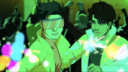
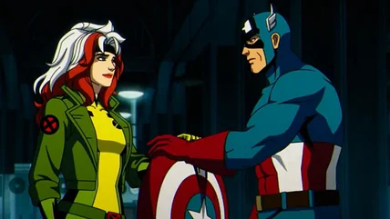
Holly Chou and Gui Agustini, who voice Jubilee and Sunspot in X-Men '97, tell us about playing the youngest cast members and the catharsis of the show's anger.
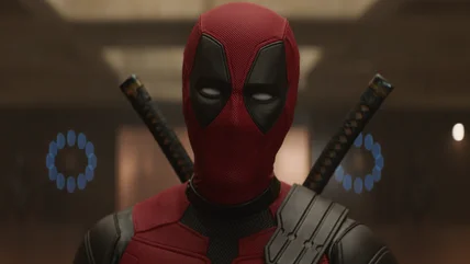
Tired of being burdened with homework every time a Marvel movie comes out? According to director Shawn Levy, that won't be the case with Deadpool & Wolverine.
2024 has already seen numerous misfires at the box office, from hopeful big studio blockbusters to smaller, original movies just trying to find their way.
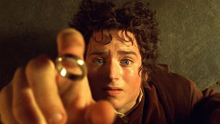
The Lord of the Rings trilogy returns theaters in June, and the re-release features the 4K remasters of the extended cuts on the big screen for the first time.
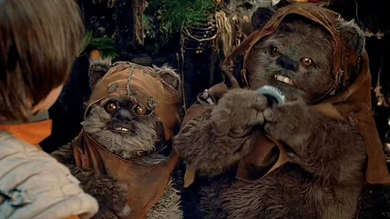
It's true: the infamous Star Wars movie Caravan of Courage: An Ewok Adventure and the classic Rudolph the Red-Nosed Reindeer TV special share a key element.
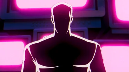
Even though we thought Mr. Sinister was responsible for the attack on Genosha, X-Men '97 episode 7 reveals a new big bad villain with ties to the past.
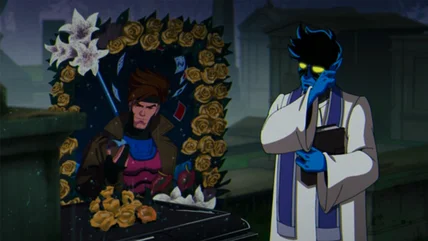
The latest episode of X-Men '97 grieves for Gambit, and alongside the mourning X-Men, there are a few deep cut Marvel characters from the original series.
You have to go back several years to find a vampire film that was a hit at the box office. Unfortunately, Abigail doesn't appear poised to break that streak.
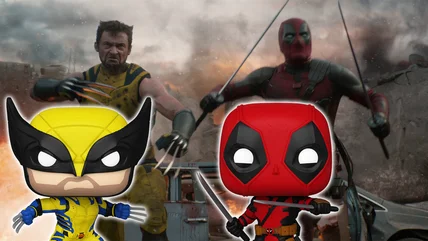
Deadpool & Wolverine has debuted the first Funko POPs that will be released in conjunction with the movie, including a fully masked Wolverine. Check them out!