Sam Rockwell's Green Mile character, 'Wild Bill' Wharton, is a real scumball, and Rockwell (plus some nasty egg white spittle) brought him to life perfectly.
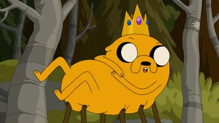
It took some advice from SpongeBob SquarePants himself for John DiMaggio to fully embrace the nonsensical weirdness of Cartoon Network's Adventure Time.
David Simon's terrific crime drama remains one of the most well-respected shows in television history. Here's our definitive list of The Wire seasons ranked.
The '90s was full of shows that changed the TV landscape, but not all were well-received. These '90s horror shows with bad reviews are still worth watching.
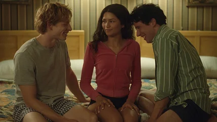
Luca Guadagnino had important advice for the writer of the new tennis erotic thriller, Challengers: All three points in the story's love triangle should touch.
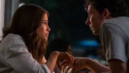
Luca Guadagnino's sexy tennis film Challengers is dripping with tension and seduction, and he took inspiration from two classic filmmakers in particular.