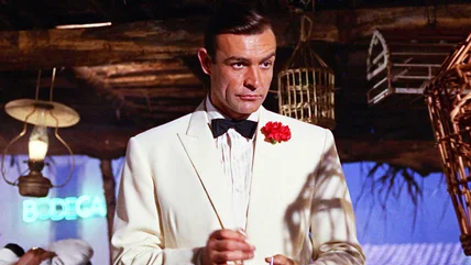
The James Bond movie that really solidified the idea of 007 and the franchise's tropes also happens to be the one with the highest Rotten Tomatoes score.
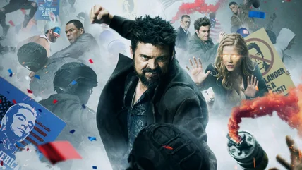
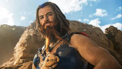
The Boys don't just have Homelander to worry about in the new season 4 trailer. They're also facing off against superpowered chickens and flying sheep.
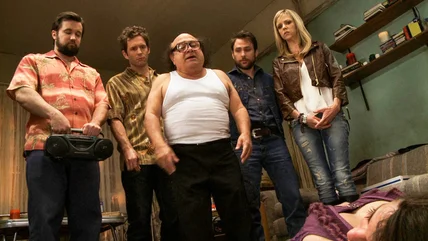
The It's Always Sunny in Philadelphia gang have been responsible for a lot of deaths, but there are two characters Glenn Howerton really regrets killing off.
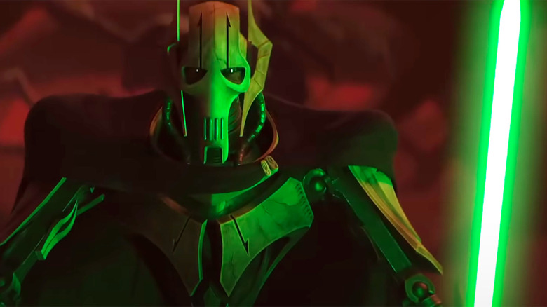
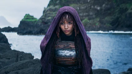
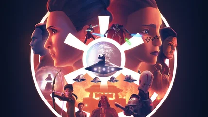
Star Wars: Tales of the Empire expands the story of the Fourth Sister, who debuted in the Obi-Wan Kenobi series, and it sets up an interesting future for her.
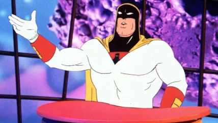
The '90s punk rock animation renaissance would lead to Cartoon Network's Space Ghost Coast to Coast becoming the bedrock of a generation of entertainment.
Marc Webb's The Amazing Spider-Man 2 made over $700 million worldwide, but still ended up killing Sony's attempt at a solo, non-MCU Spider-Man franchise.
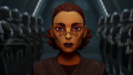
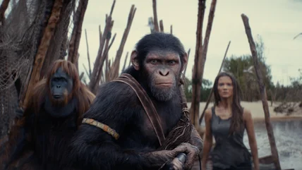
The animated anthology series Star Wars: Tales of the Empire reveals the fate of defected Jedi Barriss Offee. So which fan theories turned out to be right?
Star Wars Day is this weekend, and there are cool new toys, collectibles, gear, and memorabilia from a galaxy far, far away. Here's some of the coolest stuff.
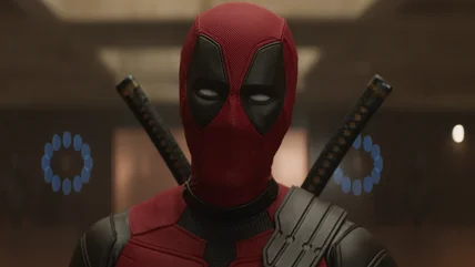
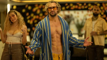
Marvel head honcho Kevin Feige was hesitant to sign off on Ryan Reynolds' early pitches for Deadpool & Wolverine, but the actor just kept the ideas coming.
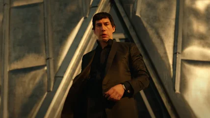
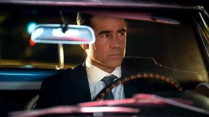
The Apple TV+ show Sugar, starring Colin Farrell as a P.I. trying to find a Hollywood producer's missing granddaughter, just rocked our world with a huge twist.
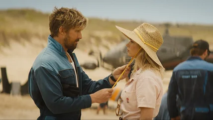
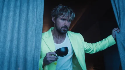
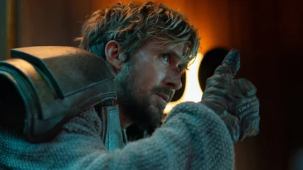
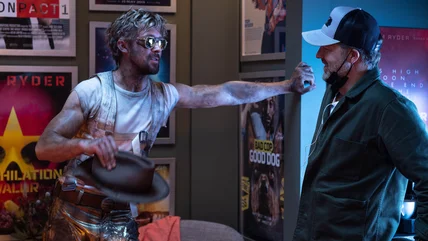
We spoke with The Fall Guy director David Leitch and stars Ryan Gosling, Emily Blunt, Winston Duke, and Stephanie Hsu about their terrific new action romance.