Papyrus Creator Defends His Font After 'Saturday Night Live's 'Avatar' Takedown Goes Viral
Typography doesn't sound like it has any latent comedic potential but throw in a wearied Ryan Gosling in a noir-inspired Saturday Night Live digital sketch, and suddenly, you've got comedy gold.
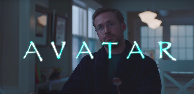
The hilarious SNL "Papyrus" skit was such a brilliant takedown of the Avatar font that we've spotlighted it twice on our site. But the conspiracy surrounding this oddity of a font choice is not yet done — we've now got the enigmatic creator of the Papyrus font finally chiming in about its public skewering, and how he feels about Ryan Gosling becoming his No. 1 enemy.
The Papyrus font has long been the subject of hatred for anyone with a passion for graphic design, and the fact that it was the face of the highest-grossing blockbuster in the world is nigh unfathomable. But it's been eight years since Avatar came out — which makes the randomly timed Saturday Night Live Papyrus sketch even more gut-busting.
"It happened again," Ryan Gosling's haunted narrator says in the season opener for Saturday Night Live. "I thought it was behind me, but the dreams came back. I was up all night. I forgot about it for years, but then I remembered that 'Avatar,' the giant, international blockbuster, used the Papyrus font as its logo."
The serious tone of the bit, supported by Gosling's own talents as a dramatic actor, lent to the inanity of the sketch, instantly transforming it into a classic fit for the SNL archives. And it had some unforeseen consequences for the actual creator of the Papyrus font, Chris Costello, who found his inbox flooded with emails the next day. Luckily, Costello told CBSN in an interview Sunday; he was a fan of the sketch. He said:
"I took a look at [the sketch] and me and my wife were like cracking up, I mean we couldn't stop laughing. It was one of the best things I've seen...I designed the font when I was 23 years old. I was right out of college. I was kind of just struggling with some different life issues, I was studying the Bible, looking for God and this font came to mind, this idea of, thinking about the biblical times and Egypt and the Middle East. I just started scribbling this alphabet while I was at work and it kind of looked pretty cool."
Costello sold the font for $750 and didn't think much of it. "I had no idea it would be on every computer in the world and used for probably every conceivable design idea," he said, revealing that he only receives "very low" royalty payments for the frequently-used and much-maligned font now.
As to its reputation for being one of the worst fonts designed — outside of Comic Sans? While Costello agrees that Papyrus is "way overused," he thinks it gets unfairly criticized.
"I really think — and again if I can take this time to apologize to my brother and sister graphic designers. I'm a graphic designer as well, I'm an illustrator ... I believe it's a well-designed font, it's well-thought out."
Since Cameron seems to be planning to use the font for his next four sequels, it's clear that Costello has at least one fan.