VOTD: The Visual Symmetry Of 'Escape From New York' And 'Escape From LA'
Recently we highlighted a couple of videos that dove into the visual symmetry between the original Star Wars trilogy and the more recent prequel trilogy and also the original Indiana Jones trilogy and Kingdom of the Crystal Skull.
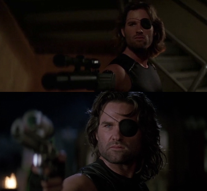
Now the editor of those videos is taking a look at some darker and grittier fare by showing the Escape from New York visual symmetry compared the 1996 sequel Escape from LA, both films from legendary director John Carpenter.
Here's the visual symmetery of Escape from New York and Escape from LA:
John Carpenter didn't waste any time making Escape from LA feel just like Escape from New York, for better or worse, right down to the opening credits (though to be fair Carpenter has used that credits style a few times). The problem with the sequel is that it just tries to comfortably coast on the legacy of the original film without doing much different, and this shows the sequels hitting much of the same beats visually as it also does narratively.
However, the visual comparisons aren't a slight against the movie. Usually sequels are supposed to share some common visuals, especially when they're from the same director. It creates a sense of familiarity and homage while bringing something fresh to the table. But it's within the story that Escape from LA doesn't stand on its own well enough.
While it's easy to point out that some shots are common among all types of movies, and not just between these two sequels, it's not hard to see that these shots and echoes of Escape from New York that we see in Escape from LA are intentional. It's just a shame that the sequel couldn't build upon the original to make a worthy follow-up instead of the strange mess that we got instead.