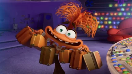
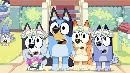
Inside Out 2 surprisingly found inspiration in an Adam Sandler film when it came to visualizing the hold that the new emotion Anxiety has on 13-year old Riley.
Time to pick up your hammer again. Park Chan-Wook is overseeing the development of an Oldboy English-language TV series inspired by his classic revenge movie.
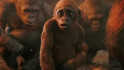
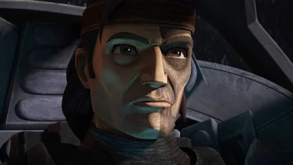
The Bad Batch pays homage to the original Star Wars trilogy, Hitchcock thrillers, classic war movies, and more in this week's episode, 'Into the Breach.'
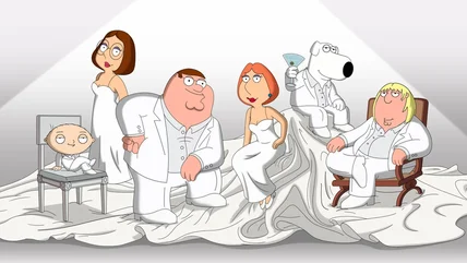
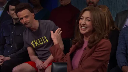
Heidi Gardner completely broke during Saturday Night Live's Beavis and Butt-Head sketch with Ryan Gosling, and she's talking about how it all happened.
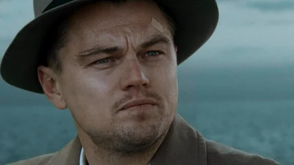
Glen Powell has been a romantic lead, a square-jawed historical figure, and a lovable jerk on screen. Edgar Wright's The Running Man will give him a new test.
Much like Inside Out had to cut down the roster of emotions in the movie, Inside Out 2 also had to leave some additional new emotions out of the final story.
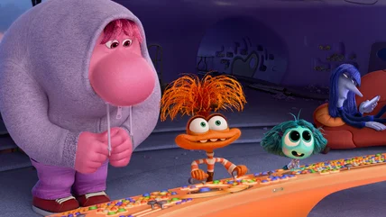
Inside Out 2 is introducing new emotions who create chaos for Riley's life, but there are two other new non-emotional characters who audiences will love.
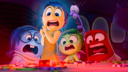
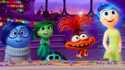
Pixar Animation invited /Film to their campus in Emeryville, California to watch 35 minutes of Inside Out 2. How does the sequel look? Let's break it down.
The Wolf Man appears in several Universal Monster movies over the years, but what's the correct order to watch them? Let's break it down for new viewers.
Gregory Widen's 1995 horror film The Prophecy was a modest hit that went on to get several direct-to-video sequels. Here's the correct order to view them.