Even though we thought Mr. Sinister was responsible for the attack on Genosha, X-Men '97 episode 7 reveals a new big bad villain with ties to the past.
The latest episode of X-Men '97 grieves for Gambit, and alongside the mourning X-Men, there are a few deep cut Marvel characters from the original series.
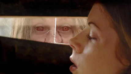
You have to go back several years to find a vampire film that was a hit at the box office. Unfortunately, Abigail doesn't appear poised to break that streak.
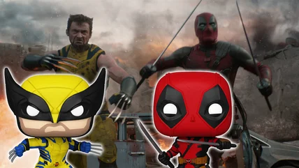
Deadpool & Wolverine has debuted the first Funko POPs that will be released in conjunction with the movie, including a fully masked Wolverine. Check them out!
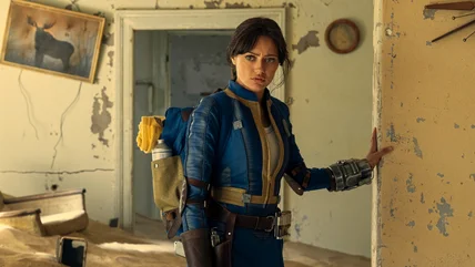
Fallout used virtual sets for many expansive locations, but you wouldn't know it by looking at the Prime Video series. Let's break down some special effects.
Heading into its series finale, Star Wars: The Bad Batch has circled back to a dangling plot thread involving one of Palpatine's secret schemes in Clone Wars.
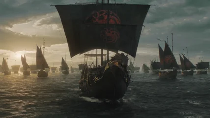
Ten Thousand Ships, the scrapped Game of Thrones spin-off, would have been about Queen Nymeria sailing around Westeros on a floating city. Here's what we know.
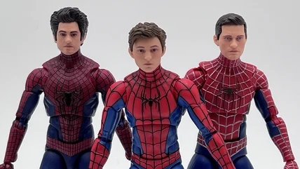
The Marvel Legends line of Spider-Man: No Way Home action figures are excellent, especially when it comes to Green Goblin and the Spider-Men. Take a look!
The Lord of the Rings: The War of the Rohirrim will bring some anime style to a Middle-earth story later this year. Here's what we know about it so far.
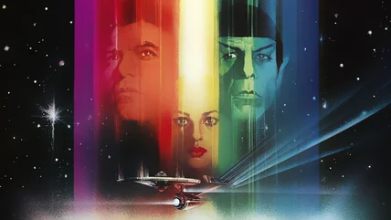
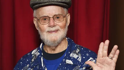
An important item used in the classic opening credits for The Original Series has found its way back to the family of late Star Trek creator Gene Roddenberry.
Without Star Trek fan John Trimble, it's possible the way modern science fiction and genre fans interact with their favorite projects would look very different.
The new Deadpool & Wolverine trailer features a brilliant Easter egg referencing Deadpool co-creator and Marvel Comics artist Rob Liefeld in a hilarious way.
David Howard Thornton, who plays deranged Terrifier villain Art the Clown, said he initially got the job by acting out a twisted bit of improv in his audition.