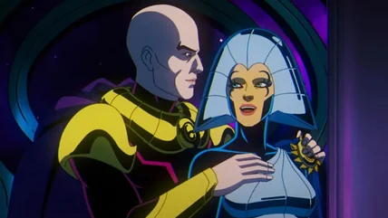
In conjunction with Zack Snyder's "Rebel Moon: Part Two - The Scargiver," a new behind the scenes book takes a closer look at the cosmology and technology.
The Addams Family movie had quite the fraught production, and arguments between the director and producer prompted one of them to hide in a pillow fort.
Guy Ritchie's The Ministry of Ungentlemanly Warfare plays fast and loose with real events, but their overall nature and stakes aren't embellished at all.
After a surprisingly strong star, Zack Snyder gives in to his worst tendencies with the sequel Rebel Moon: Part Two - The Scargiver. Here's our review.
It's a big week for AI image fails, as a Netflix true crime doc uses artificial images of the killer and A24 releases AI-generated posters for Civil War.
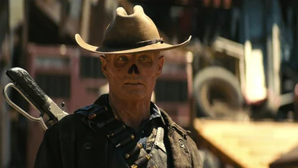
The act of changing ultra-handsome Walton Goggins into the still-weirdly-handsome Ghoul in Fallout was restrictive, but Goggins Goggins'd his way through it.